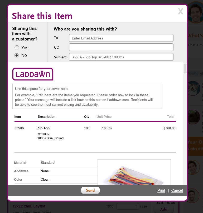
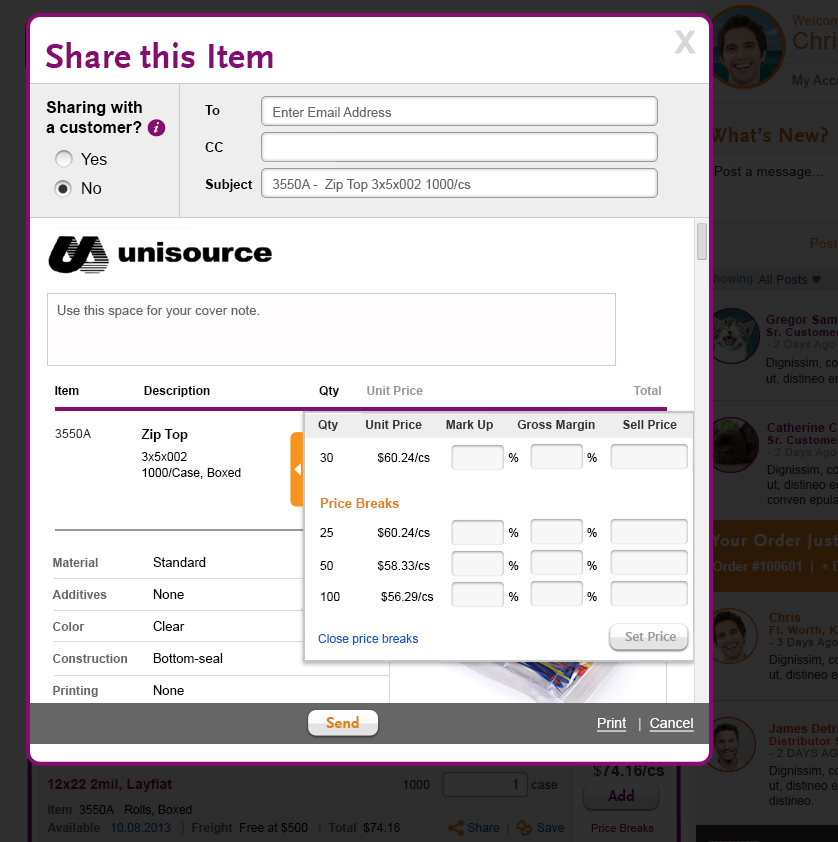
Core Concepts of Share Design Update:
- The shadowbox/main functionality (Save, Print, Cancel) should fit above fold. The user will scroll to view entire item.
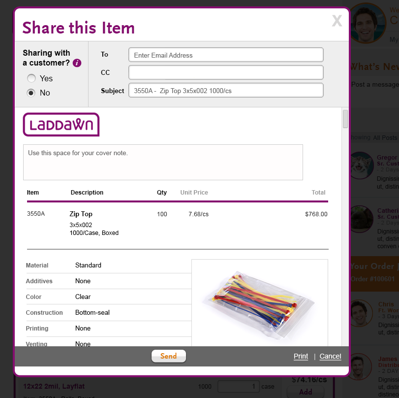
- We want this interface to be different then our other dialog shadowboxes. No purple top background header and use large Scala Sans font as main header font.
- Overall want want this shadowbox to be thinner horizontally, it should be close in size the widget/ search results area, maybe 15px wider to accommodate scroll bar. If possible, place shadowbox directly above to fit horizontally (like in sample image below).
- The shadowbox should be within 10-15 px from the top of the screen to maximize viewable area of shadowbox.
- Moving "Sharing with a customer" into a gray panel to fit with email entry fields.
- Make logo sizes smaller compared to the staging server version. Reduce the logo size by 25%.
- We are moving from using a "Print" icon to text version (located next to "Cancel" link.
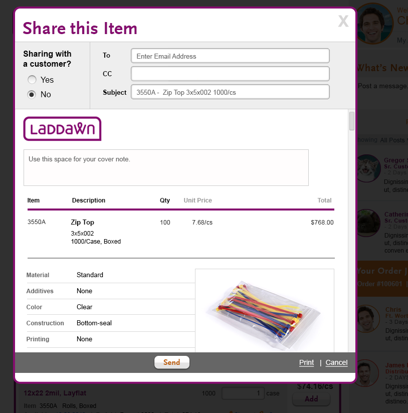
- Default "Sharing with a customer" to "No" (Laddawn/internal email) for both Share an Item and Share Cart.
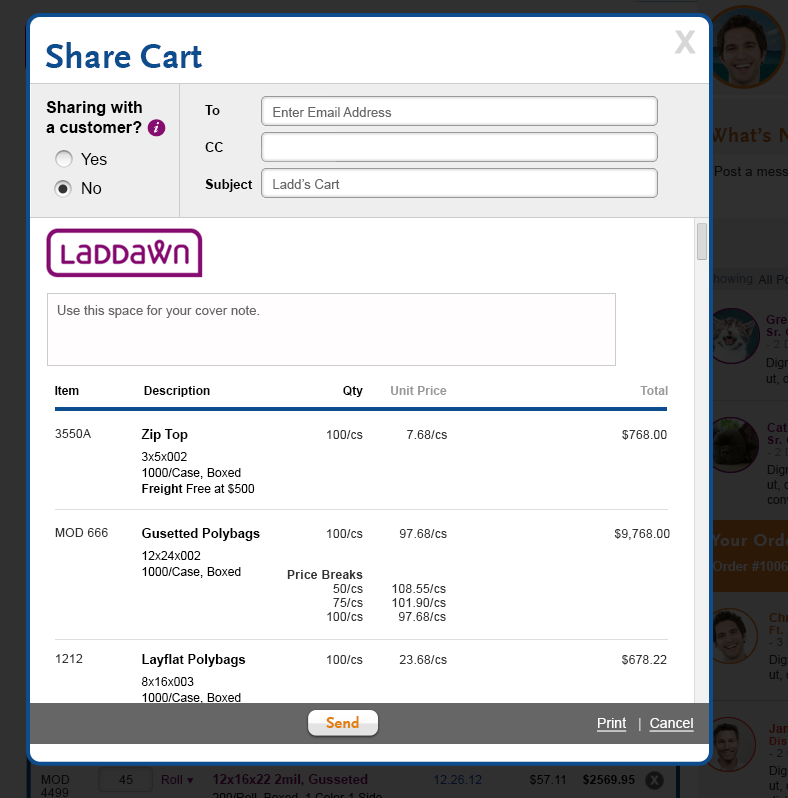
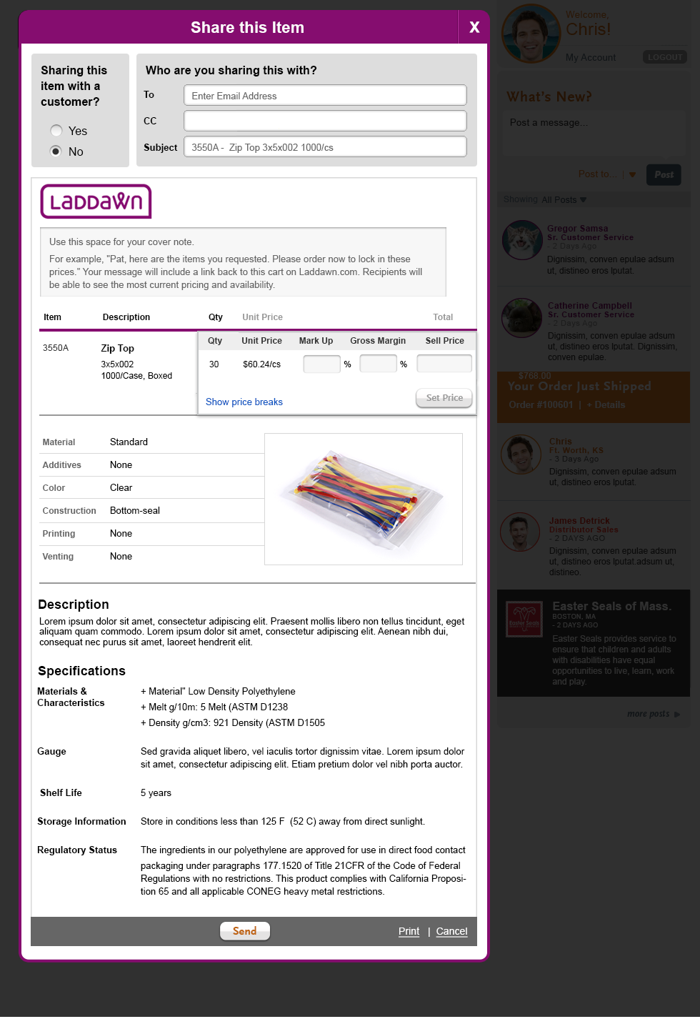
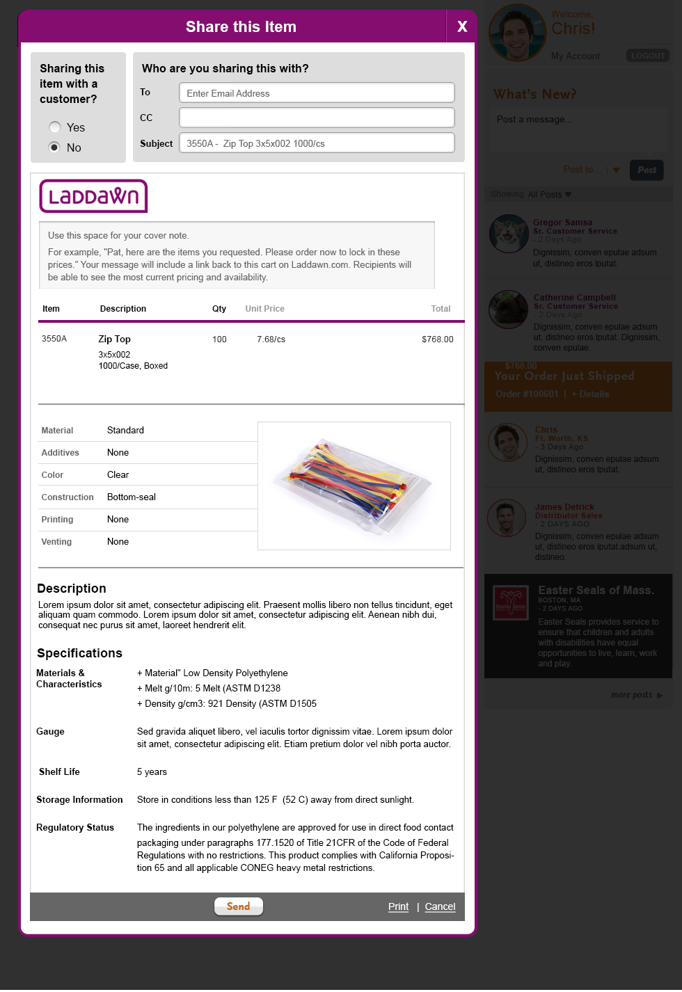
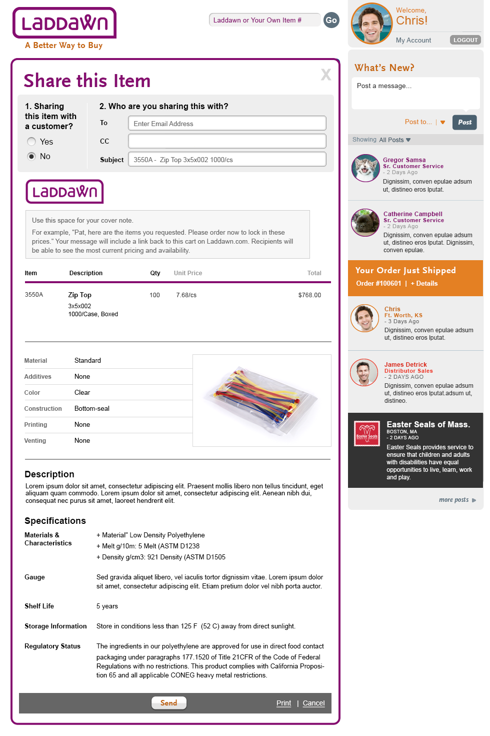
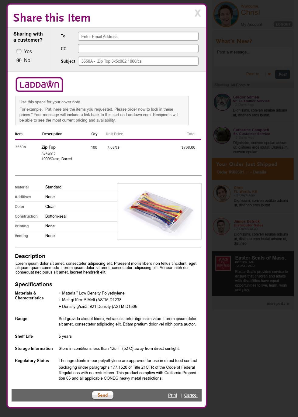
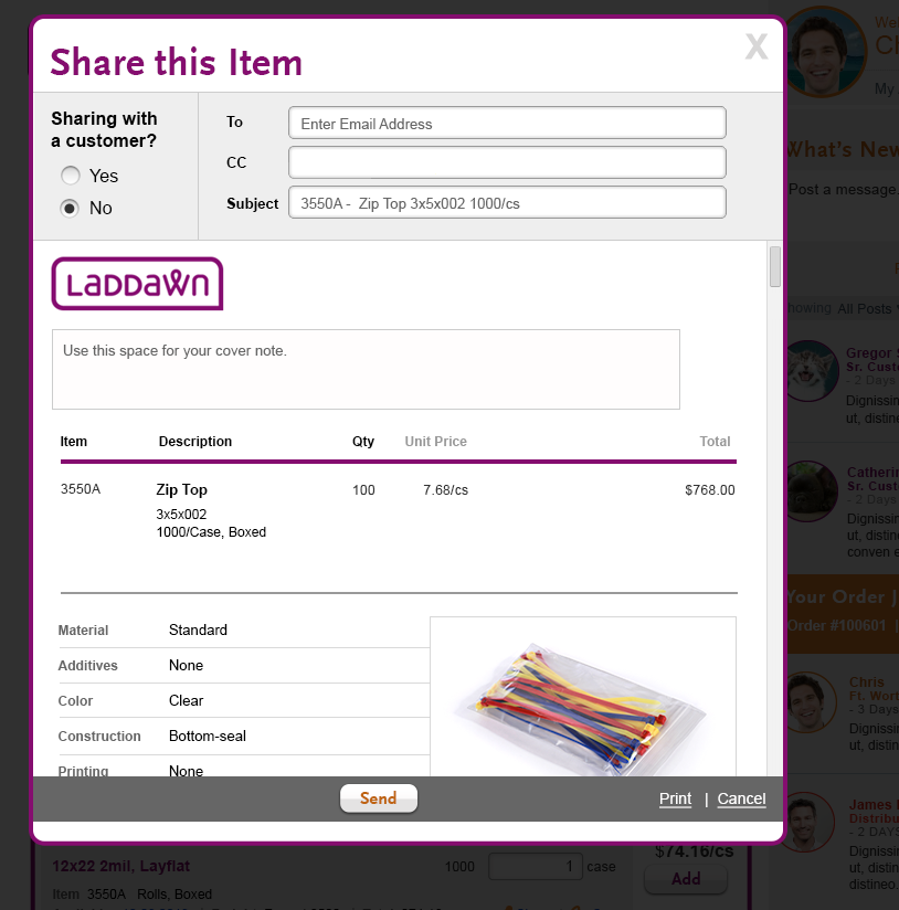
Final Design - Share an Item (Default view - Internal) | Final Design - Share an Item (Default view - external) |
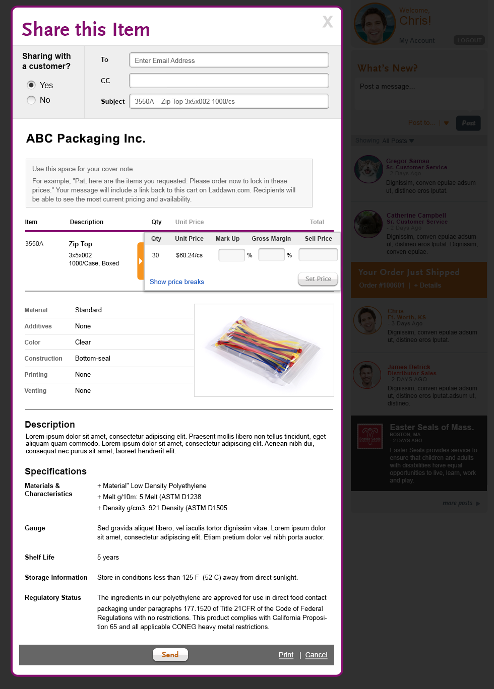
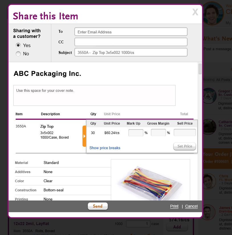
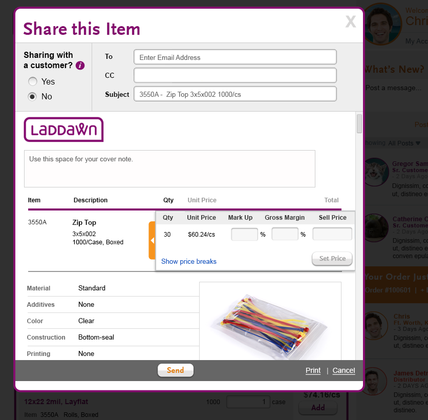
| When user select "Share with a customer" radio button, the price drawer should slide open to help orient user to this important feature. | |
 |  |
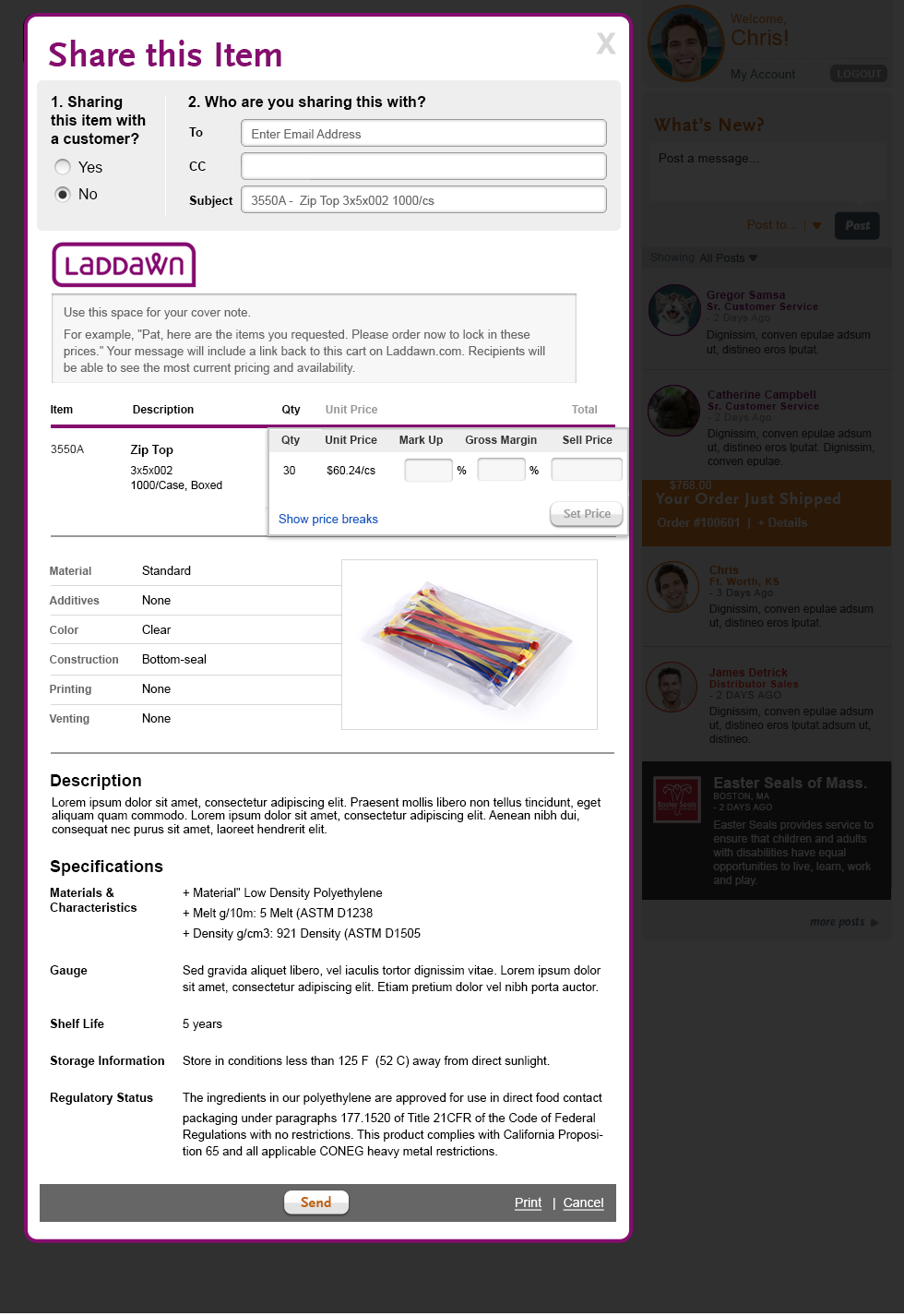
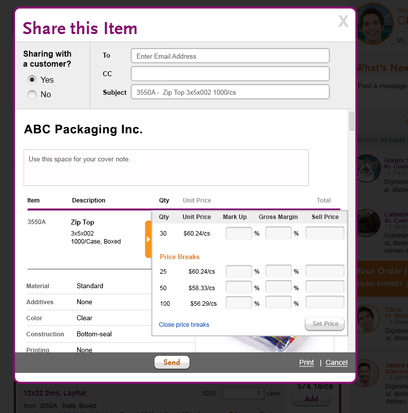
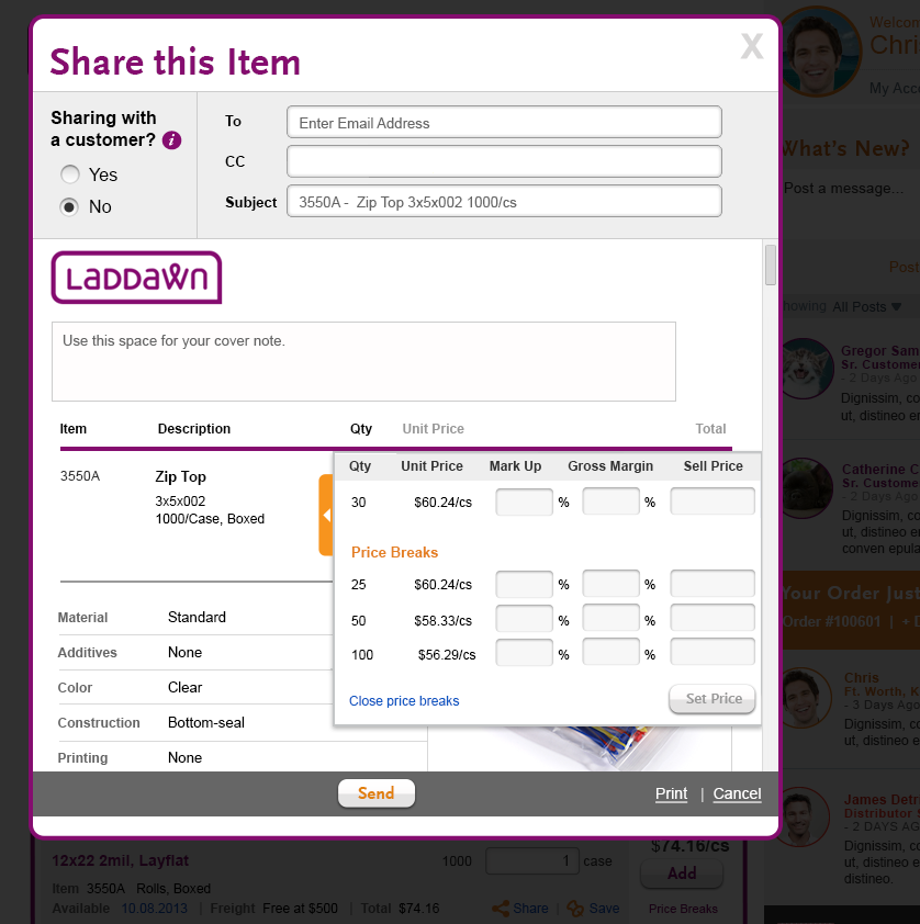
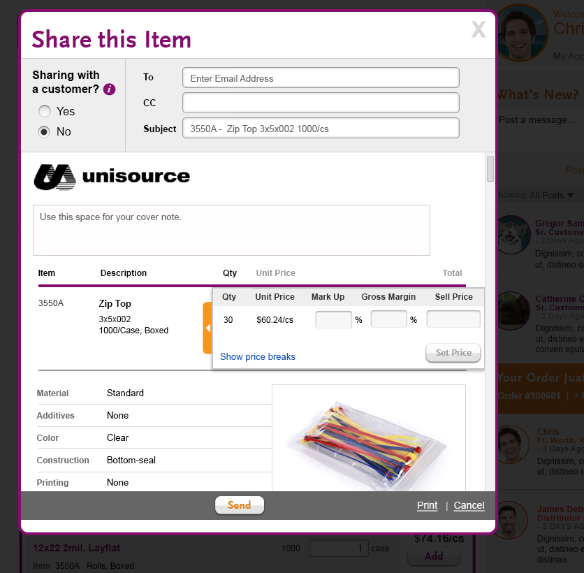
Final Design - Share an Item (Default view - external, show price break) | Final Design - Share Cart sample |
 |  |
Attachments:
 Shop_ShareItem1.png (image/png)
 Shop_ShareItem1.png (image/png)
 Shop_ShareItem2.png (image/png)
 ShareItem_ShareItem3.png (image/png)
 ShareItem_ShareItem4.png (image/png)
 Shop_ShareItem_Final_1.png (image/png)
 Shop_ShareItem_Final_2.png (image/png)
 Shop_ShareItem_Final_1.png (image/png)
 Shop_ShareItem_Final_1.png (image/png)
 Shop_ShareItem_Final_2.png (image/png)
 Shop_ShareItem_Final_3.png (image/png)
 Shop_ShareItem_Final_1.png (image/png)
 Shop_ShareItem_Final_2.png (image/png)
 Shop_ShareItem_Final_3.png (image/png)
 Laddawn_ShareCart.png (image/png)
Shop_ShareItem_Final_2.png (image/png)
Laddawn_ShareCart.png (image/png)
Shop_ShareItem_Final_2.png (image/png)
 Shop_ShareItem_Final_3.png (image/png)
 Shop_ShareItem_Final_2.png (image/png)
Shop_ShareItem_Final_3.png (image/png)
Shop_ShareItem_Final_2.png (image/png)
Shop_ShareItem_Final_3.png (image/png)