Overview
The developers have created placeholder messages. We need to craft friendlier language for them that reflects the Laddawn brand.
Some additional resources on this topic
The four H's of writing error messages
- Human
- Helpful
- Humorous
- Humble
User-friendly error messages: 7 tips
Microsoft Developer Network article on error messages
Loads of real-world examples of what not to do, and these tips for doing it right:
The characteristics of good error messages
In contrast to the previous bad examples, good error messages have:
- A problem. States that a problem occurred.
- A cause. Explains why the problem occurred.
- A solution. Provides a solution so that users can fix the problem.
Additionally, good error messages are presented in a way that is:
- Relevant. The message presents a problem that users care about.
- Actionable. Users should either perform an action or change their behavior as the result of the message.
- User-centered. The message describes the problem in terms of target user actions or goals, not in terms of what the code is unhappy with.
- Brief. The message is as short as possible, but no shorter.
- Clear. The message uses plain language so that the target users can easily understand problem and solution.
- Specific. The message describes the problem using specific language, giving specific names, locations, and values of the objects involved.
- Courteous. Users shouldn't be blamed or made to feel stupid.
- Rare. Displayed infrequently. Frequently displayed error messages are a sign of bad design.
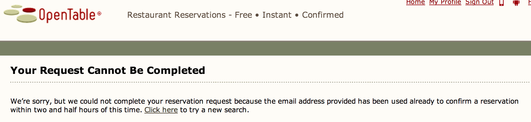
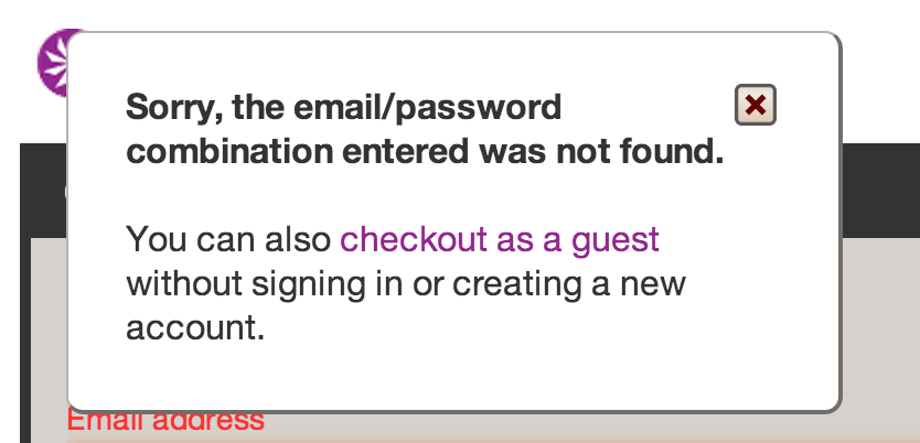
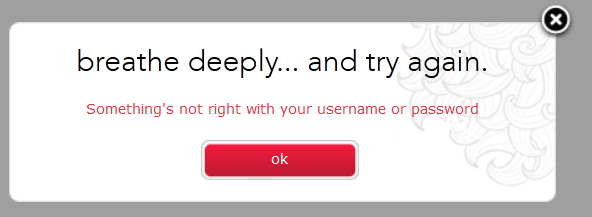
Samples from other sites demonstrating tone
I am not sure we want to closely emulate the cutesy tone of some of these, but they're interersting to see.
Firefox

Lululemon

Open table
Athleta