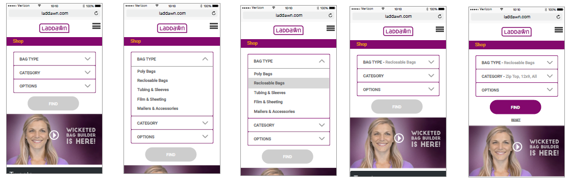
Implied or proposed changes for all viewports
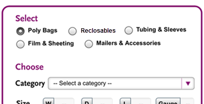
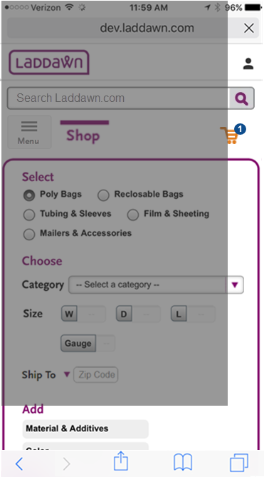
- Removed 1/2/3 lozenges in widget - they take up too much vertical space without adding much meaning (design is too buttony anyway)
- Revised tab labels - replace "Saved" with "My" - enables tabs top be fully viewable in iPhone plus size.
- Change sort buttons to dropdown.
- Revise "Viewing x to X of X items found" to "Viewing X to X of X items."
- Change "Reclosable Bags" to "Reclosables"? (Level 1 would only need 2 lines in iphone plus size; would still need three lines in iphone 5 and iphone 6-7 regular sizes.)
Smartphone viewports
Allow these differences between some mobile views and desktop
Q: Do these differences imply we need an adaptive design (v. responsive)?
- Styling of tabs in iPhone plus.
- Buttons for save, share, add to cart and view tech drawings - revised size, shape and removed text.
- Display only line count with cart, not $ value.
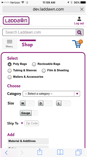
Initial homepage view
To free up valuable real estate, access to login and my account will be via head-and-shoulders icon in top right. State shown is after user has logged in and has one item in cart. If they have not logged in and/or do not have items in cart, login Icon will have the text "Log in" below it and a standalone cart (no orange dot for line count).
320 x 568 (iPhone 5) Samsung Galaxy S7 and S7 edge are 340 wide in portrait. | 375 x 667 (iPhone 6-7 regular) | 414 x 736 (iPhone 6-7 plus) Nexus, Google, Samsung models range from 411-480 wide in portrait. | |
IPHONE 6-7 REG WITH IPHONE 5 OVERLAY - the only things (within view) that don't fit here are search box and category menu.
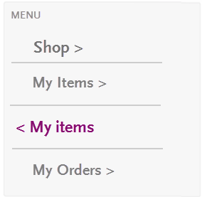
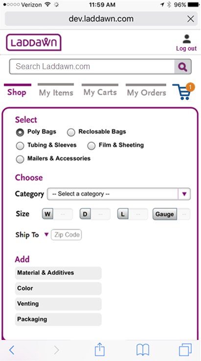
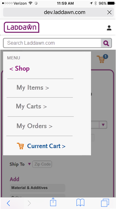
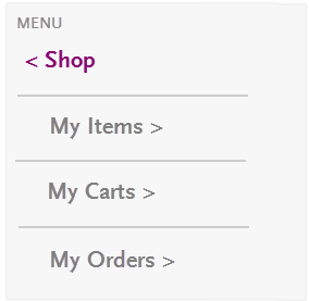
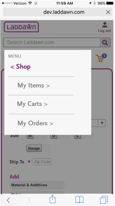
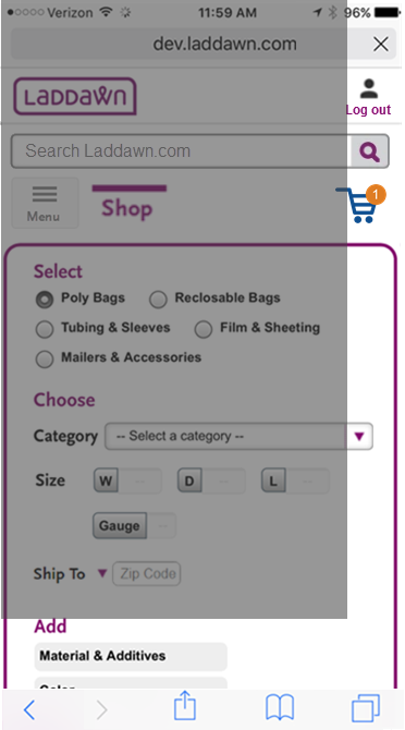
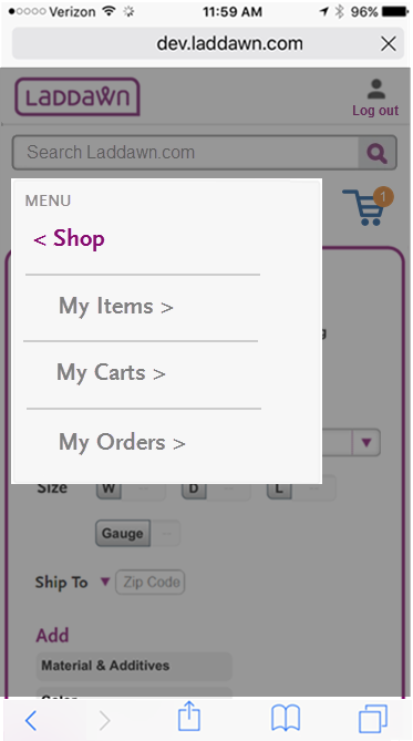
| Show only the tab you're on and the cart; access other tabs via hamburger menu.
|
| Show all tabs.
|


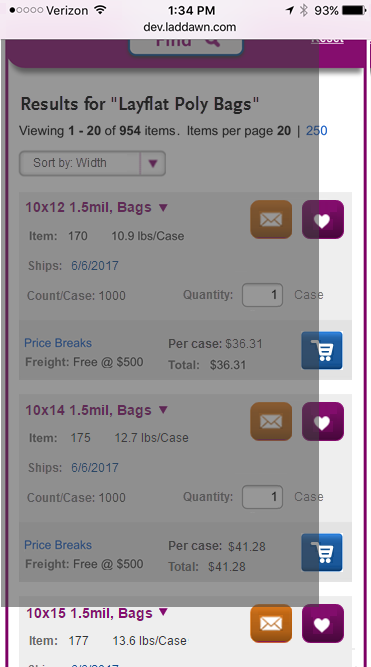
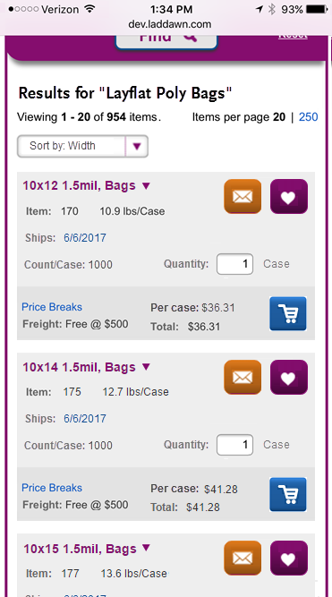
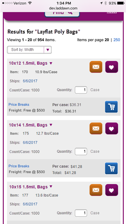
Broad search results
In any case, longer product titles will have to wrap.
Positioning of new MOD capabilities banner same as desktop? Or appears sooner?
320 x 568 (iPhone 5) Samsung Galaxy S7 and S7 edge are 340 wide in portrait. | 375 x 667 (iPhone 6-7 regular) | 414 x 736 (iPhone 6-7 plus) Nexus, Google, Samsung models range from 411-480 wide in portrait. |
IPHONE 6-7 REG WITH IPHONE 5 OVERLAY We may need to suppress "Items per page 20 | 250" (or have wrap down to another line) otherwise, everything else looks like it will fit.
|
|
|

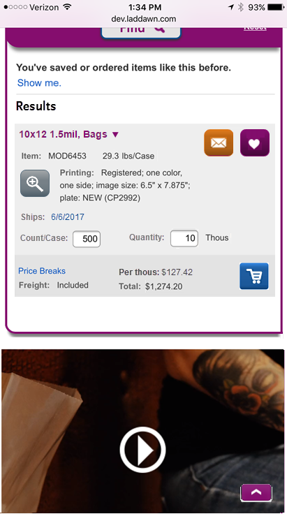
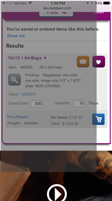
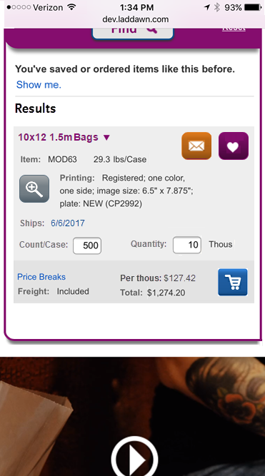
Mod search results
- Shows Godzilla.
- Shows a result with customization details and MOD features like editable count/case.
- Shows handling of tech drawing thumbnail (replaced with magnifier button) for printed items
320 x 568 (iPhone 5) Samsung Galaxy S7 and S7 edge are 340 wide in portrait. | 375 x 667 (iPhone 6-7 regular) | 414 x 736 (iPhone 6-7 plus) Nexus, Google, Samsung models range from 411-480 wide in portrait. |
IPHONE 6-7 REG WITH IPHONE5 OVERLAY Same as above, seems everything could fit if pulled leftward, there will be more wrapping of longer lines but that's ok.
|
|
|


An alternate concept for structuring the widget (from one of our job applicants)
More of a departure from our current design.
Attachments:
 iphone 5 temp.PNG (image/png)
 iphone 6-7 reg login.PNG (image/png)
 iphone 6-7 reg open menu.PNG (image/png)
 iphone 6-7 reg menu.png (image/png)
 home screen iphone 7 plus post login.PNG (image/png)
 iphone broad result temp.png (image/png)
 broad result mobile iphone 6-7 reg.png (image/png)
 broad result mobile iphone 7 plus.png (image/png)
 iphone 5 printing temp.PNG (image/png)
 iphone 6-7 reg printing.PNG (image/png)
 mod with printing.png (image/png)
 alternate widget mobile.png (image/png)
 iphone 6-7 reg open menu.PNG (image/png)
 iphone 6-7 reg menu my items.png (image/png)
 iphone 5 temp.PNG (image/png)
 iphone 6-7 reg login.PNG (image/png)
 iphone 6-7 reg open menu.PNG (image/png)
 home screen iphone 7 plus post login.PNG (image/png)
 image2017-6-14_15-51-36.png (image/png)