| Overview: | |
It's impossible for me to know, exactly why our customers are not frequenting the "Saved Item" page. Though, I can make some speculations as to why...
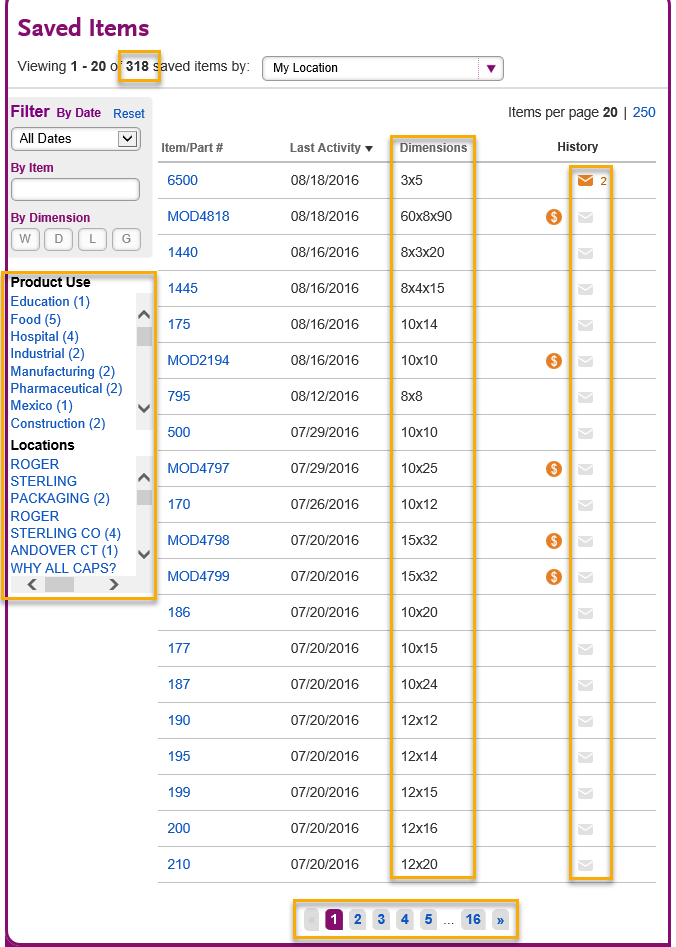
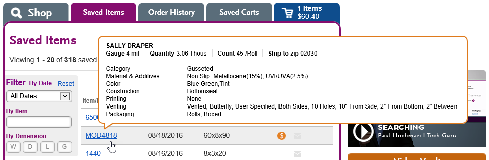
If your Saved Item page, has more than a few items - it quickly becomes unmanageable. Question: "How do I find my blue, Metallocene bag?" You don't,... unless you hover over each of your 318 Saved Items or you happen to remember it's basic dimensions. "How do I find the email I sent to my customer? Well first, you need to remember - did you share the item? Or did you share a cart which had the item? Depending on your answer, you'll either go to the Saved Items page, or the Saved Carts page. If you shared that item (which was a popular 8x10 2mil) - chances are you've shared it with several of your customers. For example, if you shared the 8x10 2mil item with 20 of your customers. You will potentially have to sort through 20 emails, one by one - in the hopes of locating the email you're looking for. "How do I tag an item (or alter it's item number and description), after it's already been saved? Well,... you can't. Unless you know the round-about way of doing it. For example, if you want to update the saved item - after the fact... you click on the saved item, which then brings it back through the Shop widget. From there, you click save (again...) in the results section and from then you'll see the Saved Item popup window. Nobody would know this, unless a Laddawn employee told them.
| |
| Saved Items - Original | |
| |
| |
| Recommendations | |
| |
| |
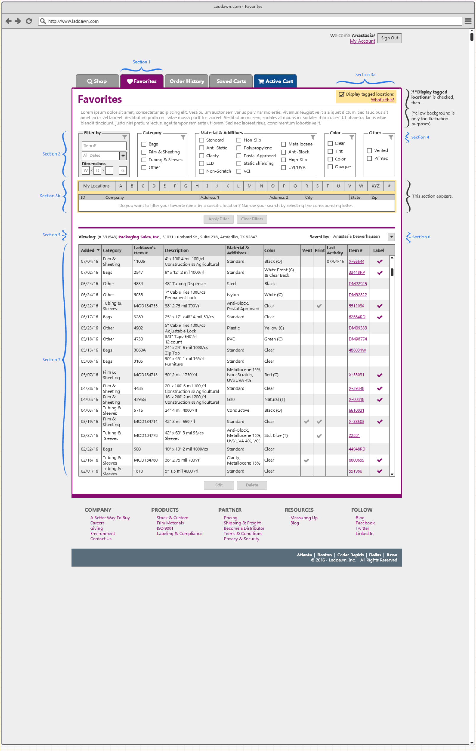
Favorites: (Section 1) I recommend we switch to "Favorites" as that term is more commonly used. | Filter by Criteria: (Section 2) Currently, sifting through Saved Items - can be a bit of a headache. Once you have more than a handful of items saved, it becomes a sea of random items. By allowing the user to search via 5 sets of criteria, we empower the user to manage their data and quickly find the items they are seeking. |
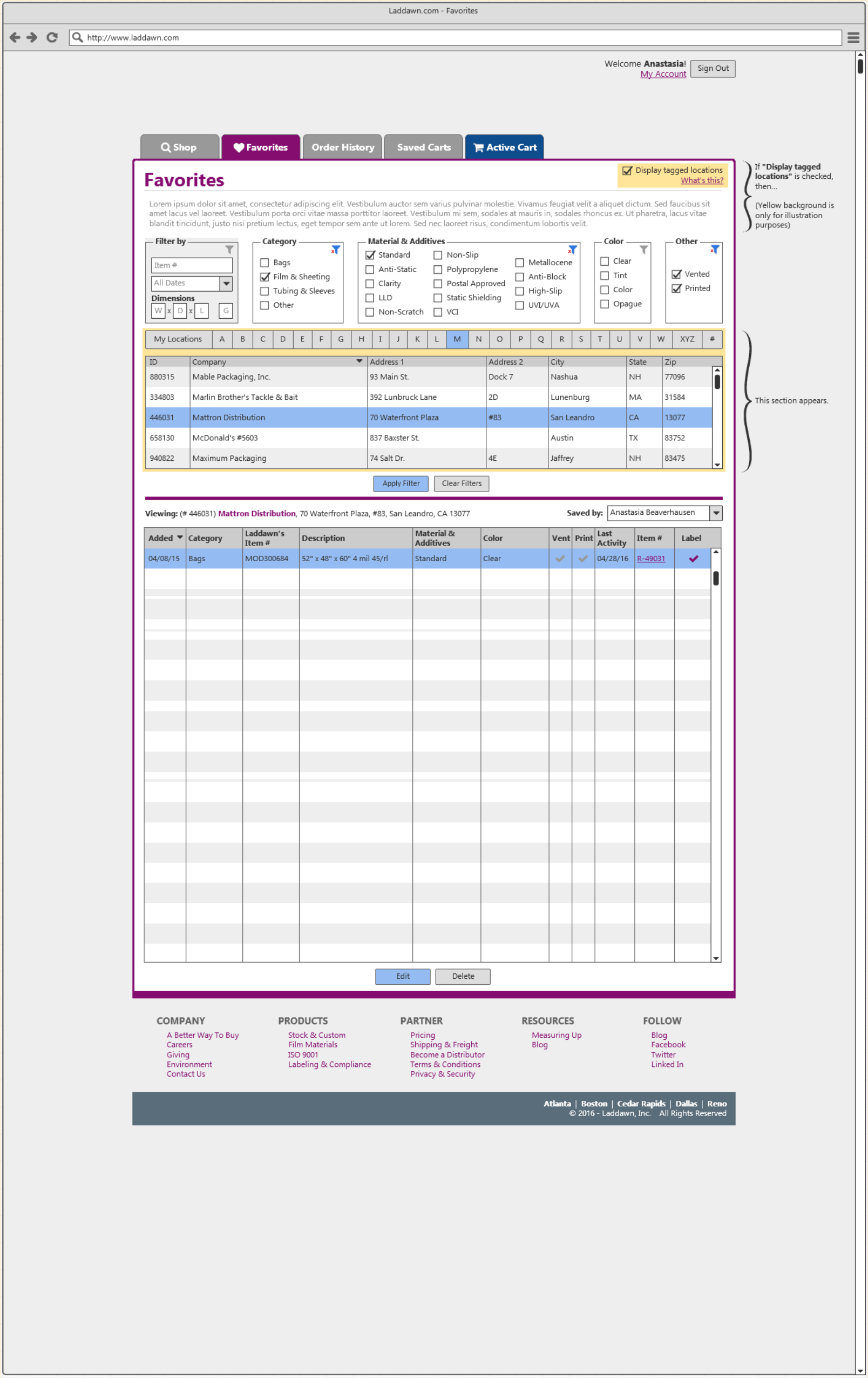
Display Tagged Locations: (Section 3a) Tagged locations are visible on the left-hand column of the Saved Items page. If you have a company name that is more than a handful of characters, the text is then displayed on multiple lines and a horizontal scroll bar is visible. Basically, it's an important feature that is constrained to such a small - unforgiving space. If the customer doesn't care about what item is tagged, I don't think they should see it. Which is why I am suggesting the "Display tagged locations" checkbox. If that checkbox is not checked, they don't see any locations. | Tagged Location Data Grid: (Section 3b) If the customer wants to see what items are tagged to a specific location, they click on "Display tagged locations" and that section appears. From there, the customer can easily drill down to what location they are looking for by selecting the corresponding letter. |
Filter Indicators: (Section 4) It might be useful, to indicate to the user visually what filters have been applied. For example, the grey icon appears when no filter has been selected. But once an item is selected, it then changes to a blue filter icon with the addition of a red 'x'. This is a universal icon, for indicating both states of the filter. It may not be obvious to the user upfront, what those icons mean - but I believe that will quickly dissipate once they make their first selection. It would take maybe a few clicks, for a user to understand what is happening. | Currently Viewing: (Section 5) The currently viewing feature, indicates to the user - who's favorite items they are viewing. if the customer filters items by "John's Pickle Barrel" - it would then change to "Viewing: (#####) John's Pickle Barrel", indicating to the user who's items they are looking at. |
Saved by: (Section 6) I recommend we switch to the customers name, (Example: "Anastasia Beaverhausen") instead of "Me". | Favorite Item Data Grid: (Section 7) My goal for this section, was to empower the user with useful information. Right off the bat, you might say to yourself - "Whoa, there's so much information here!". But that's where filtering comes in. At any point, you can filter that list down to only the items you are interested in seeing. |
Account Numbers: You'll notice, account numbers are now present in several places. This was done, mainly for cross checking purposes. There is such confusion over, what accounts are being tagged (because currently we only see the company name) - I felt it was best to include account numbers (at least for the time being). If we reach a point, where all those bugs are squashed out, then maybe we could remove them at that point. | |
