(The “dummy” is me; in the past, I relied on team members or business partners to explain this stuff to me… )
I’ve done some research – it’s not exhaustive, but seemed good enough to draw some conclusions for Laddawn. I haven’t expended a lot of effort packaging or polishing this. Let me know if it’s too verbose for Ladd and Jim and I can boil it down further.
++++
Conclusion: Designing to a 1024 width, with a fixed 960 pixel grid, is probably just fine; it’s not going to be obsolete soon. Nevertheless, before we settle on it, we should ask CMN whether a 970 grid would work equally as well, or mess up the balance and symmetry of the current modular elements. We should definitely explore reclaiming the left and right margins within this grid, that are now being used for little floating icons, to give the primary design elements more breathing room and allow them to look less crowded, or to squeeze in another column.
Why do designers and developers use grids?
A grid is a consistent system for placing objects. It works on two levels: At the unit level of cells (e.g. 20×20 pixels) and at the column level (e.g. 4 columns). A grid enables designers to lay out elements from page to page in a consistent manner, without having to reinvent the dimensions over, and over to preserve balance and symmetry.
Why are the grids that designers work with narrower than the monitor width being designed to, and how are those widths determined?
If you’re designing to say, a 1024 monitor width, then the page width itself needs to be narrower to allow for browser “chrome” (scrollbars, borders), (and a little extra padding the content or design elements don’t bump right up against the edge of the window, which looks cheesy). So why not subtract just 40-50 pixels to arrive at an ideal width of 974-984? Seems like a comfortable margin, right? The problem is that designers work in a basic unit of measurement, the pixel, not fractions of pixels; to maximize grid possibilities (number of columns of varying widths), the width needs to be divisible by as many numbers as possible. The magic number is 960; it’s only slightly smaller than the max possible, and it’s divisible by 3, 4, 5, 6, 8, 10, 12, 15, and 16. Nevertheless, some designers debate the way the 960 grid is sliced up (gutters too wide, and no need for left and right gutters), and advocate a width of 970 with narrower gutters and no left and right gutter. This grid style is not as versatile as 960, but may be versatile enough for certain designs. (Mass.Gov was redesigned with a 970 px grid.)
Why continue to design to a 1024 monitor width if over 80% of the world is using monitors of 1280 or wider?
- Versatility: Desktop monitors may be getting wider and wider, and most laptops are at 1280 or over, but more and more users are visiting sites with mobile devices which are much smaller than 1024. A fixed width of 1024 works as well on a small laptop or tablet as it does on a regular monitor; it’s “less bad” on smaller devices like smart phones (assuming the site doesn’t have a mobile version or app).
- Usability: Even if monitors can display pages wider than 960/1024, should they? The wider the page, the harder it becomes to read wrapping text (for less text heavy sites, I am guessing similar principles apply – wider and wider horizontal scanning is tiresome or overwhelming, filled with large or small graphical elements). And for most users, extra wide monitors are used for multitasking with multiple windows open; 1024 is perfectly readable in that context, text heavy or not.
- Until responsive design techniques mature (and we understand where they make sense and where they don’t…), it’s the least risky approach. Given that web browsing hardware (dimensions, orientations and input methods –typing, touchpad, etc.) is moving in every direction simultaneously… Designers are starting to start think in terms of infinitely variable “viewports” for some situations. They are adopting “fluid” designs, based on “responsive” or “adaptive” design approaches – using these approaches (as with recent Boston Globe redesign) page widths will gracefully expand and contract based on user-selected or hardware-determined window width. But these techniques aren’t considered mature yet, and in any case, may not make sense for Laddawn.
960/1024 most widely accepted standard Up to 16 columns, 20 px gutters, | 970/1024 Alternative standard 12 columns, 14 px gutters |
Pros | Cons | Pros | Cons |
Magic number - 960 has prime factors 2, 3, and 5, which make it very versatile for slicing and dicing column widths with symmetry and balance. (Designers like to work with integers, not fractions of pixels. ) | Some think 20 px gutters are too wide. “It’s so wide that when you place two elements on a column next to each other the space between them is enough to make it a visual barrier that users will fixate on.” Includes right and left gutter, which some consider useless and redundant (the total width already allows sufficient cushion on left and right). “The purpose of using a grid is to line our content up with the column edges, not the margin spacing.” The narrower the width, the more content is pushed below the fold. | More space to work with, taking fuller advantage of what is essentially a pretty conservative max width | Less flexible for… . For 16 columns, valid margin widths are only 6 and 22. 970 has prime factors of 2, 5 and 97, which is much less flexible. Designers like to work with integers. Insufficient benefit. The gain in total width is just 10 pixels, and for content just 30 pixels (or 3%). Is the loss of flexibility worth it? |
| | Design for 1280 monitors and above “ because you can” |
| | Pros | Cons |
| | Real estate for bigger and bolder graphics | Assumption that bigger is better may be faulty… Beyond a certain width, content, particularly wrapping lines of text, is less readable. Users with extra large monitors typically multitask and probably have multiple windows open side by side, not just a browser. This is why the trend, with “responsive design” is to design to the “viewport” rather than devices and monitor widths. Monitors are getting bigger, and mobile devices ranging from cellphones, to tablets, to laptops, are all over the map in width and height. The code and standards just aren’t ready for wide adoption yet. |
Fixed Example: Mass.Gov | Variable Example: Amazon, Wikipedia |
Pros | Cons | Pros | Cons |
The layout will always remain as you intended, even when viewed at higher resolutions. | Users with larger screens, set at higher resolutions, will see large, unused blocks of space around your page. Eh -- so what? Users with smaller screens may have horizontal scrolling – the horror! (Seriously.) But… if you’re designing to 1024 anyway, your fixed layout will look good in iPads and above, so not a big issue today. It was an issue when the lowest common denominator was 800, but some designers pushed to go beyond that. | Uses all the available screen real estate. More content can appear above the fold for users with wider screens. Eliminates or reduces horizontal scrolling for smaller widths. | The layout of your page will change. And similar to cons for designing for 1280+ (above)… users may find it uncomfortable to read the extremely wide sentences that will result when higher resolutions are used. View Wikipedia at max width. I really don’t now, but I suspect a variable display introduces design and coding complexity ??? In addition to all the design decisions you have to make for a fixed width, now you have to figure out how your design will expand and contract without “breaking” the desired UX. This is not a problem for Amazon, which probably has a huge design team to think it through, but may not be worth the trouble for sites with relatively low traffic, small or outsourced design teams, or highly distributed content management (e.g. Mass.Gov), in which case, control is important. |
From: Owen Richardson
Sent: Friday, January 27, 2012 8:09 PM
To: Susan Parker; Ladd Lavallee; Jim Maloy
Subject: RE: page width
Great info – I’d like to learn more about variable widths. Should they apply to our work?
___________________________________________________________________________________________________________
Owen Richardson | Vice President of Sales & Marketing | LADDAWN, 155 Jackson Road, Devens, MA 01434-5614
(: 978.563.6175 | 800.446.3639, x6175 | Ê: 978.772.7792 | www.laddawn.com
From: Susan Parker
Sent: Thursday, January 26, 2012 2:43 PM
To: Owen Richardson; Ladd Lavallee; Jim Maloy
Subject: RE: page width
Agreed. However, keep in mind ....
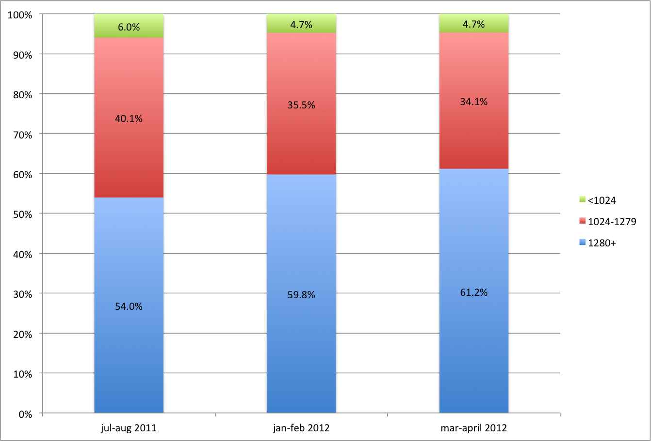
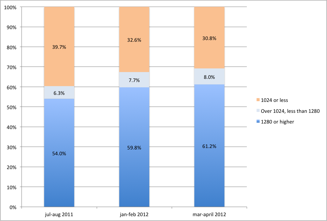
... I would not say 90% of your users have resolution > 1024; it’s at least ~30% and up to ~45% depending on what falls into “other” (data copied below). What is “other” you ask? Because my source data from GA is actually broken this down into browser types AND vertical dimensions, I had to do manual tabulation to get width totals. Because there are 283 rows of screen res data points, to simplify my tabulations, I just looked at the first 25 rows to get at what accounts for over 80% of traffic. “Other” is the long tail – the 258 rows I didn’t include. If you design a wider screen, and it is fixed width, it could annoy 30% or more of your current users.
… I’ve been reading up on this, and some designers seem to suggest that even if 100% of users have screen res above 1024, widths perhaps should not continue to grow for a couple of reasons: 1. Content isn’t as readable beyond a certain horizontal width (granted, you can chunk it up into more columns, but then the wider you go, the more clutter, etc.); 2. User preferences and behavior with really big monitors – just because you have the screen real estate, doesn’t mean you devote it all to your browser. Look at Wikipedia on a huge monitor with your browser maximized.
And yet… Anecdotally at least, it does seem that many sites (that one would think would be concerned about annoying users) are a little wider than the 960/1024 standard. Not sure if they are variable or fixed widths; will continue to check around. I suspect that they are variable though.
From: Owen Richardson
Sent: Thursday, January 26, 2012 1:50 PM
To: Susan Parker; Ladd Lavallee; Jim Maloy
Subject: RE: page width
I would not give up on this just yet, As we discussed a few moments ago, the forward and respond, tag, and add icon/circles took up some of that width. Further, if 90% or more have higher resolution that 1024, there may be room yet to expand. I’m looking forward to getting our “new” designer’s take at CMN.
O.
___________________________________________________________________________________________________________
Owen Richardson | Vice President of Sales & Marketing | LADDAWN, 155 Jackson Road, Devens, MA 01434-5614
(: 978.563.6175 | 800.446.3639, x6175 | Ê: 978.772.7792 | www.laddawn.com
From: Susan Parker
Sent: Thursday, January 26, 2012 10:50 AM
To: Owen Richardson; Ladd Lavallee; Jim Maloy
Subject: page width
Hi guys – sorry to have gotten your hopes up; I think the page width CMN is using is standard (I misjudged the screen resolution of the mockup from Basecamp). I think the 1024 standard will soon be supplanted by 1280, but that day is not here.
Based on a snapshot from Google Analytics for the last month, at least 50% of Laddawn.com’s users use screen res of 1280 or higher. 34% use screen res below 1280 (lion’s share being 1024). 16% use “other”; I would need to do further digging in Google Analytics to see which side of 1280 they fall on, but it wouldn’t exceed the tipping point for widening the page.
From: Susan Parker
Sent: Thursday, January 26, 2012 10:28 AM
To: 'D Jeong'
Cc: Julie Elanjian; Owen Richardson; Michael McPherson
Subject: RE: Basecamp
Ah, I see; and now when I take another, more careful look at the original .png, I can see that it isn’t full size.
From: D Jeong [mailto:djeong@corey.com]
Sent: Thursday, January 26, 2012 9:37 AM
To: Susan Parker
Cc: Julie Elanjian; Owen Richardson; Michael McPherson
Subject: Re: Basecamp
Great to meet you! Look forward to working with you as well~
Laddawn website is designed to 960 grid system with 16-column structure.
One of the goals of the site was to create a modular design where you have flexibility to plug in different modules into different pages. So we structured the design around 960 grid system which allows for great flexibility for development. As you can see in the attached screenshot, that's why all the main content you see fall within 960 pixels. For 1024 screen, we recommend setting up 990 as your maximum viewing area to accommodate the standard screen resolution. We still have a bit of room on either side to add some elements where we put the rollover items.
Hope this answers to your question.
If you have any additional question, please let us know.
..................................................................
Daeun Jeong | Associate Creative Director
Corey McPherson Nash
63 Pleasant St., Watertown, MA 02472
P: 617-393-7626 | E: djeong@corey.com
F: 617-923-0857
www.corey.com
Thoughtful Branding and Design
Follow us on:
Twitter: http://twitter.com/cmntweets
Facebook: http://www.facebook.com/coreymcphersonnash
Flickr: http://www.corey.com/flickr
..................................................................
CONFIDENTIALITY NOTICE
Information in this email and any attachments is proprietary and
confidential. It is intended exclusively for the person to whom it
is addressed. If you are not the intended recipient, please delete
this email and attachments and contact me as soon as possible.
D,
Please allow me to introduce myself - I am Susan Parker and was recently hired by Laddawn as web project lead. I'm really excited about working with CMN on this project.
Owen suggested I contact you directly about a design question that came up. I've been digging into the project documents on Basecamp, including functional requirements, wireframes, etc. I noticed that the most recent mockups (e.g. 111205_Laddawn_Application_Site_Rollovers[1].png) are substantially narrower than 1024 pixels.
However, I am not 100% certain I am viewing them full size; when I select "view all of these images at once" the overall view doesn't seem distorted or minimized in any way.
Can you confirm what page width you are working with, and if it is narrower than 1024, could you give some insight as to why?
Many thanks!
Susan Parker
