These are issues uncovered during design fidelity testing. What got coded matches the specifications, but the specified design/interaction may not be intuitive. We should conduct real usability testing to validate; tweak the design if warranted; or keep an eye out for this issue when CE, and then customers, are first exposed to the site.
# | Date | Reporter | Summary | Description | SeverityH, M, L | Action? |
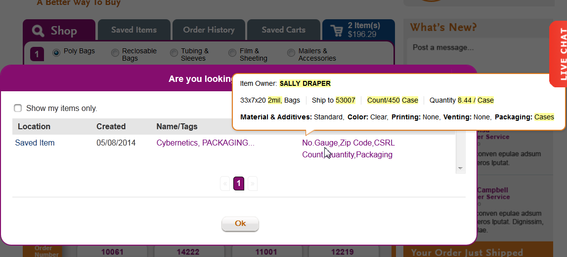
| 7 | 5/27/14 | SP | Godzilla - points of comparison | I find it frustrating not to be able to SEE the search result that I am comparing the “same or similar” items to when I look at the highlighted differences. Although I can drag the popup to be able to see them in the grayed out background, many users will not be that savvy (?) or may find the lack of contrast inhibits legibility.
| M | Watch |
| 6 | 5/16/14 | SP | printing/venting | Nice to have - until full dimensions entered, instead of graying back "None>" under P & V menus, shoe "Enter full dimensions" in gray (or enter Length/enter depth and length) | ||
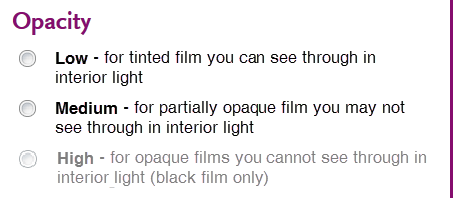
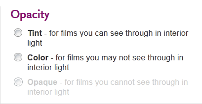
| 5 | 4/22/14 | SP | Color menu - Opacity language | The use of the term "color" on the left, and color on the right as a level of opacity was confusing. “Pick any color for tint or color” – huh??? I also thought the distinction between “for films you may not see through” and “for films you cannot see through” is somewhat muddy, which is further compounded by the use of the term “color” for medium opacity. I suggest the following approach to describing Opacity options:
In addition, it seems unnecessary to state “Choose clear for no coloration” and "Pick any color for a tint or color" - we should just leave it as "Pick black for high opacity." The challenging in making this change is that as hads with color may not sync up with revised menu choices. | M | |
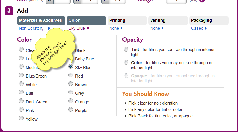
| 4 | 4/22/14 | SP | Color menu - swatches and more would be nice | What's the difference between Baby Blue and Sky Blue? Medium Green and Leaf Green? Color swatches would be nice. Also, with Opacity, some photos might be helpful. (You could leave it up to the user to expose them if you're concerned about clutter or pusshing the You should know too far down.)
| L | |
| 3 | 4/3/14 | SP | Color defaults for trash liners | This probably upsets the widget applecart too much, but when it comes to trash liners, it seems like it might be more intuitive for the default color to be "all" (or black?) rather than clear. | L | |
| 2 | 4/3/SP14 | SP | Liner nomenclature | While trying to figure out some issues with stock results, I stumbled upon this. My journey took me far and wide - at first I wondered if "bin liners" and "trash liners" were one and the same. Catalog and current website do not reference bin liners (that I can see), whereas widget didn't seem to reference trash liners. I looked at your original specs and you deliberately included both categories; your written description made it clear that these were indeed not one and the same thing. So then I went back to widget to search again for "trash" - at first I thought it was missing and was about to report it under QA. It took me a while to figure out that "trash" was not the correct trigger word. Trash liners are "hiding in plain sight" under the 4 liner categories. | L | Could we add a "trash" prefix to all the liner categories? If not, this may be an "is what it is" type of issue. |
| 1 | 4/3/14 | SP | Closed parameter searches | I don't know if users will "get" it when they select a product category that doesn't allow you to enter dimensions (because we offer a small stock selection). The treatments may need to be more obvious. I was QA testing and chose a C&A product from the catalog to plug in category/dimensions for. I forgot all about parameters being shut off for certain stock offerings. When I got to width for C&A film, I kept clicking in the width box and for several seconds didn't realize I'd entered all the paramters that I could. At first I attributed this to slow performance. Then I realized this was working properly and the only next step is to click Find. | M | Conduct testing with "real" users |


I was QA testing I kept clicking in the width field