1 Introduction
Initiating an R/A with Laddawn, is a manual process involving many employees along the way. With anything that involves a manual process, mistakes and inefficiencies are bound to happen. Today, when a customer wants to request an R/A – they do so via Chat; Phone; Fax or Email. Each of these sources, come with their own obstacles. Automating the R/A process (by moving them to the web), will allow us to handle these types of transactions both efficiently and accurately.
2 Definitions
<< Define terms specific to project, new terminology, etc. Think about readers of this document who may not be familiar with all of Laddawn's jargon. >>
3 Assumptions
<< List all assumptions made at the outset. If the design is based on a specific set of conditions or givens, list them here. If there is a desired environment or specific set of requirements that need to be met for the solution to be valid, list them here. >>
4 Design
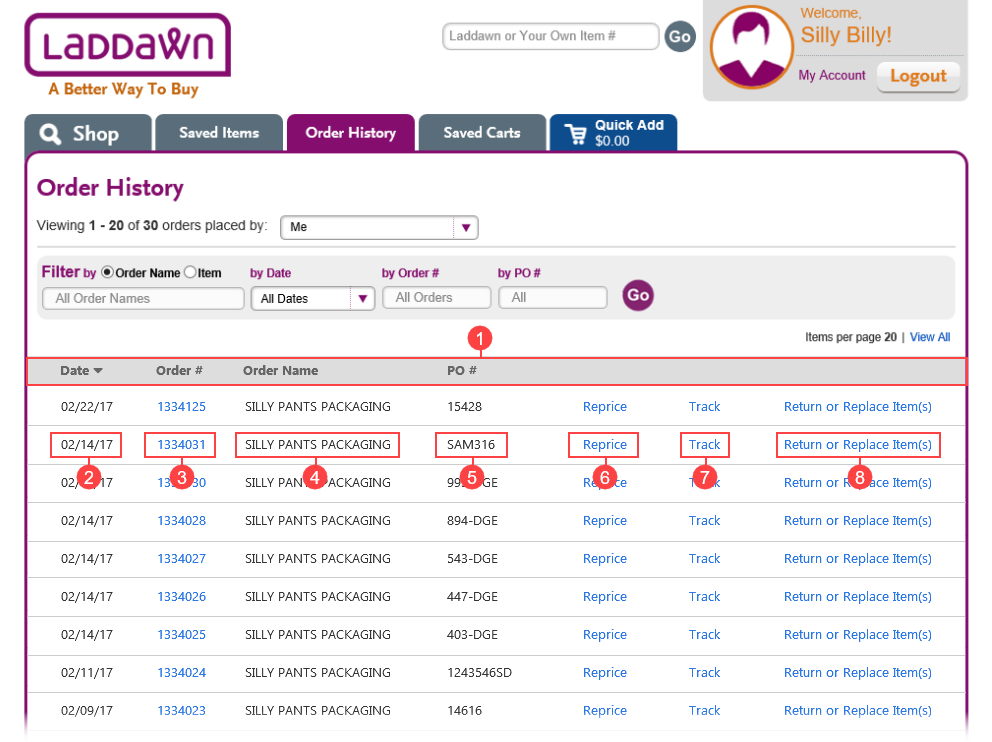
| Order History |
|---|
|
| # 1: Column Order |
The order in which columns are displayed have changed to give Order History a better flow. When a customer is viewing the page, they most likely know the Date (or time frame in which order was placed) and/or Order #. For that reason, it seemed logical to place those columns on the far left as most users will read the page from left to right. We can probably make the same argument, that customers will also know their PO # - but I wanted to avoid the first three columns consisting primarily of only numbers. |
| # 2: Date |
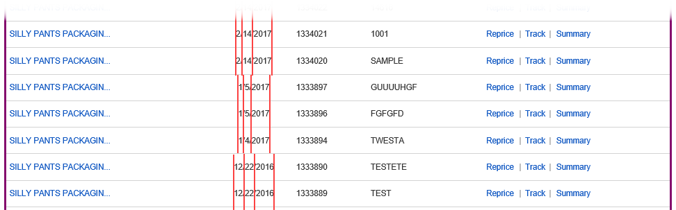
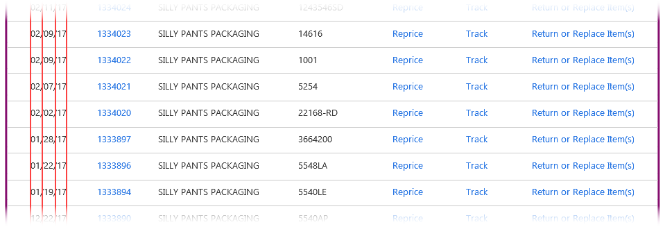
The date format has changed to MM/DD/YY. Expressing the Month (2 Characters) / Day (2 Characters) / Year (2 Characters) as having 2 characters each - avoids the ‘switch backs’ that are pictured below. Granted, changing this formatting is not consistent with other dates found within Laddawn.com. That being said, I hope we can transition over to MM/DD/YY throughout the website – especially if the date is displayed in a column layout. Before
After
|
| # 3 - 4: Order Number / Order Name |
Order Name is now plain text. Order Number now links to the Order Summary page (hovering over this field displays the popup). Today, when a user hovers over the Order Name we display the Order Summary popup. And if the user clicks on the Order Name we display the Reprice popup. My instincts tell me, clicking on the Order Name (well,… really Order Number) should open the Order Summary page. But I wasn’t convinced others would feel as I did. On a hunch, I decided to explore this further by performing some user testing. Meme and I had met with all of CE & CR and asked the question… “Do you know what happens when you click on an Order Name? And if you don’t, what do you think happens?” Out of all the employees tested, not one of them knew what would happen and the majority of them thought the Order Summary page would be displayed. We should also point out that many users commented on the delays they experience when hovering over the Order Name. There was also a subset of users who were completely unaware the Order Name was ‘clickable’. |
| # 5: PO Number |
| No changes. |
| # 6: Reprice |
| No changes. |
| # 7: Track |
| We are currently exploring the pros and cons of changing “Track” to “Status”. |
| # 8: Return or Replace Item(s) |
| Initiating a return authorization (R/A) will now be accessible from within Order History. Amazon.com, Apple.com and many other websites prominently display this information on their Order History pages. |


5 Use Cases
<< For use cases, describe each critical path through the solution, according to the following example: >>
- Title
- Briefly state the goal or desired outcome of the use case. “An inside sales person needs to create a new order for a new customer.”
- Description of the initial situation. E.g. “The user has a new customer on the phone and wishes to create a customer account and enter a new order for the customer.”
- Describe the exact steps that the user takes to achieve the goal:
- The user clicks the “Add Customer ” button from the tool bar
- The user sees the new customer dialog (see figure x)
- The user enters
i. Customer Name (required)
ii. Customer Email Address (required)
iii. Customer Phone Number (required)
iv. Customer Billing Street Address (optional)
v. Customer Billing City (optional)
vi. Customer Billing State (optional)
vii. Customer Billing ZIP code (optional)
- The user clicks the “Send Welcome Email” button on the dialog
- The system sends the personalized welcome email (figure x) to the new customer’s email address
- The system pops a dialog reminding the user to instruct the customer to click the link in the email and create a password for their new account.
- The user closes the popup and clicks the “Create Order for this Customer” button on the dialog.
- The dialog closes
- The new order dialog opens, populated with this customer’s information (name, email, phone number)
- User selects delivery type (pick up, parcel service, freight, etc.) and enters delivery address if anything other than “pick up” is selected.
- The user selects the desired products from the catalog pulldown
- Etc.
6 Example Use Case
Create Order for New User
An inside sales person needs to create a new order for a new customer.
The user has a new customer on the phone and wishes to create a customer account and enter a new order for the customer.
- The user clicks the “Add Customer ” button from the tool bar
- The user sees the new customer dialog (see figure x)
- The user enters
- Customer Name (required)
- Customer Email Address (required)
- Customer Phone Number (required)
- Customer Billing Street Address (optional)
- Customer Billing City (optional)
- Customer Billing State (optional)
- Customer Billing ZIP code (optional)
- The user clicks the “Send Welcome Email” button on the dialog
- The system sends the personalized welcome email (figure x) to the new customer’s email address
- The system pops a dialog reminding the user to instruct the customer to click the link in the email and create a password for their new account.
- The user closes the popup and clicks the “Create Order for this Customer” button on the dialog.
- The dialog closes
- The new order dialog opens, populated with this customer’s information (name, email, phone number)
- User selects delivery type (pick up, parcel service, freight, etc.) and enters delivery address if anything other than “pick up” is selected.
- The user selects the desired products from the catalog drop down
- Etc.
When describing each step, pay careful attention to the expected responses from the system, and the additional behaviors of each interaction. For example, when the user clicks the ‘send welcome email’ button, note that the system actually sends the email, the format of the email it sends, and the reaction of the system to the clicking of the button. In this example, the system sends the email then pops a message to the user to remind her to tell the customer to open the email and click the link. Create a use case for each major piece of functionality. If the design is very UI intensive, an interactive mockup (Balsamiq or equivalent) might accompany each use case. The use cases can refer to defined terminology, images, tables, etc. referenced in the body of the specification.
Some designs require both outlines and use cases, while others require only one or the other. Use cases are better suited for UI-centric designs, where outlines tend to work better for non-UI designs.
7 Testing
<< Optionally include a test plan here.
Test plans can often be built from the use cases. Since a developer should be using the use case as a script for the feature s/he is building, a very similar script should be usable for a test case.
To convert the use case into a test case,
- 1. Edit the text to be imperative.
- 2. Look for places to combine use cases for similar paths through the design. In other words, workflow processes that the use cases illustrate might differ, but unless there is a measurable difference in output from two similar but different use cases, they can often be considered the same test case.
- 3. Call out items to look for at each step.
- 4. For each step where there of choices, list the choices and create a script for each combination of choices.
In our example use case above, the shipping options are selected in step 10. Create a path through the script where the tester selects each possible choice and tests the outcome. >>
8 Example Test Case
Create Order for New User
Create a new order for a new customer.
Simulate an inside sales rep having a new customer on the phone, creating a customer account, and entering a new order for the customer.
- Click the “Add Customer ” button from the tool bar
- Note the new customer dialog (see figure x)
- Enter:
- Customer Name (test for required)
- Customer Email Address (test for required)
- Customer Phone Number (test for required)
- Customer Billing Street Address (test for optional)
- Customer Billing City (test for optional)
- Customer Billing State (test for optional)
- Customer Billing ZIP code (test for optional)
- Click the “Send Welcome Email” button on the dialog
- Customer email address should receive the personalized welcome email (figure x) to the new customer’s email address
- Note the dialog reminding the user to instruct the customer to click the link in the email and create a password for their new account.
- Close the popup and click the “Create Order for this Customer” button on the dialog.
- The dialog should close
- The new order dialog should open, populated with this customer’s information (name, email, phone number)
- Selects delivery type (pick up, parcel service, freight, etc.) and enter delivery address if anything other than “pick up” is selected (test all choices, parcel service and freight should enable shipping address fields, pick up should disable them).
- Select the desired products from the catalog drop down
- Etc.
Document Notes:
- 1. Be sure to use outline numbering. There is a need to be able to reference a particular section, paragraph, and list item by number.
- 2. Requirement documents may include any combination of design narratives and use cases as necessary to fully describe the solution to be built.
# 1: Column Order
The order in which columns are displayed have changed to give Order History a better flow. When a customer is viewing the page, they most likely know the Date (or time frame in which order was placed) and/or Order #. For that reason, it seemed logical to place those columns on the far left as most users will read the page from left to right.
We can probably make the same argument, that customers will also know their PO # - but I wanted to avoid the first three columns consisting primarily of only numbers.
# 2: Date
The date format has changed to MM/DD/YY.
Expressing the Month (2 Characters) / Day (2 Characters) / Year (2 Characters) as having 2 characters each - avoids the ‘switch backs’ that are pictured below. Granted, changing this formatting is not consistent with other dates found within Laddawn.com. That being said, I hope we can transition over to MM/DD/YY throughout the website – especially if the date is displayed in a column layout.