Created by Susan Parker (Unlicensed), last modified on Apr 25, 2012
< Back to Checkpoint meeting agenda
| Before | After | What you should know |
|---|
Last Laddawn iteration Attempt to resolve flow/exposure conundrum - introduced radio buttons, reduced vertical height 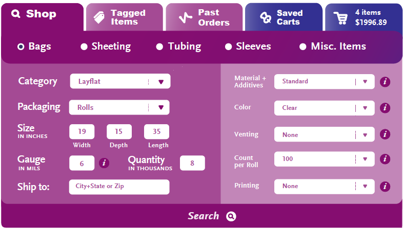
Last Corey iteration"Split" search, selecting Description triggers full exposure of widget. 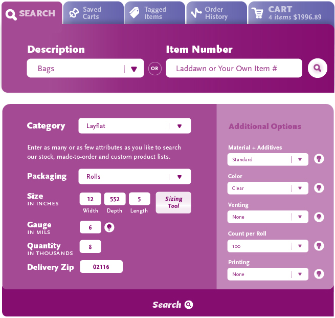
| 
| Key decisions since last versions:- Only 1 tab using special color; other tabs either purple or gray, depending on whether active.
- Search by item # now in header
- White background to improve readability and focus, and reduce overall density of appearance
- More selective use of Scala font, to improve readability
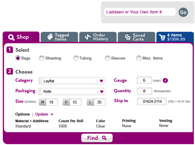
- Major choices now in 2 columns, optional choices now downplayed, moved below major choices:
- Click "Update"
- Get list of options, choose one
- Opens shadowbox of options
- Accept, choice(s) shown under appropriate heading(s)
- More prominent "Find" button
Outstanding- Validate that parameters work with this layout (Judy)
- Should we combine Category & Packaging?
- Design (Steve):
- Shadow boxes
- Selection defaults
- Combining Category & Packaging
|