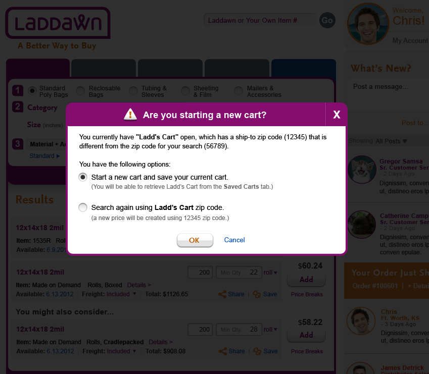
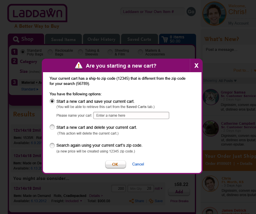
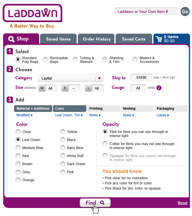
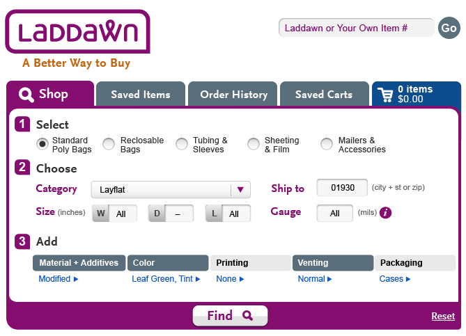
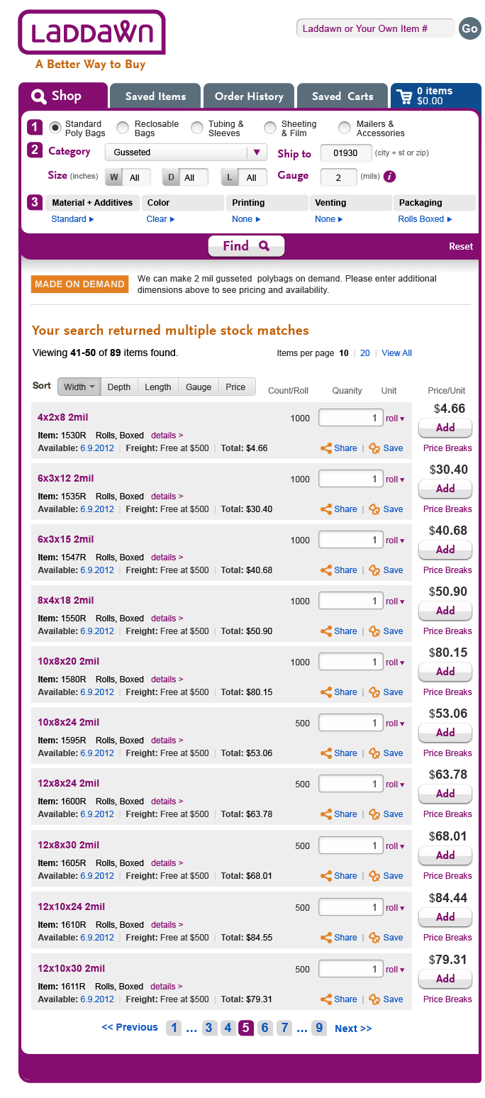
10/30 - Steve's latest round of work - zip code does not match (Named Cart/Un-Named Cart)
This one feels a lot better based on earlier discussion. The "Search Again"...help text needs to still be tightened up a bit but overall I think this is the right direction.
| Zip Code - Named Cart | Zip code - Unnamed Cart | Shop Zip code - Tip |
|---|---|---|
 |  |  |
10/8 - Steve's latest round of work - zip code does not match (Named Cart/Un-Named Cart)
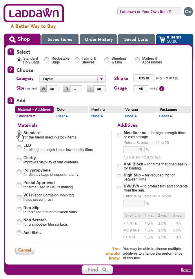
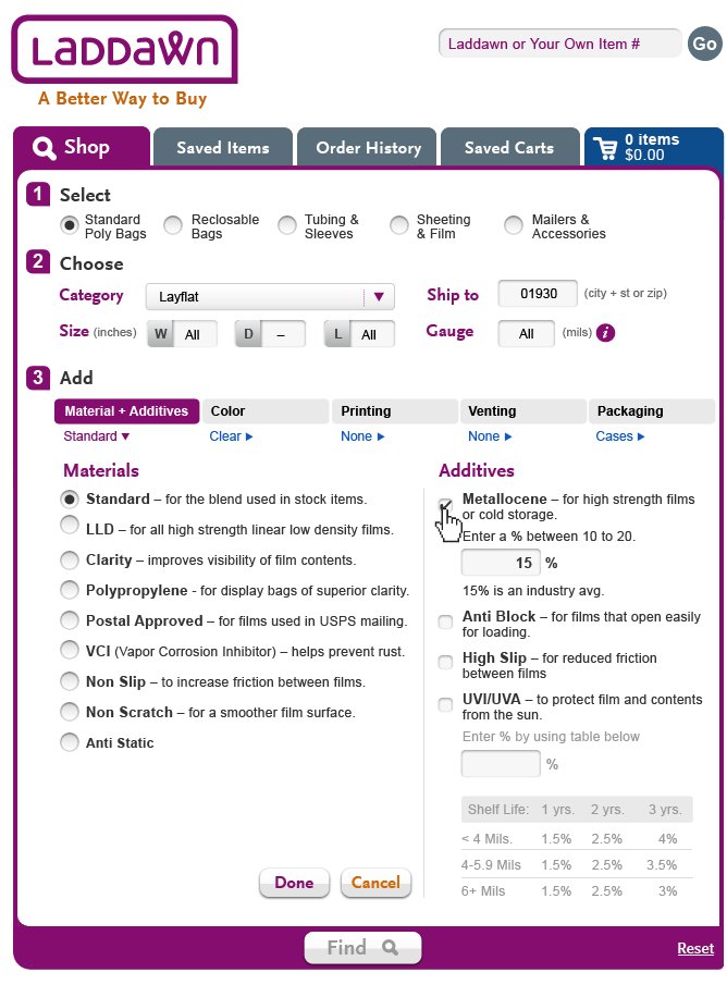
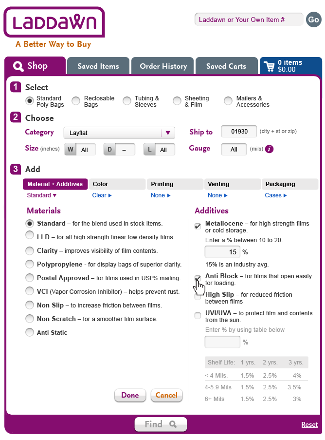
Design Notes
• Changed "Order" to "Cart" in both designs. That makes sense to me.
• In the unnamed cart design, I tried to make the required text stand out a bit more. I'm on the fence whether we need to do this?
It doesn't seem necessary to me, and seems to confuse matters - my initial reaction (with both versions) was that it made it seem like the whole act of saving was required, not just that you had to enter a name in order to save. I would just make the text inside the box gray and change it to "Enter a name here." I wonder if there should be text under the "No" answer saying "You will not be able to retrieve this cart later." One last, minor point: It seems like the margin on the right is much wider than the margin on the left. I might widen the margin in the left; doesn't seem like it would change the wrapping. -SP, 10/8
Very good. Made updates below. I wonder for the "No" response if we should add an additional shadowbox that highlights the fact that this current cart will be deleted. Or maybe instead of positioning the cart as being retrieved we should clearly spell out the current cart will be deleted? -SB 10/8
Good point. I think clearly spelling out the current cart will be deleted is the best choice, so change text to: "This action will delete the current cart." The text should be gray, no? SP, 10/10
| Zip Code - Named Cart | Zip code - Unnamed Cart |
|---|---|
| |
10/5 - OK, just waiting on 2d shadow box (un-named cart)
Also, see Jim's comment on first shadow box. Let's change "order" to "cart".
Steve's latest round of work - zip code does not match (10/2)
| Zip Code - Named Cart | Zip code -unnamed cart |
|---|---|
|
This looks great to me me. The one thing that might leave me a little confused is the use of the words "Order" and "Cart" somewhat interchangeably. I think I might have the banner say "Starting a new cart?". – JBM 10/3/12
Zip code mismatch, 10/1
Please design a series of shadowboxes for adding an item to the cart. I have copied our notes from 10/1 call to the subsection of the shop page that this links to.
Steve's latest round of work - Zip Code does not match (9/26)
Susan, Owen and Jim. The header text to these shadowboxes need some work. I added those in myself. Since the different zip code was intentionally added to the shop entry field, I'm thinking the default should be "Create a new cart."
| Zip Code - Named Cart | Zip Code - UnNamed Cart |
|---|---|
 |  |
| Please initial and date your comments. | |
COMMENTS: SP, 9/27 - I like this; I have many questions I'd like to discuss with the team. The color should be purple. Although the items are being added to the Cart, the user is seeing these shadow boxes while on the Shop tab. I wonder if the heading should be "Search zip code does not match cart zip code" and include one of those upside down pyramid/exclamation point icons...
| COMMENTS: SP, 9/27 - Aside from feedback in left cell, looks good; I am looking forward to seeing what happens when the user decides to start a new cart and is prompted to save the current cart. Here are is a copyedit for the intro sentence: The current cart has a ship-to zip code |
Next assignment - 9/25
We have identified some scenarios where the user needs to see some prompts, after clicking the "add" button, before the items get added to the cart. Please see description of flows on Shop page under "When zip code for search result does not match zip code of active cart..." (the link above brings you to this section).
Steve's latest round of work - Packaging (9/20)
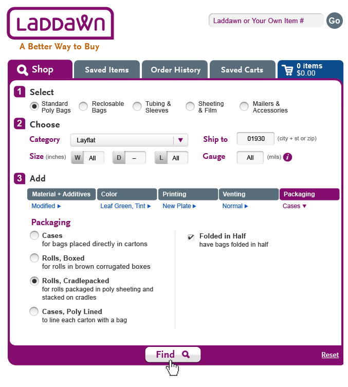
SB, 9/20 - Tried to keep the same left/right working model for adding in the "Folding in Half."
- SP: Steve, This is complete thank you!; there are some minor issues that we will address in house:
- Folded in Half should be an option with cases?
- Missing "You should know" message for folding:
- Folded in Half should be an option with cases?
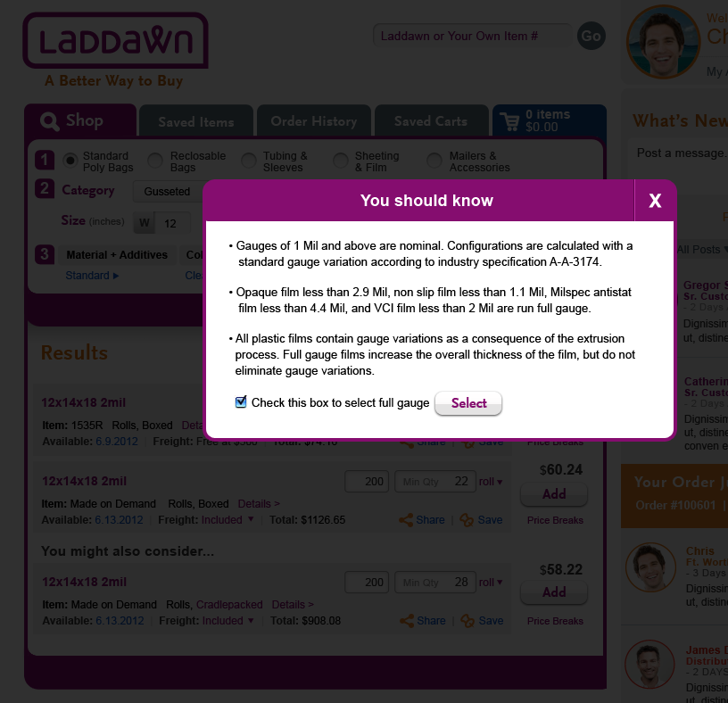
You should know:
Folding bags cuts the roll size in half, and may allow the rolls to fit on standard size pallets.
| Packaging - 1 | Packaging - 2 | Packaging - 3 |
|---|---|---|
 |  |  |
OR - It think we need to let customers know that there is an additional charge for Cases, Poly Lined - otherwise, hey, who wouldn't choose it? So I would recommend that we add, "There is a nominal charge for Poly Lined Cases" as part of that item's descriptive text. (9/24)
Direction for Steve, Moving on to Packaging (9/19-9/20)
Steve, Great work on printing; it's looking really good. There are some very minor outstanding issues, and we probably need to see "Choose an existing plate" expanded; we will have Chris address so you can move on to packaging. Please upload the PSD with all the level 3 menus to date, and keep packaging separate - we'll reunite later.
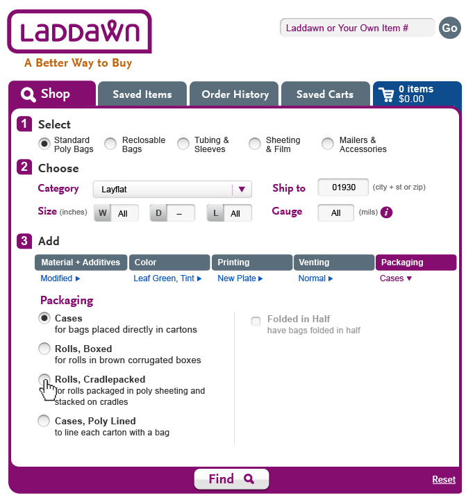
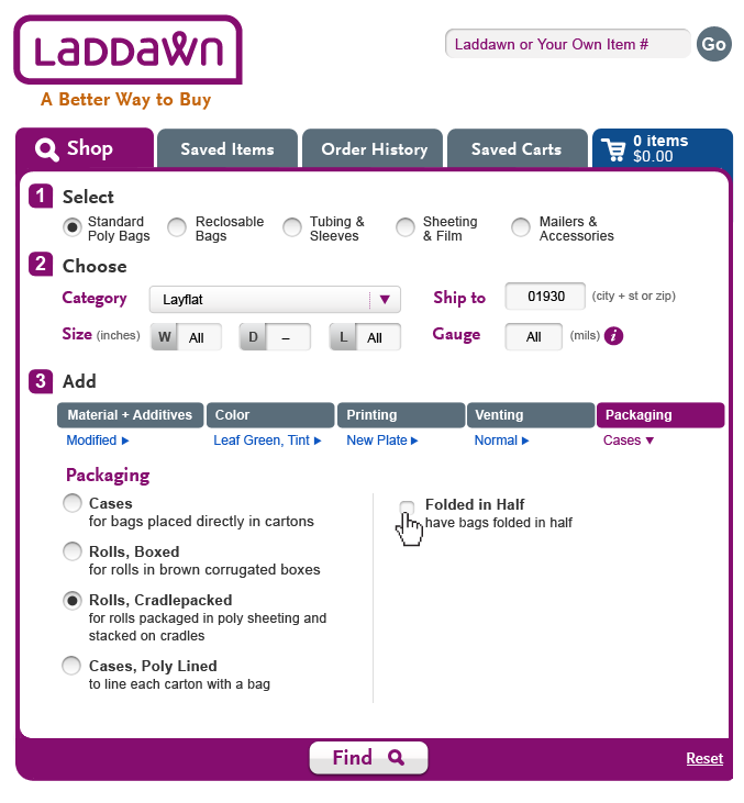
Packaging
From Owen's documentation:
Default within the Shop Widget: Cases or Rolls Boxed. (see Dependencies)
There are 4 Packaging options. Upon clicking on the word “Cases” (or “Rolls Boxed”), the following menu of options will appear:
- Cases – for bags placed directly in cartons
- Rolls, Boxed – for rolls in brown corrugated boxes
- Rolls, Cradlepacked– for rolls packaged in poly sheeting and stacked on cradles
- Cases, Poly Lined – to line each carton with a bag
Please note: There is a narrow slice of bags we offer where folding is an option. To address this, we propose offering the above 4 options with "Folded in Half" to the right of or below each with a checkbox. (When folding isn't relevant, the text and checkboxes are grayed out.)
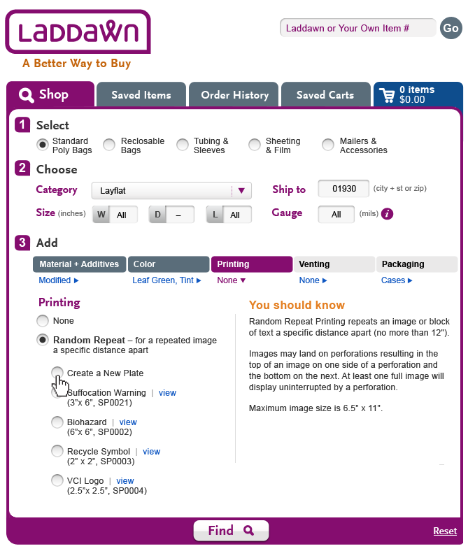
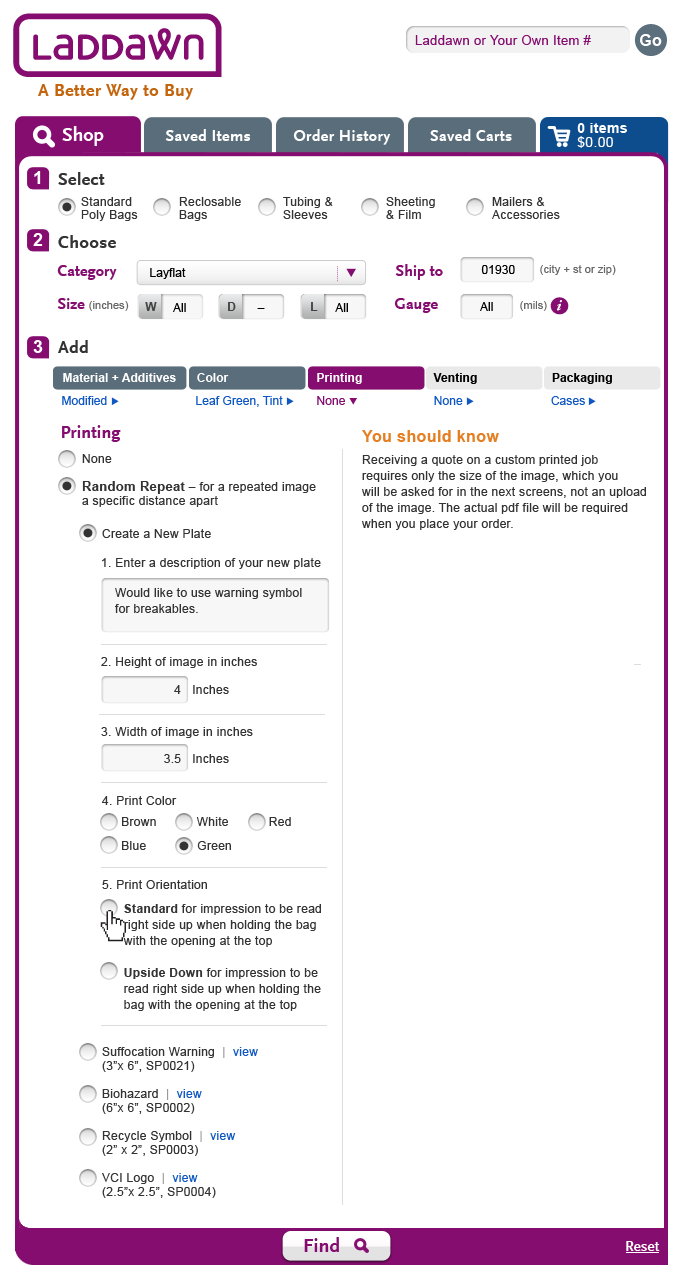
Steve's latest round of work - Printing (9/18)
OR - I think you can lose the "Maximum image size is 6.5" x 11"" from the YSK text (since you have it next to the input boxes on the right). Otherwise, great. (9/18)
- Also, please make this edit: Width of image
in inches(SP, 9/19) - We are going to change "Plate Description" to "Plate Name". The text box for "Plate Name" needs to be smaller; should only accommodate 30 chars. (sp, 9/21)
- The max height and width are calculated variables; the values here are for show only.
| Printing - 1st time | ||
|---|---|---|
 |
Feedback, 9/18
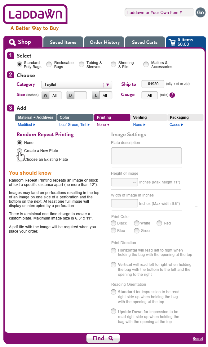
Heading over left column should be "Random Repeat Printing." Choices on the right should not be numbered.
In answer to your question re separating stock and custom plates, some of us favored separation, some didn't; we ended deciding to have one long list, alphabetized. However, this all begat a conversation about YSK's and "progressive disclosure" of the plate choices and led to a new twist. Radio buttons on left should now be: None, Create a New Plate and "Choose an Existing Plate". Similar to what we're doing with Materials, selection of "Choose an Existing Plate" pops down an indented list of alphabetized list of stock plates (mixed with custom, where they exist for the customer) with radio buttons.
Let's delete the YSK on the right, and make the following edits to the YSK on the left (which should now appear above the fold until user clicks "Choose existing plate"):
Random Repeat Printing repeats an image or block of text a specific distance apart (no more than 12").
Images may land on perforations resulting in the top of an image on one side of a perforation and the bottom on the next. At least one full image will display uninterrupted by a perforation.
There is a minimal one-time charge to create a custom plate. Maximum image size is 6.5" x 11". Stock and existing custom plates have no additional charges.
A pdf file with the image will be required when you place your order.
Additional edits:
Enter a description of your new plate Plate description
Height of image in inches (To right of text entry box + inches, add "Max height: 11")
Width of image in inches (To right of text entry box + inches, add "Max width: 6.5")
Steve's latest round of work - Printing (9/17)
Just a couple notes about the design:
• Based on where things are falling, I think it will be close to whether or not the "You Should Know" on the left side will be above the fold? It will be close.
• Should we separate the standard plates on the left with any collection of custom plates that might fall below? It seems like dividing the standard set (Custom, Suffocation, Biohazard, Recycle. VCI) with any saved set might help break up the plate lists into more digestible chunks.
Will be finishing up this flow for you on Wednesday night.
| Printing - 1st time | ||
|---|---|---|
|
Printing feedback and direction, 9/14 9/17
Steve, Thanks for the designs below. We reviewed as a group and came up with a different approach that more closely follows the left/right approach to venting. See attached Paint file.In addition to following the left/right approach, we've decided to skip the none/random repeat step, and just have the choices be none or going directly to a plate. The questions on the right would all be grayed back till the user picks a plate. The questions pertaining to custom plates would be grayed back if a stock plate is selected; enabled if custom is selected. We also greatly expanded the list of plates (just a copy paste of stock plates) as the Programming team thinks it is pretty common for customers to have an accumulation of custom plates, and we wanted to be sure the layout can accommodate this.
Some additional things to note (that we cleared up after 9/14):
- Ink colors do not currently include Brown (Owen's documentation is in error on that). The colors are Black, White, Red, Blue, and Green; based on bag color, some ink options will be grayed out (e.g. black ink on a black bag).
- Revised "You Should Know" content:
You should know:
Random Repeat Printing repeats an image or block of text a specific distance apart (no more than 12").
Images may land on perforations resulting in the top of an image on one side of a perforation and the bottom on the next. At least one full image will display uninterrupted by a perforation.
There is a minimal one-time charge to create a custom plate. Maximum image size is 6.5" x 11". Stock and existing custom plates have no additional charges.
In the new lft/right layout, this message should appear in the left column, below the plate choices. For users who are new to printing, we are assuming this message will be above the fold and therefore sufficiently noticeable; for users who have extensive printing experience (and perhaps a long list of plates) this message is less important, and therefore it is OK for it to be below the fold.
- "Print Orientation" should instead be called "Reading Orientation"; it should come after a set of prompts that is missing from the last design:
- "Print Direction"
( ) Horizontal will read left to right when holding the bag with the opening at the top
( ) Vertical will read left to right when holding the bag with the bottom to the left and the opening to the right
- "Print Direction"
Note: The Reading Orientation prompts are grayed back unless horizontal is selected under Print Direction.
Printing (9/11)
Still working on expanded views. Will have that wrapped up by Thursday AM.
| Printing (Create a plate flow) 1 | Printing (Create a plate flow) 2 | Printing (Create a plate flow) 3 | |
|---|---|---|---|
|  |  |
9/12 Feedback on M&A, Venting & Color (from 9/8-9/9)
- We have no further changes for you to make to Color and Venting; there are some mistakes with the tab colors and breadcrumbs in venting, and one change (we decided to have breadcrumbs be dynamic), that we'll have Chris address later and/or address through requirements documentation and coding.
- I have noted a question for Owen and Jim on Linear Low Density. Still waiting for Owen's input, but there might be enough there for you to react to?
Steve's latest round of work (9/8-9/9)
1-M&A; 2-Color; 3-Venting
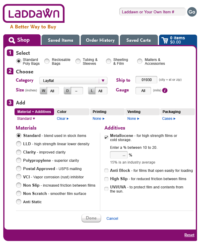
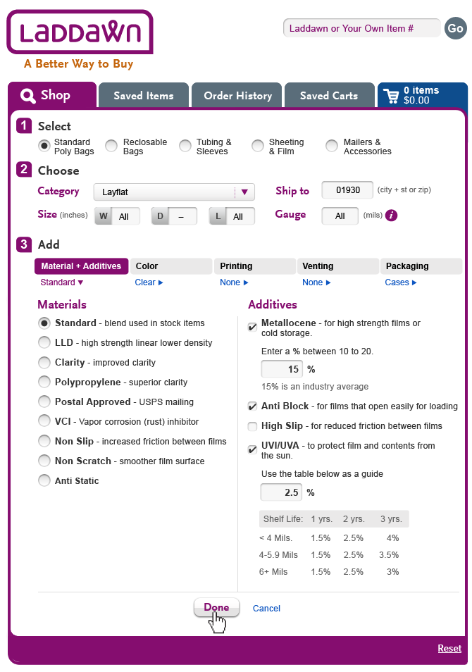
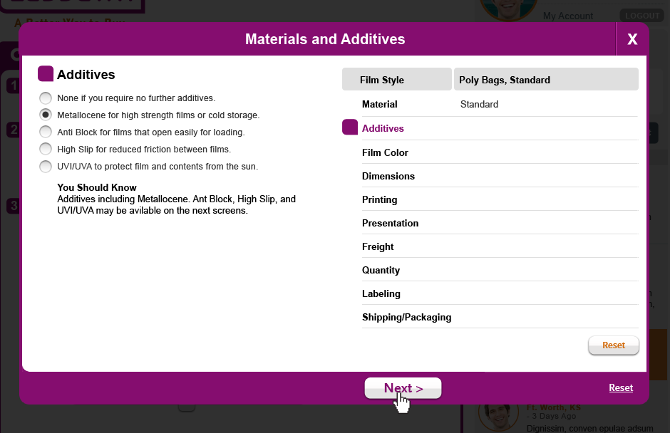
1-Material and Additives
M&A, Flow 1 (Standard) - User selects Metallocene | M&A, Flow 1 (Standard) - Metallocene % added. | M&A, Flow 1 (Standard) - Anti Block Added | M&A, Flow 1 (Standard) - UVI/UVA added |
|---|---|---|---|
 |  | 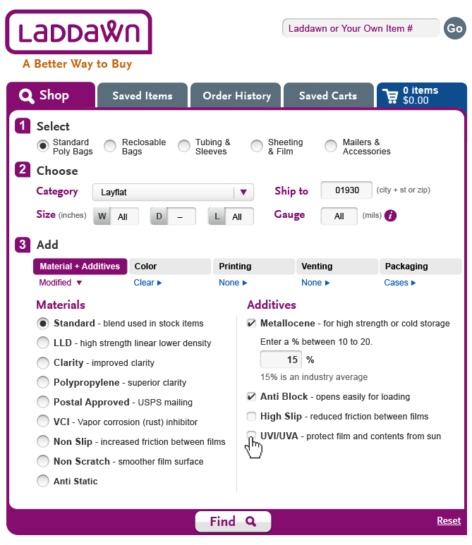 |  |
Comments:
| Is it intentional to change the breadcrumb from "Standard" to "Modified" at this step? Or should the verbiage not change till the user exits. See comment below on color. -SP Commenting on Susan's thoughts: My reaction would be that the Tab stay purple and the breadcrumb un-changed until the tab is exited - 9/10 JBM After seeing it, I think I agree with you both. I was on the fence of what the | ||
| M&A, Flow 2 (LLD) - User selects LLD. | M&A, Flow 2 (LLD) - 2 sub choices slide out, the user prepares to select STD Hexene Blend. | M&A, Flow 2 (LLD) - User now moves to make additive selection(s). The Material sub choice remains on the left. | M&A, Flow 2 (LLD) - The user selects UVI/UVA. This scenario shows you what a more complex set of choices could show. |
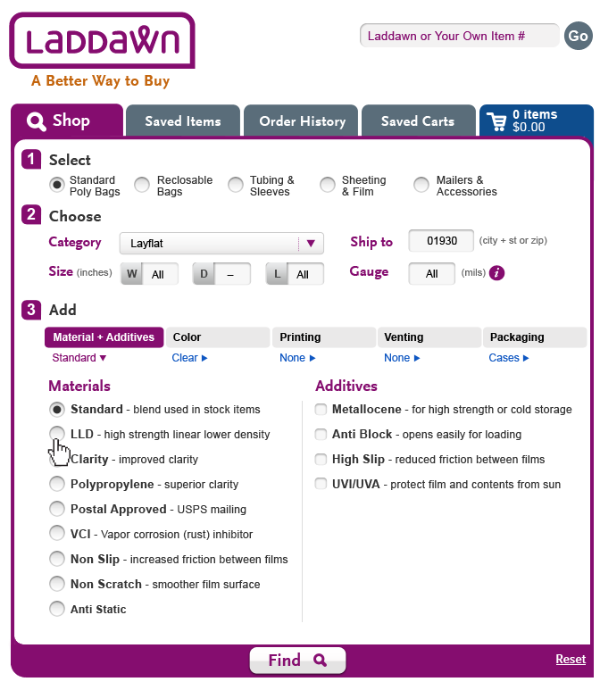 | 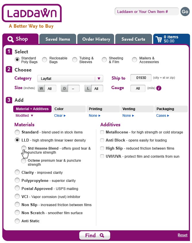 |  |  |
| Comments: | I wonder if rather than having 2 radio buttons, Octene could be presented as a checkbox - optional alternative to "standard hexene." (Would need to tweak how LLD is described.) Maybe this is a solution in search of a problem. Also if the properties of LLD greatly mattered to me, I guess I would want to know the difference between "good" and "premium" tear and puncture strength. How do I know if "good" is good enough? BTW the current site has a "you should know" for this choice, which needs to be represented here somehow (missing in our specs for Steve?), but it doesn't answer the question about how good is good enough. You should know: I don't think it makes sense for this very targeted YSK to be in the lower right corner. How many of these YSK's are there? -SP, 9/10 Good catch on the YSK. There seems to be a couple (LLD and Anti Static) and they should probably be in a fashion similar to the UVI/UVA situation rather than isolated lower right. Also, we will need set up the Anit Static for its prompting as well as it has multiple prompts - 9/10 JBM After reading this again, it makes me wonder are there industry standards |
2- Color
Centered content evenly between left/right sections. I removed the Done/cancel buttons and made "Find" active throughout. Last, I top-aligned all radio buttons.
 |  |  |  |
Comments:
| The color "tab" goes back to gray at this step and undoubtedly should remain purple until the user exits. Also, the breadcrumb has changed from "Clear v" (open) to "Leaf Green, Tint >" (closed). For what it is worth, I did ask myself at one point whether the breadcrumb ( not the open/closed direction of the arrow, but the verbiage) should change after a selection is made, but I ended up concluding that it should all stay the same until the user exits the menu (via clicking find, via clicking to something else, or via clicking the breadcrumb/arrow); to have the verbiage change would be too fussy and potentially confusing. Suggest we just correct these errors in the coding process. -SP
UPDATE: OR, JM, SP and JP discussed 9/12; JP advocated having the breadcrumb change while you are in the menus. E.g., in the color menu, if I select "Leaf green", breadcrumb changes from "Clear" to Leafe Green |
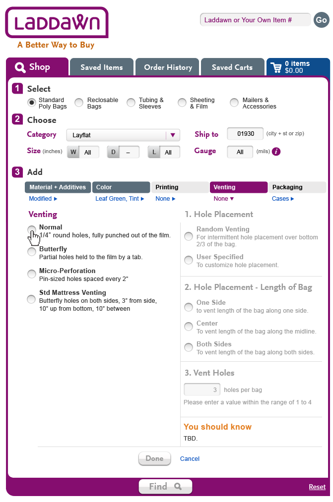
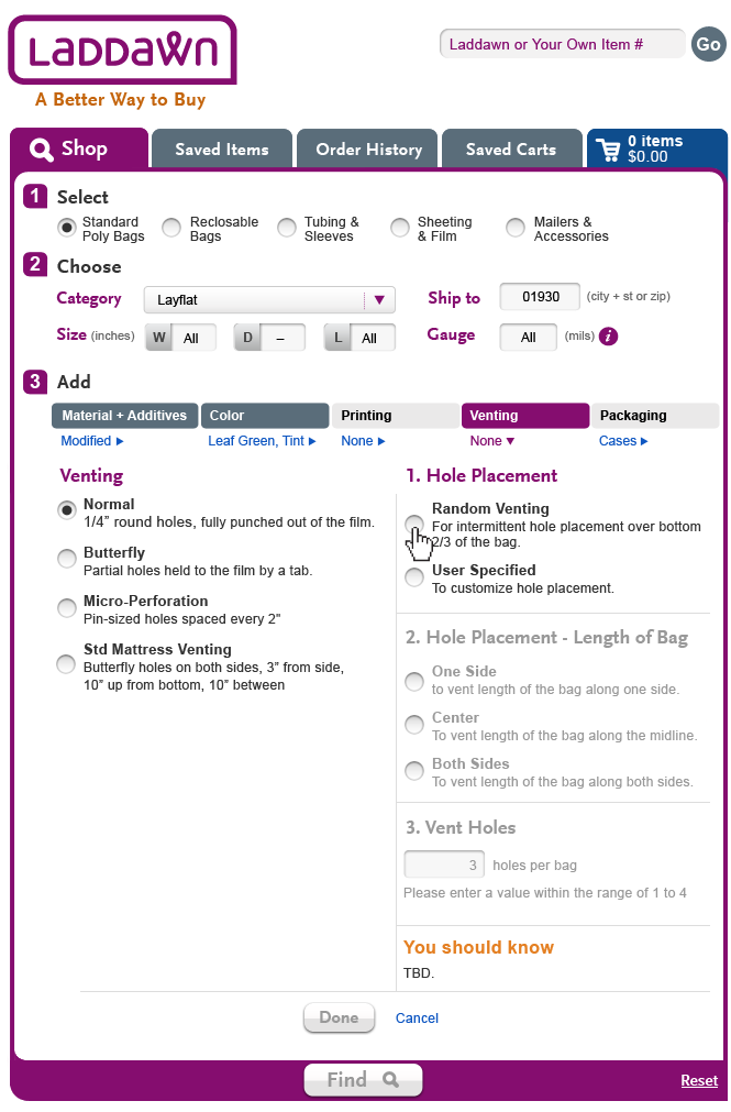
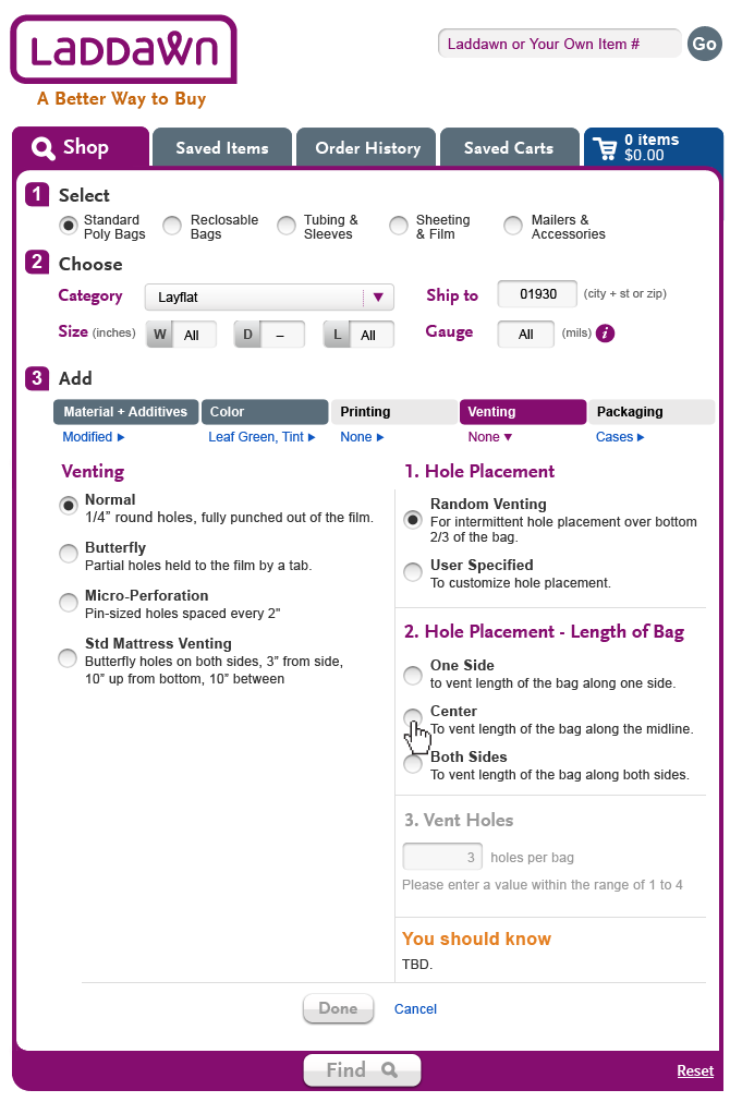
3-Tweaks to venting per 9/7 feedback
See venting table below (images in original table replaced with corrected images).
9/7 - Feedback on Steve's next round of venting
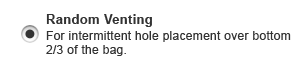
SB, 9/6 - Susan, Owen, and Jim. I have finished the updated flows for Venting. I have addressed the issues in the "General" list above as well. I did not do the mattress flow, if you need that completed, send the mattress data values and I will take care of it.
SP, 9/7: No need to do mattress flow; we'll handle that. The flow depicted in the images seem just about right, except I am a little confused about how you described the transition between 1b and 1c. You said: The user selects "Random Placement" under 1st "Placement" header. The other 2 sections remain inactive. However, we say, and in effect your pictures say, as soon as the user selects "Random Venting" then section 2-Alignment, should become active. No action required, just want to be sure we are on same page for sake of any future iterations.
SB, 9/8. Yes, you are correct. I don't think I described that well and have hopefully fixed it.
Thank you for the proposed handling of the error for the incomplete fields (section 3). There is some internal discussion about whether we want to handle those errors in a manner that is consistent with validation errors.We'll get back to you next week.
SB, 9/8. Gotcha.
The vertical alignment of the radio buttons for multi-line selections still seems to be off. You seem to center it vertically. Again, we're looking for it to line up with the top line of text, like an outdented bullet for a paragraph. This is not hugely important; I am guessing Ed can code it this way. But can you make sure you do it this way in the other menus?
SB, 9/8. Thanks for the quick mockups. I was thinking you were talking about the left alignment of the header and all the radio buttons. I was thinking, "boy, you guys have great eyesight because these are no more than a pixel off if that. I quickly adjusted these below.
I guess this means wrapping up M&A and Color next, and then moving on to Printing and Packaging.
| Current | Desired |
 |  |
User Flow 1a - Venting (Normal, Random Venting) | User Flow 1b - Venting (Normal, Random Venting) | User Flow 1c - Venting (Normal, Random Venting) | User Flow 1d - Venting (Normal, Random Venting) |
|---|---|---|---|
 |  |  |  |
User Flow 2 - Venting (Normal, User Specified) OR - We will need to instruct the user to put in full dimensions if they choose user specified - since the allowable number and placement dimensions are dictated by size. (9/12) OR - I like the headings very much. Remove the periods on the alignment section (for consistency). Again, the inches from side, bottom, number, etc. section can't be there until the size is selected (those ranges will change). I recommend we show/populate these if and when they become active. (9/12) | User Flow 3 - Required Field Error Message The user has attempted to click the "FInd" button but hasn't finished inputting data into 2 fields. 2 required field error messages appear pointing the user to fields needing attention. | OR - Remember when programming that Center will only remain available if the width is between 6 adn 16". Otherwise, that option should not show. (9/12) | OR - again, venting spacing defaults will requre dimension outputs. (9/12) |
 |  |
9/6 feedback and revised direction
General
- Let's remove the Done button and Cancel link; please restore the Find button.
- Intent for 'Cancel' was to serve as "undo last." Decided this was overkill and potentially confusing (would some think of it as clear/reset?). With this UI , user can easily change choices (or return to default via initial radio buttons).
- Intent for Done button was hand holding, i.e. "save what I just did so I can move on to the next step" - again, we decided it does not seem necessary given UI of level 3 tabs and right/down-open/close arrows.
- Exit of these menus is via clicking down/close arrow (i.e., under Materials & Additives, "Modified v"(widget closes back up); Find (widget closes back up); or clicking to another level 3 menu, right/open arrow (widget stays open and repopulates with that menu).
- Do not gray out the Find button; if user attempts to exit menu before completing all required fields, cue will be a pop-up warning.
Venting (revised AGAIN 9/6)
- You omitted "None" as the first choice (and initial default). We need that added in.
- Let's abbreviate the three headings on the right: 1. Placement; 2. Alignment; 3. Spacing. (These need work, but let's go with them for now.)
- You can take out the "You should know" placeholder; Owen is pretty sure there aren't any for venting.
- Right side, based on left side selections:
- When None or Micro Perf are selected on the right you see the 3 headings and subchoices fully exposed and grayed ou t
- When normal or butterfly are selected, what you see on the right are the 3 headings and subchoices fully exposed, with first section enabled; 2d and 3d disabled (grayed out), and progressively enabled as prior sections are completed. Section 3 should now include all the questions, with the questions grayed out as applicable (based on whether random or user specified are the selection in section 1)
- When mattress is selected, you see the 3 headings and subchoices fully exposed and grayed out, with the data values filled in.
- For "standard" and "butterfly," if the user attempts exiting (via clicking Find, via clicking to another level 3 menu or via clicking the close/down arrow link "Normal v") before all the required fields on the right are completed, user gets warning about needing to complete the required fields.
Color
- Please change Translucency to Opacity.
Materials & Additives
- Amongst the flows, we'd like to see the user select one of the materials with subchoices, and then see those subchoices exposed after the material is selected.
- SB, 9/5 - Susan, I noticed your comment about having Owen and Jim review this first but I went ahead and made the changes knowing they could be tweaked. There was enough updates to this (specifically centering the divider line) to make all the changes at once. I love the new shortened descriptions for Materials. Any chance the Additive descriptions could be shortened as well? They feel flabby compared to the materials version. Yes, we can shorten them. Please truncate or use lorem ipsum for now. I will get you polished verbiage tomorrow or Fri.
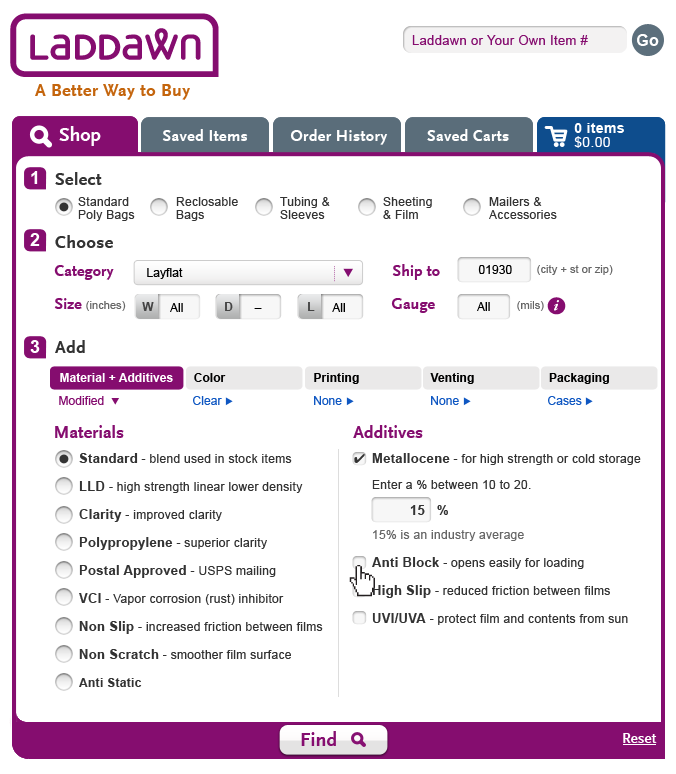
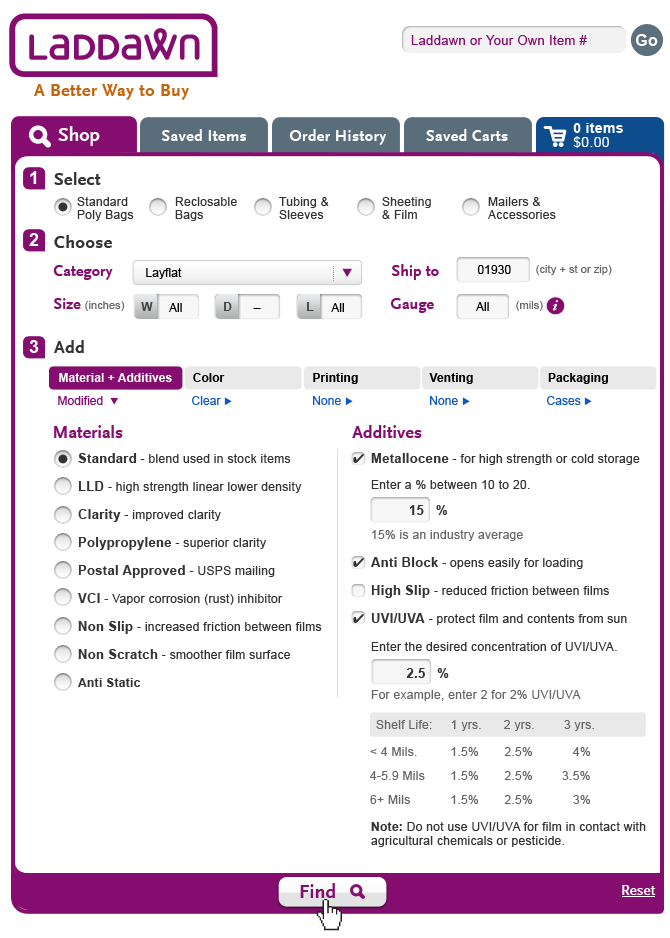
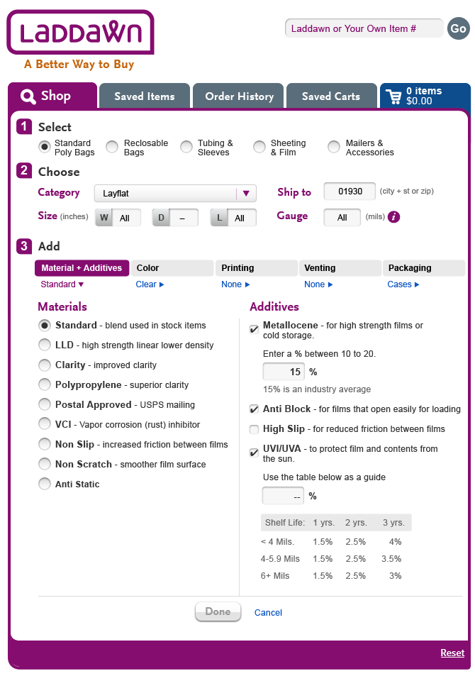
- 2nd, do you think the UVI, state needs any better explanatory text? It feels like there should be something mentioned about shelf life to better help guide the user? Yes, that was an oversight - there is actually some guiding info + YSK content on the current site (with some pretty important info). Here it is; we will likely want to tweak it but this is good enough for a design placeholder: Enter the desired concentration of UVI/UVA. For example, enter
2 for 2% UVI/UVA:
You should know:
UVI/UVA protects film and its contents from damaging effects
of the sun. Do not use UVI/UVA for film in contact with
agricultural chemicals or pesticide.
9/5 feedback on 9/4 M&A work
- Steve's questions
SB, 9/5 - Susan, I noticed your comment about having Owen and Jim review this first but I went ahead and made the changes knowing they could be tweaked. There was enough updates to this (specifically centering the divider line) to make all the changes at once. I love the new shortened descriptions for Materials. Any chance the Additive descriptions could be shortened as well? They feel flabby compared to the materials version. Yes, we can shorten them. Please truncate or use lorem ipsum for now. I will get you polished verbiage tomorrow or Fri.
2nd, do you think the UVI, state needs any better explanatory text? It feels like there should be something mentioned about shelf life to better help guide the user? Yes, that was an oversight - there is actually some guiding info + YSK content on the current site (with some pretty important info). Here it is; we will likely want to tweak it but this is good enough for a design placeholder:
Enter the desired concentration of UVI/UVA. For example, enter
2 for 2% UVI/UVA:
You should know:
UVI/UVA protects film and its contents from damaging effects
of the sun. Do not use UVI/UVA for film in contact with
agricultural chemicals or pesticide.
- Centering of done/cancel - I think you've centered the text, but what we'd like to see is centering between right edge of "Done" button and left edge of 'C' in Cancel. We are also discussing whether the "Done" button is really necessary, i.e., should we eliminate it and restore the Find button, and have that gray out and turn purple the same way the Done button changes color?
| Done button | Done button removed |
|---|---|
 |  |
- Outdenting/alignment of checkboxes on Additives side still not quite right.
- 9/4 instructions on venting have been modified.
9/4 feedback on recent (8/30?, 9/1 and 9/3)
General
- We would like radio buttons and checkboxes to align cleanly with the first line of any item (like outdented bullets).
- For the "left/right interaction model" we would like to divide each section between right and left evenly, and place the vertical rule right in the middle of the screen, if possible. We've included some editorial changes below to help with spacing.
- We like "Done" as a button, and "Cancel" as a link; we think that they should be centered below the vertical divider, and that the widget Find button should disappear v. being grayed out, when these menus are still in play.
- "Done" being grayed back v. actionable v. typical radio button behavior... When radio buttons are involved, typically isn't the first item shown as being selected? So in theory, "Done" should be clickable from the get go? (For instance, when you open Materials & Additives and "Standard" is the default selection. Likewise, your second screenshot for color shows the user about to select a translucency just after selecting a color; it appears as though none of the translucencies are selected by default, but "Done" is clickable. Seems like first translucency should be a default selection. The Done button should only gray back if the user selects an item that requires sub-choices to be selected (such as one of the two materials with subchoices, or one of the two additives with subchoices).
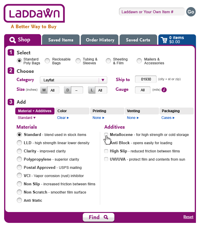
Materials & Additives (8/29?)
- Please use the following shortened descriptions for materials - (Steve, please go with these, but I have asked Owen to review, don't know if he'll get to it by time you commence work tonight?:
- Standard - blend used in stock items
- LLD - high strength linear lower density
- Clarity - improved clarity
- Polypropylene - superior clarity
- Postal Approved - USPS mailings
- VCI - Vapor corrosion (rust) inhibitor
- Non Slip - increased friction between films
- Non Scratch - smoother film surface
- Anti Static -?
- Now that we see additives with sub-choices exposed (thank you), we'd like to conceal them, and only reveal them when the particular additive is selected.
- For metallocene, please spell out "average"
- For UVI/UVA, please change "Enter a % using the table below" to "Use the table below as a guide"
SB, 9/5 - Susan, I noticed your comment about having Owen and Jim review this first but I went ahead and made the changes knowing they could be tweaked. There was enough updates to this (specifically centering the divider line) to make all the changes at once. I love the new shortened descriptions for Materials. Any chance the Additive descriptions could be shortened as well? They feel flabby compared to the materials version.
2nd, do you think the UVI, state needs any better explanatory text? It feels like there should be something mentioned about shelf life to better help guide the user?
M&A 1 | M&A 2 | M&A 3 | |
|---|---|---|---|
|  |  | |
| M&A 4 The user selects "Anti Block" | M&A 5 The user selects "UVI/UVA" and the "Done" button is inactive again until a percentage is chosen. | M&A 6 | M&A 7 The "Find" button return as the widget folds backup. "Materials & Additives" goes from "Standard" to "Modified" and the on state turns to blue/gray shade as an additional cue a change has occurred. |
 |  |  |  |
Color
- No changes other than those issues mentioned in 'General' section above.
Venting (revised 9/5)
Let's abbreviate the three headings on the right: 1. Placement; 2. Alignment; 3. Spacing. (We actually also discussed removing these subheads and just having one label over everything called "Placement", and dividing the three sections with horizontal rules.I can't remember where we ended up. Thoughts?)You can take out the "You should know" placeholder; Owen is pretty sure there aren't any for venting.You omitted "None" as the first choice (and initial default). We need that added in.When normal or butterfly are selected, what you see on the right is each heading with their subchoices exposed (under headings 1 and 2, first radio button selected under each).When Micro Perf or Standard Mattress are selected, all you see on the right are the 3 headings, all closed, and grayed back. (Another thing I am not sure about; we went back and forth and not sure where we ended up. This is my best guess.)We would like to see an additional scenario; we'd like to see the additional sub choices that populate under "3. Spacing." when user has selected "User Specified" under "1. Placement."For "standard" and "butterfly," "Done" (or Find? See above from 9/5.) should remain gray until all 3 sections on right have been answered (as you have it here) - because the right side requires inputs.
I tried to follow the left/right interaction model we have tried to implement in M&A and Color.
Venting Flow 1 | Venting Flow 2 | Venting Flow 3
|
|---|---|---|
 |  |  |
| Venting Flow 4 Vent holes is completed and the user gets some guidance telling them to select "a value with the range of 1 to 4." | Venting Flow 5 The user selects "Done" and the widget fold back up. Venting shows a selected state and "Normal" is shown as the choice. | |
 |  |
8/31 Feedback on 8/30 work
*** This is a bit of a shot in the dark best suited for further discussion rather than action ***
The M&A work is really helpful. In looks really good in some ways but also looks a little scattered - the UVI Table is a big part of this. That said, I wonder if we can make it more symmetrical by splitting the screen equally and using the same technique on both sides as follows: put the the option itself on one line and the description of the option underneath (as Steve did in one of the mockups); for any additional prompts put the box and description together on the next line; place all other helpful content (including UVI Table) in the You Should Know section. If we can stick to this it might be more easily digestible.
8/30 - Feedback on 8/29 work
General
We like the concept of purple for the active window, dark gray for a window that has been visited, and light gray for a window that has not been visited. It tells the story well.
Headings - we think Materials, Additives, Color, Translucency should left align over the radio buttons/check boxes, not the text.
We discussed having the "You should knows" consistently appear on the lower right corner (the position of that corner will vary with the content for each level 3 menu within the expanded widget). We owe you some analysis of the "You should know" content to validate this will work in most/all cases.
M&A
Materials will remain as radio buttons; however, when a choice is made we would like to continue showing the other choices. In Owen's documentation, materials and additives are combined in a single list (due to prior vision of how these selections might play out), which we agreed is a source of confusion for you now. He or I will fix that soon. In the meantime, one correction to content that you need to make is to add Anti Static to the Materials list.
When LLD or Antistatic are chosen, sub choices (see Owen's documentation) will appear (downward expansion).
As discussed, we would like additives to be check boxes, with their sub-choices exposed (and grayed back if they are incompatible with the chosen material or a prior widget selection).
JM: I wish there was a way to not wrap the content associated with each choice but I think it will be difficult. Could we possibly start the description for all items on the 2nd line (probably not)?
SB, 8/30: For me these designs look good except when you get to the UVI/UVA section. That table kills the flow a bit. It is on the current Laddawn site as a Did You Know but it seems critical info for a user to complete this? Is that correct? Could we make the user expand/collapse UVI/UVA table? This is why I tried Jim's suggestion (Design 1b) of dropping the description to a 2nd line which helps balance out the 2 sides a bit better.
| M&A Design 1a | M&A Design 1b | |
|---|---|---|
 |  | |
| Design 2 - Additive checkboxes | Design 3 - Select multiple additives | Design 4 - Complete Additive choices |
 |  |  |
| Design 5 - Finish and click "Done" | ||
 |
Color flow
We’d like to see Color and Translucency on the screen together and preserved on the screen after any choice was made. Incompatible options would be grayed back - for instance, Opaque grayed back for every color except black.
SP: I wonder if, to be consistent with what you've done elsewhere, the cancel button should instead be a more subdued, underlined link. Also, I would change "Choose Translucency" to "Translucency"; I think the headlines should be consistent.
SB, 8/31 - Here's is a 4 screen flow for color. As I was designing it made me wonder whether we should allow users to proceed to "Printing" vs. making them have to close the "Color" panel and then open the "Print" one? Since Laddawn already uses a linear flow, is that something your current users might find useful?
The User is about to select "Leaf Green" and all | The user selects "Leaf Green" and prepares to | Once "Tint" is selects, the user selects "Done." | The widget closes up and the "color" turns to |
|---|---|---|---|
 |  |  |  |
8/29 Level 3 Menu designs - M&A Part 2 - Still a work in progress
| |
8/29 Level 3 Menu designs - Color Flow
| 2. The user then gets a "Choose Translucency" | 3 The "Done" button now appears and is active. | 4 The Level 3 menus collapses back to its original state. |
|---|---|---|---|
 | |  |  |
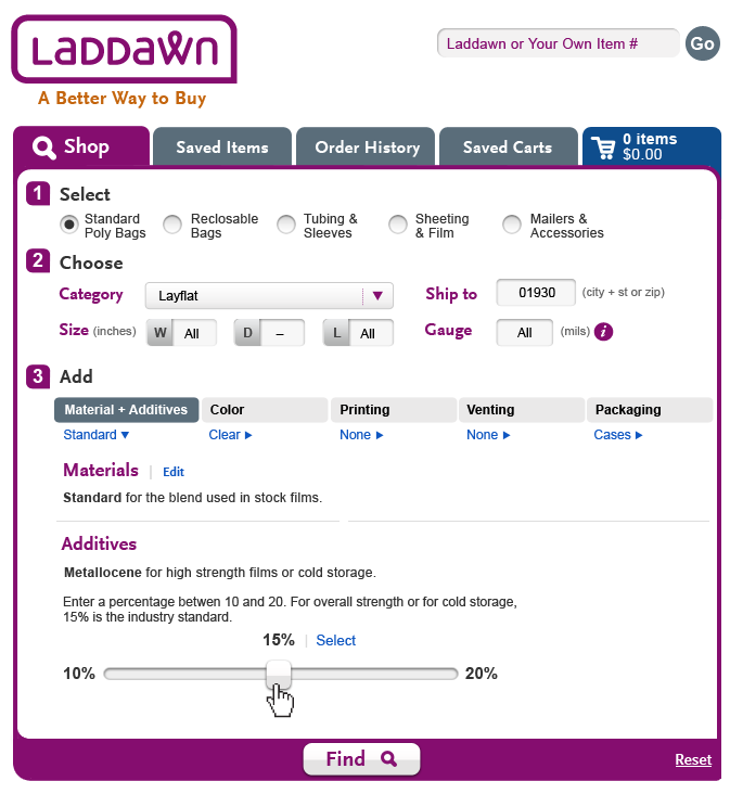
8/27 Feedback
SP: I like the notion of keeping the level 3 interface within the widget (I hadn't expected that) and highlighting the particular section you are within (here, M&A). I like some of the elements you've added such as the sliders for percentage. One thing that strikes me as odd though is Additives start out as radio buttons, and then become select buttons (once one additive is chosen). Related to that, I like the way the additives stack up next to each other as gray boxes, but in this example, the 15% seems completely disconnected from the Metallocene, still showing with its (useless?) radio button, whereas UVI/UVA (2.5%) are clearly together. I don't want to be too prescriptive, but I wonder if the real estate to the right could be used for the "playback" of options selected (along with links or buttons for editing or undoing an additive one at a time - Owen/Jim is that not feasible due to interdependencies?). Regardless, I think the selection of an additive, and the playback after the additive has been selected, should be handled in a more consistent manner. Also: I think the Select buttons look too similar to the Done buttons.
SB: Susan, that's a good point. I will remove the radio buttons as you step through the various processes. My general concept was to have the items stack vertically with out a need for a playback. Maybe I should do a quick version that adds the playback into the right? I was able to make a few of the changes you requested and have placed them below.
JM: Some preliminary thoughts. I also wasn’t expecting to see the Widget expand. I like what Steve is done here as well – though I am still trying to figure out whether I’d prefer to see it in a shadow box. It does seem to work this way. I am also a little confused by the logic and flow behind the additives. I have started to envision a situation where you have materials in one column and additives in another with checkboxes (and where applicable a place to add a percentage). As boxes were checked, other boxes in either of the columns could be grayed back, you could un-gray columns by unchecking boxes as well until you got a combo you really liked. Steve introduced a lot of the “you should know” info it this … I haven’t thought much about how that would work in my scenario but I think it is worthy of decided how much of that need come up and how prominent it needs to be.
SB:
8/21 - Level 3 menus a.k.a. "Add Options" - added some notes 8/23
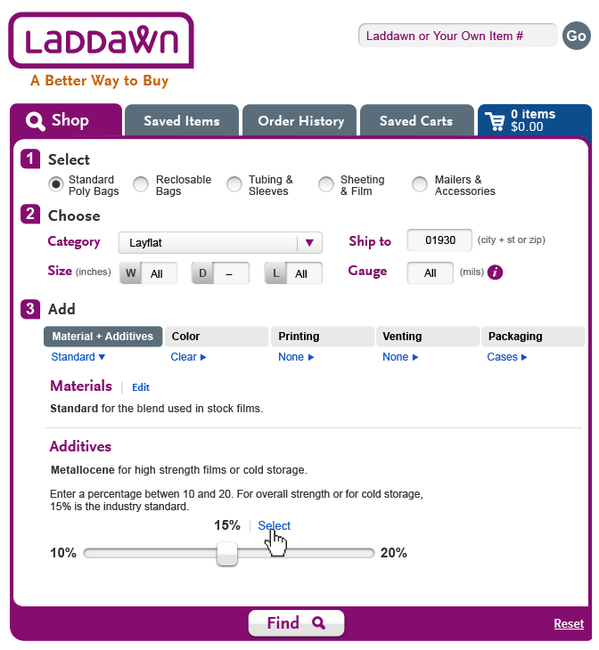
Concept A - Vertical Scroll (M&A)
| 2. As Standard is selected, the Additives panel opens | 3. The user selects Metallocene and the Metallocene functionality flow begins with a percentage slider. |
|---|---|---|
 |  |  |
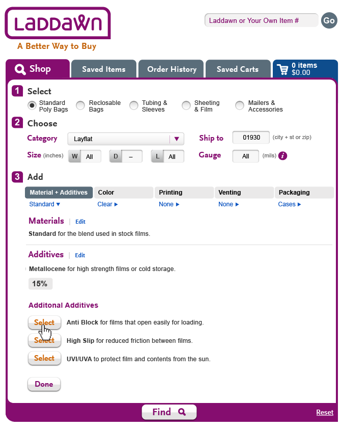
| 4. after the percentage for strength is chosen, the user clicks "Select." | 5. 15% is now listed as an additive choice below Metallocene. Next the user has 3 other additive choices he can select or click done to finish. The user selects anti block. | 6. Anti block now shows up next to "15%" and the user moves on to selects "UVI/UVA" |
 |  | 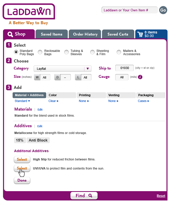 |
| 7. The "UVI/UVA" flow begins and a small with a helper table to assist the user with their choice. | 8. User clicks "Select." | 9. user is finished and clicks "Done." |
 |  |  |
| Final Shop Widget after Materials and Additives has been added. | ||
|
Concept B - Shadowbox (M&A)
 |  |  |
As discussed, please refer to Owen's documentation, and to Laddawn's current configurator, and begin to flesh out a UI for the Level 3 menus, beginning with Materials & Additives.
Thoughts from Jim, 8/23:
- M&A: Since the material is generally a single choice and the additives multiple choice we thought they should be kept separate. We could use a drop down for materials. That said it seemed logical to make two separate check box lists and have the logic disable and enable available choices in both lists that have resulted from other choices made inside and outside of this shadowbox. Note: some additive fields would have/reveal and addition box for the “percentage” when/where required.
- Colors: Two drop down lists or check box lists of available color and “type”. The logic would enable/disable based on previous choices and require one color and one type choice.
- Printing: It was decided that all questions should be displayed so that the customer understood what was available. The logic would enable/disable individual questions and or make default choices based on previously answered questions.
- Venting: It was decided that all questions should be displayed so that the customer understood what was available. The logic would enable/disable individual questions and or make default choices based on previously answered questions.
- Packaging: For consistency we should use a shadowbox and have a drop down list of available choices. The list should disable any choices that were unavailable due to previously answered questions. NOTE: Judy reminded us that we have to account for “Folded In Half” where applicable. Maybe we just have a “Folded In Half” checkbox when available.
Research from Steve, 8/22
Hey Gang, spent some time doing research on different UI builders that might help us find some models for the level 3 work. Here's a few I've found:
1. Apple MacBook Builder
What nice about this.
I like the idea of using these blocks of content that could change depending on your choice. seem like a very flexible way to accommodate the type of complex possibilities for the various level 3 sections. I also like as you scroll down the Summary, Just Ask and Spec off to the right stay anchored in place at all times.
http://store.apple.com/us/configure/MD102LL/A?#accessories
2. Blue Cotton - T Shirt Builder
What nice about this.
How the various choices spawn new windows within the experience. We might not want to do multiple shadow boxes but extra layered panels might be a nice compromise.
http://www.bluecotton.com/studio.html?need=50
3. Nike ID
What's nice about this.
The way the alternate/secondary choices are displayed. Everything is very subtle and in text with the selection you make. For example when you select stitching on #5. It's a simple toggle (Yes or No) but each answer gives you a different set of secondary options and they just simply slide out from the same area.
4. Turbo Tax TaxCaster
What's nice about this.
Takes a lot of complexity and makes it works fairly well in a condensed space. Don't really like how the way the objects animate in and out but overall it gets you through complexity fairly.
http://turbotax.intuit.com/tax-tools/calculators/taxcaster/
8/15 - Round 7 (finishing touches) - Done
- As discussed, Laddawn will handle further experimentation with ways of highlighting Cradlepacked.
- Please provide PSDs that reflect all of our recent decisions, including today's:
- The MOD and stock price break shadow boxes are good to go (please also do the Cart version of these and upload the .png's to the Cart to do list).
- Scenarios 2 and 3, broad searches with pagination and sorting, are all good to go.
- Full gauge breadcrumb (option A) in widget is good to go.
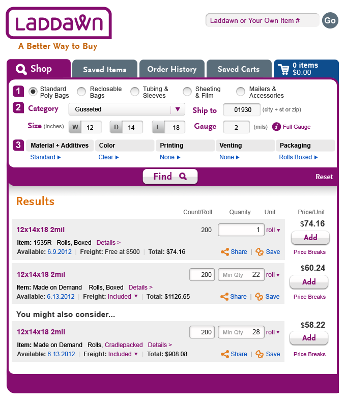
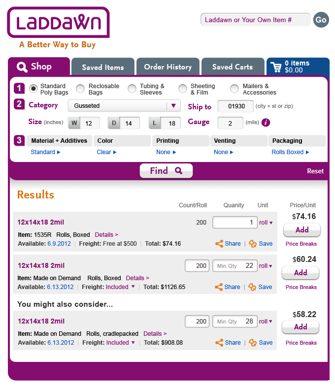
- Only outstanding change is today's decision on full gauge indicator for individual results; to handle this the way we handle other customizations, that is, to insert a line below the item line: "Gauge: Full" ("Details" should be moved down to the end of this new line.) After making the change to the PSD, please embed a .png here.
| "i" gauge - Full Gauge - Round 7 |
|---|
 |
8/13 Round VI, search results and gauge (based on consolidated feedback) + 8/14 feedback
Scenario 1
- Use of color for various elements. See comments in table below. Try orange for Cradlepacked? More importantly, what about our uses of color for links and highlights overall? Previously, we had discussed semantic use of color with Corey, for a variety of reasons we abandoned some of their color choices, though I think we always liked the idea of colors being based on semantic logic. I am wondering if we should limit orange to icons and static highlights, and purple and blue to clickable items - and even then, what is the rationale behind choosing blue for some things (e.g. availability date) v. purple (Details, price breaks, etc.)? I am not suggesting I want all the links to be the same color; I think that would be too monochromatic and a "foolish consistency." But I am just trying to be sure there is some semantic logic underlying our choices. Note, if we go along with what I suggest about the use of orange, we'd have to change all of the buttons that currently use an orange font. If you don't think this change is necessary, tell us why the status quo works.
From Steve, 8/14 -Here's my view on colors. I try to design my color patterns based on context. Too much of one color in an area, then we add another. But there has to be a limit or things start harm your eye vs. helping it. Here's how I break up the use of colors in Shop:
Orange - Ideally used as an accent color. For occasional headers where the page needs a splash of color or for icons. I also use it for simple common buttons. Buttons that we really want to pop, I use the purple.
Blue - The primary link color. All common clickable interactions use the blue.
Purple - a secondary link option. Too avoid the "sea of links/link farms" look of having a ton of blue links, I used the purple to call out simple alternative links like "price break" and "Details" I also use the purple for all dropdowns.
I thought making the cradlepacked purple was to make it a linked shadowbox? I didn't realize you just wanted to highlight it. Here's where the context part comes in. That area is jam packed with linked and unlinked data. Your best bet would be to make it bold and bring the color back to black. It will stand out better than adding a 4th color. - SB, 8/13
SOLD! Let's make Cradlepacked black and italicized (not bold) and keep all the other colors the same.
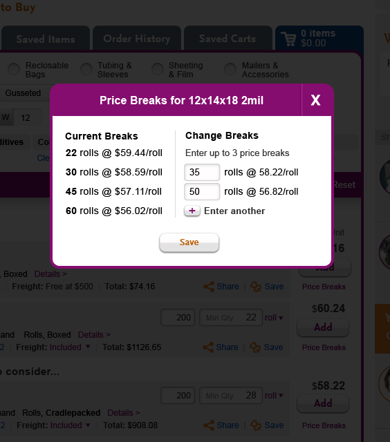
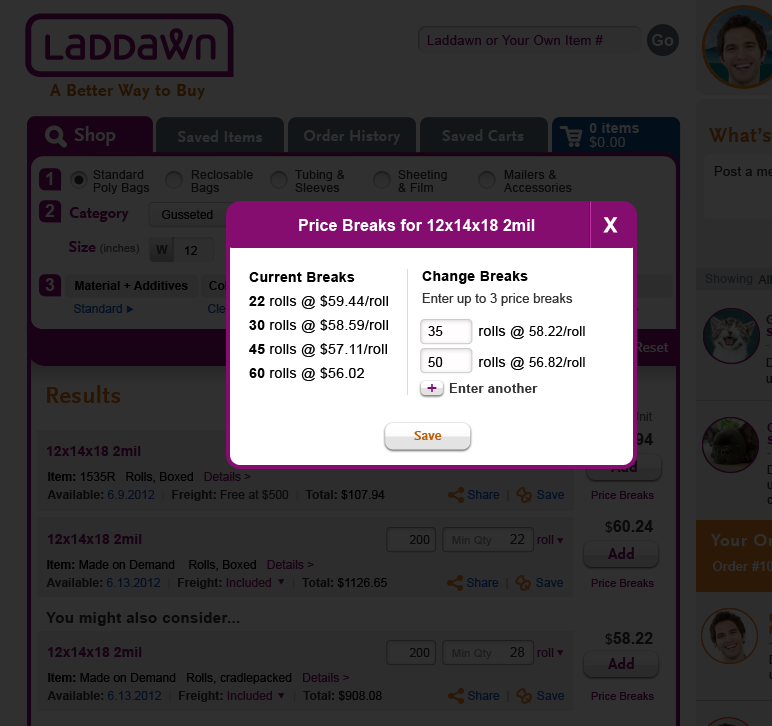
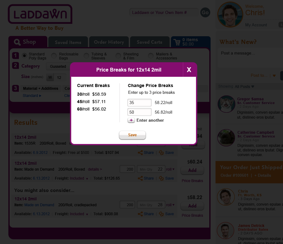
Price break shadow boxes
- See comments on price alignment for both stock and MOD.
We are satisfied with your last iteration of MOD shadow box, and we prefer the horizontal version for stock. The only change is to remove the period after Qty and center it over Price, after those changes you should be able to make the Cart versions of these, and we can cross these off both lists. - See request for B-version of stock price breaks.
Scenarios 2 and 3 - all set! 
Except...
Changes to color of links based on discussion above about consistent, semantic use of color.
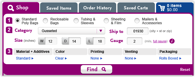
Gauge
- Hover and shadow box all set (note - we'll need to change the verbiage in the future, but specific edits not known at this time).
- Breadcrumb - needs work
; see comments and suggestions in table below. Andyes, we think we need a full gauge indicator in search results. See suggestion in table below - we are open to other ideas. Perhaps you can modify scenario 1 to show this to us.
We want to see "(mils)" change to "(mils, full)"; full is in same gray font as mils, not clickable as it is in my paint experiment below. We would like an indicator in search results too - could be "full", "F", "FG", perhaps in smaller gray font, to right of mil in dimensions.
| Scenario 1 - Round 6 | Scenario 1 - Round 6 - Price Breaks (MOD) | Scenario 1 - Round 6 - Price Breaks (Stock) |
|---|---|---|
 |  |  |
| "i" gauge - Full Gauge Breadcrumb (Option A) | "i" gauge - Full Gauge Breadcrumb (Option B) | |
 |  |
8/12 - Round V revisions from Steve + feedback
| Scenario 1 - Round 5 | Scenario 1 - Round 5 -Price Breaks (MOD) | Scenario 1 - Round 5 -Price Breaks (Stock - A) | Scenario 1 - Round 5 -Price Breaks (Stock - B) |
|---|---|---|---|
This is exactly what we requested. However, I now wonder if purple has been a poor choice all along for highlighting the YMAC difference. We're using purple and blue (and orange in other contexts) for clickable or actionable items. Do we introduce a fourth color as a highlight? Is there no method to our madness? (I.e., I think I've lost sight of why blue in some situations, purple in others, and orange in others, if there ever were reasons - do we need to rationalize these decisions?) Also, another oversight I just realized (ugh) - since we've just decided not to do "eaches" anymore, shouldn't we reduce the width of the quantity box? -SP, 8/13 The "Cradlepacked" highlight does not work for the reasons Susan details above. I don't see an obvious solution but agree we should review our use of color and see if come up with a rational that will work. 8/13 JM I do not know if we have a whole lot of room to gain in the quantity field if we want to sometimes have the "Min Qty" displayed within. Maybe we can shed a few pixels - 8/13 JM OK, I guess that works. -SP Here's my view on colors. I try to design my color patterns based on context. Too much of one color in an area, then we add another. But there has to be a limit or things start harm your eye vs. helping it. Here's how I break up the use of colors in Shop: Orange - Ideally used as an accent color. For occasional headers where the page needs a splash of color or for icons. I also use it for simple common buttons. Buttons that we really want to pop, I use the purple. Blue - The primary link color. All common clickeable interactions use the blue. Purple - a secondary link option. Too avoid the "sea of links/link farms" look of having a ton of blue links, I used the purple to call out simple alternative links like "price break" and "Details" I also use the purple for all dropdowns. I thought making the cradlepacked purple was to make it a linked shadowbox? I didn't realize you just wanted to highlight it. Here's where the context part comes in. That area is jam packed with linked and unlinked data. Your best bet would be to make it bold and bring the color back to black. It will stand out better than adding a 4th color. - SB, 8/13 |
See Owen's comment to right. SP, 8/13 Version 2
I think I like the original much better. In smaller doses it reads as a sentence which is easier on the eyes. As you can see by breaking up the spaces by right aligning the data it becomes harder to digest. Also, it will leave some awkward breaks in horizontal space. - SB, 8/14 I agree with Steve. I think the original version is fine. But if you still prefer alignment horizontally and vertically, I think you need a table to align everything - @'s, quantities, etc.. SP, 8/14 |
OR - When Steve lists all 6 stock item breaks it becomes apparent that the prices are not aligned. That makes them harder to read. Could we right justify the pricing on each line? For that matter, perhaps the 3 breaks in MOD should be done the same way. 8/13 I agree with Owen. Might there be some products/breaks that have prices in the hundreds (or even thousands?). SP, 8/13 Agreed - JM 8/13 Version 2
This style starts to fall apart and in my opinion and awkward breaks occur. I think the best way to think about this would to use sentence style for price breaks of 3 or less and go to a traditional data table for all price break tables of 4 or more. - SB, 8/14 I agree with Steve. I think the original version is fine. But if you still prefer alignment horizontally and vertically, I think you need a table to align everything - @'s, quantities, etc.. SP, 8/14 |
This is the same as A; I think Steve forgot to upload B, I've requested it. -SP, 8/13 Sorry about that. It is fixed. - SB, 8/13 I still prefer this version. I am OK with MOD being vertical and stock being horizontal. They're actually quite different - one is editable, the other isn't. One is combinable, the other isn't. -SP, 8.14 I pushed the vertical version but I like this version as well. It is nice and neat. Small things but I would remove the period from the "Qty" header and center it on the column. JM 8/14 |
| Scenario 2 - Round 5 | Scenario 3 - Round 5 | "i" gauge - Hover | "i" gauge - Shadow box ("i" icon clicked) |
 |
OR - This works beautifully. I like that the Depth button is greyed out. It no longer looks as if 2 buttons are depressed, and it clearly looks deactivated. Nice. I also like that Steve has put in 2 size variables (12.5" and 2 mils) - it works. 8/13 Works for me. SP, 8/13 Agreed - JM 8/13 |
OR - Yes -although the text will need to be edited from the work done on gauge and compliance in September. 8/13 Agreed - JM 8/13 |
OR - Yes -although, again, the text will need to be edited from the work done on gauge and compliance in September. 8/13 Agreed JM 8/13 |
| "i" gauge - Full Gauge Breadcrumb | |||
OR - I don't think this works. Purple suggest a heading and calls an unreasonable amount of attention to it. Its placement (after the i) looks peculiar. Mre to do here, I think. 8/13 What about this? SP 8/13
How about (mils, full) or (mils, Full). Since it is the "gauge" field anyway do we need to restate it. Also, I might apply whatever treatment/color we use for YMAC differences. JM 8/13 I toyed with "mills, full" for the same reason, but it didn't read right to me. Since you bringit up though, let's try it that way. I don't think it should be the YMAC color, because I am assuming this is an actionable link. -SP, 8/13 |


8/10 - Round V revisions search results
Scenario 1
Please capitalize Cradlepacked and make purple.
MOD price breaks:
Looks good, but can you align the lines on the left with those on the right?
Stock price breaks:
Let's see shadow box for price breaks 2 ways:
- With breaks stacked vertically in a column, similar to the way MOD price breaks box is laid out.
- With breaks in a row as you originally laid it out - but please adjust the left alignment of the various elements; price sticking out on the left is a little funky.
Please make following additional changes to both variations:
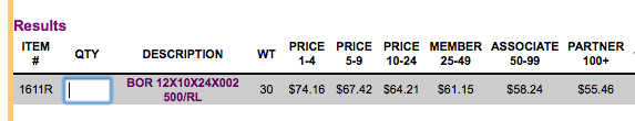
- Don't use different shading for the last three price breaks (though that was a good thought), and please remove the references to Member, Associate, Partner
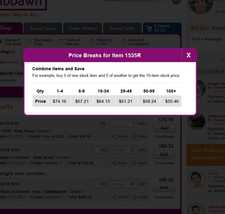
- Change box title to "Price Breaks for Item 1234"; put "Combine and Save" verbiage inside the shadow box, and tweak this verbiage to:
Combine Items and Save
For example, buy 5 of one stock item and 5 of another to get the 10-item stock price.
Scenario 2
Perfect except see comment on sort tool for Scenario 3
Scenario 3
Sort tool:
I like the idea of gauge being treated differently because sorting doesn't really do anything when the results are all the same gauge. However, Owen and Jim didn't feel that it was a big deal to have an indicator when something isn't truly sortable; if we do have such an indicator, they felt it should be more subtle. In your design, both width and gauge look depressed, and I guess I agree. I noticed you didn't include this treatment in Scenario 2, where it should apply (based on gauge being the only parameters). If you do come up with a treatment it should be consistent in both scenarios. Any way, if you can't come up with something better, we'd be fine if the buttons (for dimensions not being sorted on) went back to looking the same.
Headline and results content
The result content and "your search returned" headline are incorrect. See my comments under this scenario in table below.
8/10 - Round IV revisions from Steve + feedback
Susan, as for the size of the "Price Breaks" text, I reduced it to 11px (was 12px) and it seems to do the trick and make that right area with Price, add button and Price breaks all playing well togther. - SB 8/9 Awesome! - SP
| Scenario 1 - Round 4 | Scenario 1 - Round 4 -Price Breaks (MOD) | Scenario 1 - Round 4 -Price Breaks (Stock) |
|---|---|---|
 |  |  |
Looks good; very minor detail, should've caught sooner, pls capitalize Cradlepacked and make it purple. -SP Capitalize Cradlepacked and it is great --- JM | Looks good, SP I am a little conflicted about the functionality here. There are 2 ways to go. If you come to the screen with 3 price breaks recorded it could show all three price breaks on both sides with the ability to update the right side quantities and then hit save. You could also show no price breaks on the right and have them "enter another" for as many price breaks as they now want. I think I am liking option 2 better - what do you think? — JM
| I am curious as to what Owen and Jim think. I think we were envisioning the current Laddawn stock price break content reformatted vertically in a column to look like the mod price breaks - but I wasn't explicit about that. And now that I see it as a row, I wonder if it's helpful to users to have it remain horizontal b/c it's a familiar way to see it. Inconsistency with MOD price breaks may be OK since they both work very differently anyway. I don't think the verbiage (which comes from the catalog) works in this context. Owen? Also, I think the left alignment of the various elements needs work. -SP I'd like to see a vertical alignment, I think I'd like it better. I think I'd show then only as many breaks as they are eligible for. – An "A1" customer would see a row for 1-99 and a row for 100+. I also am not sure what the orange boxes are denoting - lets discuss? ---- JM
|
| Scenario 2 - Round 4 | Scenario 3 - Round 4 | |
 |  | |
| Looks good, other than how gauge is shown in sort widget (see comment on Scenario 3 >>>). -SP | FROM SP: I happen to like what you've done here with gauge (to indicate it's a dimension that was entered in widget, so won't change with sorting; shouldn't that also be done in scenario 2 though?). HOWEVER, a few critical things are missing from this scenario - the right headline verbiage and the results themselves; going waaaay back to instructions from 8/1, here is what we are looking for in scenario 3: (3) New search scenario - searches that have incomplete dimensions, and include one dimension we don't stock but we can make. Verbiage for heading: (MOD stamp that's been added since then) We can make 12.5" wide 2 mil gusseted polybags on demand. Enter complete dimensions for pricing and availability. You might also consider the following stock alternatives:Viewing 1-10 of 16 items... Follow with fake results for bags that are 12" wide (8 items, with varying depth, gauge and price) and 13" wide (8 items with varying depth, gauge and price) - Q: would you group these two widths under subheads for 12" and 13" or present as a continuous list? For this scenario, please incorporate the "sort by" menu and your pagination and viewing options (Items per page 10 | 20 | View All) from your last broad search iteration. Here is what you did before: From Steve:I mixed and match some different data to go with the fact the stock results were only 12 or 13 widths. ... I designed this as a continuous list. I think having the sort makes it very easy to scan without having to put up the visual roadblocks of explicit 12 and 13 sub headers.
| |
8/9 Round IV direction, search results
- For scenario 2, please restore the black font for the "Your search returned multiple..." headline; you changed it to gold on round 3, but we didn't request it; we had actually considered asking for that change, but group decided the black was better.
- Q: Is font size for price breaks links smallest it can be? (Can't tell if it is same as or larger than the font size used for text within the gray box.) Making it smaller might make it seem less crowded on the right (people want to keep the round 3 vertical spacing.)
- Revised blurb to appear to right of Made on Demand stamp: "We can make 2 mil gusseted polybags on demand. Enter complete dimensions for pricing and availability." *Remember to note in requirements: This "fill in the blank" will be the first completed dimension in a hierarchy TBD + product category. Note that this blurb will apply to both custom made and custom sourced items (Marketplace).
- Please capitalize "Details >"
- In MOD price breaks shadow box, please delete "price" from "Change Price Breaks" per Owen's feedback below.
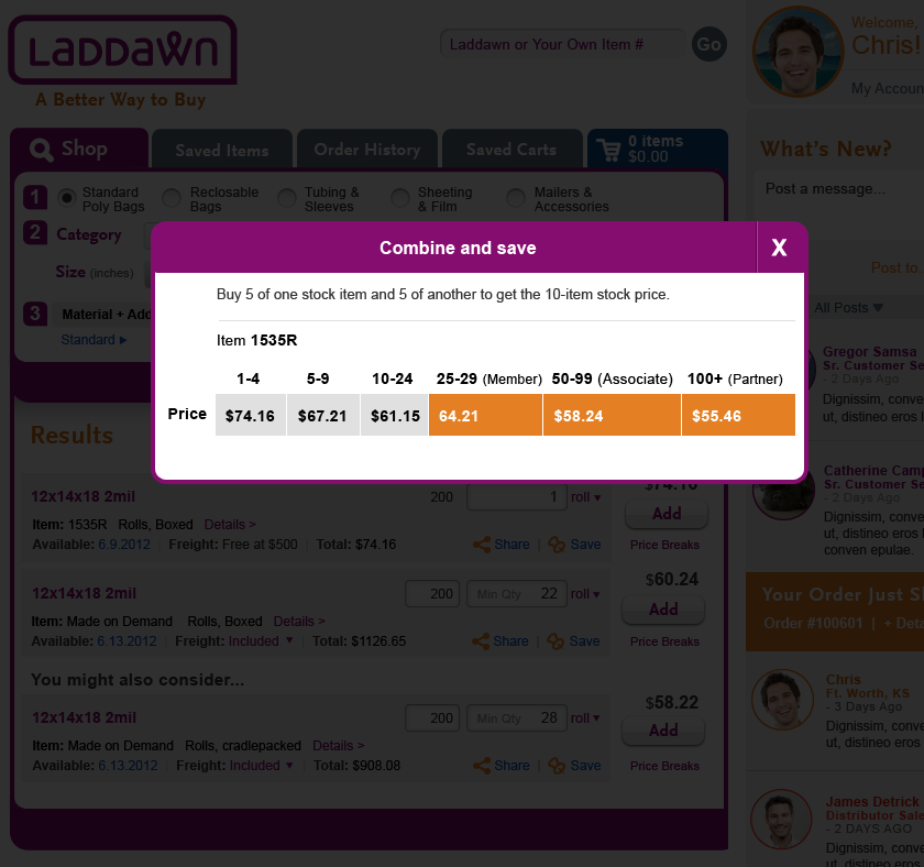
- Here is the text we'd like for stock price breaks shadow box. For content, refer to screenshot from current site.
Combine and save
Buy 5 of one stock item and 5 of another to get the 10-item stock price.
Make the stock shadow box and all of the above changes for scenarios 1, 2 and 3 and we should be able to call it a day.
8/7 - Revisions from Steve, based round III feedback
All Items on Scenario 1 Round 3 have been addressed from 8/7 list - SB 8/7
| Scenario 1 - Round 3 | Scenario 1 - Round 3 Shadowbox |
|---|---|
OR - I'll sleep better knowing that Reset has found it's place on the right. (It doesn't bother me that it's not underlined.) (8/8) |
OR - I dont' think we need "Change Price Breaks", "Change Breaks" will do. (8/8) |


Scenario 2, revision 3
My two cents (SP, 8/8)
- Unit price, add button and price breaks stack seems crowded; restore original spacing between product headline and item line? (A: No.) Q: Is font size smallest it can be? (Can't tell if it is same as or larger than the font size used within the gray box.)
- Changed "Your search returned..." to gold; we actually preferred this as black text.
- Revise blurb(?) - "
We make 2 mill gusseted bags on demand, too. Enter additional dimensions for specific item pricing.
We also make gusseted bags on demand. Please enter complete dimensions above to see pricing
We can make 2 mil gusseted polybags to your specifications. Please enter additional dimensions above to see pricing and availability. (Additional, or complete? Additional suggests to me that entering incomplete dimensions will still produce a MOD result.) - Capitalize "Details"?
8/7 Search results, round III
Ladd, Dawn, Owen, Jim and Susan met and discussed scenarios 1 and 2 below - overall we are quite pleased with how this is coming out. Here are our changes:
- A little off topic, but we'd like to downplay the "Reset" link in the widget. Please remove the underline. Also, can we move it over to the right? Open to other ideas.
- "We make this ..." Majority preferred the stamp. Please change text within stamp to "Made on Demand." For scenario 2, please add "stock" to the blurb:
Your search returned multiple stock matches
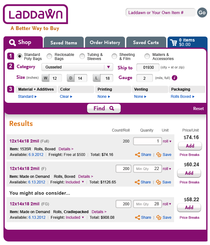
- In prior comments we asked you to remove "Rolls" from item line (Rolls, 200/roll, boxed). You made this change in scenario 1, but not in scenario 2. In any case, we changed our mind about what to remove - please remove "200/roll" instead - so the line should now read "Rolls, boxed" - in all scenarios.
- Alignment - thank you for making count/roll, quantity, and unit on the right align horizontally with item row on the left, in Scenario 1, per our request. Seeing it in comparison to scenario 2 (which uses your original alignment - count etc. lines up with product headline) we've decided we prefer your original alignment. Please apply this to all scenarios going forward - however, please shrink the vertical distance between the result headline and the next row slightly (20%?). We like that extra vertical space for scannability, but we'd like to gain a little bit back.
- Tabs - thank you removing the icons from the tabs in both scenarios. Also, thank you for changing Tagged Items to Saved Items in scenario 1- however it's still Tagged Items in scenario 2. Can you fix that?
- We will go with the shadow box approach for price breaks, with a couple of tweaks -
- Please insert a line under "Current price breaks" for the current quantity - for any scenarios illustrated, assume it's the minimum quantity. Please treat it as though it is another price break.
- Price break content should be: "30 rolls @ $xx.xx/roll" (note, if user has changed unit to "Thousand" - we'd use K, not M as the abbreviation - 31.0 K rolls @ $XX.xx/K)
OR - Question: Should we move away from K (or M) to Thous (or something similar)? I worry that our customers (and internal users) have used M for decades and I don't know if M is somehow accepted in some corners of our industry. Will they get "K"? Going to something like 'Thous" our ",000" might be more helpful in the long run. (8/8) - ALSO: We decided to override a longstanding prior decision not to include price breaks for stock items. So, every search result should include a price breaks link below the "Add" button. Although we'd like the shadow box for stock price breaks to be somewhat similar to that for MOD price breaks, price breaks for stock are a bit different than those for MOD. They are not editable, they are only served to a subset of customers who qualify for them (based on total annual purchases), and they are cumulative - i.e., if I have 3 different stock items in my cart, totaling 8 in quantity, I get the "5-9" price break for all of those items. Here is some sample content from current site:
Although the "cumulativity" doesn't come into play at the search results stage, we'd like to see a brief explanatory message in the shadow box, alongside the breaks:
Combine and save
Buy 5 of one item and 5 of another to get the 10-item price.

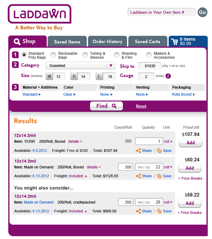
- Scenario 1 - results are gusseted - please add depth to the product headline, dimensions in widget are 12 x 14 x 18 (or change the search to layflat category
 ).
). - Last but not least - we reviewed the current Cart design, in light of all of these changes to search results. We think most of the design still holds up (its layout differs from search results layout by necessity), but we identified some tweaks which are logged on the Cart design to do list page.
8/5 -Revised search result scenarios
Scenario 1
(SB) - Susan,Owen, Jim, here is the design with your requests addressed. I was able to shave 10 more pixel off vertically. A couple notes:
a. one of the reasons I kept extra space between the Quantity entry field and the Share/Save functionality is for the "Update" link. Have we decided how that's going to be handled? I think it needs to be considered before we tighten up these lines any more.
Good point - I think I neglected to tell you that after seeing Neptune's version of the Cart, we decided to go for the simplest approach for now, which is the user puts cursor in the field, it highlights, then they hit return or click out, and the updates just happen without any special link or prompt. -SP, 8/5
Excellent. I think that was the best choice you could make for updating the data. - SB, 8/6
Although I am glad we shaved width here and there to allow the count/quantity/unit to align with the item row, I think I prefer these fields up on the product headline line instead (the way Steve did it originally). -SP, 8/6
b. I know we are trying to condense more horizontal space and making those changes above have helped but I think we would need even more to add an "expand" icon to "price breaks". I used the text version for now and think that might be the best option based on the limited vertical space between the "Add" button.
Thanks, I have a hunch we may go for a shadow box instead. -SP, 8/5
I think the shadow box approach looks pretty good. I also don't think it is going to be easy to expand price breaks within the page in an elegant way; JM 8/6
I like the price breaks in a shadow box -Ladd, 8/6
c. Although 1 idea I did have to save us more horizontal space is to remove the details shadow box link and make the item number a link. I did a sample under the YMAC (Made on Demand is a blue link) and clicking on "MAde on Demand" would show the shadowbox details...
This is a good thought, and yet - Although I think it might be intuitive in the case of an item number, I am not sure it would be intuitive in the case of the words "Made on Demand." -SP, 8/5
I think "details" is necessary in place of highlighting. -Ladd, 8/6
I'd love to get rid of "details" but it feels fairly easy to miss the "item number" link; I would stick with the "details" link unless we confirm that we have space limitations - JM 8/6
| Price breaks expanded | Price Breaks Shadowbox | ||
|
|  |
Scenario 2
I created 3 design options for your review and attempted to make the MOD messaging a bit more subtle SB, 8/6.
Design 1 - pushed the message off to the right and created an orange alert icon to make the message pop just a little. I did try a version that Susan mocked up below, but even a reduced orange block you're just goes right to it. That is why I went with the smaller icon. The content still balance out well when moving the message off to the right.
Design 2 - This is my Google paid ad version. A soft background color and the message with the rest of the content following below. I think this works as a nice visual disruptor but it doesn't dominate the page. Then I tried to make the "Your search returned...." header a bit stronger with the orange header color.
Design 3 - The idea here is to create a small "sticker" that Laddawn could brand as their way to promote the MOD business. When you mix this small sticker idea with normal text I think its visible but doesn't overwhelm and dominate the eye on the page.
I am unable to launch high def images of the "We Make This" options, but I am graphically inclined to the sticker version in low res. But that might be because it's the only thing that stands out. Nevertheless, I do have some concern that "We Make This" is too literal for Marketplace items, and I think we'll want to use the same language in both cases. Maybe "We can make" was already too much. "We can provide" is pretty weak, though. - Ladd, 8/6
Scenario 2 - Round 3
 |  |  |
|---|
Scenario 3
(Steve, insert scenario 3 pics and comments here.)
8/4 Search results, round II
Over the course of the last few days, Steve emailed us the three scenarios (embedded below with original 8/1 assignment). This is our combined feedback.
Scenario 1:
In the original Paint mockup, we tried to align the count/roll, qty, and unit with the item/presentation row. We can see that without some tweaks to the original content and design, that's not possible, which is probably why you have it aligned with the purple product headline. We propose the following changes in order to achieve the desired horizontal alignment of content:
- Remove the first "Rolls" (Case, etc.) from ""Rolls, 200/Roll,...."; in hindsight it seems redundant and unnecessary. (And yes, "cradlepacked" is probably the longest word that will appear in that slot.)
- Reduce the width of the editable count per roll field for MOD items; the most it will ever be is about 4 figures (perhaps in rare instances 5 figures; never 6 figures which it appears to accommodate currently).
In answer to some of your other questions:
- We do want details like printing to display. This content will only exist when the user has taken the trouble to enter full dimensions and customizations, in which case there will only be 1-2 results and 1 YMAC; so we imagine seeing it is preferable to a clean look.
- Price breaks, expanded version - we might want to see it two ways:
- As an expansion (with + icon) squeezed into the right column under the add button, with the same "change price breaks" link spawning the same series of shadow boxes as before (change one break at a time). With changes proposed above, might there be room to widen this column a teeny bit?
- An "all in one" shadow box - displays standard price breaks, with quantity fields that are editable in place. We're just not sure how this will fly with Ladd and others, as we recall debating this option before and for whatever reason we went with the 2-step approach.
- Min qty added to entry field - this seems like a good idea, except, we may decide we don't need that field to be as wide as it is currently (it's that wide now to accommodate quantity by "eaches"). Leave as is for now.
Scenario 2:
- We really like the sort mechanism you came up with.
- All relevant dimensions should be included in the product headline, so with a gusseted scenario, include depth.
- We agree that the "we can make it on demand" message needs to be something other than black text on white background, and that the text needs to be broken up somehow, but we also don't want to call as much attention to it as you have done here with the orange block and exclamation point. Laddawn is walking a fine line here; they definitely want customers to know about the MOD capabilities, but if the stock offering would meet the customer's needs just as well, that's what they prefer to sell. Here are some somewhat contradictory thoughts from Jim and me.
- Jim:
I have been thinking about leading with a "Results" header, I think it would be helpful but maybe it is just chewing up precious real estate...? I do like the concept of a "You Should Know we can make things if you want to tell us a little more." I think the orange box should go in favor of some noticeable language that is slightly larger than the text below and maybe a color. I might move the "Your search returned multiple results" line below the "You should know". - Susan mocked something up, but is probably still calling too much attention to the "we can make it.." message; we offer it only to open up some creative possibilities:
I was envisioning this reduced orange block with the exclamation point removed, perhaps replaced with a little light bulb (or not), and some "You should know" or "By the way, we can ..." verbiage tacked on at the beginning. It could also maybe appear in more of a square format off to the right of the other verbiage above the results.

- Jim:
Scenario 3:
With the changes noted for the base design in Scenario 1, Scenario 3 is fine - except for the gauge issue noted in an email (please change gauge in widget to "All" (or change all gauges in results to 2). Q: Let's say the user had entered a width of 12.5 and 2 mil gauge - should the gauge tab in the sort mechanism be gray and/or static (because all results are 2 mil?)
8/1 Search results
We were quite pleased with the three states you produced for broad searches. However, this sparked debate about a variety of issues (searches with few results in spite of the search technically being "broad"; broad, incomplete searches with no exact matches, etc.). At the end we concluded we should eliminate the extra "select" step from broad searches, and more importantly, strive for a single design for all search results, whether the inputs are narrow or broad. We revisited the design for "normal" search results, and experimented with a more scannable layout that would work well whether there are as few as 2-3 results or pages of results.
We would like you to fine tune the crude Paint design below. Although we welcome your input as always, please note that relative font sizes and weights are deliberate and reflect a desired hierarchy and flow of information. ALSO: You might as well complete the save icons assignment (use the pin icon, remove icons from the 3 inner tabs) before handing this in.
We would like the "Filter by" menu to be a "Sort by" menu with the following choices:
- Width: small to large
- Depth: small to large
- Length: small to large
- Gauge: small to large
- Price: low to high
Extra credit if you can think of a clean alternative to the drop list that also accommodates large to small, high to low sorting for each of those attributes - we don't think we want a drop list with 10 rows for sorting.
We'd like to see 3 scenarios using the fine-tuned design:
(1) "Normal" results (user has entered all dimensions, search produces 1 exact stock, 1 exact MOD, 1 YMAC), using the same results scenario as before. Obviously, Paint image above doesn't address expandable price breaks for MOD, or subhead for "You might also consider." Please incorporate those elements; we'd like to try having the price breaks appear below the "Add" button in the right column.
Do not include the Sort by menu in this scenario.
From Steve:
Here's is 1st crack at a new search results look that handles all forms.
(1) "Normal" results (user has entered all dimensions, search produces 1 exact stock, 1 exact MOD, 1 YMAC), using the same results scenario as before. Obviously, Paint image above doesn't address expandable price breaks for MOD, or subhead for "You might also consider." Please incorporate those elements; we'd like to try having the price breaks appear below the "Add" button in the right column.
I think this works and a couple notes/questions before I move forward to scenarios 2 & 3:
a. Have some concerns about the horizontal spacing, the item/Rolls line in particular. as you can see in the YMAC example, things start to get tight when the option is "cradlepacked." Is that the largest word used for that line? I'm trying to see what's the farthest to the right that line could push?
b. I moved MIn Qty into the entry field for MOD items. I'm pretty sure this is doable and would clean up the space a bit more.
c. Price Breaks: I like it moved over under the "Add" button but did not add an expand icon to it. I was thinking at this point the whole interaction would move to a shadowbox. It would be pretty strange to expand the gray box to the left to fit the price break data. Unless you had something different in mind?
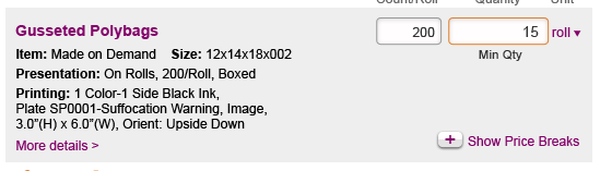
d. In some of our previous scenarios we had included Printing into the search results (here's the sample data used and I included a .png of this as a sample - "Printing: 1 Color-1 Side Black Ink,Plate SP0001-Suffocation Warning, Image,3.0”(H) x 6.0”(W), Orient: Upside Down"). Is the expectation the same as before? This data shows up in the main search result box or do we want to keep this initial look clean and push that type of data into the Detail link exclusively?
 |  |
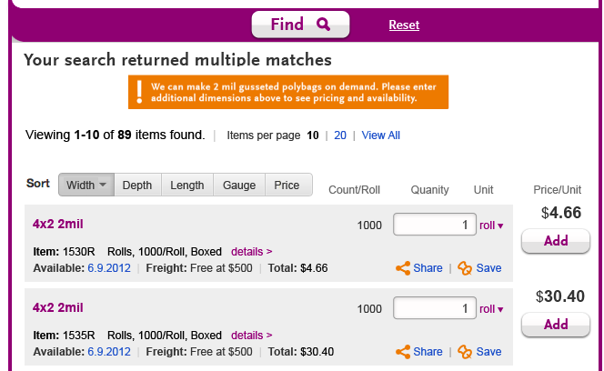
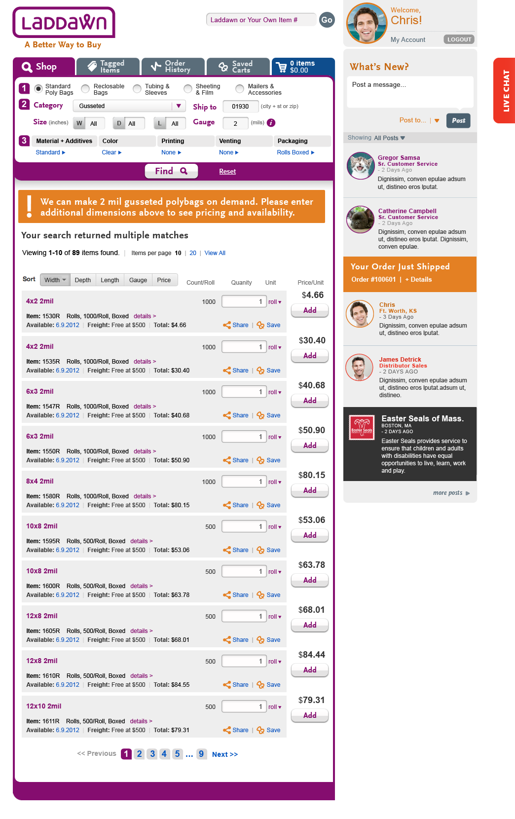
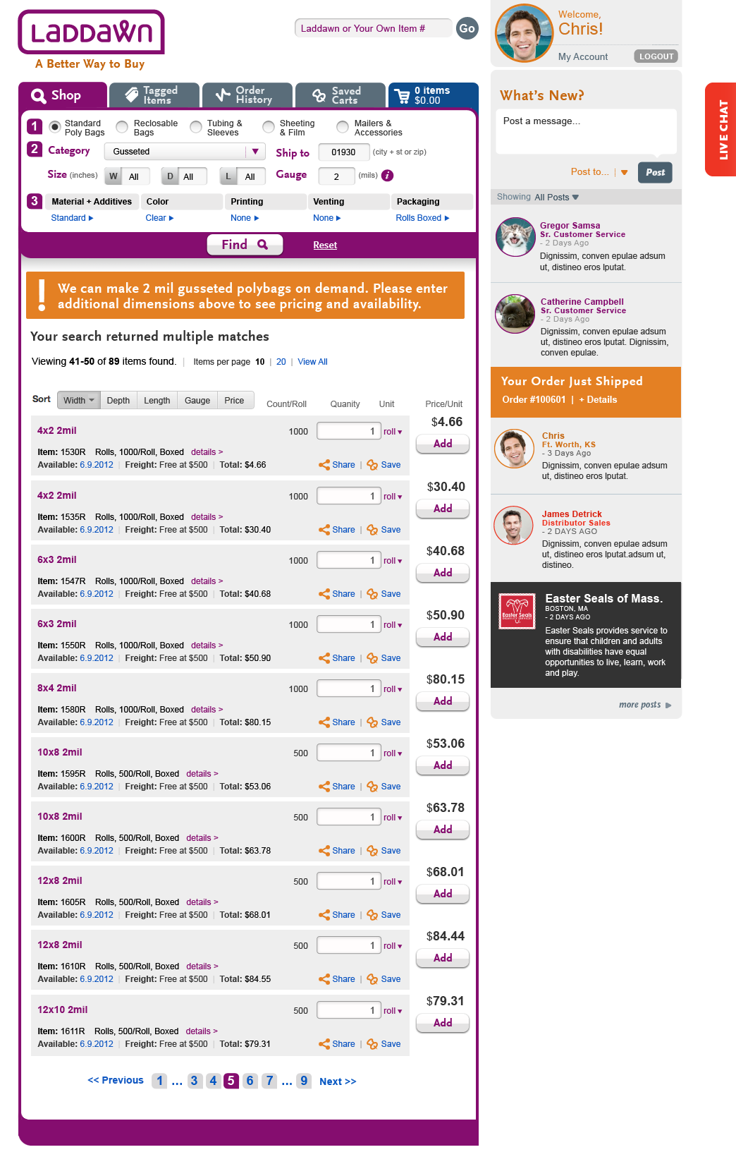
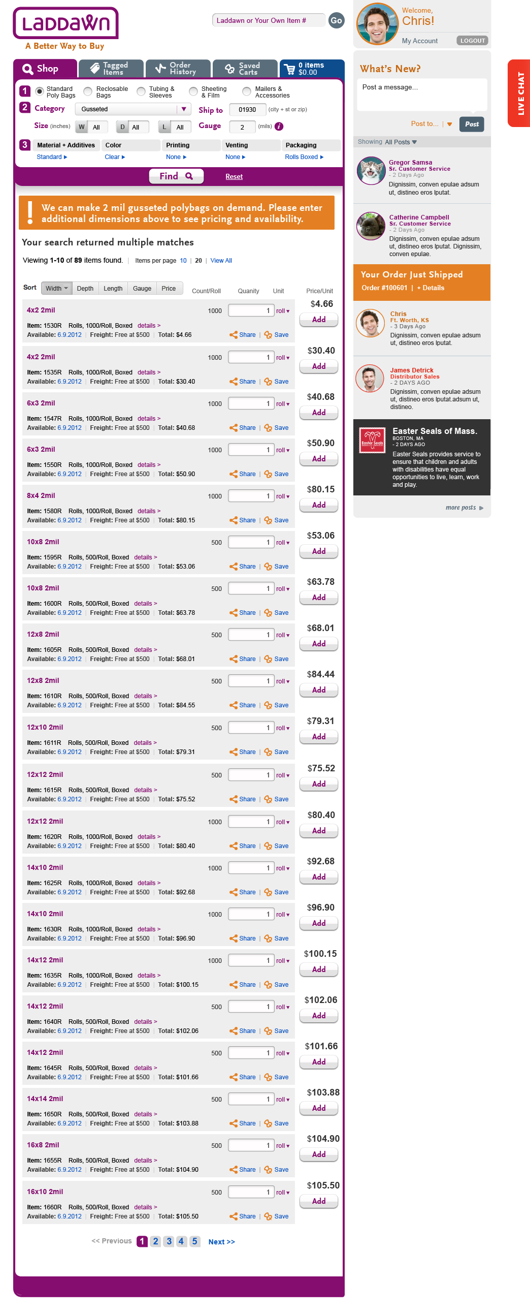
(2) Broad search, using the same broad results scenario as before. Please also add the following verbiage to the heading of the original broad search scenario (all 3 states):
We can make 2 mil gusseted polybags on demand. Please enter additional dimensions above to see pricing and availability.
Your search returned multiple stock matches
Viewing 1-10 of 89 items found ...
For this scenario, please incorporate the "sort by" menu and your pagination and viewing options (Items per page 10 | 20 | View All) from your last broad search iteration.
From Steve:
Here is scenario 2 for the new search results look. A few notes on the design:
a. I wanted to mention this in the last design I sent you, but I noticed that depth was not included in your sample design on the wiki. Should I include that? Right now I am following your sample which just had width and length.
b. The "We can make 2 mil polybag" message I called out in an orange block to make it more prominent but it also helps breaks up the multiple lines of text which I think may be tough to view if we used black on white text.
c. I used a "Kayak.com" style sort which can give you the ascending/descending options you are looking for. Once a sort control is clicked, you re-click to change the order (a toggle).
 |  |  |
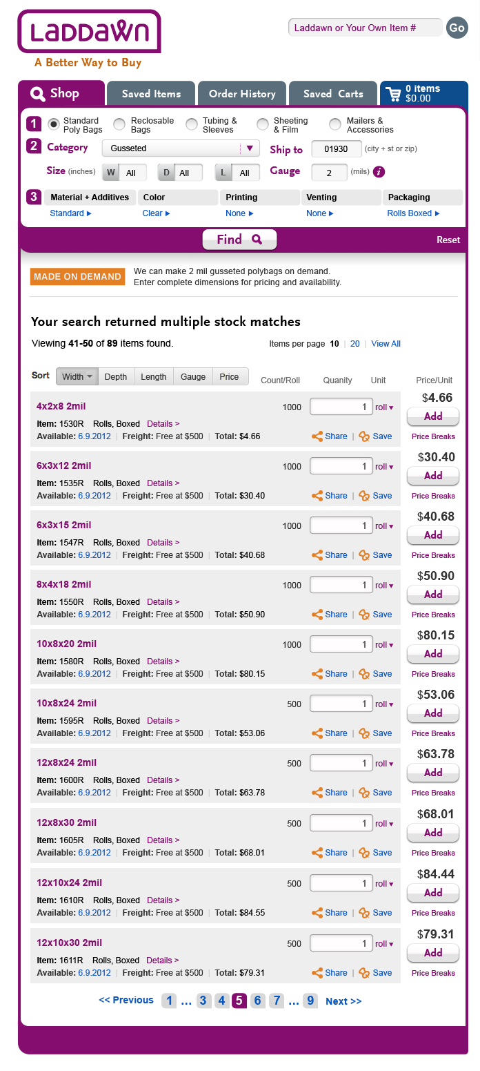
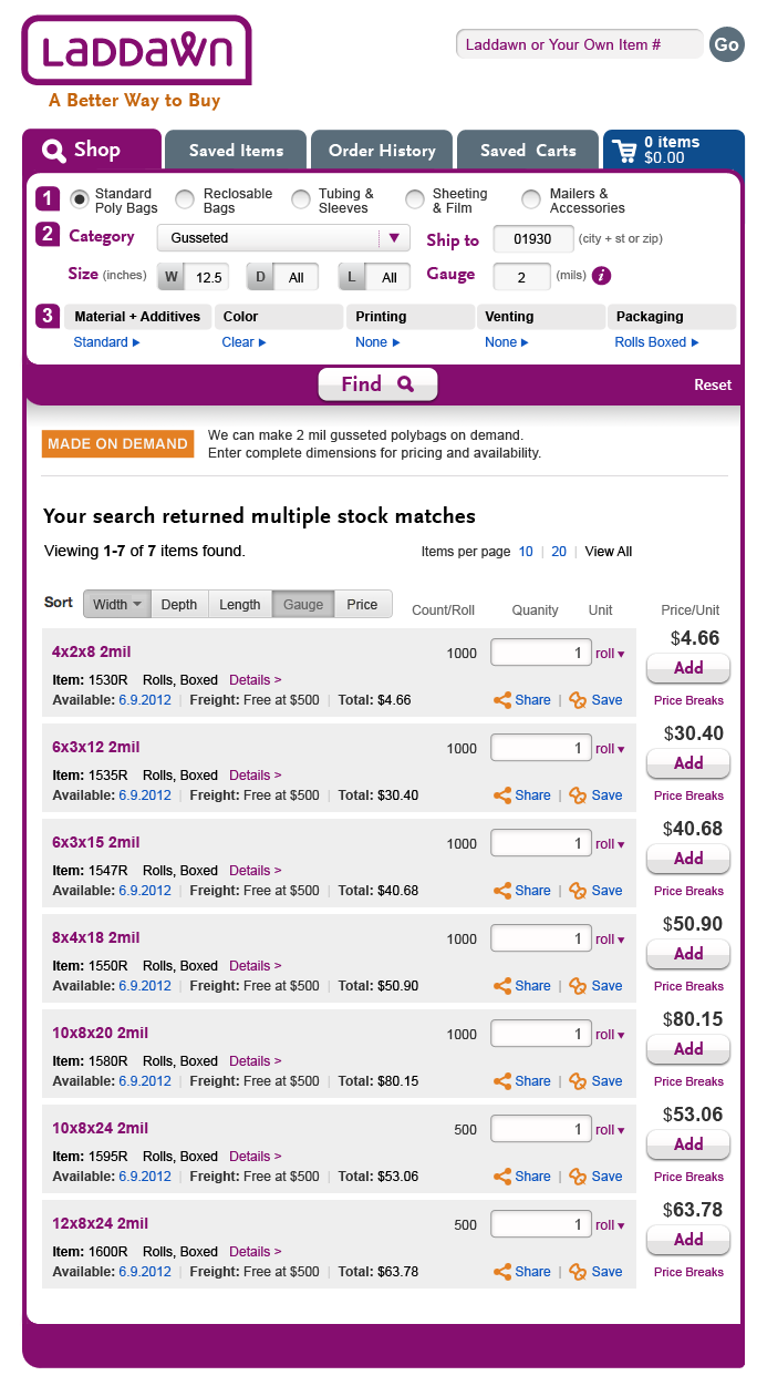
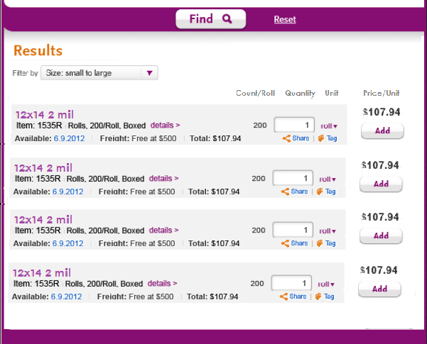
(3) New search scenario - searches that have incomplete dimensions, and include one dimension we don't stock but we can make. Verbiage for heading:
We can make 12.5" wide layflat polybags on demand. Please enter additional dimensions above to see pricing and availability.
You might also consider the following stock alternatives:
Viewing 1-10 of 16 items...
Follow with fake results for bags that are 12" wide (8 items, with varying depth, gauge and price) and 13" wide (8 items with varying depth, gauge and price) - Q: would you group these two widths under subheads for 12" and 13" or present as a continuous list?
For this scenario, please incorporate the "sort by" menu and your pagination and viewing options (Items per page 10 | 20 | View All) from your last broad search iteration.
From Steve:
I mixed and match some different data to go with the fact the stock results were only 12 or 13 widths. ... I designed this as a continuous list. I think having the sort makes it very easy to scan without having to put up the visual roadblocks of explicit 12 and 13 sub headers.
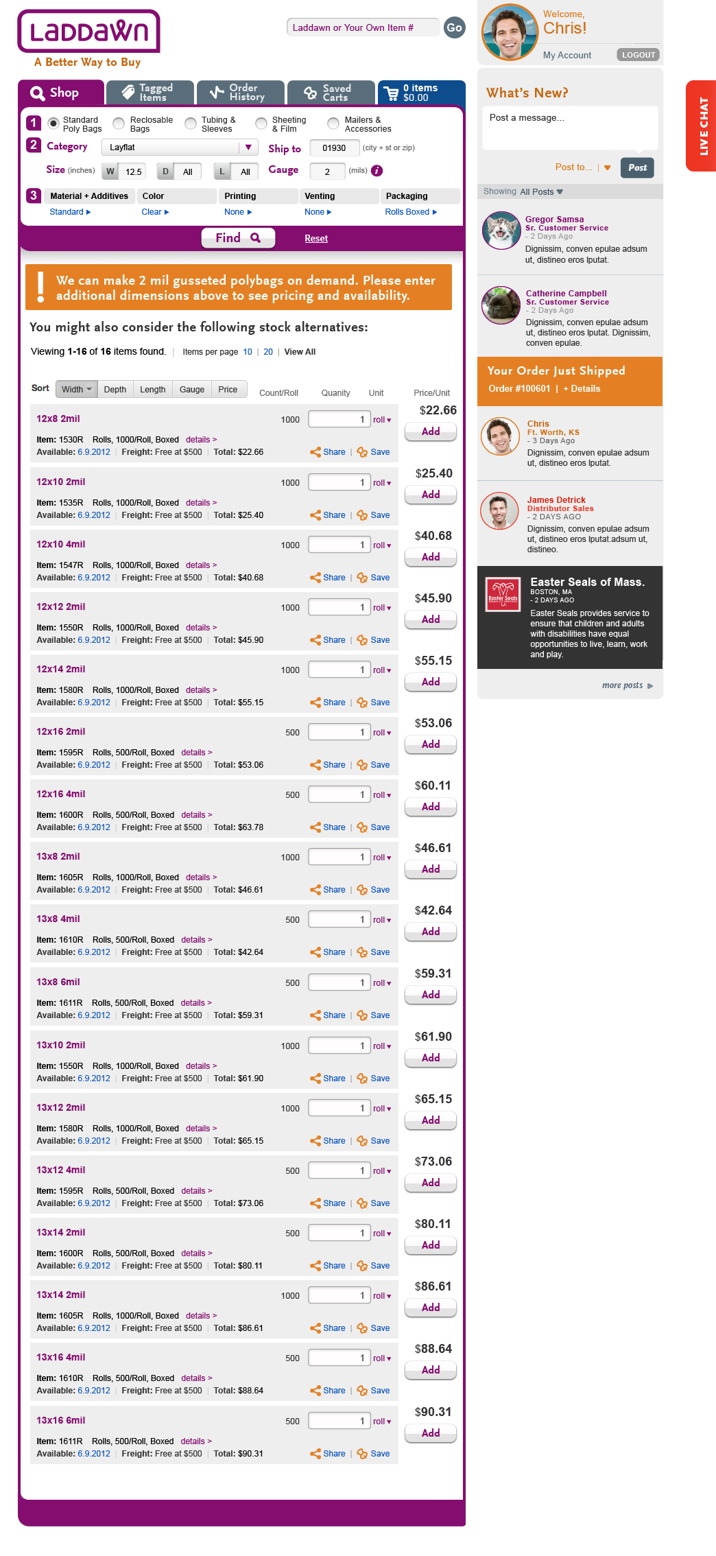
7/26, "Tagging" has been changed to "Saving" first round done, new iteration logged on save icons page
See Saved items tab page. All references to tagging on cart pages need to be replaced with new Saving icon + text "Save" - we also need that icon/text to show in all instances of the tab formerly known as Tagged items.
7/12 - Hover effect and shadow box for "i" / gauge - almost done (images uploaded to Shop page), just need breadcrumb
- When user mouses over the "i' to the right of gauge, we would like a hover effect with the following text:
"Gauges of 1 Mil and above are nominal. Click “i” to learn more about full and nominal gauge."
- When the user clicks "i", a shadow box opens:
Heading: You should know
Body:
Gauges of 1 Mil and above are nominal. Configurations are calculated with a standard gauge variation according to industry specification A-A-3174.
Opaque film less than 2.9 Mil, non slip film less than 1.1 Mil, Milspec antistat film less than 4.4 Mil, and VCI film less than 2 Mil are run full gauge.
All plastic films contain gauge variations as a consequence of the extrusion process. Full gauge films increase the overall thickness of the film, but do not eliminate gauge variations.
Check this box to select full gauge
Note - I don't know if a check box is the answer; please use your best judgment about how to present this choice to the user and how to close out of the shadow box, with or without having selected full gauge.
Something we haven't thought of and could use your help with - I will ask Owen too - If the user opts for full gauge, I assume we need to "play that back" in the shop widget as a breadcrumb. How might you do that?
7/5 - We are going to need shadow boxes for each of the "3. Add" menus:
We're going to need up to several variants for each product category; but let's start with bags, and see if that's sufficient for UI and programming purposes.
Source: Grouping 1: Standard Poly Bags
Material + Additives
All current options are to be available. The shadow box will present 2-3 rounds of questions (as provided now on the current site). LLD, Postal Approved, Antistatic, VCI, Clarity, Non-Slip, Non-Scratch…then, Metallocene, AntiBlock, High Slip UVI/UVA.
Current list:
| (A) Next set of choices, if "Standard" selected | Next set of choices, if "LLD" selected | Next set of choices, if "Anti-Static" selected | Next set of choices, if "Postal Approved" selected | Next set of choices, if "VCI" selected
| Next set of choices, if "Clarity" selected | Next set of choices, if "Non Slip" selected | Next set of choices, if "Non Scratch" selected |
Please add to the list above:
Upon selection of either PP or HDPE, no other Material & Additives options will be allowed. | 1. None: end M&A 2. Metallocene:
2a. Metallocene, after %:
3. Anti Block
3a. Repeat step 2+ 2a above if metallocene chosen 3b. Repeat step 5+5b if UVI/UVA chosen 4. High slip - same as 3 above 5. UVI/UVA
5b. UVI/UVA
|
Repeat Additives series (col. A)
|
Whether
... are chosen, show these choices next
3. If Std Low Density chosen, show these choices next:
3a. If mil spec chosen, show this smaller subset of Additives:
3b. If other pct is chosen, show this:
3c. After entering pct, show these Additives:
| Limited additives:
| Additives - same as A, minus high slip.
| Additives - limited list:
| Additives - limited list:
| Additives limited list:
|


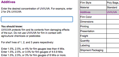
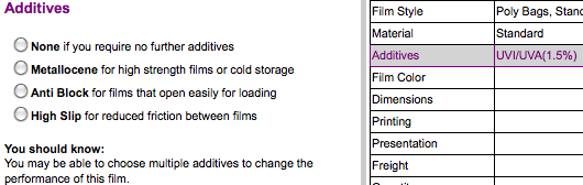

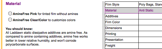
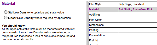
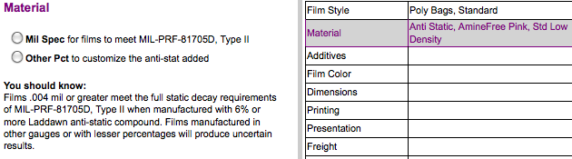

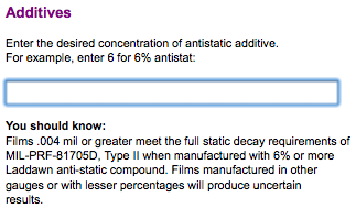

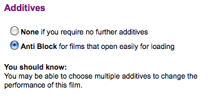
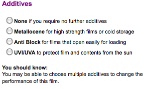


Color
The shadow box will reveal all the same color options (Light Green, Medium Blue, Red, Brown, Grey, Orange, Yellow, Black, Baby Blue, Sky Blue, White, Buff, Dark Green, Pink) and same strength options (Tint, Color, Opaque for Black) as found on today's web site.
If Antistatic is selected, Pink will be the default color (but allow clear or any other color).
If VCI is selected, Sky Blue will be the default color (but allow clear or any other color).
For PP and HDPE, no color options will be allowed.
If modified, "Clear" will change to "Color, Level" (Red-Tint, for example). Some colors will have to be abbreviated, i.e. "Lt.Grn.,Color".
Printing
If bag size and film choice allows, the Random Repeat option is to be shown in a shadow box, otherwise "None" is the only option. (Clicking on "None" should generate a message that printing is not allowed for this configuration.) Current Random Repeat questions will apply here.
Printing will not be an option for either PP or HDPE (Materials & Options).
If modified, "None" will change to "Random Repeat".
Venting
Where the options allow, this shadow box will follow the same criteria and questions we have now – with the exception of "Standard Mattress Bag Venting".
Venting will not be allowed for PP or HDPE (Materials & Options).
If modified, "None" will change to "Standard", "Butterfly", or "Microperf".
Packaging
In this shadow box, there are 4 options: 1) Cases, 2) Rolls Boxed, 3) Rolls Cradle Packed, 4) In Cases, Polylined. (A caution will note that Polylined costs more.) Cradlepacked and Polylined will not be allowed for PP or HDPE. If modified, "Boxed" will change to "Rolls Boxed", "Cradlepacked", or "Cases Polylined".
Note on V-Board Options from 6/26 Meeting:
There is a narrow slice of the bags we offer that may be folded (through a V-Board). To address this, we decided to add Folded in Half as an option under Packaging - where that option is available. In the shadoe box, there will be 8 options - 1) Cases, 2) Folding in Half, in Cases, 3) Rolls Boxed, 4) Folded in Half, Rolls Boxed, 5) Rolls Cradle Packed, 6) Folded in Half, Rolls Cradlepacked, 7) Cases, Polylined, 8) Folded in Half, in Polylined Cases.
If modified, the abbreviated Packaging Options will change from "Cases" to "Rolls Boxed", "Folded, Rolls Boxed", "Cradlepacked", "Folded, Cradlepacked", "Cases, Polylined", "Folded, Cases, Polylined".
7/2 -For review, initial design for broad search results -
Direction for next iteration (7/27) - done, images uploaded and discussed, new iteration requested above (8/1)
(This direction supersedes any earlier feedback in table below that is contradictory.) After some discussion, we arrived at consensus that we should just do the view that you refer to as grid (but to us looks like a list), and not provide a choice. You can keep the width, depth, length, gauge and price columns sortable as you now show them. I think all the column heads should be bold though. Let's modify the content a bit, and remove the "Details" column; let's see if we can put the packaging type and count into a single line of description.
We like what you did with pagination, but upon further reflection would also like to give users the ability to override pagination and "show all" results on one page (or show results in fewer pages, more items per page than the initial default for pagination - thoughts?). Also, please show what the pagination ought to look like with greater than 5 pages of results - i.e., < previous 1 | 2 | 3 | 4 | 5 | ... | 97 | next > ?
Some examples:
Sierra Trading Post

Initial search, list view - 2 mil gusseted, all W-D-L | Showing sort categories | Grid view, new filter/sort mechanisms | User makes selection (1547R) | Updated search results - search parameters match 1547R (W-6, D-3, L-12) |
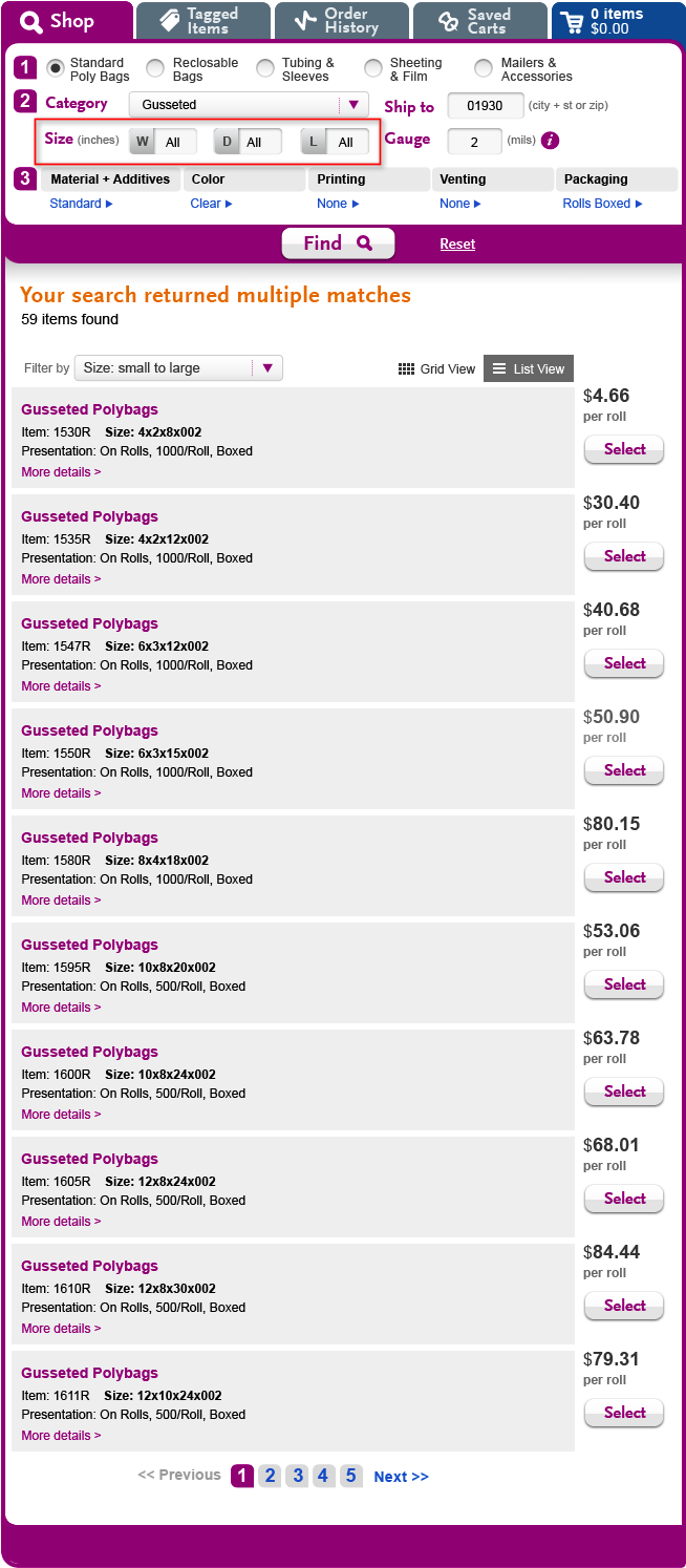 | 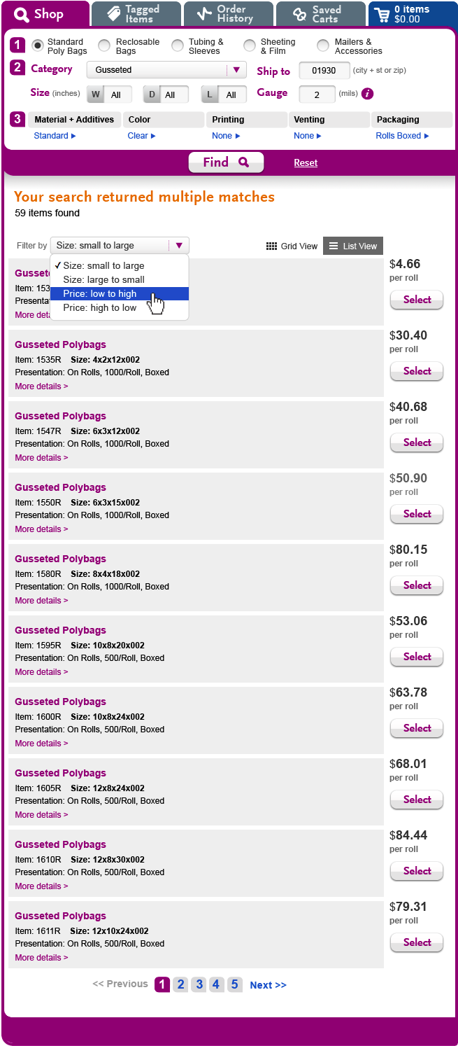 | 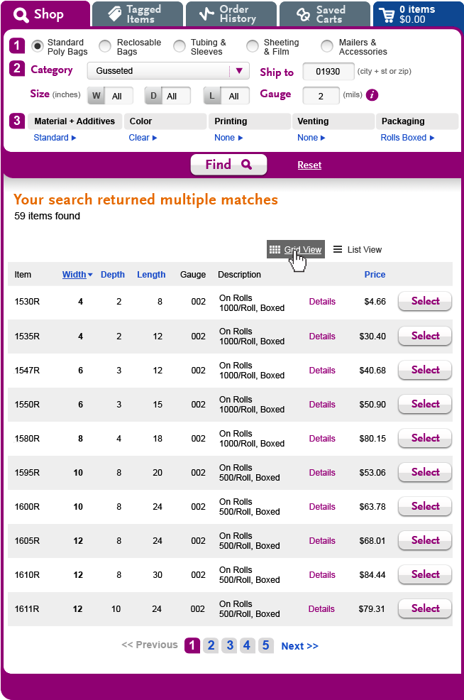 | 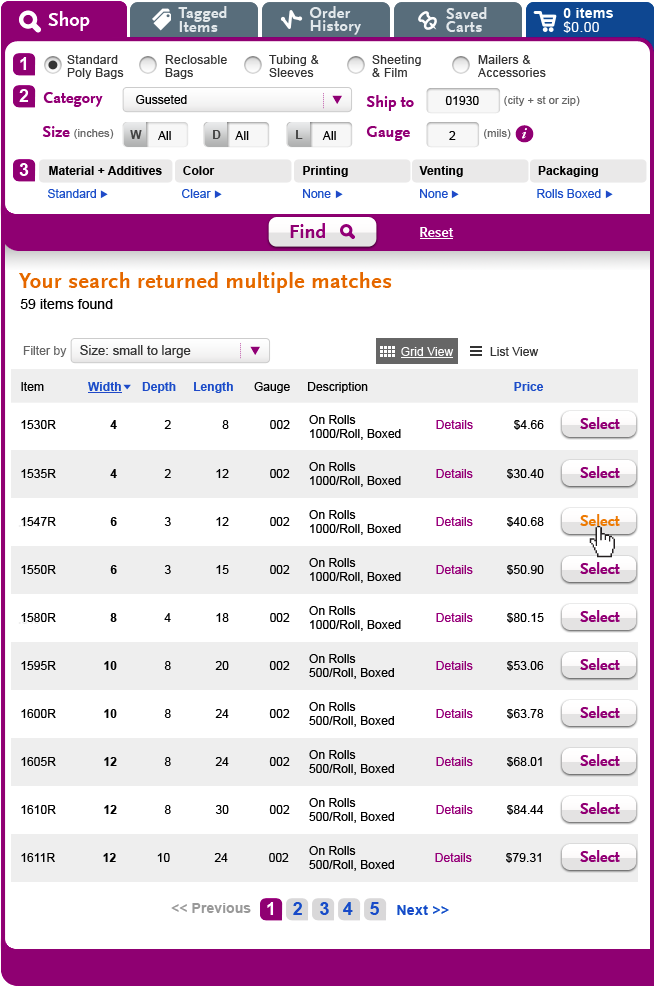 | 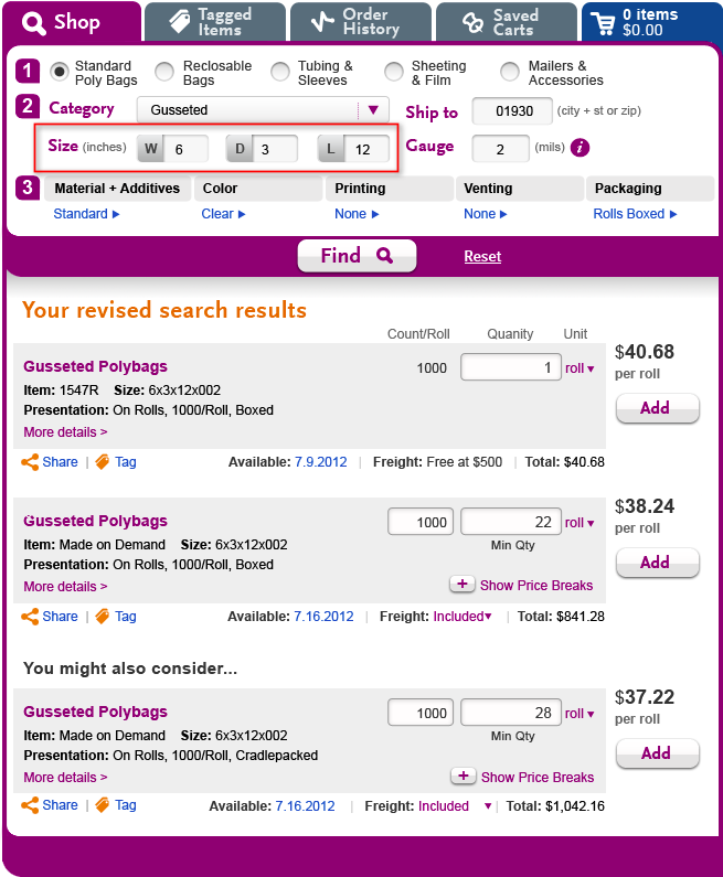 |
COMMENTS Although it is aesthetically nicer, I am not sure this view adds much; I think it makes the key content (dimensions) harder to scan. I think what you refer to as the grid view is more useful functionally. (Also, do you have the terms reversed - the "list" view looks more like a "grid" view, and vice versa). I don't think it makes sense to repeat "Gusseted Polybags" over and over - whether in the list or grid view, I think it belongs in an uber-subhead (see specs) - perhaps "Gusseted Polybags - 59 items found"? Or "Your search returned multiple Gusseted Polybags" ? -SP JM - My feeling is that there is more information and associated real estate being used than is necessary. I think I would not even offer this view but would focus on the tighter grid view.
| COMMENTS I am not sure the overarching sort tool makes sense in this context. Is "size" just one dimension, or total area? I don't think users think in terms of total area, and we really don't know which dimension is most important, so sorting by width seems kind of arbitrary (although if you had to pick one dimension, I guess it would be width). Likewise, I am not sure how useful sorting by price is in this context. With the exception of heavily discounted items (which are rare?) price for like items is going to track closely size (total area) anyway, since it is driven mainly by cost of materials. However, as an alternative to what I am requesting in my comments to the right, you could keep sorting and filtering separate, and make an overarching filter tool that allows the user to filter on specific dimensions (e.g. show everything 24" wide; show everything 24" deep; show everything 24" long), and filter on ranges (e.g. ,show everything 18-24" wide, etc.). SP | COMMENTS I would like to see a drop menu for each dimension, for sorting and filtering combined - if such a thing is possible. Something like this:filter sort.png
JM - I like this view better and might even put the packaging type and count into a single line of description and remove the details link so it could be a single row per line. I think this will keep it nice and tight for longer lists. I like the idea of sorting on each key column and may not complicate it with filtering since the user blast put in the widget just above if they'd like.
| COMMENTS Looks good, -SP | COMMENTS Looks good, -SP |
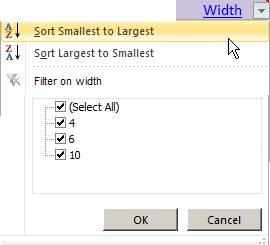
6/22 - Intermediate step for broad searches (clarifications added 6/29) - Please see feedback 7/2
When search parameters are broad, e.g. "all 2 mil gusseted poly bags"and return > 1 exact stock match...... search heading will say "Your search returned multiple matches" followed by results rows with "Add" button changed to "Select" and no forward/tag icons, no quantity, no availability date, etc. When user selects one of the matches, results space repopulates with a normal result set (one exact match, followed by "You might also consider" matches if applicable). Please see attached spreadsheet with proposed table layout and sample data. We should use this exercise to determine how pagination will work. (I propose a cut-off of 10-15 results -- use your best judgment). Please be sure the shop widget reflects the search parameters in the spreadsheet.
6/6 - for review
Revised "see options handling based on 6/6 discussion. (Note, some pieces still outstanding - alternatives for what you see in search results after selecting a substitute. Also, alternative design treatments for shadow box.)
Question: Laddawn does not/will not ship a single order quantity from multiple locations, right? (I.e., my default warehouse is Sterling; you won't ship some from Sterling and some from Iowa, right?)
| Step | Scenario 1 Sterling is user’s default warehouse. The item is not in stock at Sterling, but is in stock at one of the predetermined alternate warehouse locations. Today is 6/5. | Scenario 2
|
| 1- Initial search results - date is 6/6, but if clicked would show 1 roll being shipped w/in 24 hrs from Sterling and no other choices. | 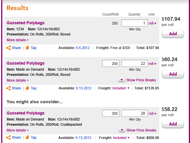 | |
| 2-User enters a quantity that triggers a see options situation, and refreshes. | 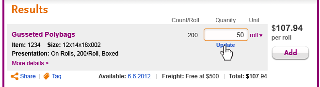 | 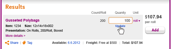 |
| 3-User has refreshed, total has updated. User can click date to see more info, but now content behind that date is different. | 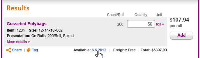 |  |
| 4-User has clicked date, shadow box opens |
Please disregard substitute being pre-selected. As with shadowbox in scenario 2 (to right), no radio buttons would be selected initially. Clicking X or cancel will preserve default choice of shipping from Iowa. |
Clicking X or cancel will preserve default choice of shipping from Sterling within 72 hours.. |
5-User has clicked X or cancel.
| Same view as step 3. If user selects first option, date will change to 6/9. If user selects partial/backorder, date will remain 6/6 (?) If user selects substitute, view will change to something in process of being designed. | Same view as step 3. If user selects partial/backorder, date will change to 6/6 (?) If user selects substitute, view will change to something in process of being designed. |
| COMMENTS - please initial | ||
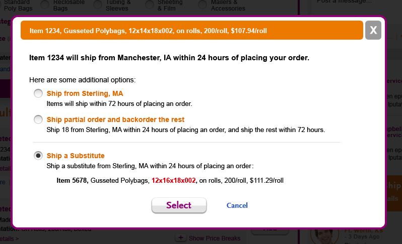
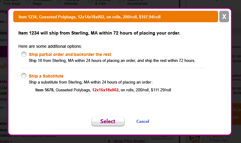
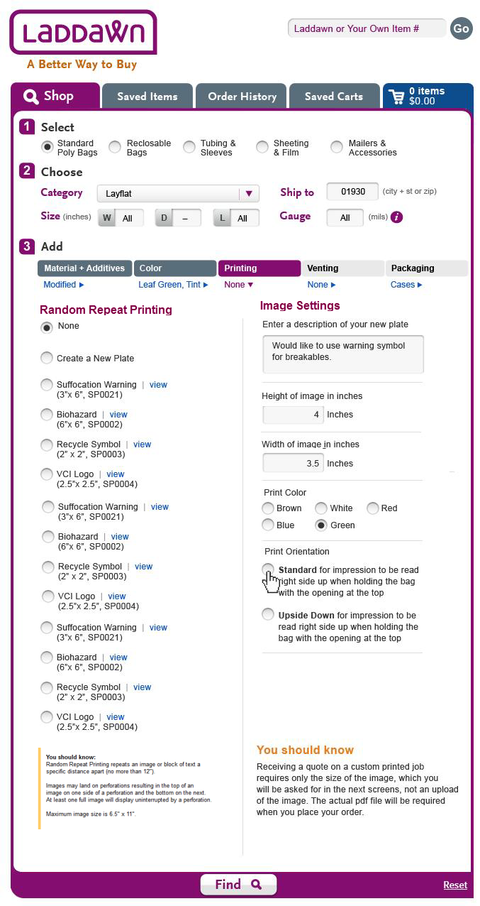
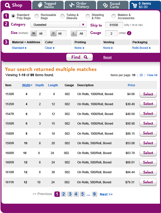
Alternative shadow box design
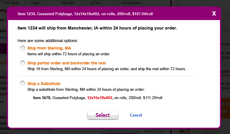
COMMENTS (please initial):
6/4 - "See options" handling. DONE
For requirements, scroll to "see options" on shop page. See comments from 6/5 discussion below.
5/22, for review
For additional detail on what Steve was asked to do, see notes below from 5/17.
Questions/considerations for reviewers:
- The images below are thumbnails; click to see larger version. (Click back button to return to this page.) To leave comments, click the edit link (above right), position cursor in appropriate table cell. Please initial your comments. Click save (bottom right corner).
- Search widget selections don't match results - please disregard.
- Positioning of "+Show price breaks" - shown in scenarios 1 and 2 in bottom right corner of gray box. In situations like scenario 1, when there is a non-standard attribute that expands the height of the gray box (like printing), the price breaks link seems like it will be more noticeable or less "lost" in the collapsed state (than if it were always positioned a certain distance below the count/quantity). But in expanded state, it does mean the price break content is pushed further down.
- Steve provided an alternative to the shadow box, a hover effect (see third row of images).
- Should generic product descriptions be paired with the product specs, or kept separate? If separate, I am assuming users access the generic description by clicking or hovering over the product title (in these examples, "Gusseted Polybags").
- The images below are thumbnails; click to see larger version. (Click back button to return to this page.) To leave comments, click the edit link (above right), position cursor in appropriate table cell. Please initial your comments. Click save (bottom right corner).
Scenario 1 - 1 exact match and 1 YMAC (cradlepacked), searching for a customized item (printing) | Shadow box - product specifications only | Shadow box - product specifications + generic product description | First search result, expanded state
|
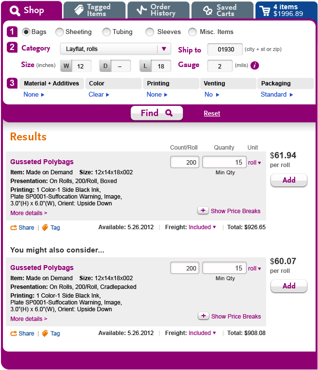 |  |  |  |
COMMENTS: This looks good to me. -DL
| COMMENTS:I think I prefer the shadowbox versus the hover. -DL | COMMENTS: I think I prefer keeping the generic description separate from the product specs at the results stage, but at the share stage, I am guessing there are times users will want the ability to combine this content into one description of the quoted item. -SP I agree with Susan. Separate specs. info at the share stage. Able to combine when sharing. -DL | COMMENTS: |
Scenario 2 - search for an item with standard configuration. 2 exact matches (1 stock, 1 MTO), and 1 YMAC (only difference - cradlepacked). | |||
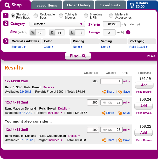 | |||
COMMENTS:
| |||
Alternative to shadow box - provide full product specs on hoverPlease disregard content discrepancies. | Hover variation with generic product descriptionPlease disregard content discrepancies. | ||
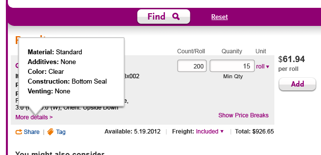 | 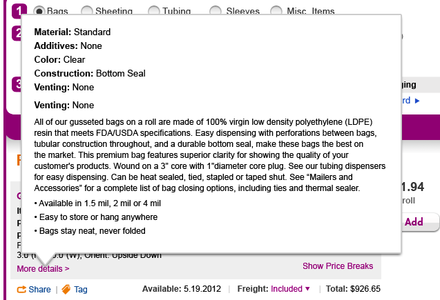 | ||
COMMENTS: I think I prefer the shadow box to the hover effect. The nice thing about the original expand/collapse feature BTW is that you could see/print the whole results set with all the content for all the results together, if you so chose. Not sure if that's important though. -SP | COMMENTS: If you do have a hover, do you even need the "More details" or would you just see this when hovering over any part of the visible product specs? -SP |
Logged 5/17
Decisions/changes, based on weekly status meeting:
- Restore design as of 5/11, with following modifications:
- Beyond first two lines (item, size, presentation), only show product specifications that are non-standard (see sample data below).
- Full product specs to be viewable via link, "Details" (purple font?) placed to right of last line of description, that opens shadow box. Q: Owen/Jim - So are we combining these with generic product descriptions or not? A: Let''s see it both ways.
- Correction: Please change "Desc" to "Size" (as shown in sample data below).
- Restore design as of 5/11, with following modifications:
Sample data
With the design changes above, please mock up 2 sets of results, and 2 shadow boxes using this data.
Search result set 1 – 1 “worst case” non-standard spec; 1 exact and 1 close match | “More details” Shadow box | Search result set 2 – no non-standard specs; 1 exact stock and 1 exact MOD match, 1 close match | “More details” Shadow box |
Gusseted Polybags | Gusseted Polybags Use this content for shadow box 1 and 2. Instructions below | Gusseted Polybags | Gusseted Polybags
|
Gusseted Polybags | Same as above except “Made on Demand” | ||
You might also consider: |
|
You might also consider: |
|
Gusseted Polybags | Same as above, except “Cradlepacked” | Gusseted Polybags | Same as above except “Made on Demand” and “Cradlepacked” |
Shadowboxes:
- Shadowbox 1: Use content above.
- Shadowbox 2: Use content above plus this generic description:
Gusseted Polybags On A Roll
All of our gusseted bags on a roll are made of 100% virgin low density polyethylene (LDPE) resin that meets FDA/USDA specifications. Easy dispensing with perforations between bags, tubular construction throughout, and a durable bottom seal, make these bags the best on the market. This premium bag features superior clarity for showing the quality of your customer's products. Wound on a 3" core with 1"diameter core plug. See our tubing dispensers for easy dispensing. Can be heat sealed, tied, stapled or taped shut. See “Mailers and Accessories” for a complete list of bag closing options, including ties and thermal sealer.
- Available in 1.5 mil, 2 mil or 4 mil
- Easy to store or hang anywhere
- Bags stay neat, never folded
Designs (5/16) for 5/11 assignment
Below are 3 comps for 5/11 search result assignment. First two are a pair - expanded and collapsed states. Third stands alone to show what it would look like if, as Ladd suggested, full product specs should always be displayed (no expand/collapse).
A word about the data (so it is not a distraction):
1. I instructed Steve to start with an example involving gusseted bags that Owen concocted (see assignment details below. As noted, the third result would never exist for a couple of reasons, a) it shows worst case for each product attribute, some of which are mutually exclusive and b) something this customized would probably not be a close/YMAC match following the first two results.
2. For pricing and quantity data, I instructed Steve to use some sample data that I developed for a completely different scenario involving different products - showing an exact stock and MOD match, followed by a close match that differed only in terms of packaging (first two boxed, third cradlepacked).
I have a couple of questions: I am wondering if the content in the second line (On rolls, 200/roll, etc.) needs its own label (to be consistent); if so, what would it be? Also, I am wondering if we can combine the 2d line (ie, "Rolls, 200/roll") with the configuration line, because there is space horizontally to do so (assuming these lines would not vary too much in length); this might reduce verticality, but might also be too much data on one line for scanning purposes?
Keep in mind that I had to cut off the top of the search widget to show these comparably, at full size. So don't be deceived about where the fold really is. On my giant Laddawn monitor, I can see all three results in the collapsed state; in the expanded state (middle picture) screen cuts off within the detail of the second result; in third picture, I can only see the YMAC heading. For your customers, all these cut offs will be higher. Let me know if you need a more precise idea.
| Two states (initial state always collapsed) | One state (always expanded)** | |
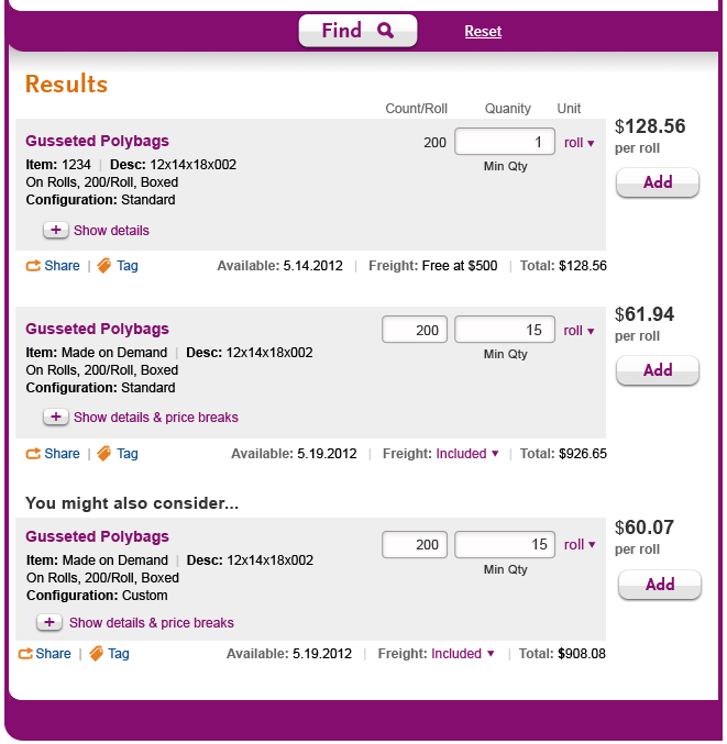 | 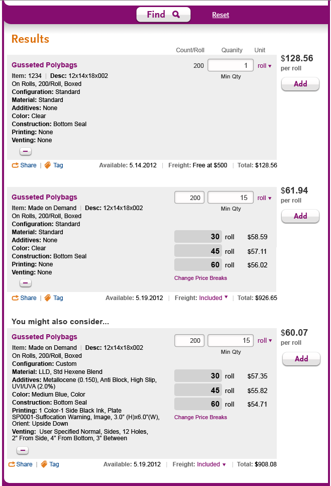 |  |
**This is not as tall as the image to the left, because I instructed Steve to remove the "Configuration" line, which only seems necessary if you have a collapsed state.
Logged 5/11
Need comps to reflect expandable/collapsible full product specs (stock and MOD). Some issues still up for debate, but go ahead with design.
Pull pricing/quantity breaks from sample data for search scenario 2 (even though totally different products, dimensions, etc.) Note, examples below do not demonstrate search result logic for close matches - first two results being used to demonstrate consistency between stock and MOD (MTO) with no customization; third result showing worst case (most detailed) configuration.
Steve, for expand/collapse, please use best judgment about verbiage, and whether/how to use pluses or arrows. Also, should there just be one expand/collapse link that handles both the product specs AND the price breaks?
| Collapsed | Expanded |
Gusseted Polybags | Gusseted Polybags |
| Gusseted Polybags Item: Made on Demand Size: 12x14x18x002 On Rolls, 200/Roll, Cradlepacked Configuration: Standard + Show more | Gusseted Polybags |
You might also consider: | |
| Gusseted Polybags Item: Made on Demand Size: 12x14x18x002 On Rolls, 200/Roll, Boxed Configuration: Custom + Show more | Gusseted Polybags |
Logged 5/8
1-Four comps: DONE,but ...
The following issues noted for future iteration: tag/share have wrong icons (changing share icon anyway); would like to see gray boxes for stock and MOD be same height
1. shop widget, initial state; 2. shop widget + search results (price breaks collapsed); 3. shop widget + search results (price breaks expanded).
... with the following tweaks where relevant:
- Be sure reset link is in same location on all three.
- Add "Min Qty" under the qty for the stock item (whenever it is the default value of 1).
- Use the vertical spacing from version 5 (May 7) for all search results pages.
- Tighten up the vertical spacing in the initial state of the shop widget a little bit.
4. Search results, price breaks expanded, one exact match, with widget and product description reflecting the following content: DONE, but changes logged above, 5/11.
Medium Blue Gusseted Polybags
Item Made on demand | Size 12x4x18x002
Materials LLD, Std Hexene Blend
Additives Metallocene (0.150), Anti Block, High Slip, UVI/UVA (2.0%)
Printing 1 Color-1 Side Black Ink, Plate SP0001-Suffocation Warning, Image, 3.0” (H)x6.0”(W), Orient: Upside Down
Venting User Specified Normal, Sides, 12 Holes, 2” From Side, 4” From Bottom, 3” Between
Packaging Rolls, Cradlepacked
RE Pricing and price breaks - no such product can be made with the above combination of attributes (worst cases were developed for each attribute independently). Please just use the pricing, quantities, etc. from the "Clear Layflat" example being used in comps 1-3 above.
2-Shadow box for changing price breaks DONE (attached to Shop page)
See crude mockup discussed 5/7.
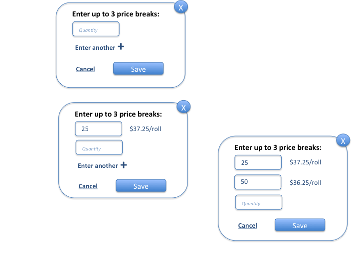
3-Additional comps showing editability of fields
Additional comps showing quantity of stock, quantity of MOD, count/roll just after being typed over and changed, with highlighting and refresh links and grayed-out add buttons. READY FOR REVIEW - PLEASE USE COMMENTS FEATURE TO LEAVE FEEDBACK.
FROM STEVE:
Here are my thoughts for this:
a. Stock Item - the user has just placed his cursor the quantity field and it is highlighted orange. no other change has been made yet so the add button is still active.
b. The MOD entry fields (count/roll and quantity) have been changed. My thinking is the update link can show up both under quantity or under count/roll but never both at the same time. I'm thinking the rule would be to have the update link show up under the entry field that was adjusted 1st. Then the add button becomes inactive until the update link is clicked.
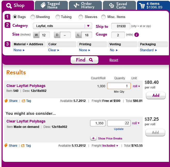
4-Prove out design, especially for price quantities and unit prices, when unit of measure is toggled to "each" i.e. "bag" for bags.
TOC for linking purposes
- 10/30 - Steve's latest round of work - zip code does not match (Named Cart/Un-Named Cart)
- 10/8 - Steve's latest round of work - zip code does not match (Named Cart/Un-Named Cart)
- 10/5 - OK, just waiting on 2d shadow box (un-named cart)
- Steve's latest round of work - zip code does not match (10/2)
- Zip code mismatch, 10/1
- Steve's latest round of work - Zip Code does not match (9/26)
- Next assignment - 9/25
- Steve's latest round of work - Packaging (9/20)
- Direction for Steve, Moving on to Packaging (9/19-9/20)
- Steve's latest round of work - Printing (9/18)
- Feedback, 9/18
- Steve's latest round of work - Printing (9/17)
- Printing feedback and direction, 9/14 9/17
- Printing (9/11)
- 9/12 Feedback on M&A, Venting & Color (from 9/8-9/9)
- Steve's latest round of work (9/8-9/9)
- 9/7 - Feedback on Steve's next round of venting
- 9/6 feedback and revised direction
- 9/5 feedback on 9/4 M&A work
- 9/4 feedback on recent (8/30?, 9/1 and 9/3)
- 8/31 Feedback on 8/30 work
- 8/30 - Feedback on 8/29 work
- 8/29 Level 3 Menu designs - M&A Part 2 - Still a work in progress
- 8/29 Level 3 Menu designs - Color Flow
- 8/27 Feedback
- 8/21 - Level 3 menus a.k.a. "Add Options" - added some notes 8/23
- 8/15 - Round 7 (finishing touches) - Done
- 8/13 Round VI, search results and gauge (based on consolidated feedback) + 8/14 feedback
- SOLD! Let's make Cradlepacked black and italicized (not bold) and keep all the other colors the same.
- 8/12 - Round V revisions from Steve + feedback
- 8/10 - Round V revisions search results
- 8/10 - Round IV revisions from Steve + feedback
- You might also consider the following stock alternatives:
- 8/9 Round IV direction, search results
- 8/7 - Revisions from Steve, based round III feedback
- 8/7 Search results, round III
- 8/5 -Revised search result scenarios
- 8/4 Search results, round II
- 8/1 Search results
- We can make 2 mil gusseted polybags on demand. Please enter additional dimensions above to see pricing and availability.
- Your search returned multiple stock matches
- We can make 12.5" wide layflat polybags on demand. Please enter additional dimensions above to see pricing and availability.
- You might also consider the following stock alternatives:
- 7/26, "Tagging" has been changed to "Saving" first round done, new iteration logged on save icons page
- 7/12 - Hover effect and shadow box for "i" / gauge - almost done (images uploaded to Shop page), just need breadcrumb
- 7/5 - We are going to need shadow boxes for each of the "3. Add" menus:
- Material + Additives
- Current list:
- (A) Next set of choices, if "Standard" selected
- Next set of choices, if "LLD" selected
- Next set of choices, if "Anti-Static" selected
- Next set of choices, if "Postal Approved" selected
- Next set of choices, if "VCI" selected
- Next set of choices, if "Clarity" selected
- Next set of choices, if "Non Slip" selected
- Next set of choices, if "Non Scratch" selected
- Color
- Printing
- Venting
- Packaging
- Note on V-Board Options from 6/26 Meeting:
- 7/2 -For review, initial design for broad search results -
- Direction for next iteration (7/27) - done, images uploaded and discussed, new iteration requested above (8/1)
- 6/22 - Intermediate step for broad searches (clarifications added 6/29) - Please see feedback 7/2
- 6/6 - for review
- 6/4 - "See options" handling. DONE
- 5/22, for review
- For additional detail on what Steve was asked to do, see notes below from 5/17.
- Questions/considerations for reviewers:
- Scenario 1 - 1 exact match and 1 YMAC (cradlepacked), searching for a customized item (printing)
- Shadow box - product specifications only
- Shadow box - product specifications + generic product description
- First search result, expanded state
- Scenario 2 - search for an item with standard configuration. 2 exact matches (1 stock, 1 MTO), and 1 YMAC (only difference - cradlepacked).
- Alternative to shadow box - provide full product specs on hover
- Hover variation with generic product description
- Logged 5/17
- Designs (5/16) for 5/11 assignment
- Logged 5/11
- Logged 5/8
Attachments:
 Slide1.png (image/png)
3_Laddawn_EditabilityFields.png (image/png)
Slide1.png (image/png)
3_Laddawn_EditabilityFields.png (image/png)
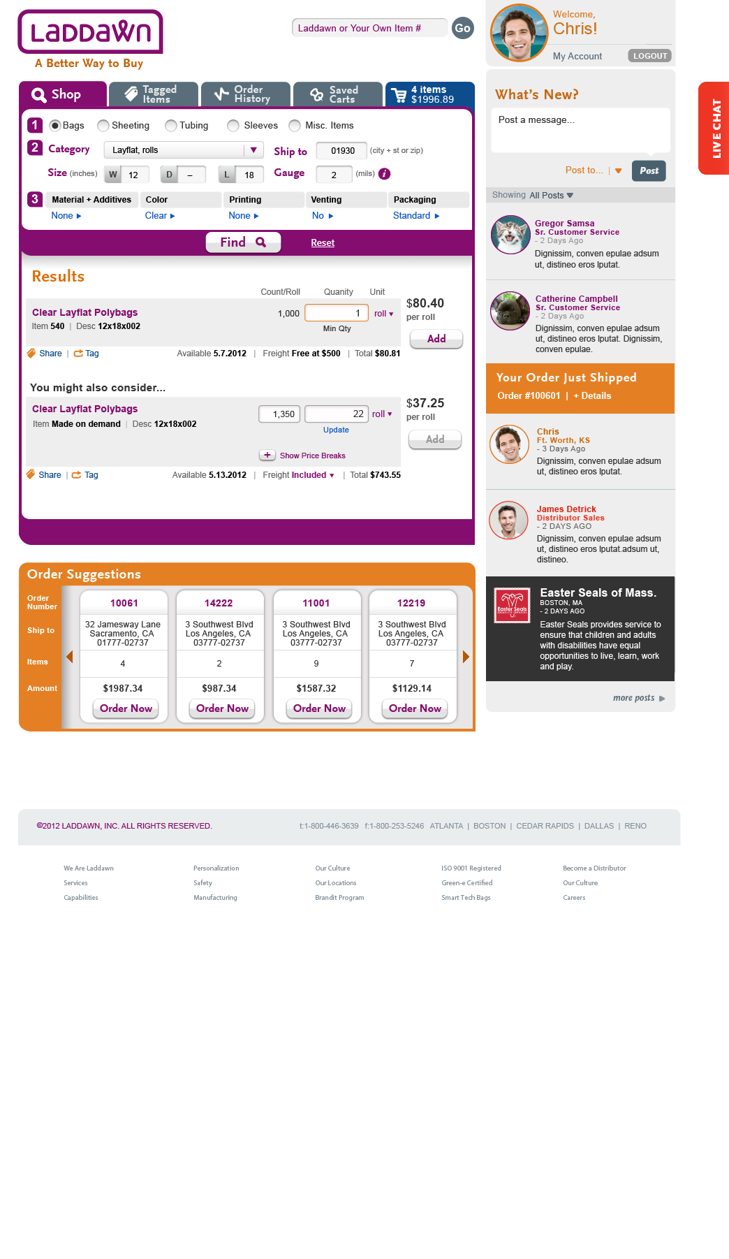 3_Laddawn_EditabilityFields snippet.png (image/png)
 Laddawn_Shop_Initial.png (image/png)
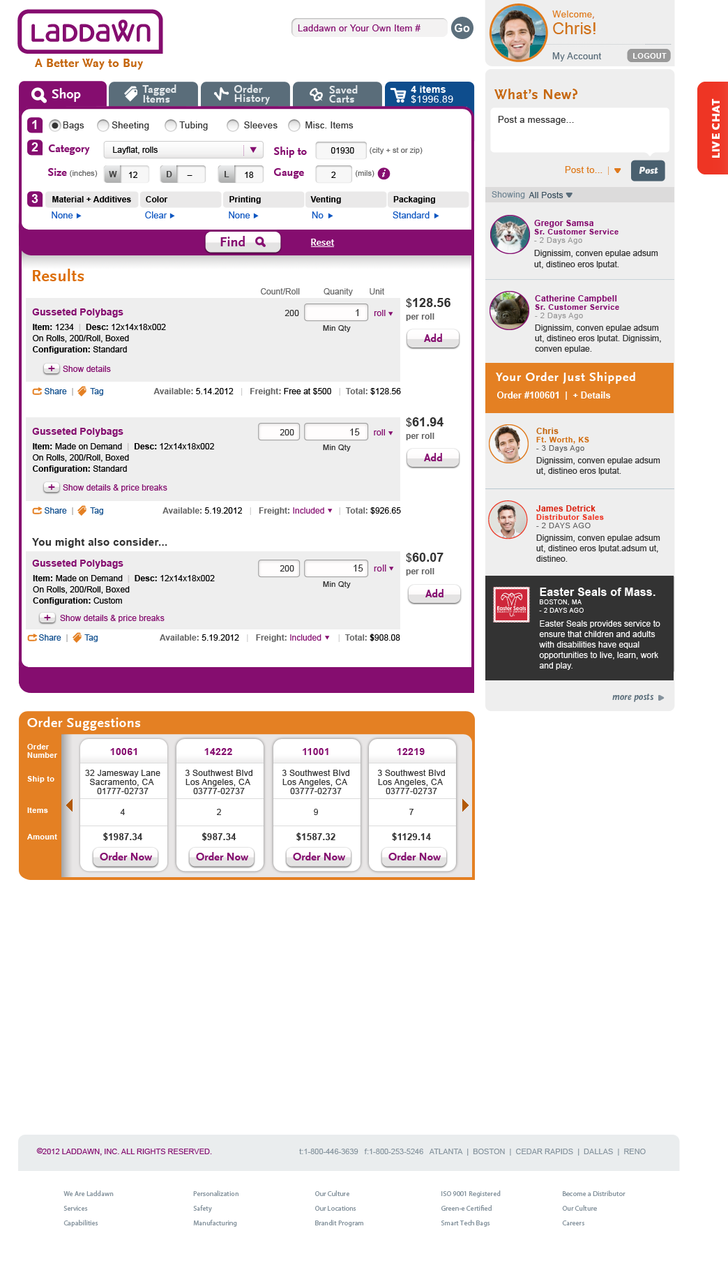 results description initial snippet.png (image/png)
results description expanded snippet.png (image/png)
results description always expanded snippet.png (image/png)
result set 1.png (image/png)
rollover 1.png (image/png)
results description initial snippet.png (image/png)
results description expanded snippet.png (image/png)
results description always expanded snippet.png (image/png)
result set 1.png (image/png)
rollover 1.png (image/png)
 result set 1 expanded.png (image/png)
rollover 1.png (image/png)
rollover2.png (image/png)
Laddawn_Shop_SeeOptions4.png (image/png)
result set 1 expanded.png (image/png)
rollover 1.png (image/png)
rollover2.png (image/png)
Laddawn_Shop_SeeOptions4.png (image/png)
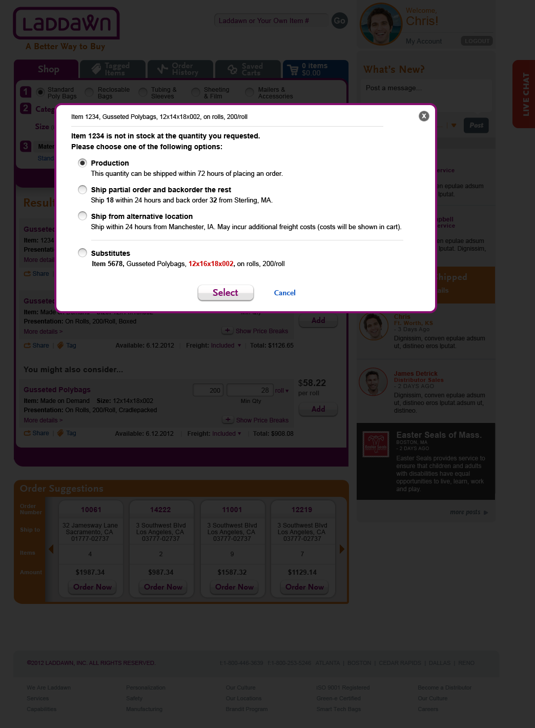 Laddawn_Shop_SeeOptions3B.png (image/png)
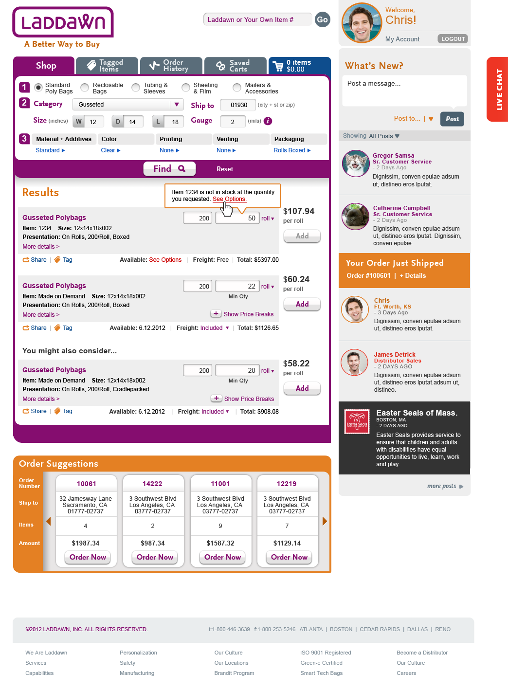 Laddawn_Shop_SeeOptions1.png (image/png)
 Laddawn_Shop_SeeOptions2.png (image/png)
 Laddawn_Shop_SeeOptions3.png (image/png)
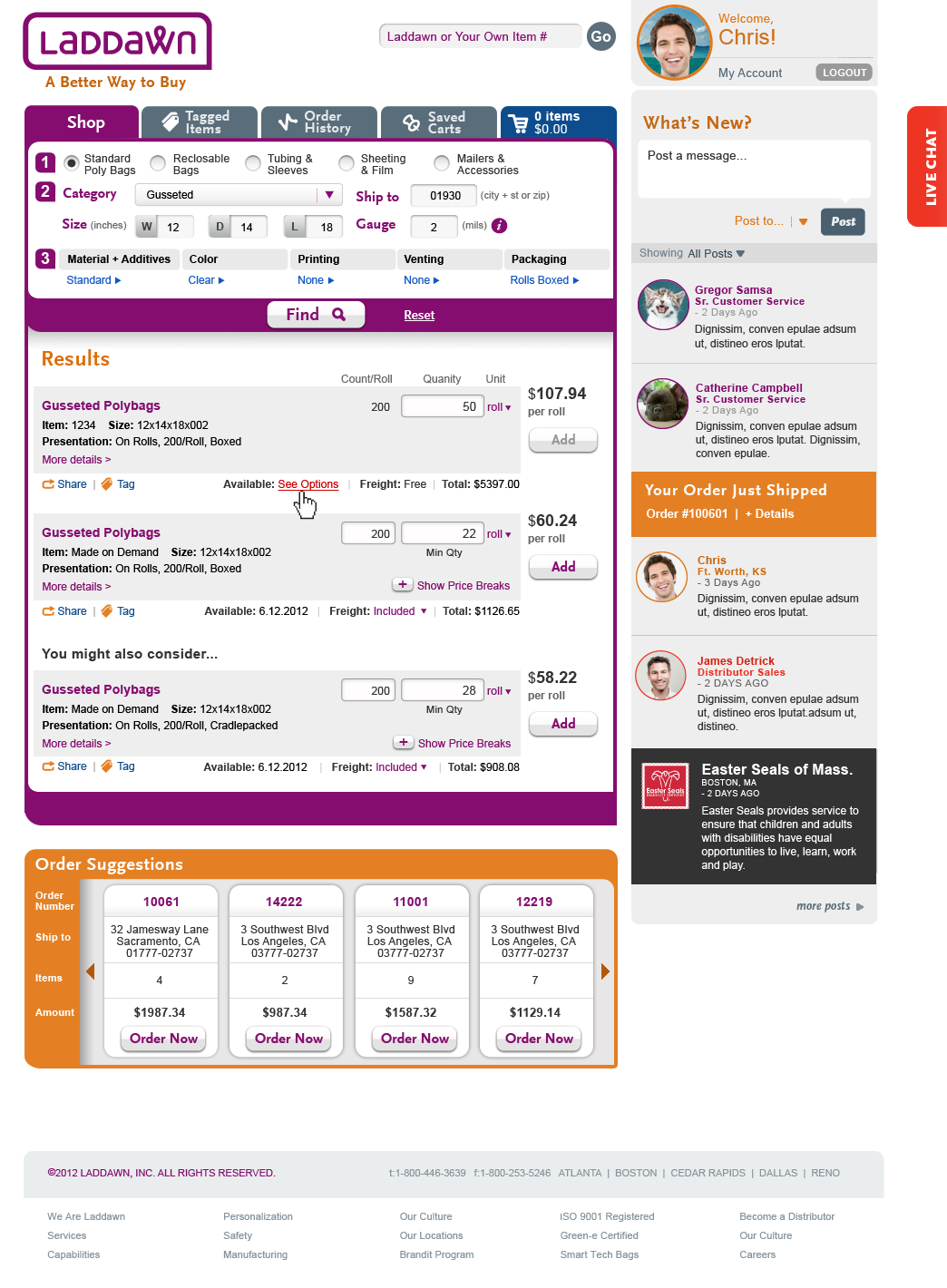 Laddawn_Shop_SeeOptions5.png (image/png)
 Laddawn_Shop_SeeOptions6.png (image/png)
 Laddawn_Shop_SeeOptions6_Substitute.png (image/png)
 Laddawn_Shop_SeeOptions5_Substitute.png (image/png)
 see options 1-b.png (image/png)
see options 1-c.png (image/png)
see options 1-d.png (image/png)
see options 2-d.png (image/png)
see options start.png (image/png)
see options 2-b.png (image/png)
see options 2-c.png (image/png)
see options alternative look.png (image/png)
Laddawn_Shop_SeeOptions_6d.png (image/png)
see options 1-b.png (image/png)
see options 1-c.png (image/png)
see options 1-d.png (image/png)
see options 2-d.png (image/png)
see options start.png (image/png)
see options 2-b.png (image/png)
see options 2-c.png (image/png)
see options alternative look.png (image/png)
Laddawn_Shop_SeeOptions_6d.png (image/png)
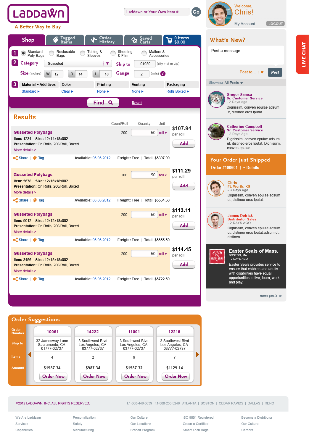 Laddawn_Shop_SeeOptions_6a.png (image/png)
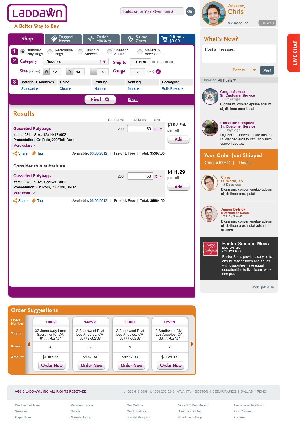 Laddawn_Shop_SeeOptions_6b.png (image/png)
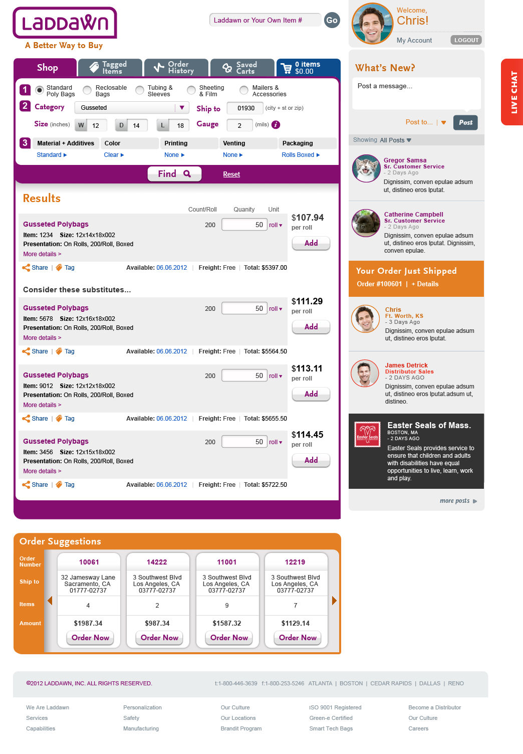 Laddawn_Shop_SeeOptions_6c.png (image/png)
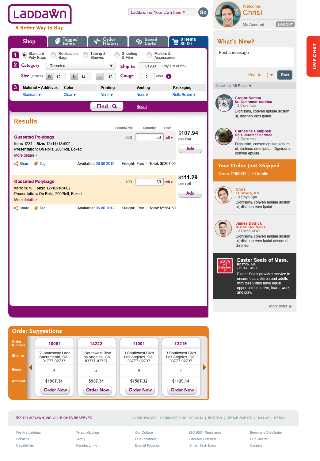 sample data for broad results.xlsx (application/vnd.openxmlformats-officedocument.spreadsheetml.sheet)
broad1.png (image/png)
broad2.png (image/png)
broad3.png (image/png)
broad4.png (image/png)
broad5.png (image/png)
filter sort.png (image/png)
m+a today 1.png (image/png)
sample data for broad results.xlsx (application/vnd.openxmlformats-officedocument.spreadsheetml.sheet)
sample data for broad results.xlsx (application/vnd.openxmlformats-officedocument.spreadsheetml.sheet)
broad1.png (image/png)
broad2.png (image/png)
broad3.png (image/png)
broad4.png (image/png)
broad5.png (image/png)
filter sort.png (image/png)
m+a today 1.png (image/png)
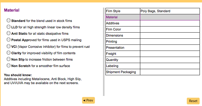 image2012-7-5 15:25:48.png (image/png)
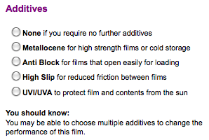 image2012-7-5 15:28:42.png (image/png)
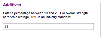 image2012-7-5 15:29:52.png (image/png)
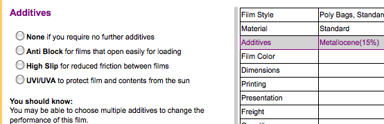 image2012-7-5 15:32:3.png (image/png)
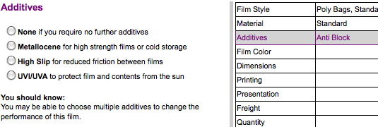 image2012-7-5 15:38:54.png (image/png)
 image2012-7-5 15:39:54.png (image/png)
 image2012-7-5 15:45:5.png (image/png)
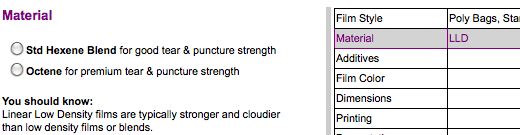 image2012-7-5 15:49:42.png (image/png)
 image2012-7-5 15:51:51.png (image/png)
 image2012-7-5 15:55:7.png (image/png)
 image2012-7-5 15:59:17.png (image/png)
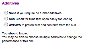 image2012-7-5 16:0:41.png (image/png)
 image2012-7-5 16:3:46.png (image/png)
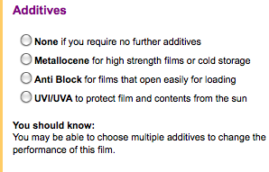 image2012-7-5 16:5:54.png (image/png)
 image2012-7-5 16:9:50.png (image/png)
 image2012-7-5 16:12:28.png (image/png)
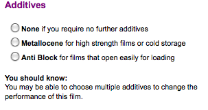 image2012-7-5 16:13:40.png (image/png)
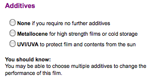 image2012-7-5 16:14:43.png (image/png)
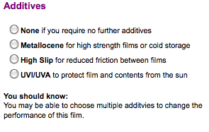 image2012-7-27 14:37:9.png (image/png)
 image2012-7-27 14:41:22.png (image/png)
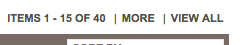 New Results (Owens Folly) 7 31 12.png (image/png)
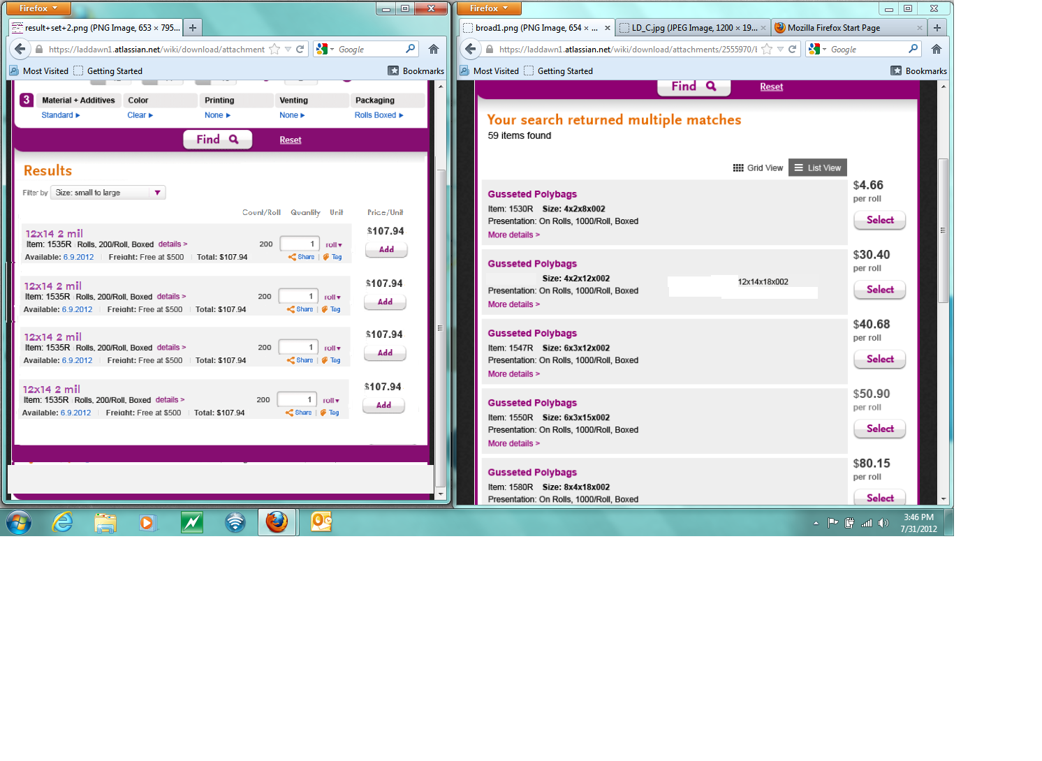 unified results.png (image/png)
we can make it.png (image/png)
unified results.png (image/png)
we can make it.png (image/png)
 we can make it3.png (image/png)
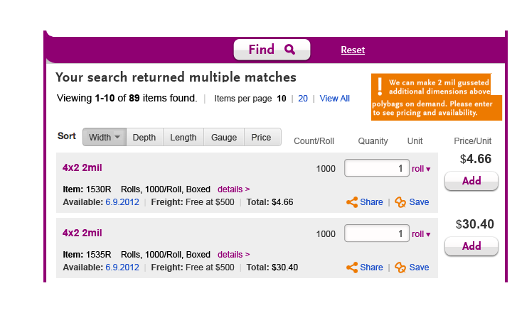 3_BroadSearch_Incomplete_Rev3.png (image/png)
1_Laddawn_Shop_BroadSearches_Rev2.png (image/png)
2_Laddawn_Shop_Page5Pagination_Rev2.png (image/png)
3_Laddawn_Shop_View20_Rev2.png (image/png)
Laddawn_Shop_SearchResults_Normal.png (image/png)
Printing_dataSample.png (image/png)
3_BroadSearch_Incomplete_Rev3.png (image/png)
1_Laddawn_Shop_BroadSearches_Rev2.png (image/png)
2_Laddawn_Shop_Page5Pagination_Rev2.png (image/png)
3_Laddawn_Shop_View20_Rev2.png (image/png)
Laddawn_Shop_SearchResults_Normal.png (image/png)
Printing_dataSample.png (image/png)
 1_Shop_SearchResults.png (image/png)
Shop_PriceBreaks_Expanded.png (image/png)
Laddawn_PriceBreaks_Shadowbox.png (image/png)
Shop_BroadSearches_Callout1.png (image/png)
Shop_BroadSearches_Callout2.png (image/png)
Shop_BroadSearches_Callout3.png (image/png)
image2012-8-7 14:37:25.png (image/png)
Laddawn_Shop_Scenario1_Rev3.png (image/png)
1_Shop_SearchResults.png (image/png)
Shop_PriceBreaks_Expanded.png (image/png)
Laddawn_PriceBreaks_Shadowbox.png (image/png)
Shop_BroadSearches_Callout1.png (image/png)
Shop_BroadSearches_Callout2.png (image/png)
Shop_BroadSearches_Callout3.png (image/png)
image2012-8-7 14:37:25.png (image/png)
Laddawn_Shop_Scenario1_Rev3.png (image/png)
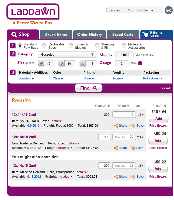 Laddawn_Shop_Scenario1_Rev3.png (image/png)
 Laddawn_BroadSearches_Scenario2_Rev3.png (image/png)
Laddawn_PriceBreaks_Shadowbox_Rev3.png (image/png)
Laddawn_BroadSearches_Scenario2_Rev3.png (image/png)
Laddawn_PriceBreaks_Shadowbox_Rev3.png (image/png)
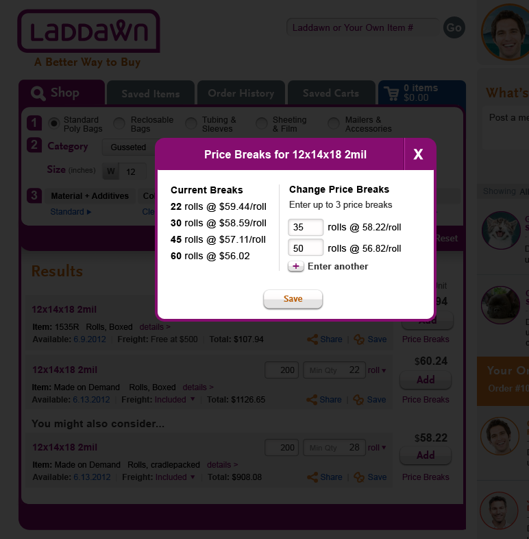 image2012-8-8 11:21:27.png (image/png)
 Laddawn_Shop_Scenario1_Rev4.png (image/png)
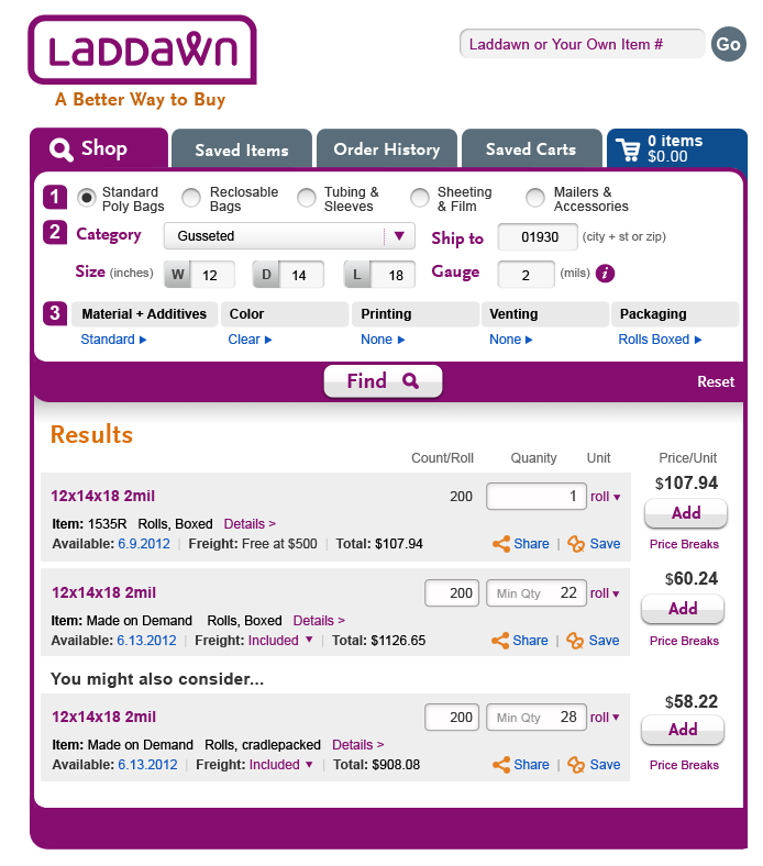 Laddawn_PriceBreaks_Shadowbox_Rev4.png (image/png)
Laddawn_Shop_Scenario1_Rev4.png (image/png)
Laddawn_PriceBreaks_Stock_Rev4.png (image/png)
Laddawn_BroadSearches_Scenario2_Rev4.png (image/png)
Laddawn_Shop_Scenario3_Rev4.png (image/png)
Laddawn_Shop_Scenario1_Rev5.png (image/png)
Laddawn_PriceBreaks_MOD_Rev5.png (image/png)
Laddawn_PriceBreaks_Shadowbox_Rev4.png (image/png)
Laddawn_Shop_Scenario1_Rev4.png (image/png)
Laddawn_PriceBreaks_Stock_Rev4.png (image/png)
Laddawn_BroadSearches_Scenario2_Rev4.png (image/png)
Laddawn_Shop_Scenario3_Rev4.png (image/png)
Laddawn_Shop_Scenario1_Rev5.png (image/png)
Laddawn_PriceBreaks_MOD_Rev5.png (image/png)
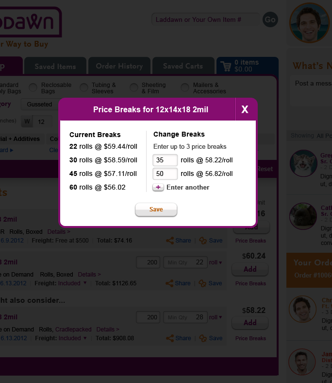 Laddawn_PriceBreaks_Stock_Rev5a.png (image/png)
 Laddawn_PriceBreaks_MOD_Rev5.png (image/png)
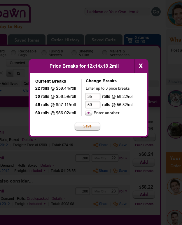 Laddawn_PriceBreaks_Stock_Rev5a.png (image/png)
Laddawn_BroadSearches_Scenario2_Rev5.png (image/png)
Laddawn_BroadSearches_Scenario3_Rev5.png (image/png)
Laddawn_PriceBreaks_Stock_Rev5a.png (image/png)
Laddawn_BroadSearches_Scenario2_Rev5.png (image/png)
Laddawn_BroadSearches_Scenario3_Rev5.png (image/png)
 Laddawn_BroadSearches_Scenario3_Rev5.png (image/png)
Laddawn_Shop_IGauge_Roll.png (image/png)
Laddawn_Shop_IGauge_Click.png (image/png)
Laddawn_Shop_IGauge_FullGauge.png (image/png)
full gauge alternate breadcrumb.png (image/png)
Laddawn_PriceBreaks_Stock_Rev5b.png (image/png)
Laddawn_PriceBreaks_MOD_Rev5b.png (image/png)
Laddawn_PriceBreaks_Stock_Rev5c.png (image/png)
Laddawn_Shop_Scenario1_Rev6.png (image/png)
Laddawn_BroadSearches_Scenario3_Rev5.png (image/png)
Laddawn_Shop_IGauge_Roll.png (image/png)
Laddawn_Shop_IGauge_Click.png (image/png)
Laddawn_Shop_IGauge_FullGauge.png (image/png)
full gauge alternate breadcrumb.png (image/png)
Laddawn_PriceBreaks_Stock_Rev5b.png (image/png)
Laddawn_PriceBreaks_MOD_Rev5b.png (image/png)
Laddawn_PriceBreaks_Stock_Rev5c.png (image/png)
Laddawn_Shop_Scenario1_Rev6.png (image/png)
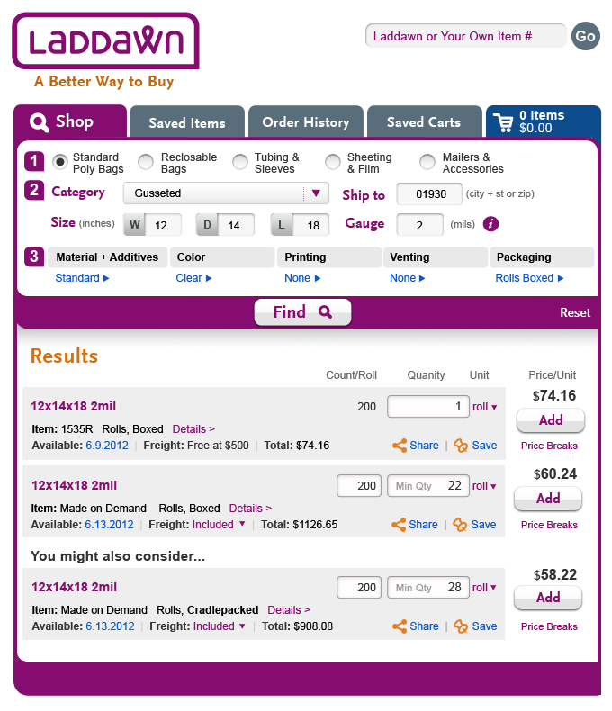 Laddawn_Shop_Scenario1_Rev6.png (image/png)
Laddawn_PriceBreaks_MOD_6.png (image/png)
Laddawn_PriceBreaks_Stock_6.png (image/png)
Laddawn_IGauge_FullGauge_Rev6a.png (image/png)
Laddawn_IGauge_FullGauge_Rev6b.png (image/png)
Laddawn_IGauge_FullGauge_7.png (image/png)
Level3_Scroll_1.png (image/png)
Level3_Scroll_2.png (image/png)
Laddawn_Shop_Scenario1_Rev6.png (image/png)
Laddawn_PriceBreaks_MOD_6.png (image/png)
Laddawn_PriceBreaks_Stock_6.png (image/png)
Laddawn_IGauge_FullGauge_Rev6a.png (image/png)
Laddawn_IGauge_FullGauge_Rev6b.png (image/png)
Laddawn_IGauge_FullGauge_7.png (image/png)
Level3_Scroll_1.png (image/png)
Level3_Scroll_2.png (image/png)
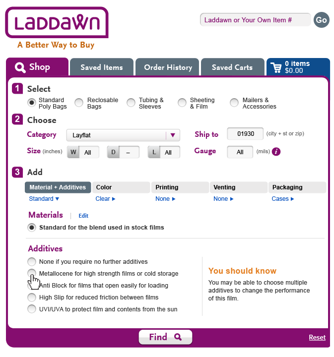 Level3_Scroll_3.png (image/png)
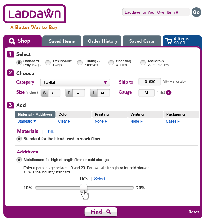 Level3_Scroll_2.png (image/png)
 Level3_Scroll_3.png (image/png)
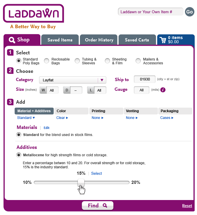 Level3_Scroll_4.png (image/png)
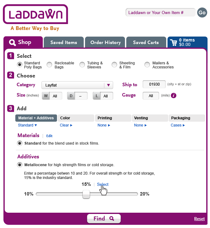 Level3_Scroll_5.png (image/png)
 Level3_Scroll_6.png (image/png)
 Level3_Scroll_7.png (image/png)
 Level3_Scroll_8.png (image/png)
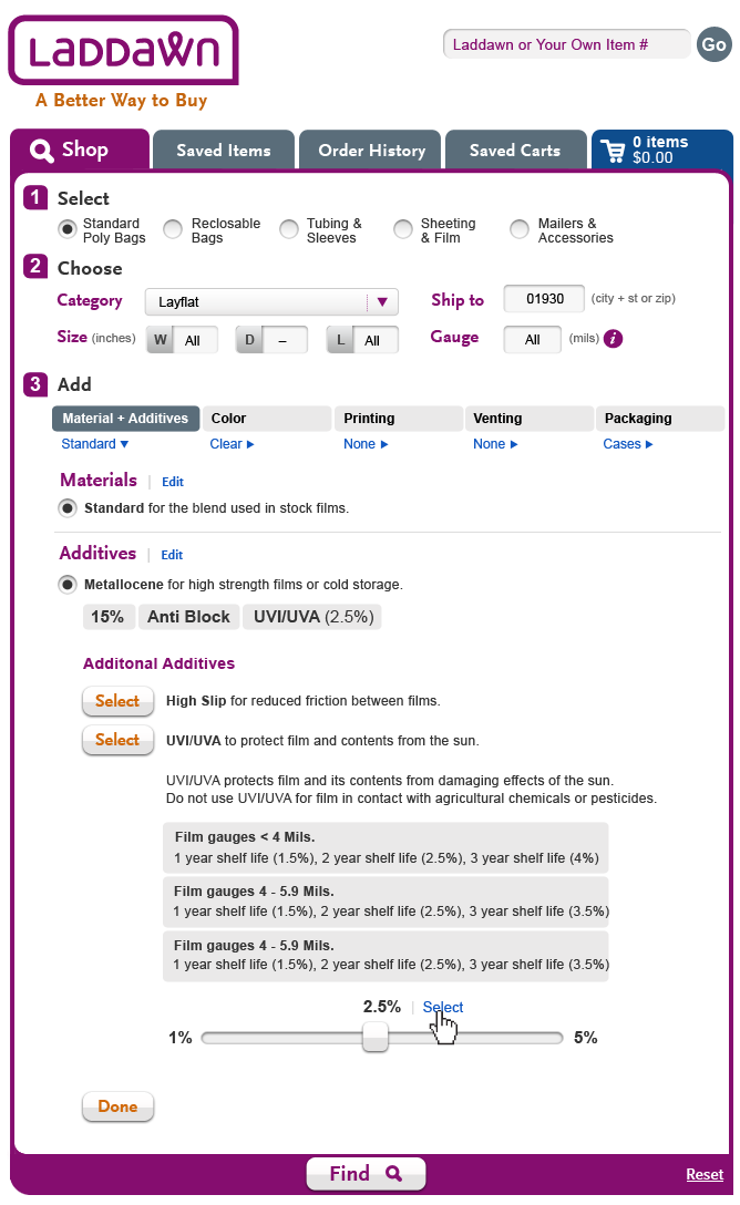 Level3_Scroll_9.png (image/png)
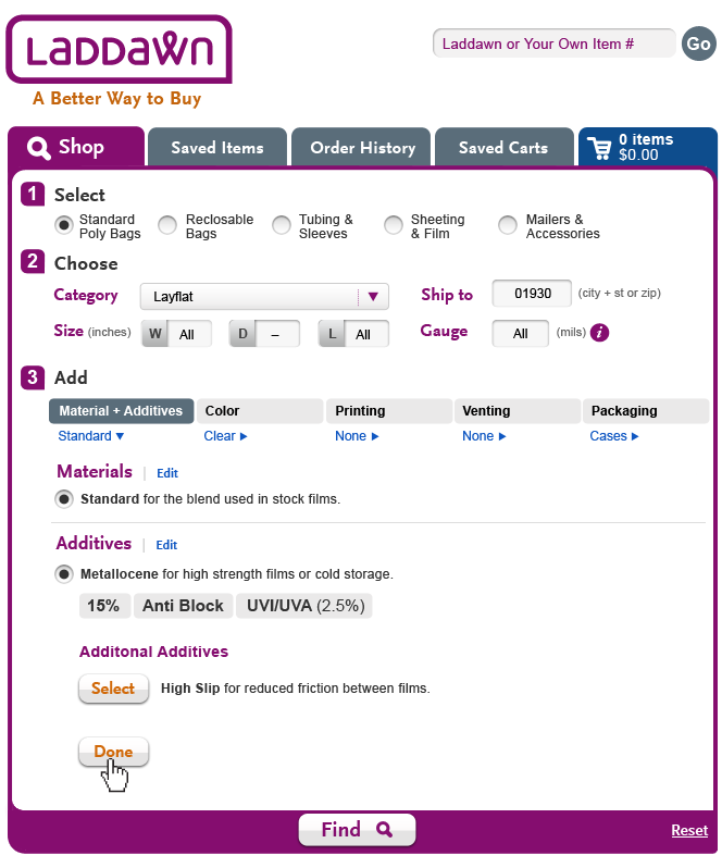 Level3_Scroll_10.png (image/png)
 Level3_Scroll_10.png (image/png)
Level3_Scroll_2.png (image/png)
Level3_Scroll_3.png (image/png)
Level3_Scroll_4.png (image/png)
Level3_Scroll_5.png (image/png)
Level3_Scroll_6.png (image/png)
Level3_Scroll_7.png (image/png)
Level3_Scroll_8.png (image/png)
Level3_Scroll_9.png (image/png)
Level3_Shadowboxl_1.png (image/png)
Level3_Shadowboxl_2.png (image/png)
Level3_Shadowboxl_3.png (image/png)
1_Laddawn_Level3_Color.png (image/png)
Level3_Scroll_10.png (image/png)
Level3_Scroll_2.png (image/png)
Level3_Scroll_3.png (image/png)
Level3_Scroll_4.png (image/png)
Level3_Scroll_5.png (image/png)
Level3_Scroll_6.png (image/png)
Level3_Scroll_7.png (image/png)
Level3_Scroll_8.png (image/png)
Level3_Scroll_9.png (image/png)
Level3_Shadowboxl_1.png (image/png)
Level3_Shadowboxl_2.png (image/png)
Level3_Shadowboxl_3.png (image/png)
1_Laddawn_Level3_Color.png (image/png)
 2_Laddawn_Level3_Color.png (image/png)
 3_Laddawn_Level3_Color.png (image/png)
 1_Laddawn_Level3_Color.png (image/png)
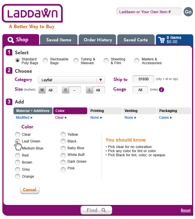 2_Laddawn_Level3_Color.png (image/png)
 3_Laddawn_Level3_Color.png (image/png)
 4_Laddawn_Level3_Color.png (image/png)
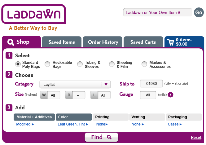 Laddawn_M&A_1.png (image/png)
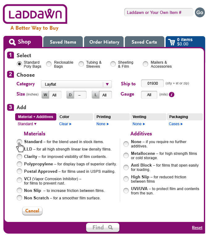 Laddawn_M&A_1.png (image/png)
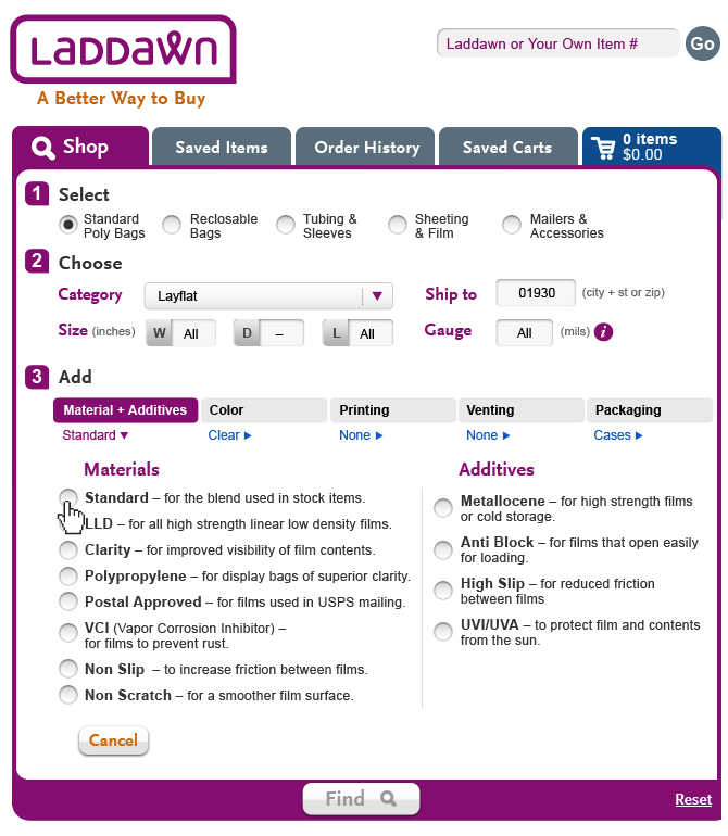 Laddawn_M&A_2.png (image/png)
 Laddawn_M&A_1.png (image/png)
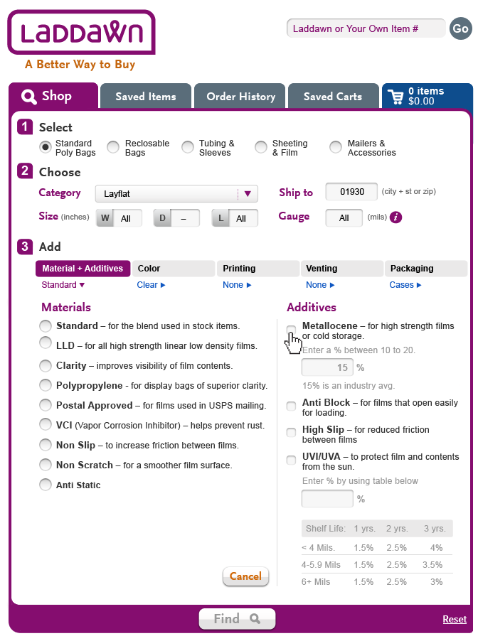 Laddawn_M&A_1.png (image/png)
Laddawn_M&A_1b.png (image/png)
Laddawn_M&A_2.png (image/png)
Laddawn_M&A_1.png (image/png)
Laddawn_M&A_1b.png (image/png)
Laddawn_M&A_2.png (image/png)
 Laddawn_M&A_2.png (image/png)
Laddawn_M&A_3.png (image/png)
Laddawn_M&A_4.png (image/png)
Laddawn_M&A_5.png (image/png)
1_Laddawn_Level3_Color.png (image/png)
2_Laddawn_Level3_Color.png (image/png)
3_Laddawn_Level3_Color.png (image/png)
4_Laddawn_Level3_Color.png (image/png)
Laddawn_Venting_1.png (image/png)
Laddawn_M&A_2.png (image/png)
Laddawn_M&A_3.png (image/png)
Laddawn_M&A_4.png (image/png)
Laddawn_M&A_5.png (image/png)
1_Laddawn_Level3_Color.png (image/png)
2_Laddawn_Level3_Color.png (image/png)
3_Laddawn_Level3_Color.png (image/png)
4_Laddawn_Level3_Color.png (image/png)
Laddawn_Venting_1.png (image/png)
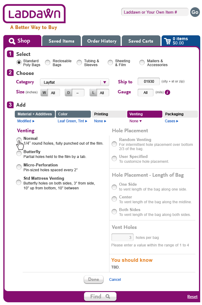 Laddawn_Venting_2.png (image/png)
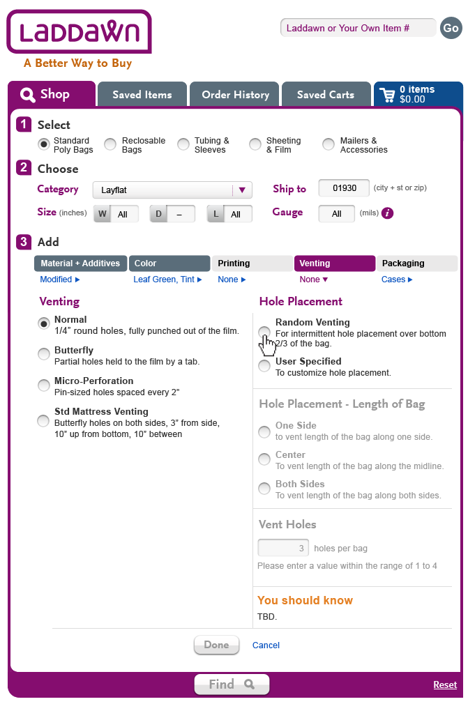 Laddawn_Venting_1.png (image/png)
Laddawn_Venting_2.png (image/png)
Laddawn_Venting_1.png (image/png)
Laddawn_Venting_2.png (image/png)
 Laddawn_Venting_2.png (image/png)
 Laddawn_Venting_2.png (image/png)
Laddawn_Venting_3.png (image/png)
Laddawn_Venting_2.png (image/png)
Laddawn_Venting_3.png (image/png)
 Laddawn_Venting_4.png (image/png)
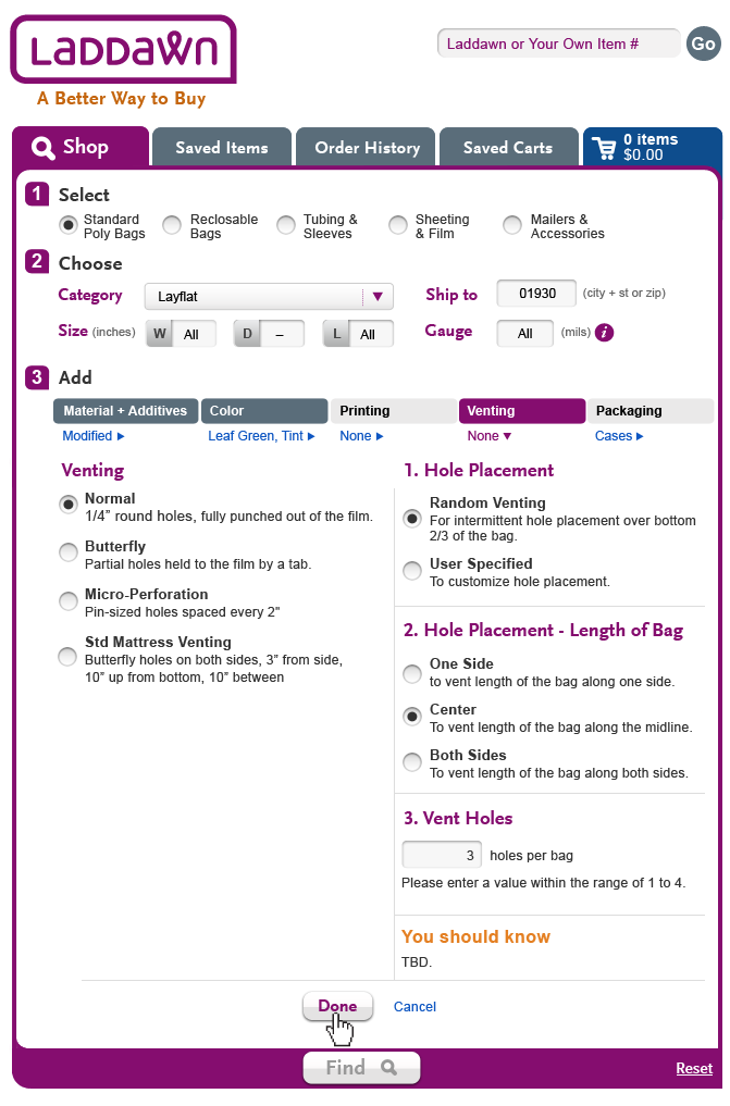 Laddawn_Venting_5.png (image/png)
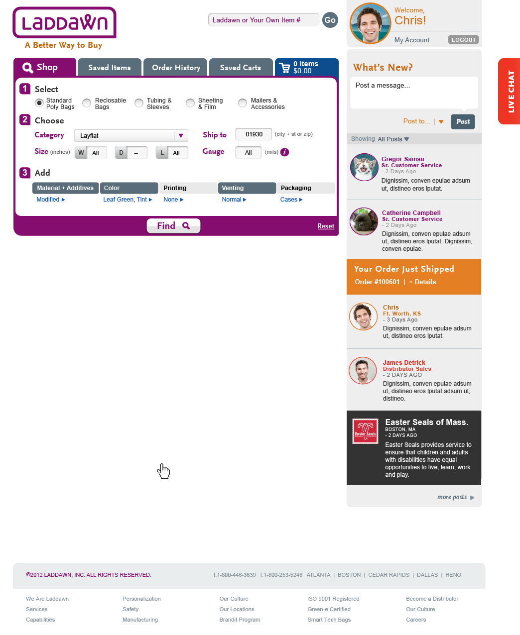 Laddawn_Venting_5.png (image/png)
Level3_MatAdd_1.png (image/png)
Laddawn_Venting_5.png (image/png)
Level3_MatAdd_1.png (image/png)
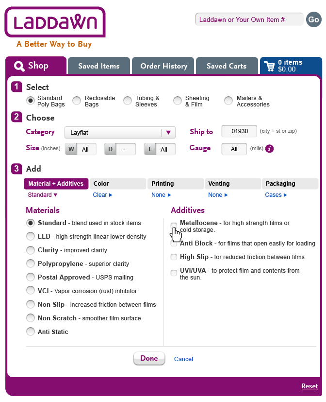 Level3_MatAdd_2a.png (image/png)
Level3_MatAdd_2b.png (image/png)
Level3_MatAdd_3.png (image/png)
Level3_MatAdd_4a.png (image/png)
Level3_MatAdd_4b.png (image/png)
Level3_MatAdd_1.png (image/png)
Level3_MatAdd_1b.png (image/png)
Laddawn_Shop_Normal1.png (image/png)
Level3_MatAdd_2a.png (image/png)
Level3_MatAdd_2b.png (image/png)
Level3_MatAdd_3.png (image/png)
Level3_MatAdd_4a.png (image/png)
Level3_MatAdd_4b.png (image/png)
Level3_MatAdd_1.png (image/png)
Level3_MatAdd_1b.png (image/png)
Laddawn_Shop_Normal1.png (image/png)
 Laddawn_Shop_Normal2.png (image/png)
 Laddawn_Shop_Normal3.png (image/png)
 Laddawn_Shop_Normal4.png (image/png)
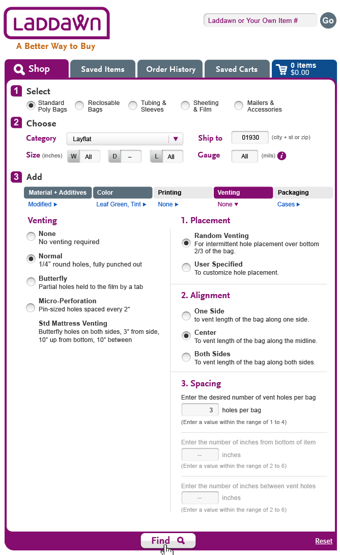 Laddawn_Shop_NormalUserSpecified1.png (image/png)
 Laddawn_Shop_Normal1.png (image/png)
 Laddawn_Shop_Normal2.png (image/png)
 Laddawn_Shop_Normal2.png (image/png)
 Laddawn_Shop_Normal3.png (image/png)
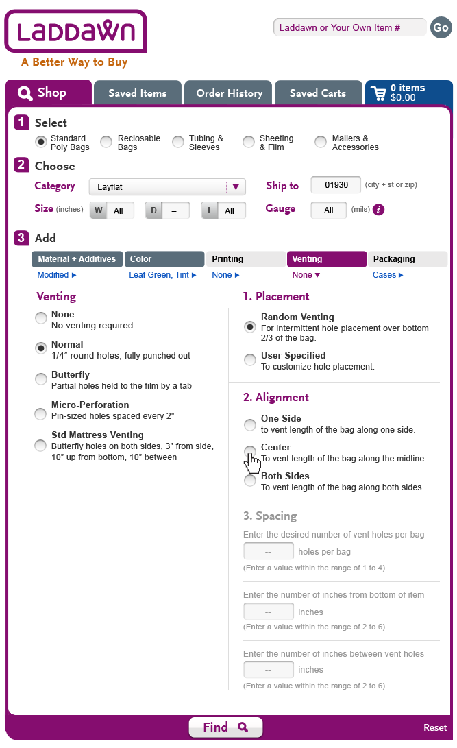 Laddawn_Shop_Normal4.png (image/png)
 Laddawn_Shop_NormalUserSpecified1.png (image/png)
 Laddawn_Shop_NormalUserSpecified_Error.png (image/png)
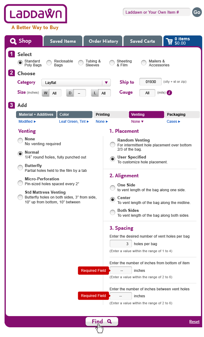 align1.png (image/png)
align2.png (image/png)
Laddawn_Shop_Normal1.png (image/png)
Laddawn_Shop_Normal2.png (image/png)
align1.png (image/png)
align2.png (image/png)
Laddawn_Shop_Normal1.png (image/png)
Laddawn_Shop_Normal2.png (image/png)
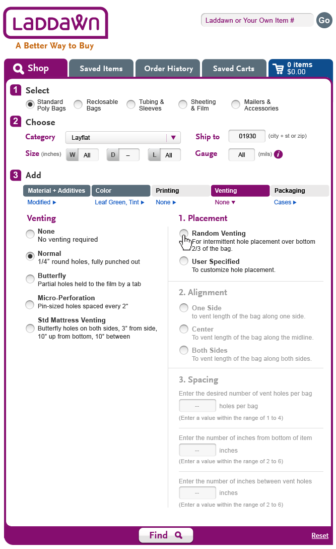 Laddawn_Shop_Normal2.png (image/png)
Laddawn_Shop_Normal3.png (image/png)
Laddawn_Shop_Normal4.png (image/png)
Laddawn_Shop_Normal2.png (image/png)
Laddawn_Shop_Normal3.png (image/png)
Laddawn_Shop_Normal4.png (image/png)
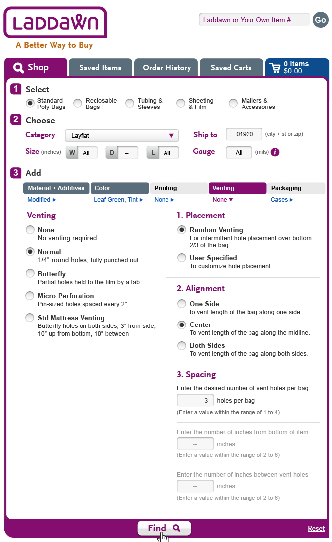 Laddawn_Shop_Normal4.png (image/png)
Laddawn_Shop_NormalUserSpecified_Error.png (image/png)
Laddawn_Shop_Normal4.png (image/png)
Laddawn_Shop_NormalUserSpecified_Error.png (image/png)
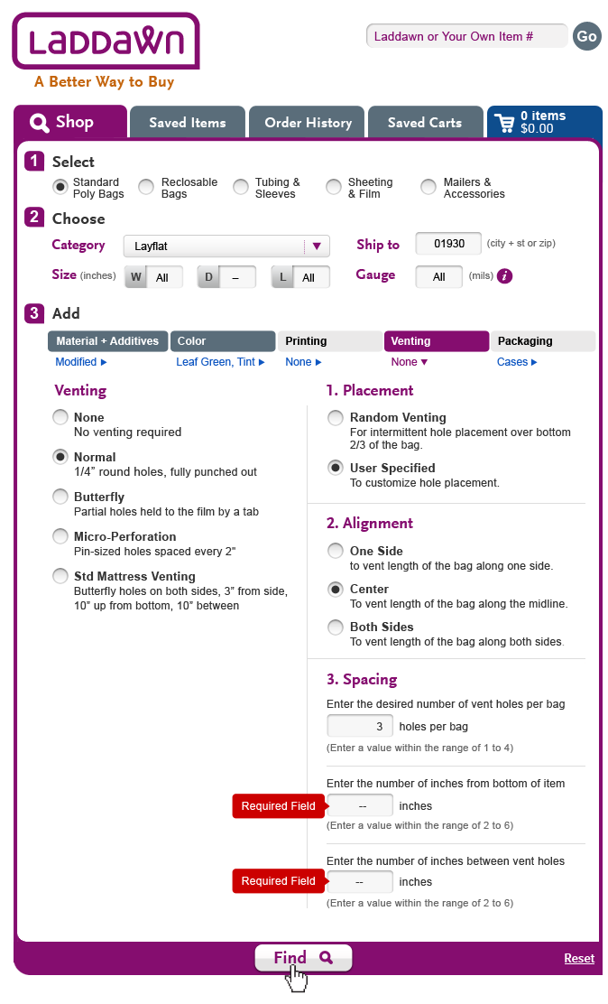 Laddawn_Shop_NormalUserSpecified1.png (image/png)
1_Level3_Color.png (image/png)
2_Level3_Color.png (image/png)
3_Level3_Color.png (image/png)
4_Level3_Color.png (image/png)
MatAdd_1.png (image/png)
MatAdd_2.png (image/png)
MatAdd_3.png (image/png)
MatAdd_4.png (image/png)
MatAdd_LLD_1.png (image/png)
MatAdd_LLD_2.png (image/png)
MatAdd_LLD_3.png (image/png)
MatAdd_LLD_4.png (image/png)
1_Level3_Printing.png (image/png)
Laddawn_Shop_NormalUserSpecified1.png (image/png)
1_Level3_Color.png (image/png)
2_Level3_Color.png (image/png)
3_Level3_Color.png (image/png)
4_Level3_Color.png (image/png)
MatAdd_1.png (image/png)
MatAdd_2.png (image/png)
MatAdd_3.png (image/png)
MatAdd_4.png (image/png)
MatAdd_LLD_1.png (image/png)
MatAdd_LLD_2.png (image/png)
MatAdd_LLD_3.png (image/png)
MatAdd_LLD_4.png (image/png)
1_Level3_Printing.png (image/png)
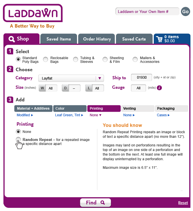 2_Level3_Printing.png (image/png)
3_Level3_Printing.png (image/png)
PrintingDesign.png (image/png)
1_Level3_Printing.png (image/png)
2_Level3_Printing.png (image/png)
3_Level3_Printing.png (image/png)
PrintingDesign.png (image/png)
1_Level3_Printing.png (image/png)
 1_Level3_Printing.png (image/png)
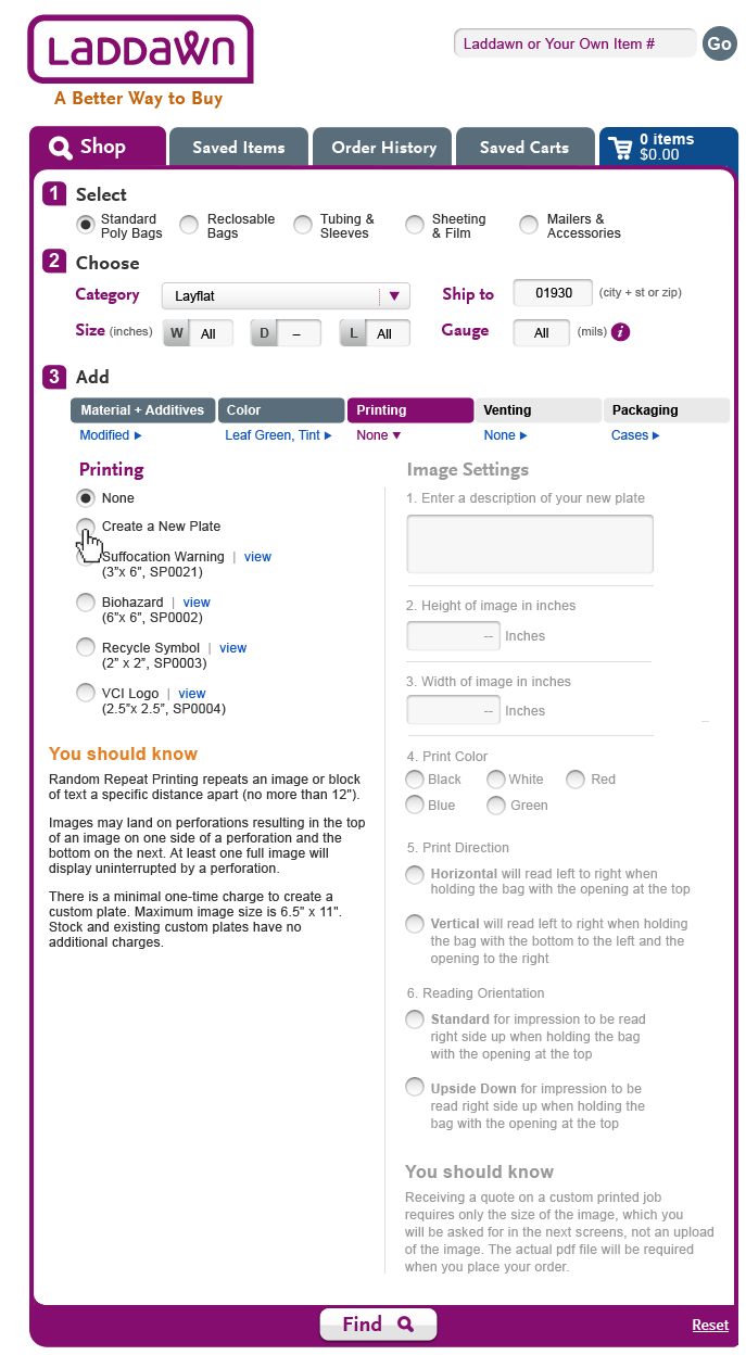 1_Level3_Printing.png (image/png)
image2012-9-19 10:44:54.png (image/png)
1_Level3_Printing.png (image/png)
image2012-9-19 10:44:54.png (image/png)
 Packaging_1.png (image/png)
Packaging_2.png (image/png)
Packaging_3.png (image/png)
Cart_Shadowbox_ZipCodeNoMatch.png (image/png)
Packaging_1.png (image/png)
Packaging_2.png (image/png)
Packaging_3.png (image/png)
Cart_Shadowbox_ZipCodeNoMatch.png (image/png)
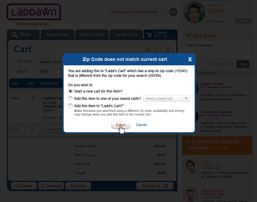 Cart_Shadowbox_ZipCodeUnNamed.png (image/png)
image2012-9-27 8:24:16.png (image/png)
Cart_Shadowbox_ZipCodeUnNamed.png (image/png)
image2012-9-27 8:24:16.png (image/png)
 Shop_ZipCode_CartName.png (image/png)
 Shop_ZipCode_CartName.png (image/png)
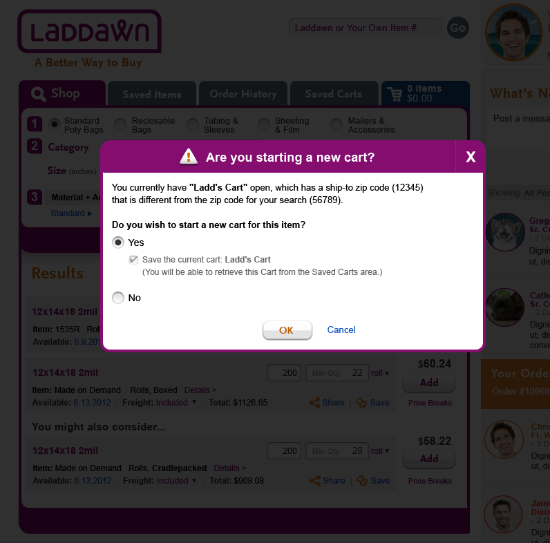 Shop_ZipCode_UnNamedCart.png (image/png)
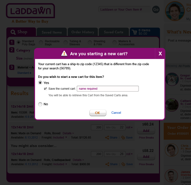 Shop_ZipCode_UnNamedCartB.png (image/png)
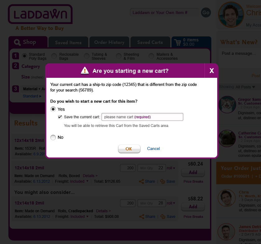 Shop_ZipCode_CartName.png (image/png)
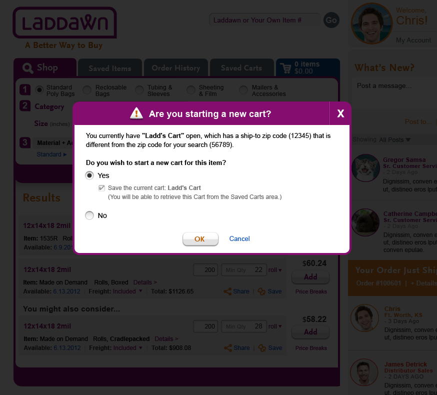 Shop_ZipCode_UnNamedCart.png (image/png)
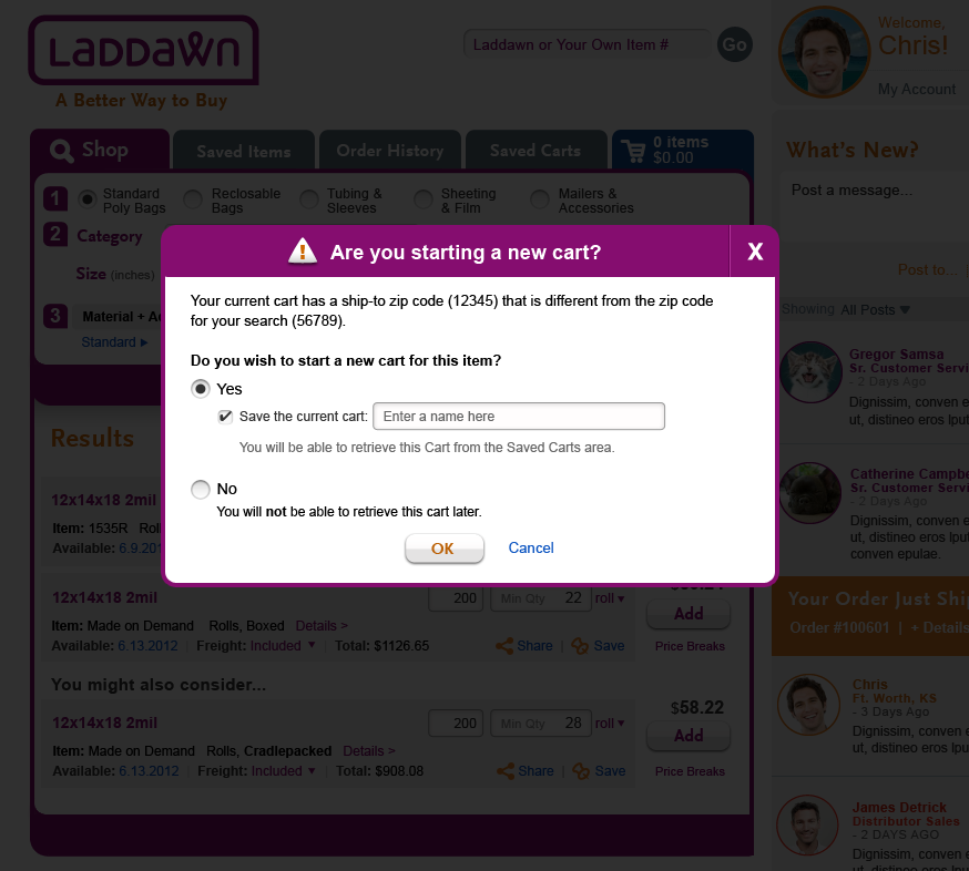 Shop_ZipCode_UnNamedCart.png (image/png)
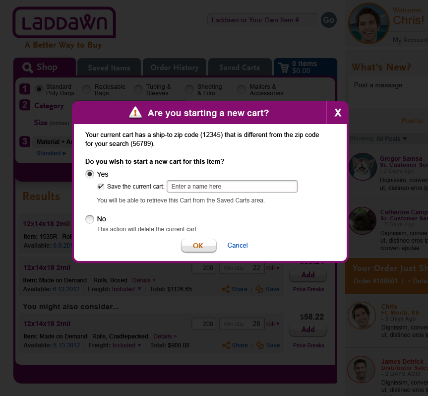 Shop_ZipCode_UnNamedCart.png (image/png)
 Shop_ZipCode_UnNamedCart.png (image/png)
Shop_ZipCode_CartName.png (image/png)
Shop_ZipCode_TipPopUp.png (image/png)
Shop_ZipCode_UnNamedCart.png (image/png)
Shop_ZipCode_CartName.png (image/png)
Shop_ZipCode_TipPopUp.png (image/png)
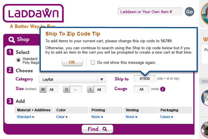 Shop_ZipCode_TipPopUp.png (image/png)
image2012-12-6 9:26:59.png (image/png)
Shop_ZipCode_TipPopUp.png (image/png)
image2012-12-6 9:26:59.png (image/png)
 image2012-12-6 9:37:57.png (image/png)
 image2012-12-6 9:41:4.png (image/png)