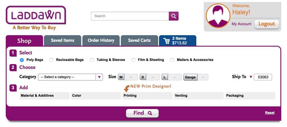
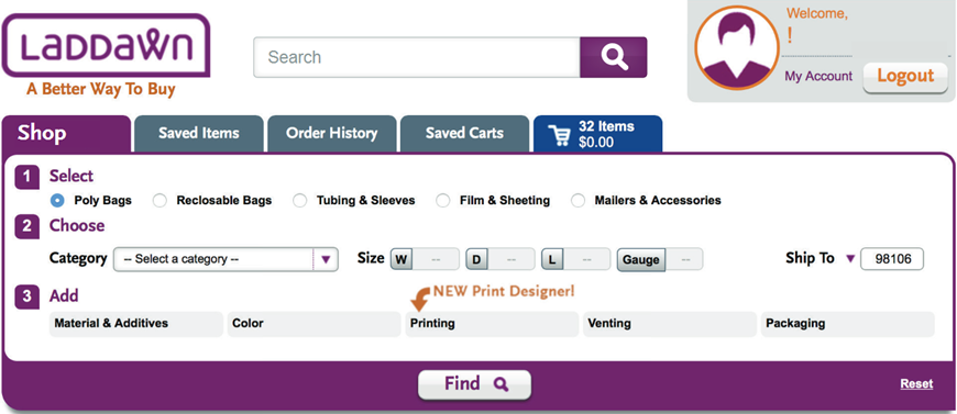
Search results box
| Current | Susan's last | Haley's last | Chris's last | New |
|---|---|---|---|---|
|
|
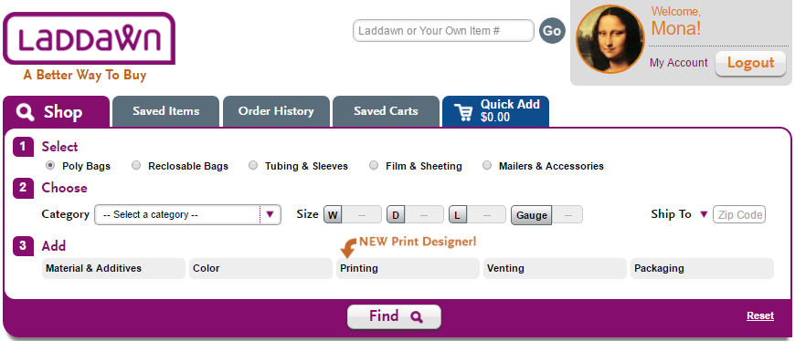
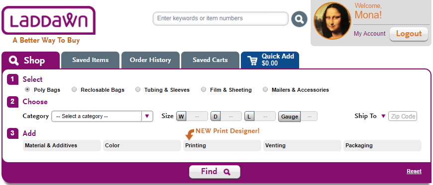
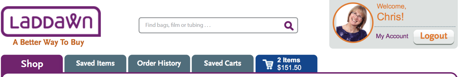
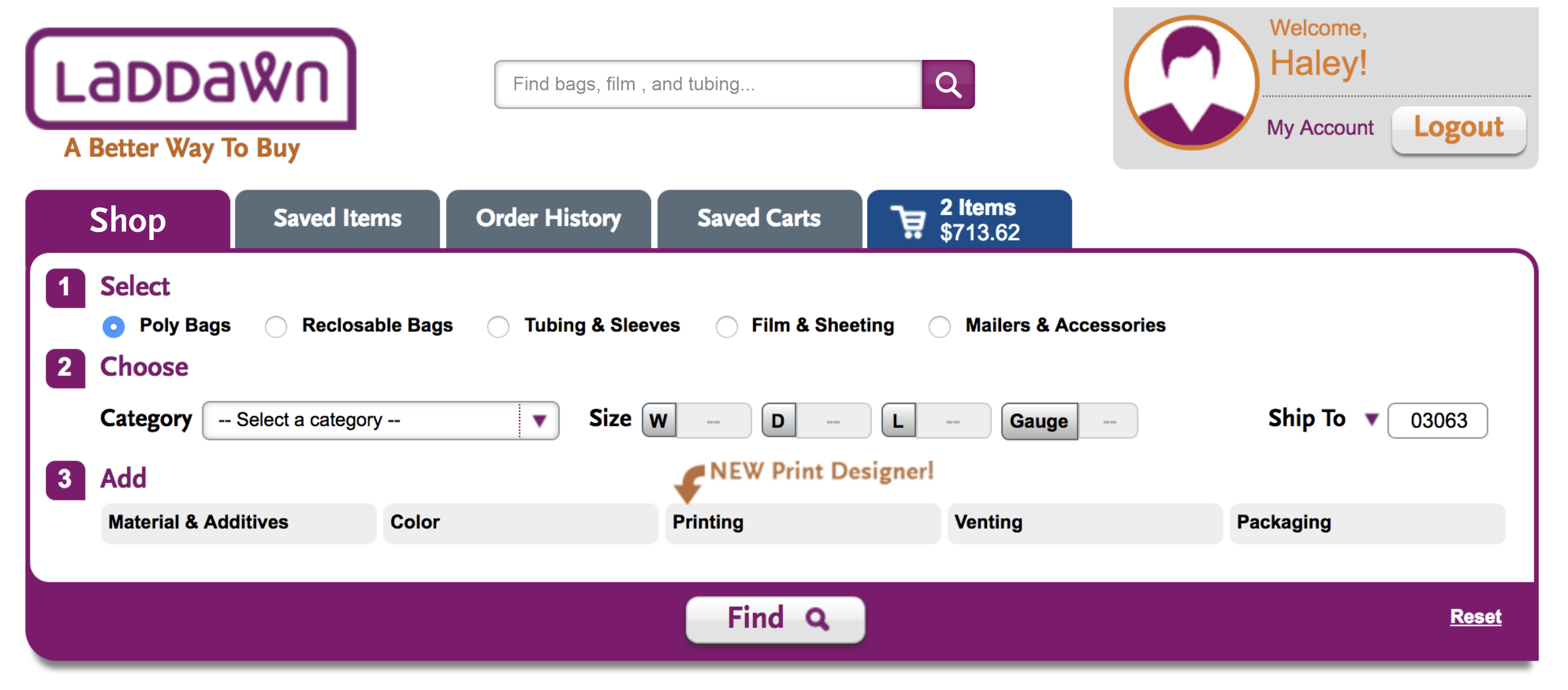
Scale of button - when looked at in conjunction with widget and Find button, a little too dominant? Try this treatment using Chris's scale? Need to show how auto-suggestions would look. |
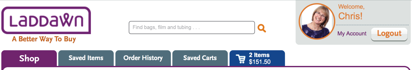
We like the watermark text. The scale of the box and button in both versions, relative to other features (Find etc.) seems more appropriate than Haley's larger version. I think the second version works best for both the box and the suggestions... (OR) Wonder about the exact water marked text. "Bags, film & tubing..." may imply that we don't have things like mailers, packing list envelopes and vacuum pouches.
|
|


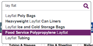
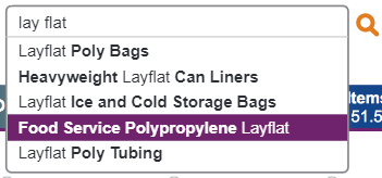

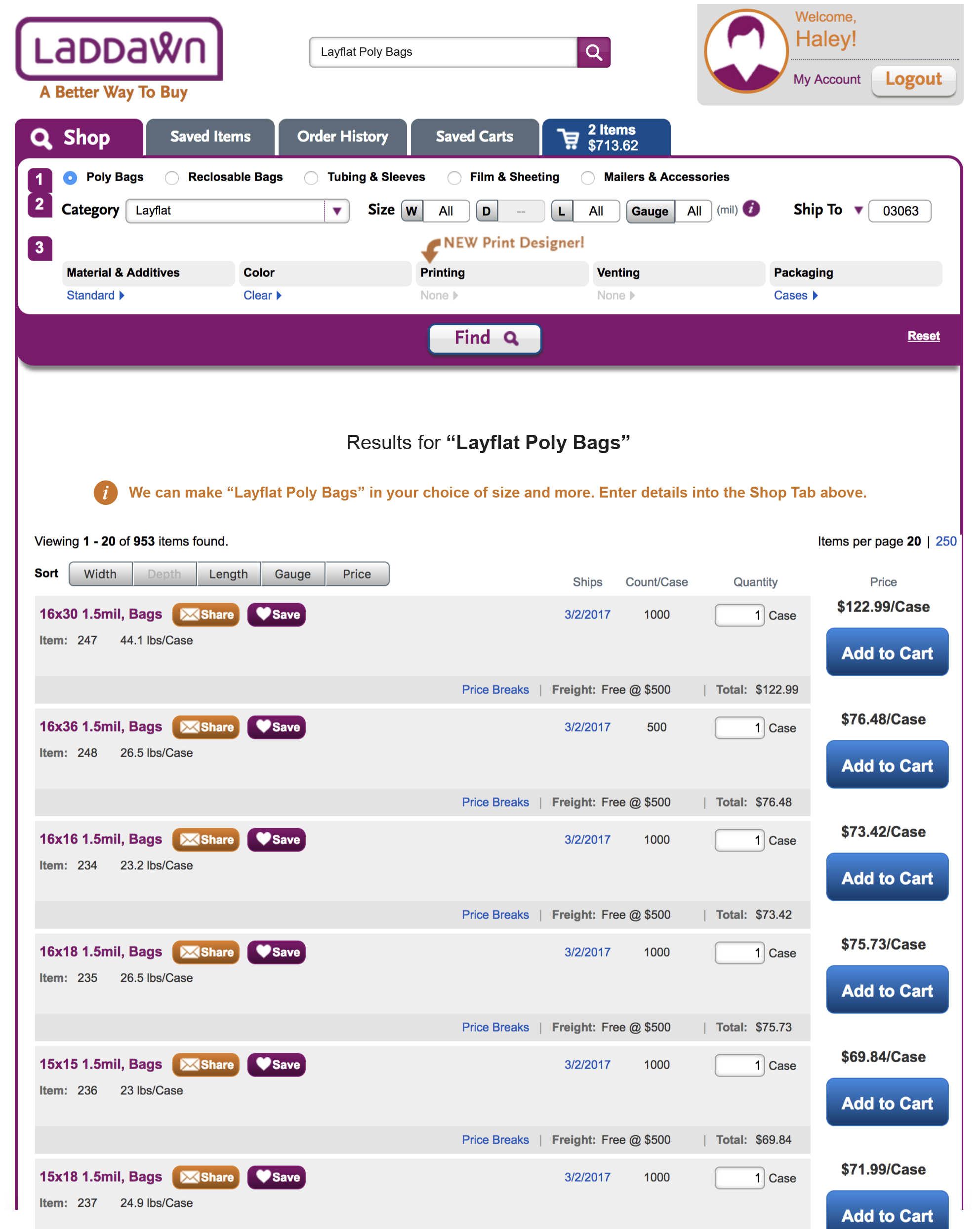
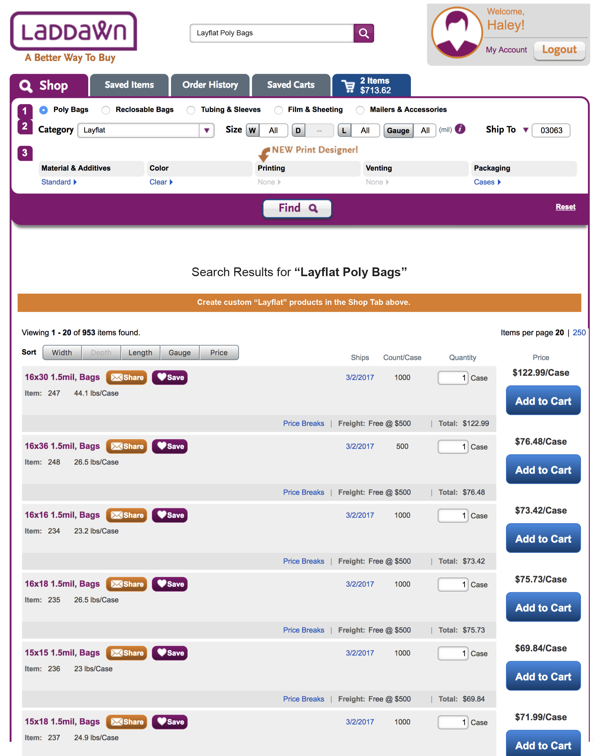
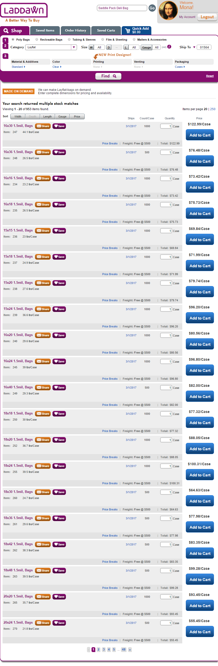
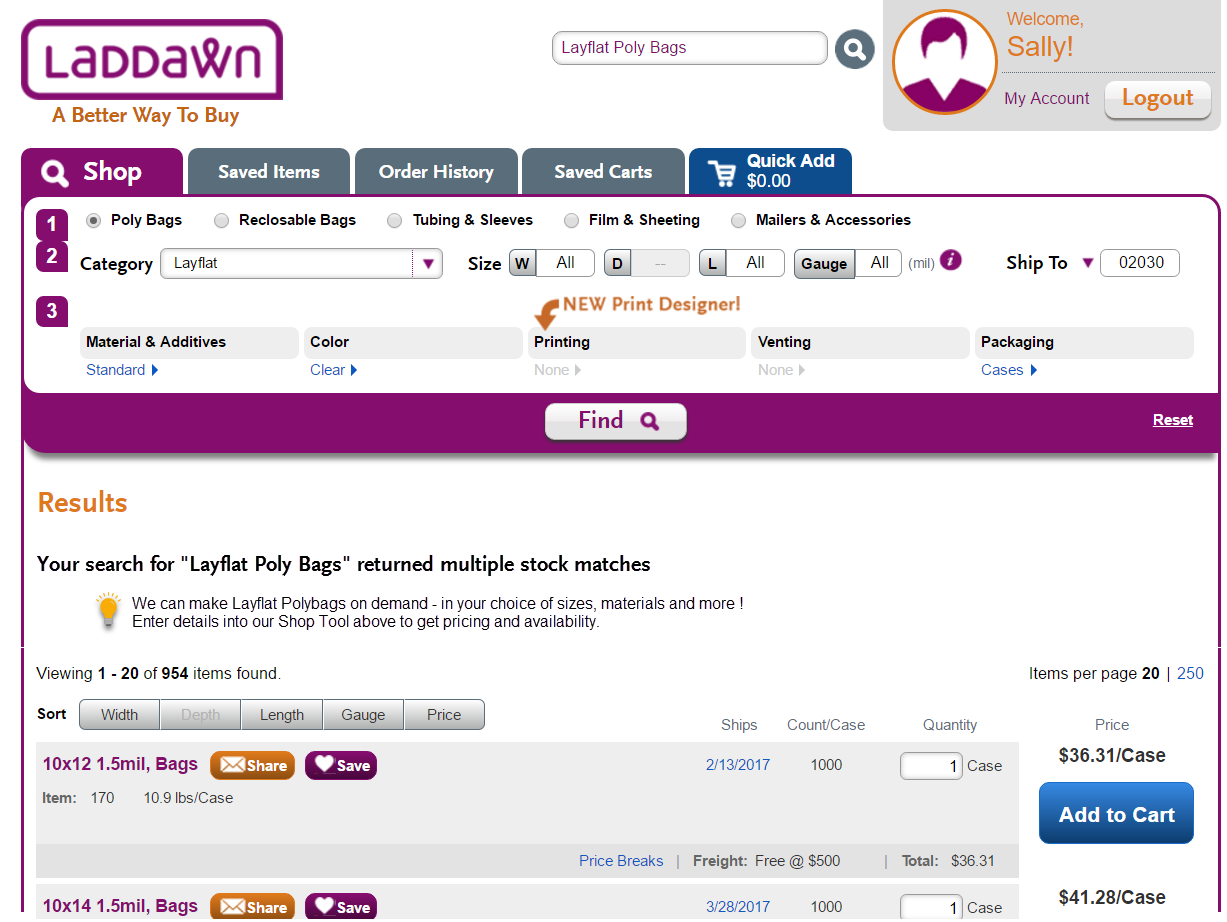
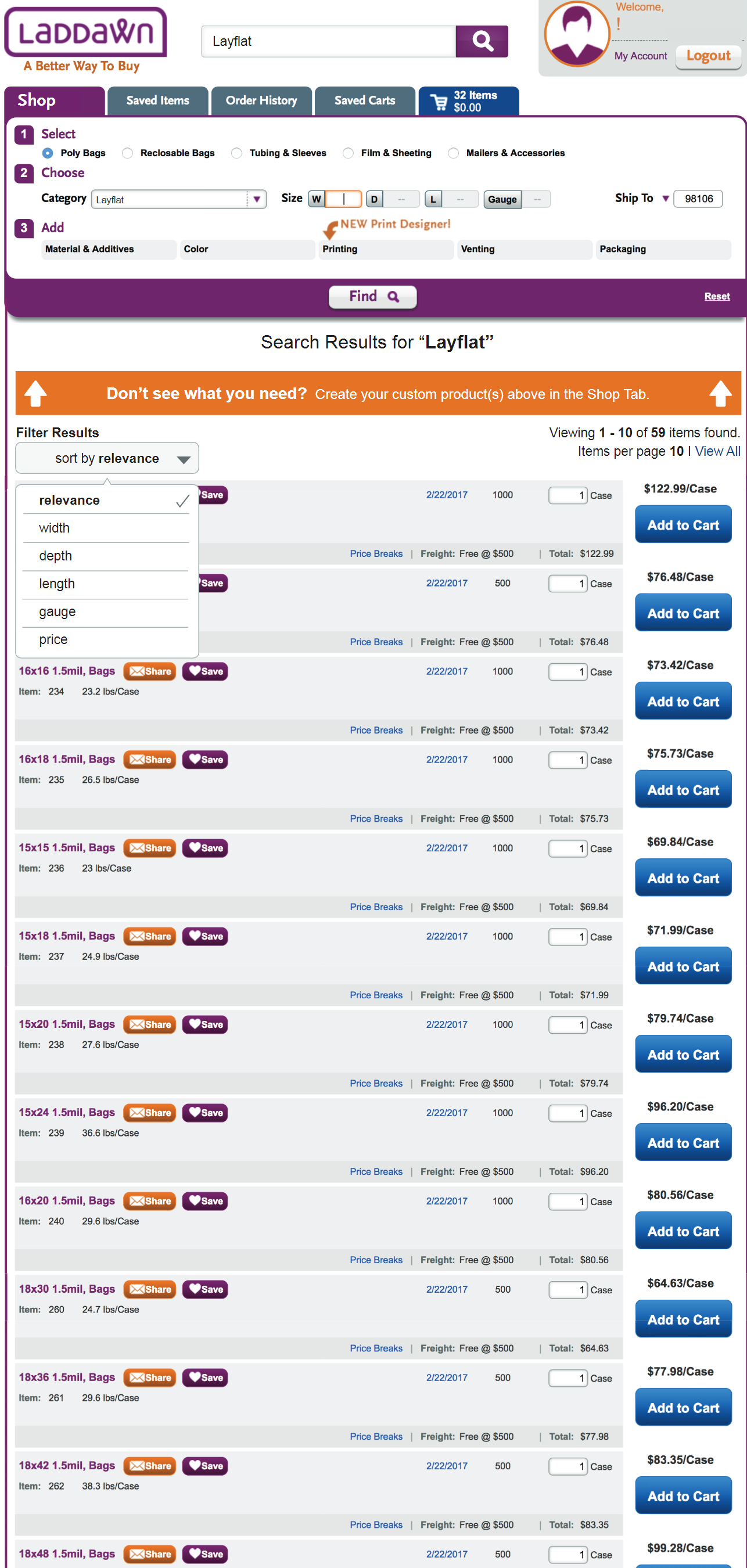
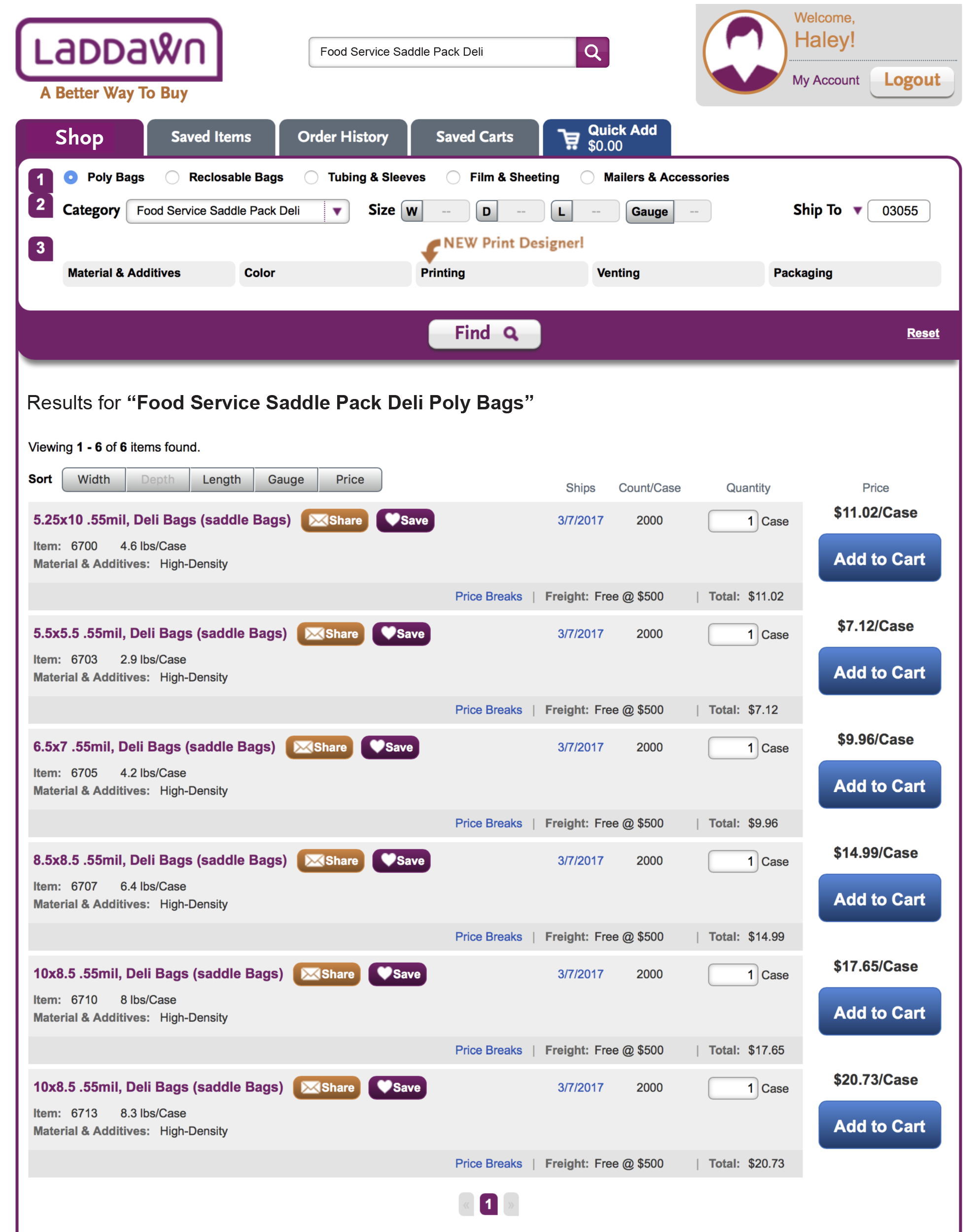
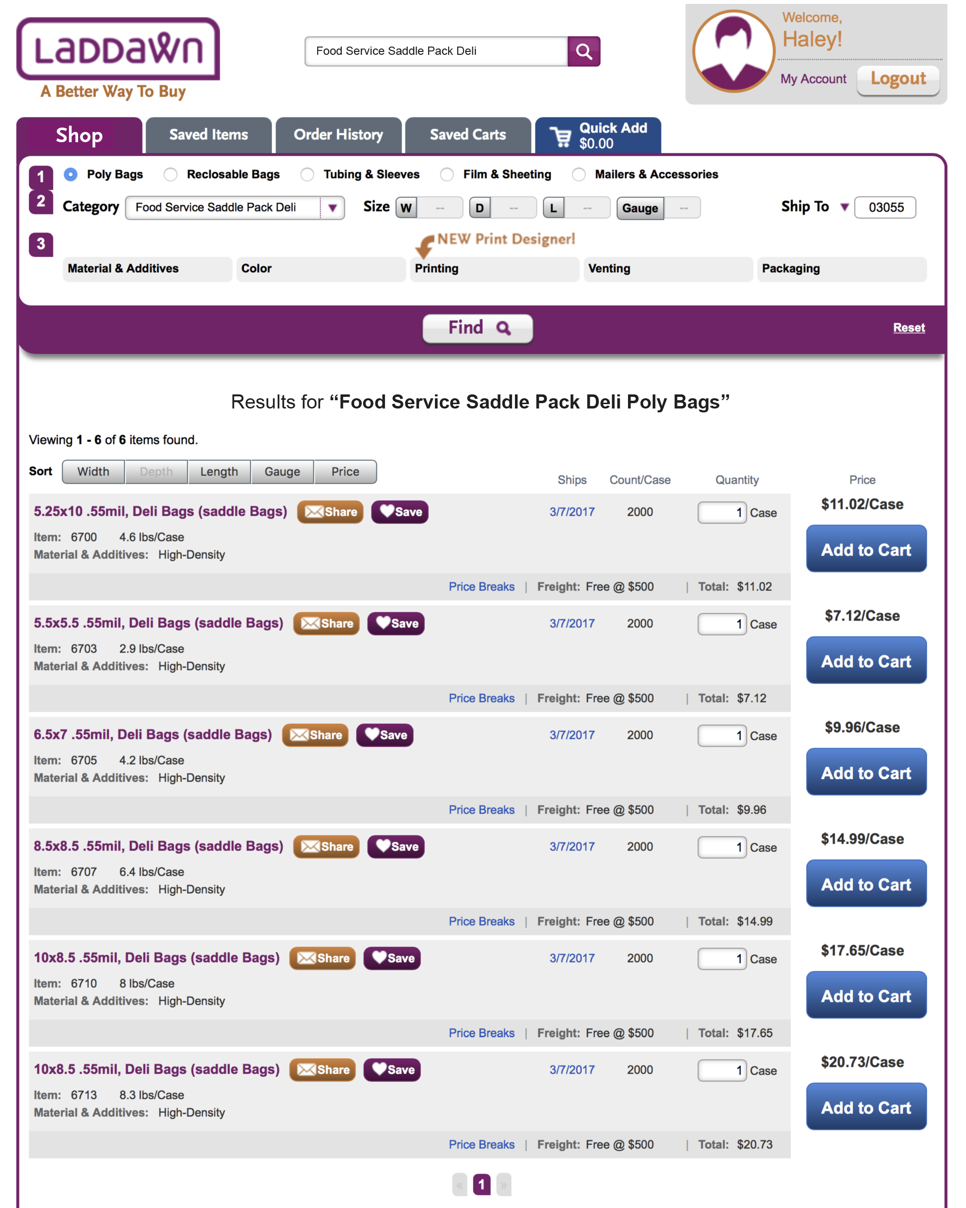
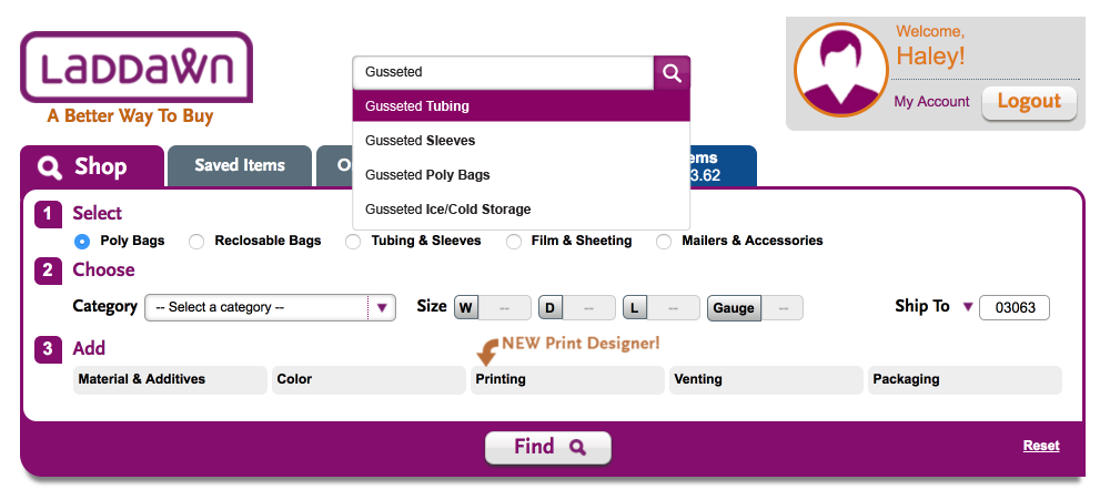
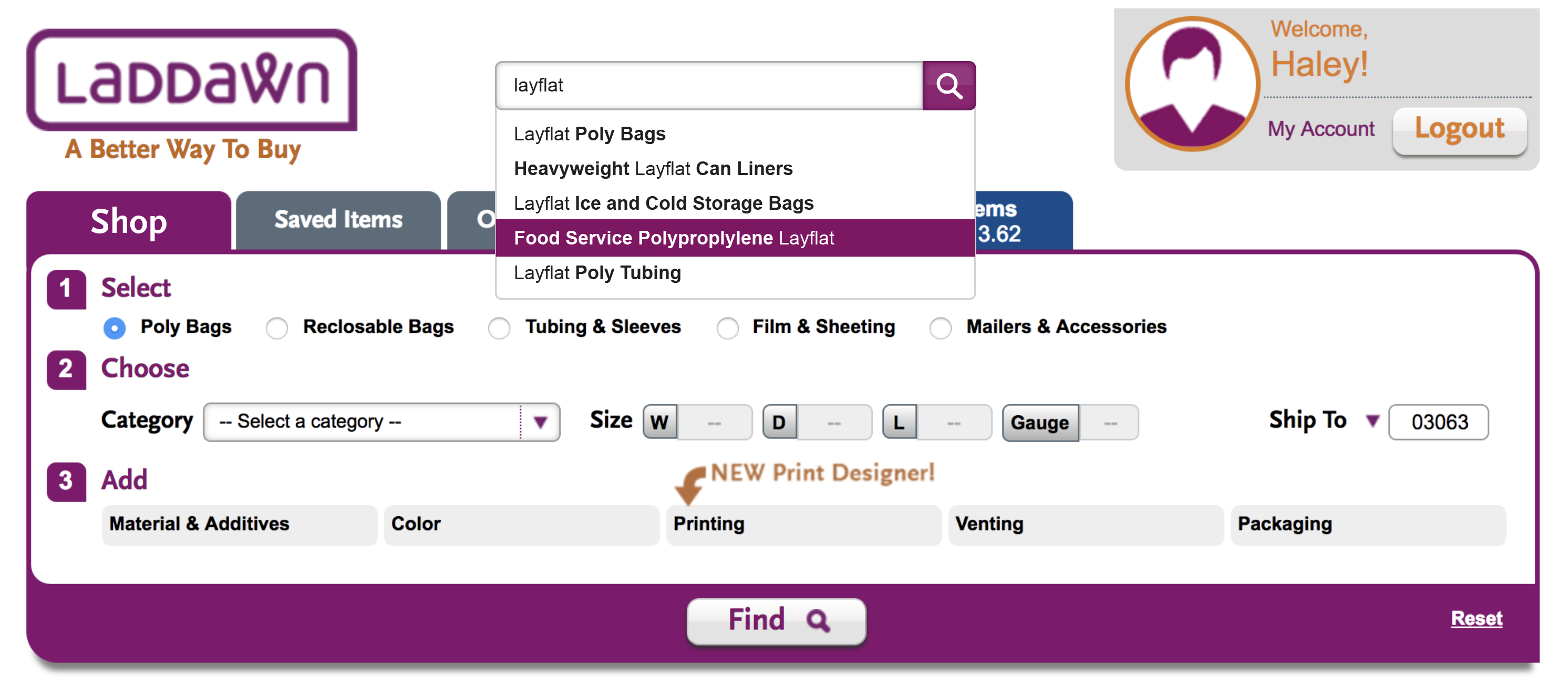
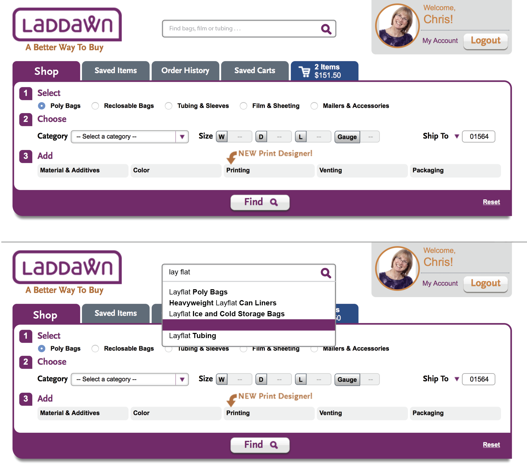
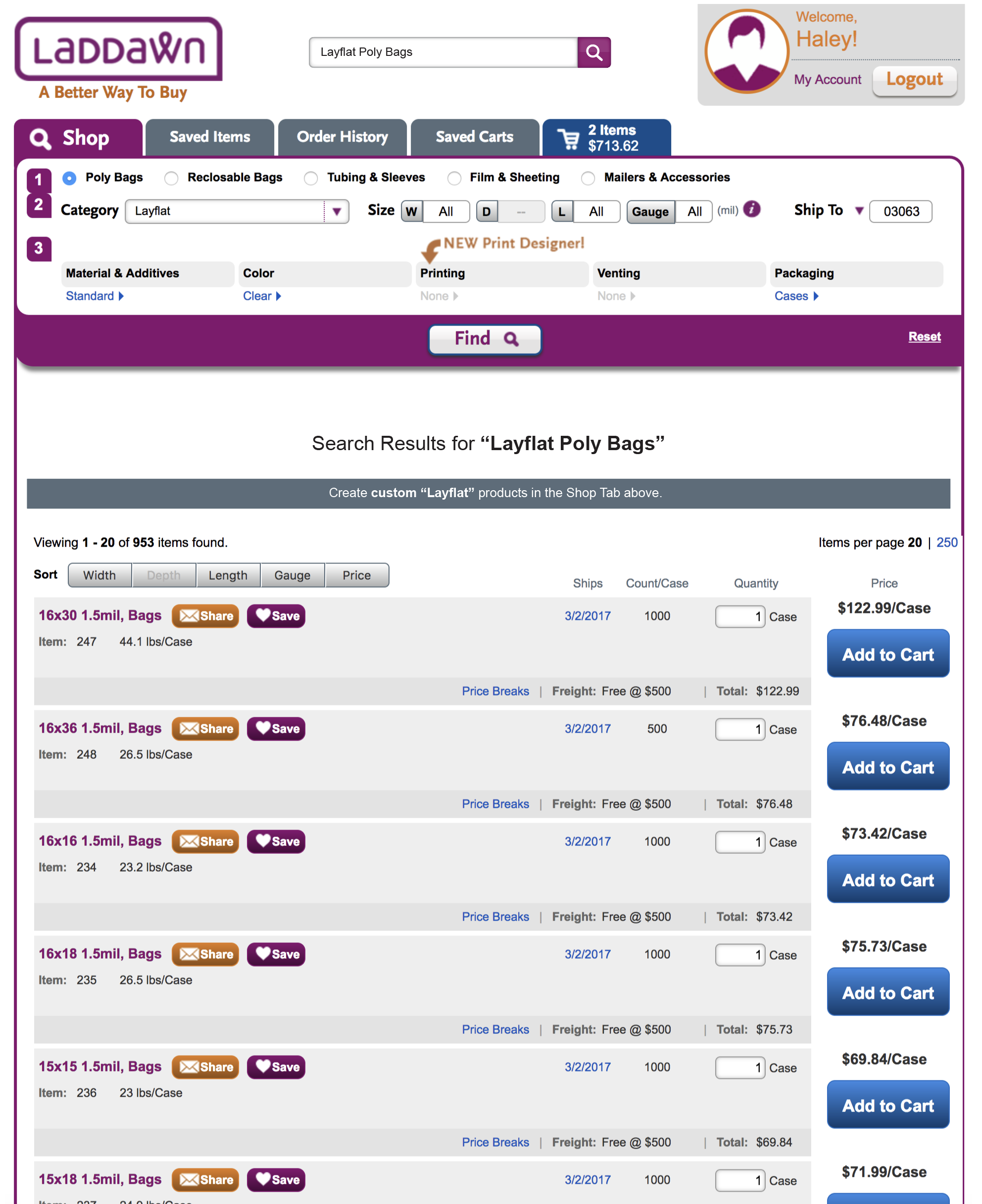
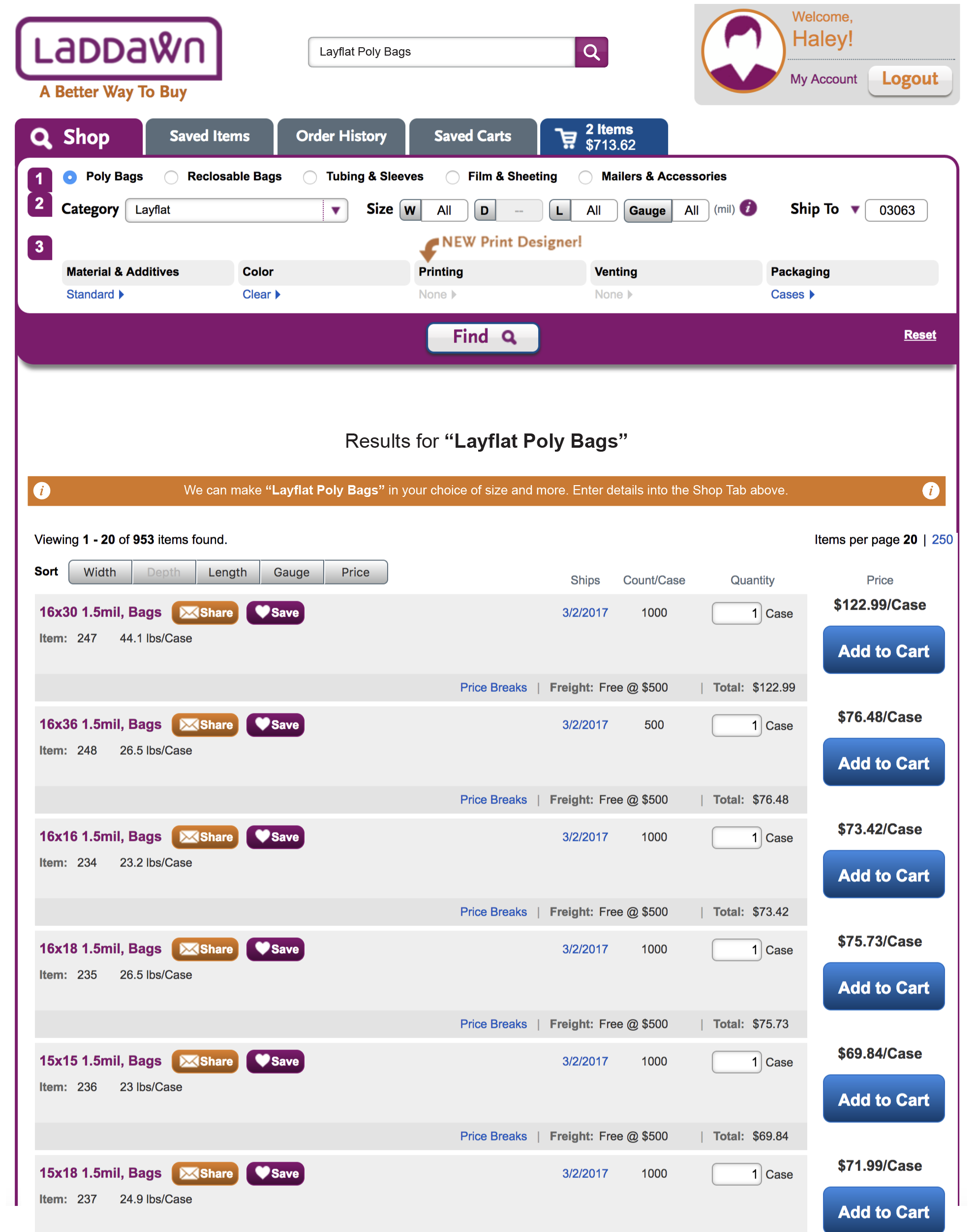
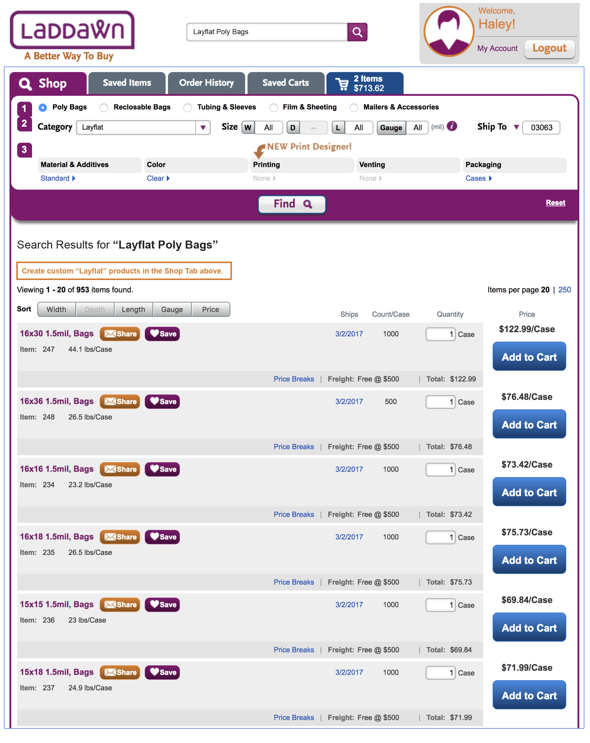
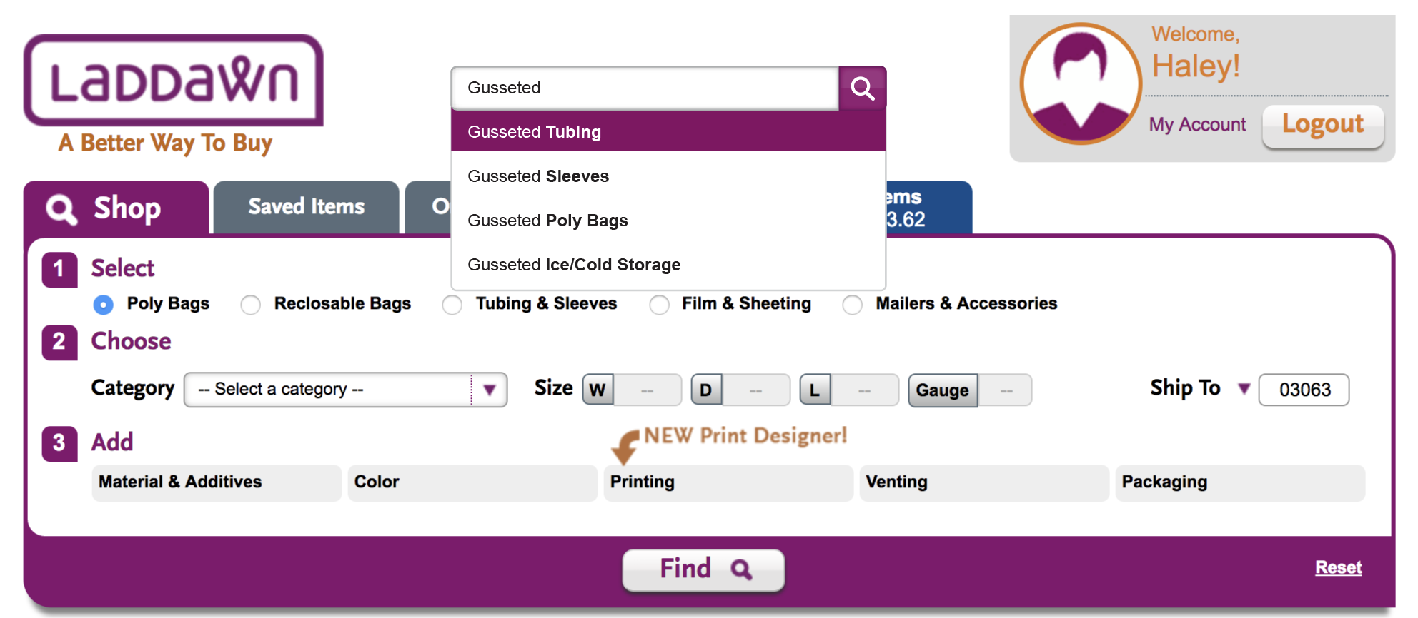
Scenario 1 - user chooses suggestion that matches category we stock, and which we make
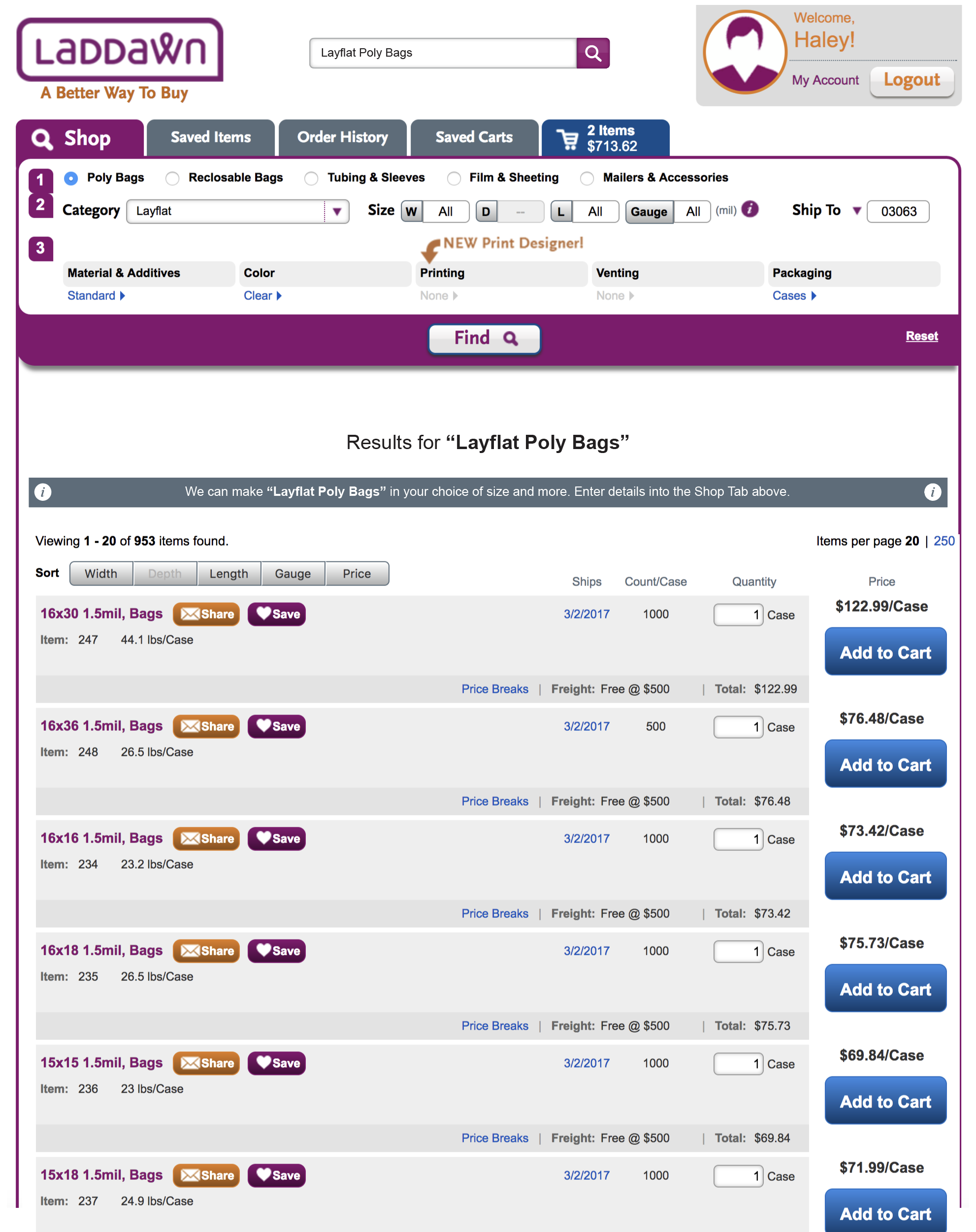
For example, "Layflat Poly Bags" - we stock them, but we can make them in custom sizes, materials, etc. Our results messaging should mention our custom capabilities, without implying the results are in some way deficient.
| Current | Susan's last | Haley's last | New |
|---|---|---|---|
|
|
Results heading: Font is large, and centering it, stacked under Find button clouds hierarchy. MOD capabilities message: Orange box/arrows and "don't see what you need?" verbiage seems too extreme for this scenario. We're directing the eyes upward, when it's quite possible what they need is in the results list below. Below the orange box... We'd like to continue to explore this layout option (changes to sorting and viewing x of x results). However,we're losing focus on the main goal - enabling keyword searches. Let's hold off on these changes for now. When we're ready to resume... No need for "filter results" heading. Collapsed state will always show "Sort by <whatever is selected>". (We may also want to research best practices some more, and see if what we've got is as functional or more ...) (OR) Agreed. Let's split off the "Sort by" work I'm glad to see the old approach questioned - and I personally like a drop down approach - but, I find it distracting to the design work at hand. At the very least, let's close it up in the design and pull it out as a separate effort. | Would like to see results heading left aligned and smaller. Would like two variations: 1) "Results for 'Layflat Poly Bags'" 2) "Your search for 'Layflat Poly Bags' returned multiple stock matches" I'd like to see this messaging take the place of the text in orange box: "We can make Layflat Poly Bags on demand in your choice sizes and more. Enter details into Shop Tab above." (CE) alt text: We can make Layflat Poly Bags in your choice of size and more. Enter details into the Shop Tab above.
       |
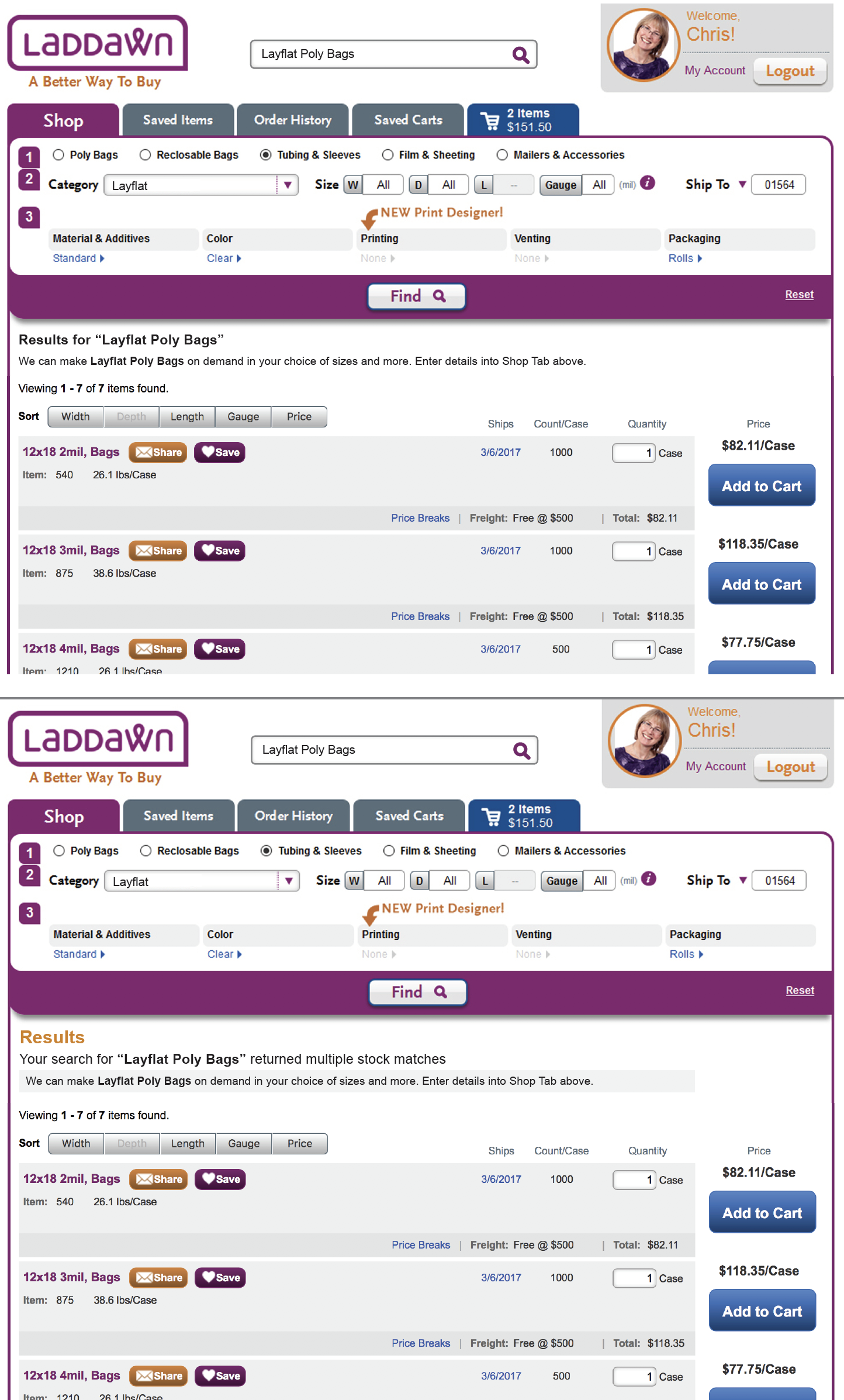
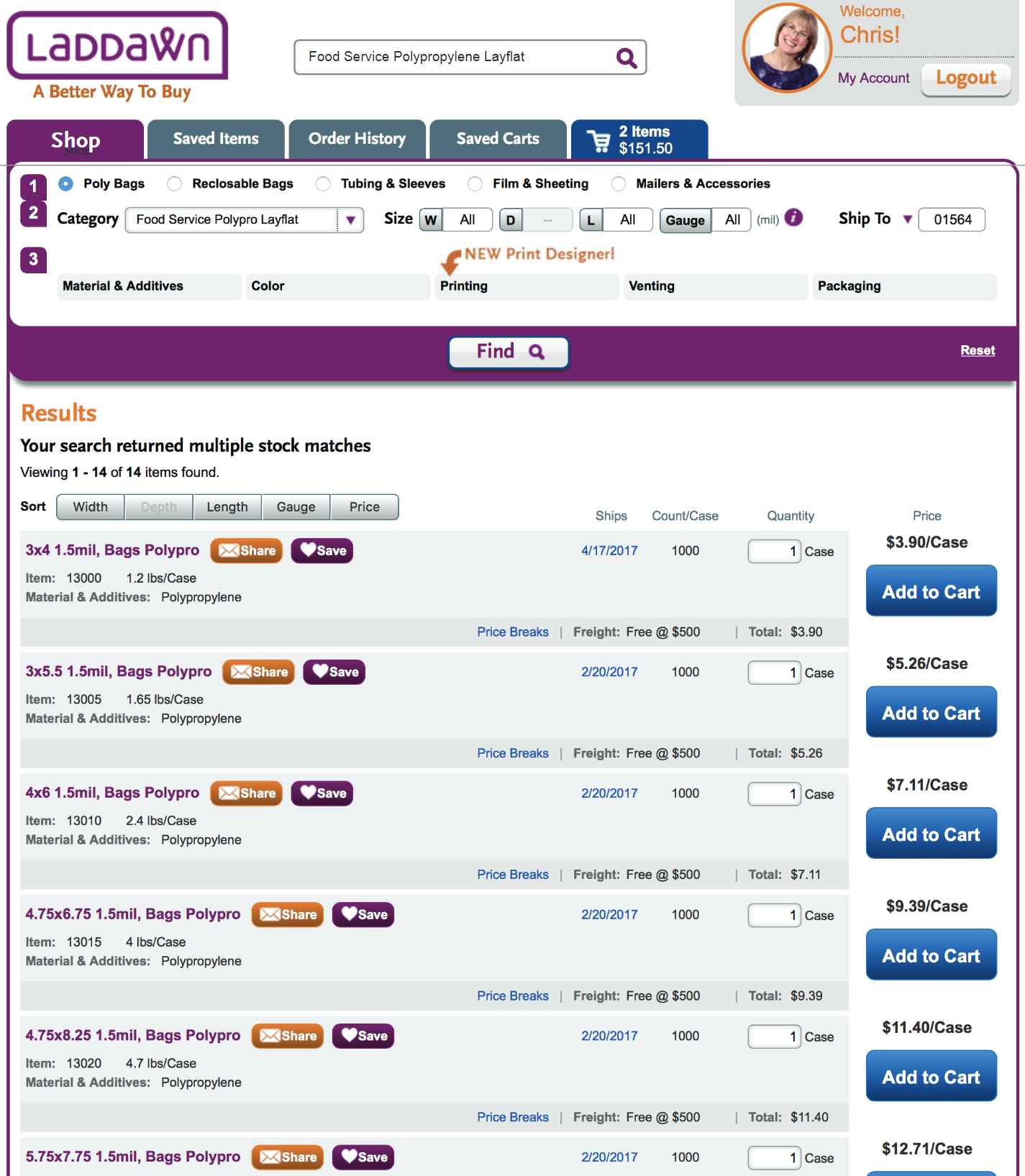
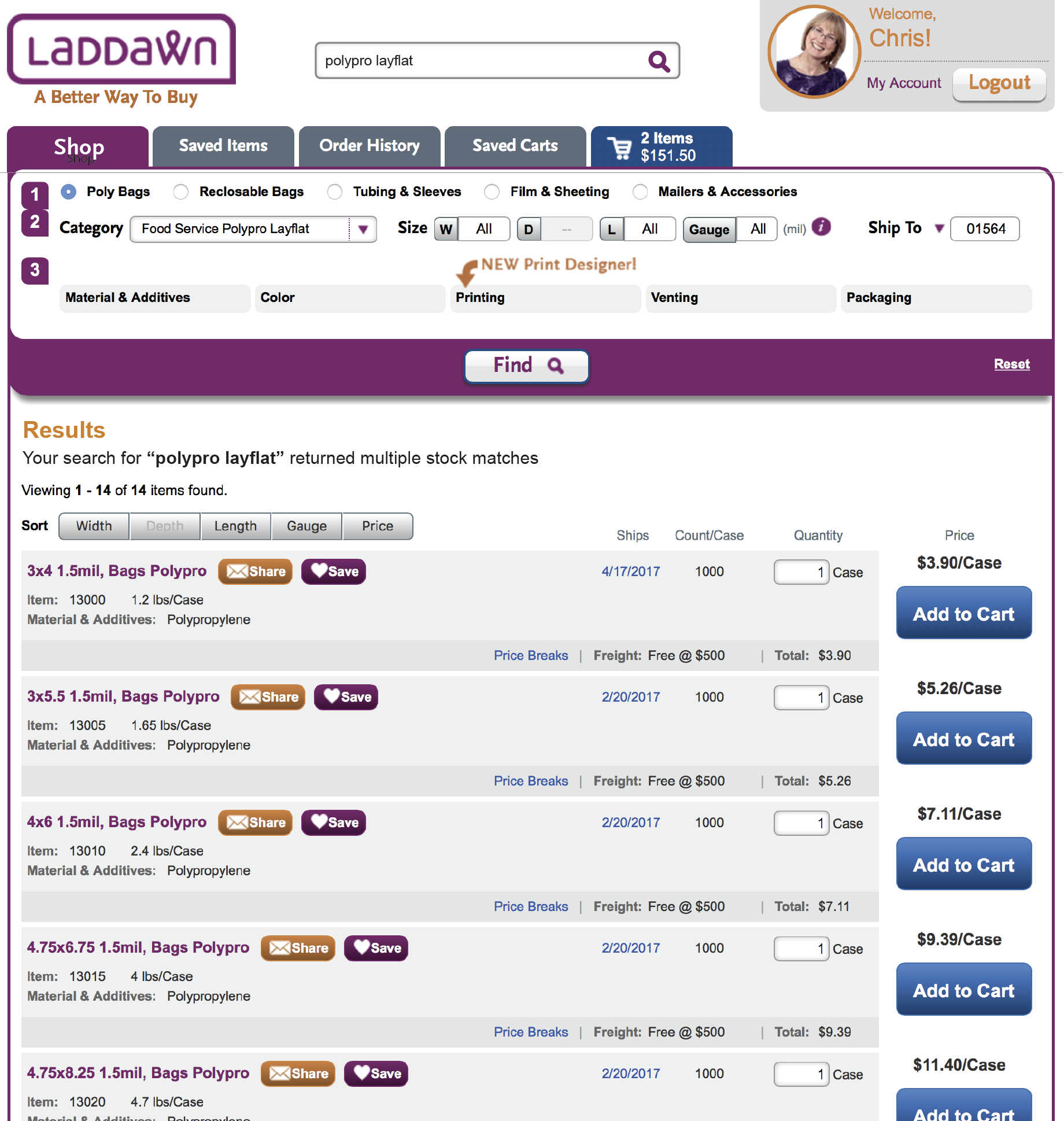
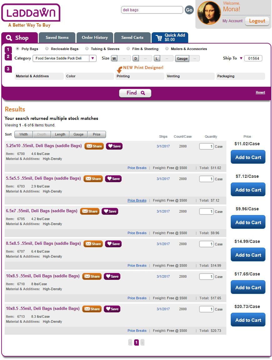
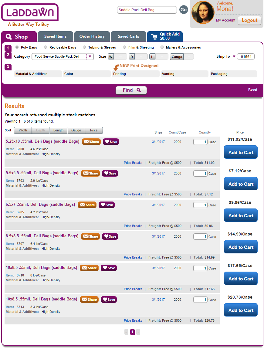
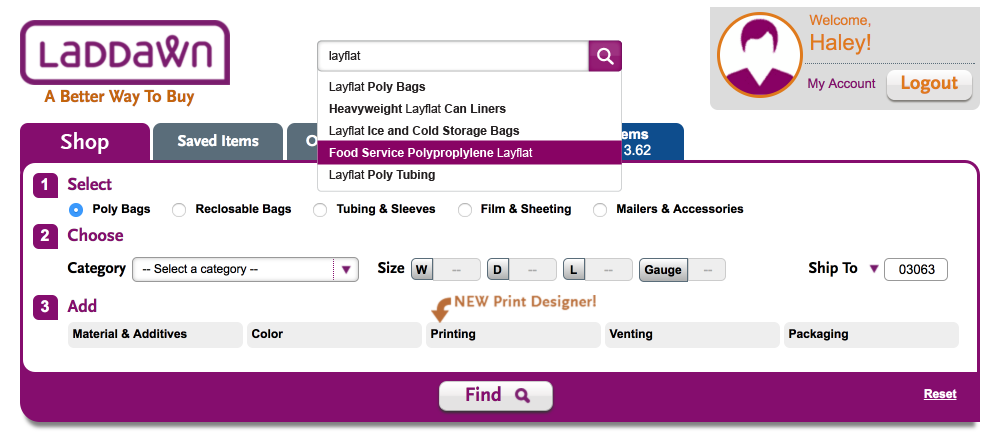
Scenario 2 - user chooses suggestion that matches category we stock, but do not make
For example, "Saddle Pack Deli Bags" or "Food Service Polypro Layflat" - we stock them, but we do not make them in custom sizes or materials. (When you select this category in the widget, the dimension fields and level 3 menus are disabled. That will also be the case if what the user types in the search box brings up one of these categories as a suggestion and they search on it.)
| Current | Chris's last | New |
|---|---|---|
I would like all of our result taglines to reference what was searched, so: Your search for "Saddle Pack Deli Bags" returned multiple stock matches. |
Again, I would like all of our result taglines to reference what was searched, so: "Your search for 'Food Service Polypro Layflat' returned multiple stock matches." | Whatever we come up with here should be consistent with what we come up with for scenario 1 as far as display of results heading, tagline and results - but there should be no message concerning custom capabilities. (OR) I think it will be helpful to remove the "New Print Designer!" and arrow from the widget. It's meant to be temporary anyway and it will continue to add noise to any design solution above or below.
|

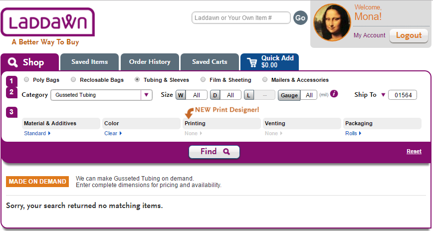
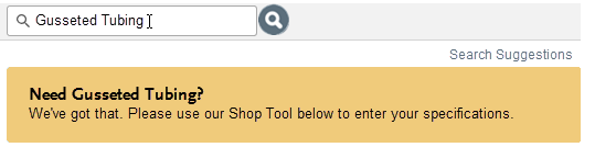
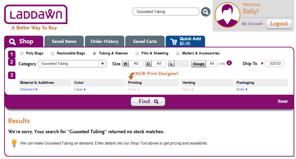
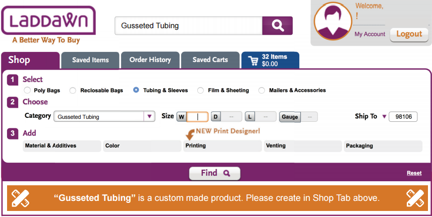
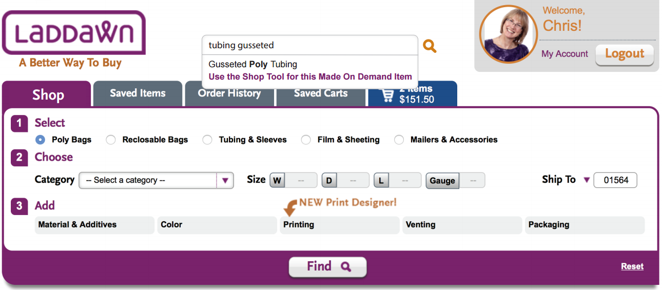
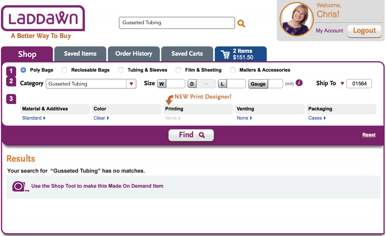
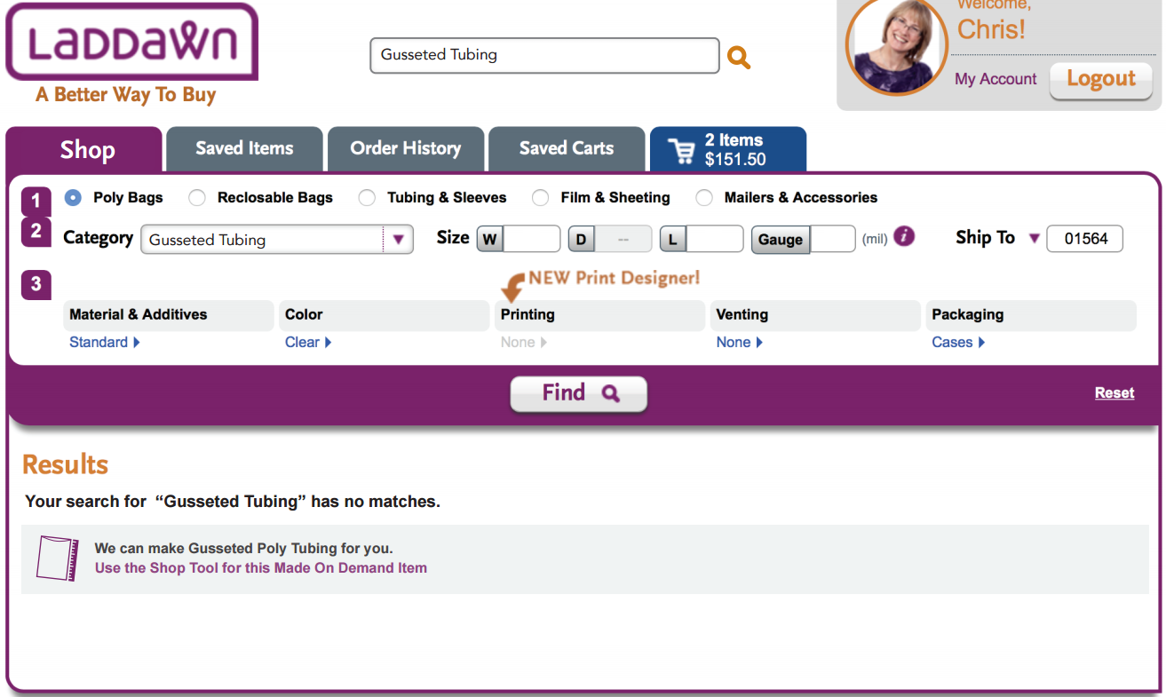
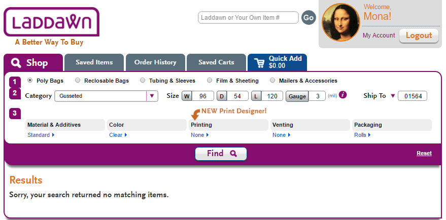
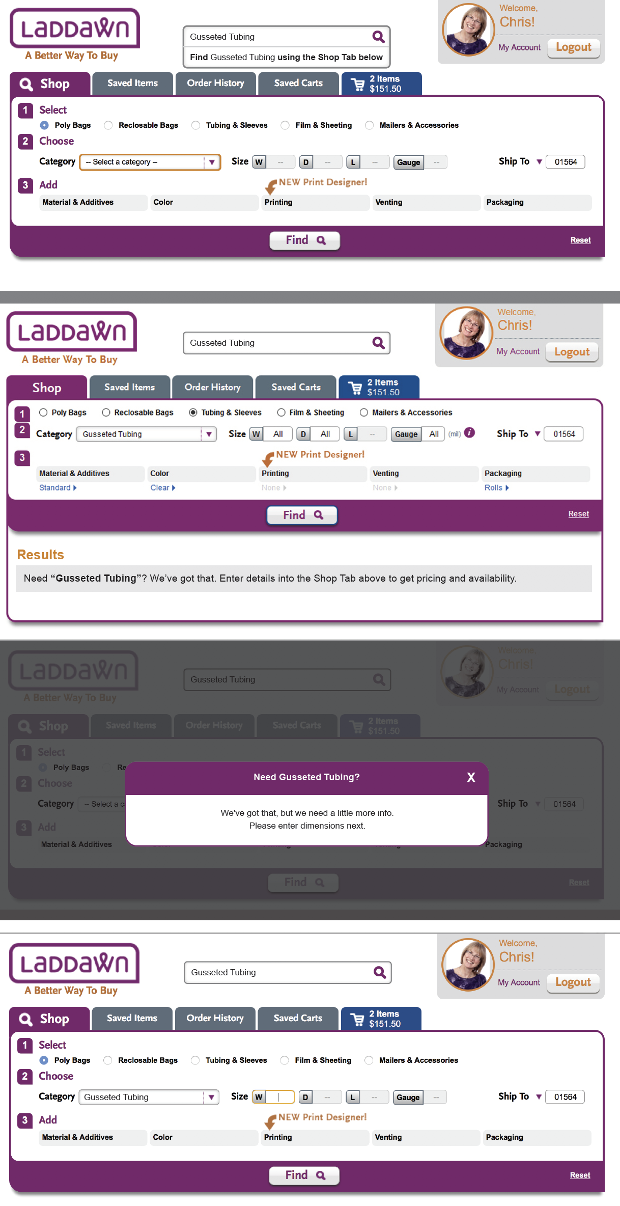
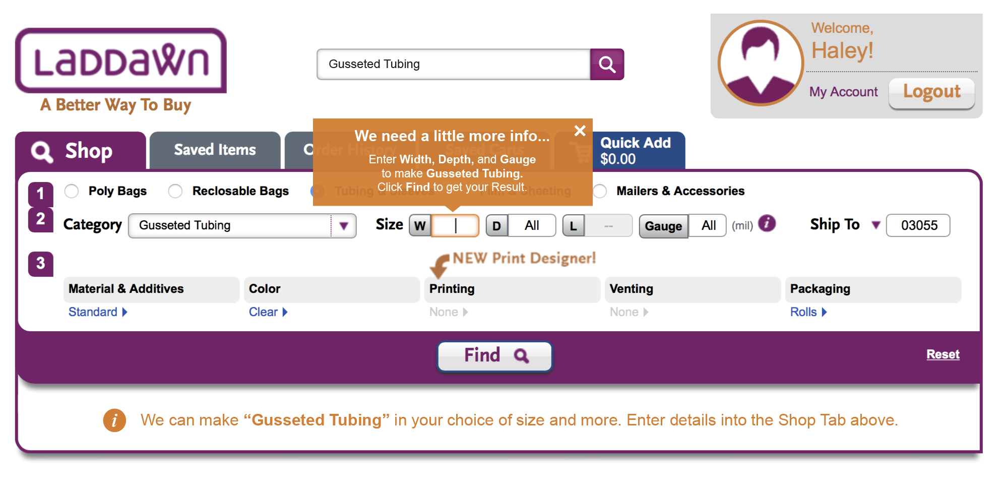
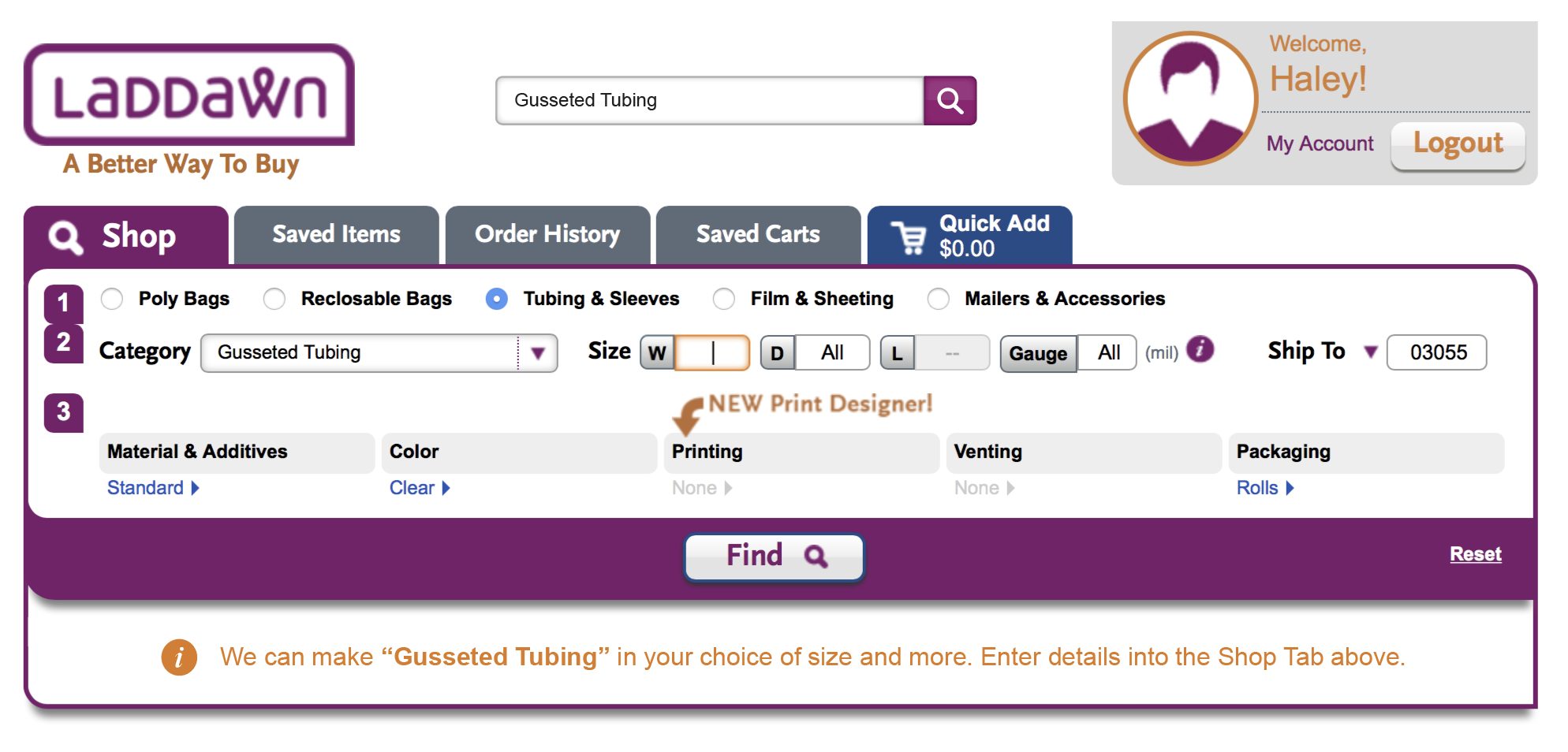
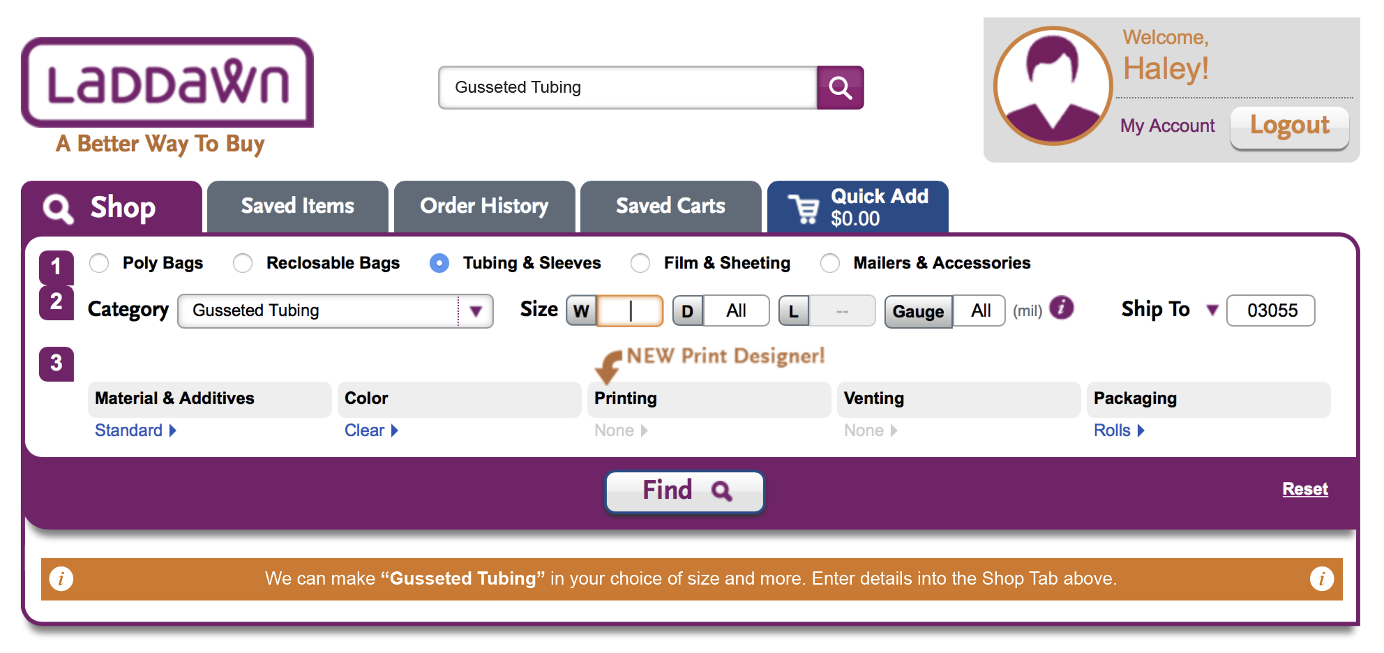
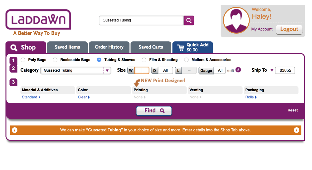
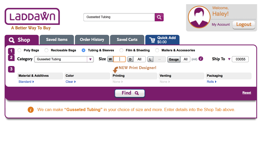
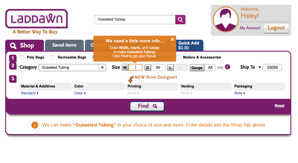
Scenario 3 - user searching for category we make, but do not stock
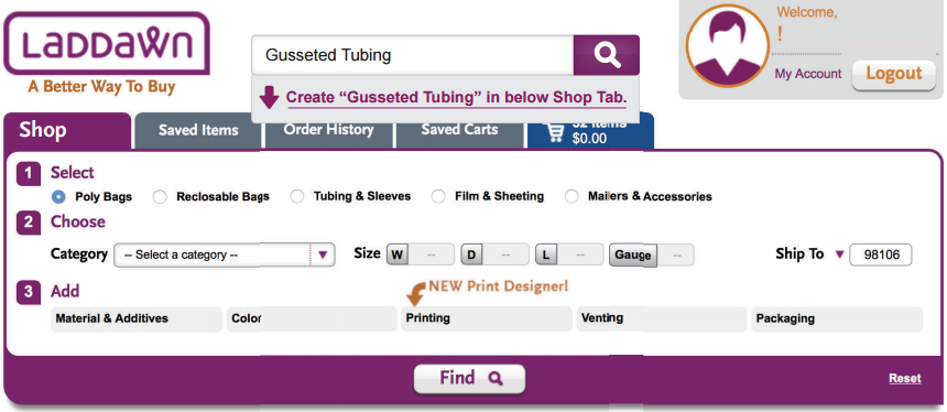
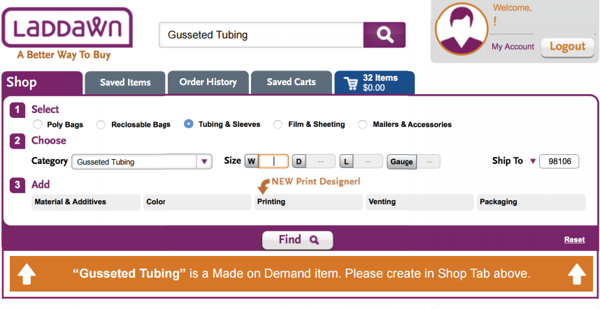
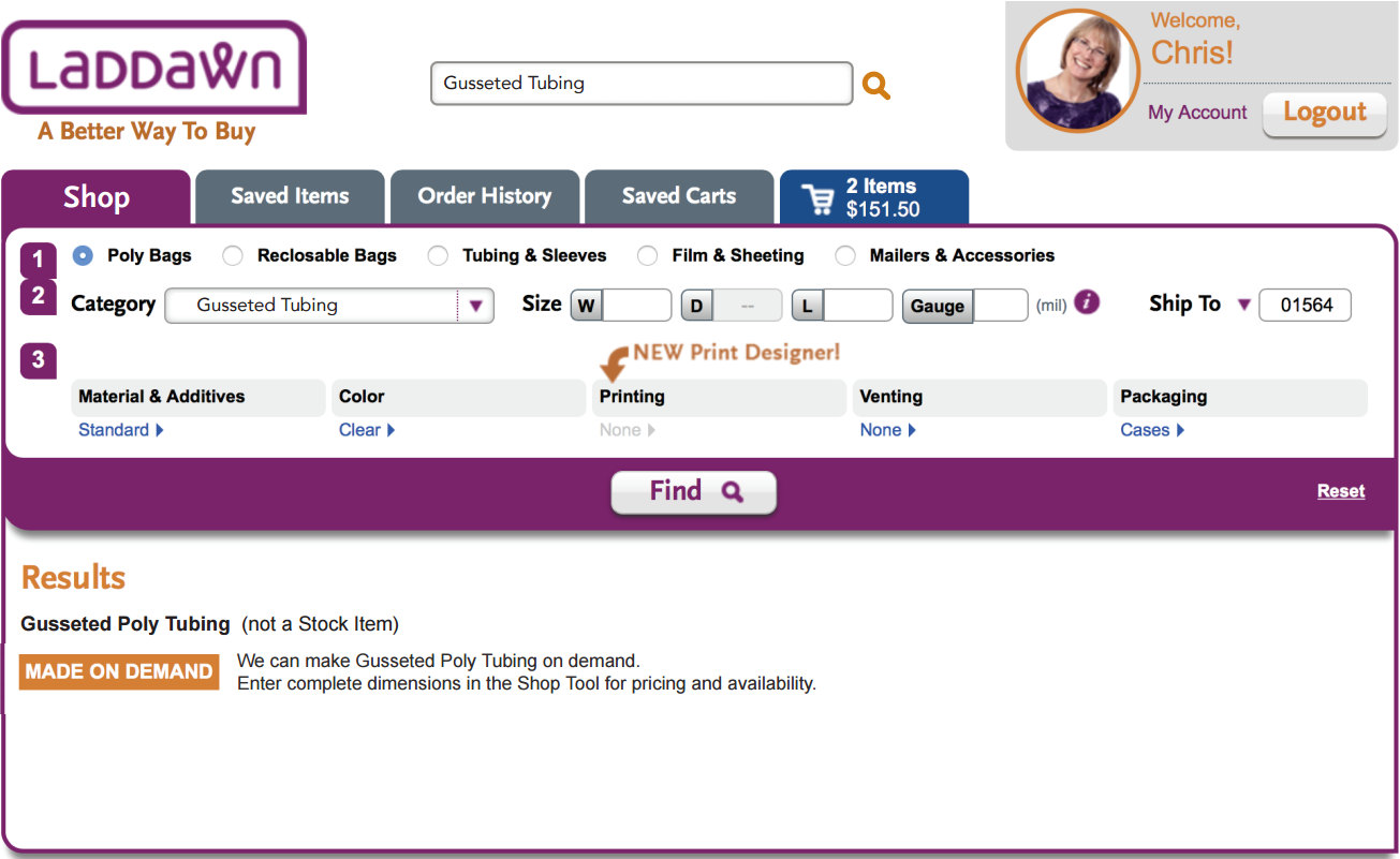
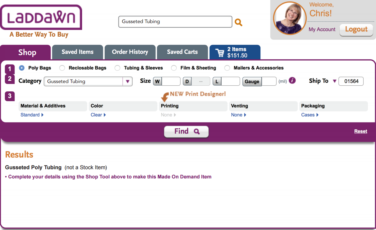
For example, "Gusseted Tubing" - we cannot provide any results without full dimensions (width, depth and gauge). We need to convey that we can make this product, but also that we need them to provide some more detail via the widget.
| Current | Susan's last | Haley's last | Chris's last | New |
|---|---|---|---|---|
| Search box after typing
Result if you click search button instead of navigating to widget.
| Search box and auto-suggestion after typing
It should be "...in Shop Tab below" not "in below Shop Tab." Arrow is problematic in scenario 4 below, so eliminate here for consistency? Result if you a) click the hyperlinked suggestion or b) click search box.
I very much like the idea of picking the category for the user and putting the focus put on the width field - regardless of whether they click the suggestion link, or click search button. I also like the concept of a bold message below the widget, directing your eyes upward, though I am still unsure about the visual treatment. I would rewrite the text. I would not draw attention to distinctions between stock and MOD. I'm not wild about the word "create" in this context. I don't think the icons work in the second option. (OR) Agreed. I find that these orange boxes sort of yell a corrective message -made more remedial with arrows and icons. The graphical answer should support the brand voice: friendly, helpful, positive. | Search box after typing
I prefer not to call out, at the search stage, that this is a made on demand item. Result if you click search box with typing intact.
Not sure the iconography helps here. The tape measure looks like a snail. | 1) I would like to see the search suggestion mocked up as "Find Gusseted Tubing using Shop Tab below" 2) I would like to see the messaging below the widget mocked up using this text: "Need Gusseted Tubing? We've got that. Enter details into the Shop Tab above to get pricing and availability." 3) I'd also like to see how the flow feels with a variation of this message in a popup instead of the results area below the widget. (The popup would appear as soon as you click either the suggestion or the search button. When you click "OK", you cursor is in width field.) "Need Gusseted Tubing? We've got that, but we need a little more info. Please enter dimensions next."
  |


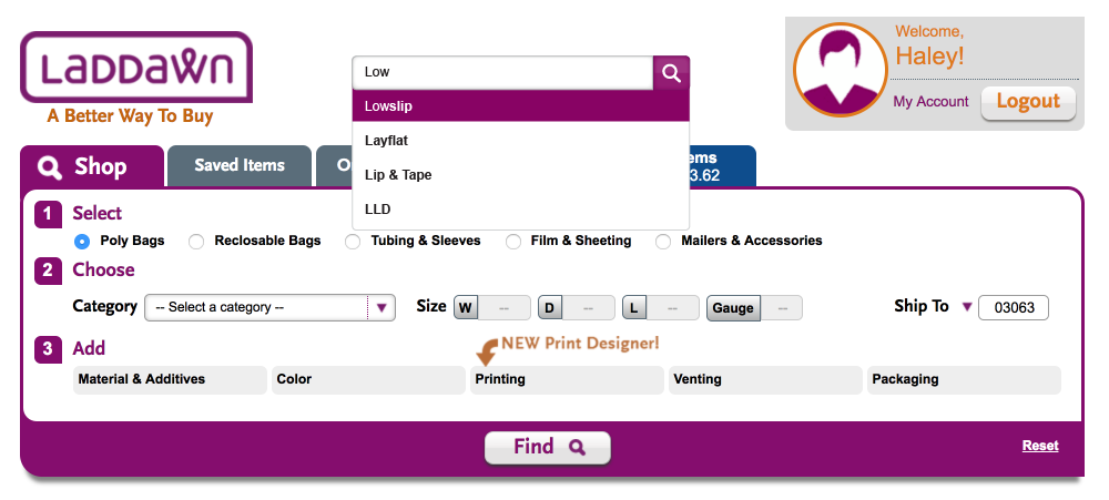
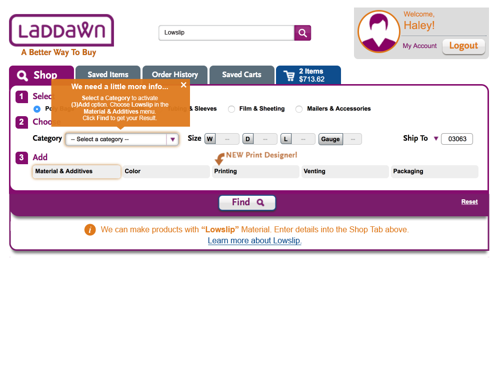
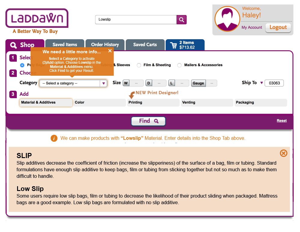
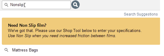
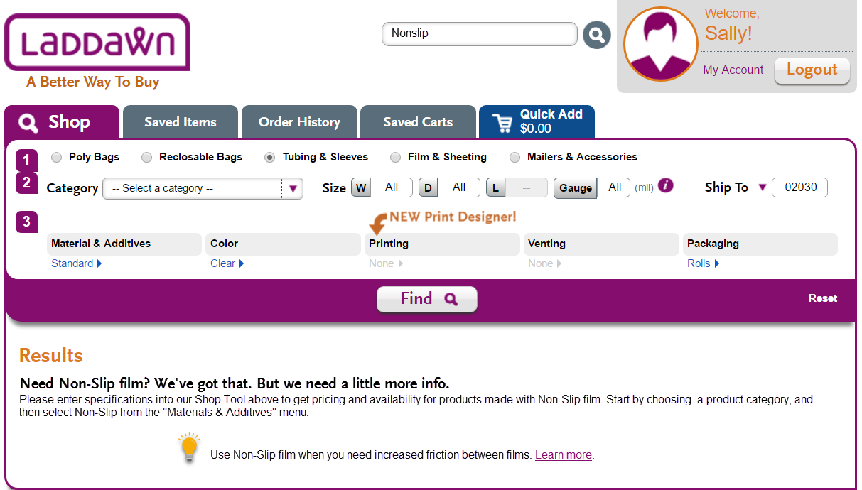
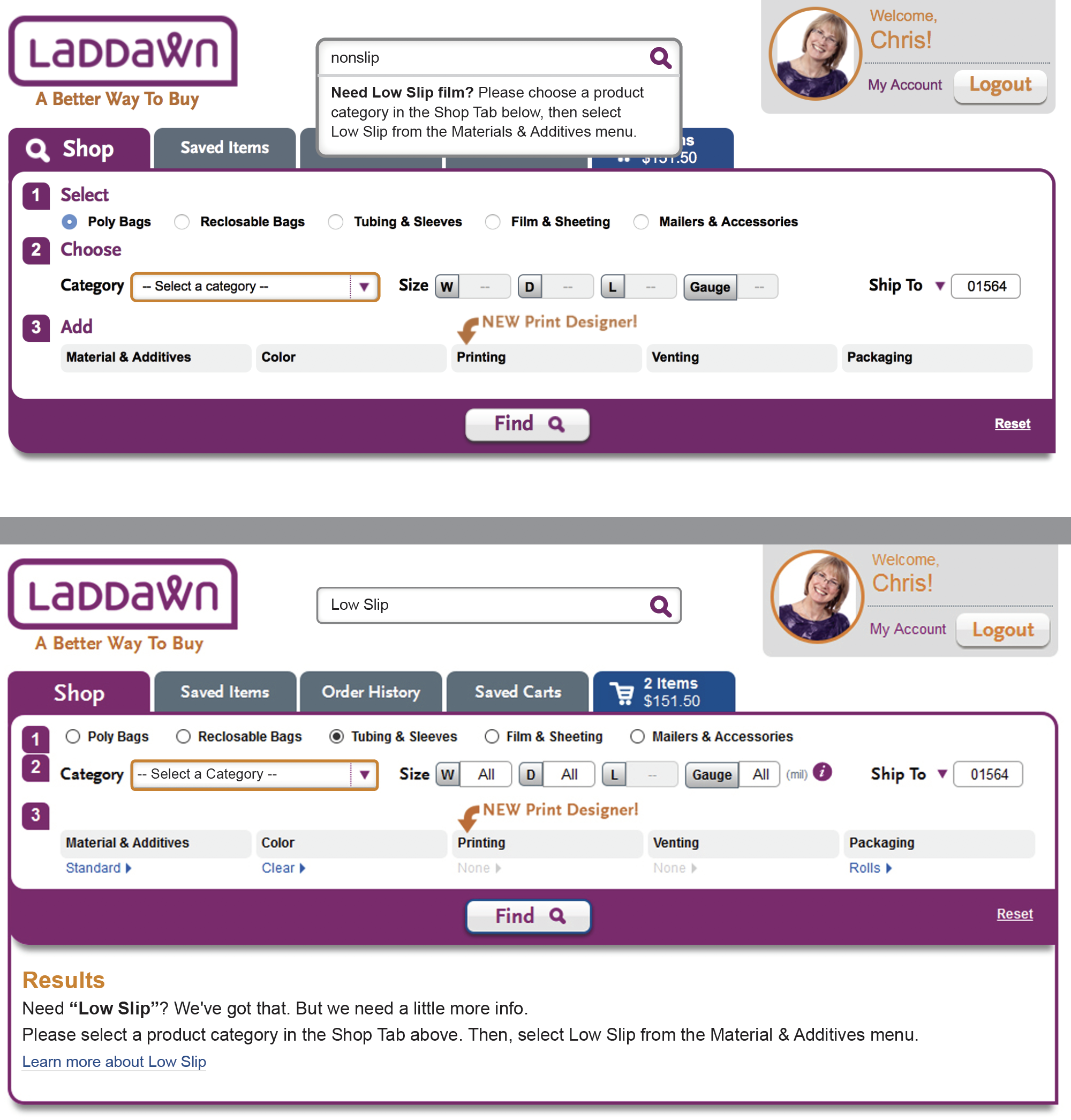
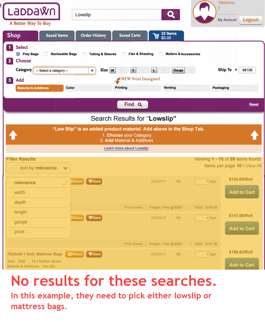
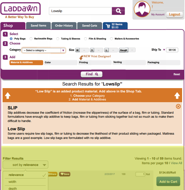
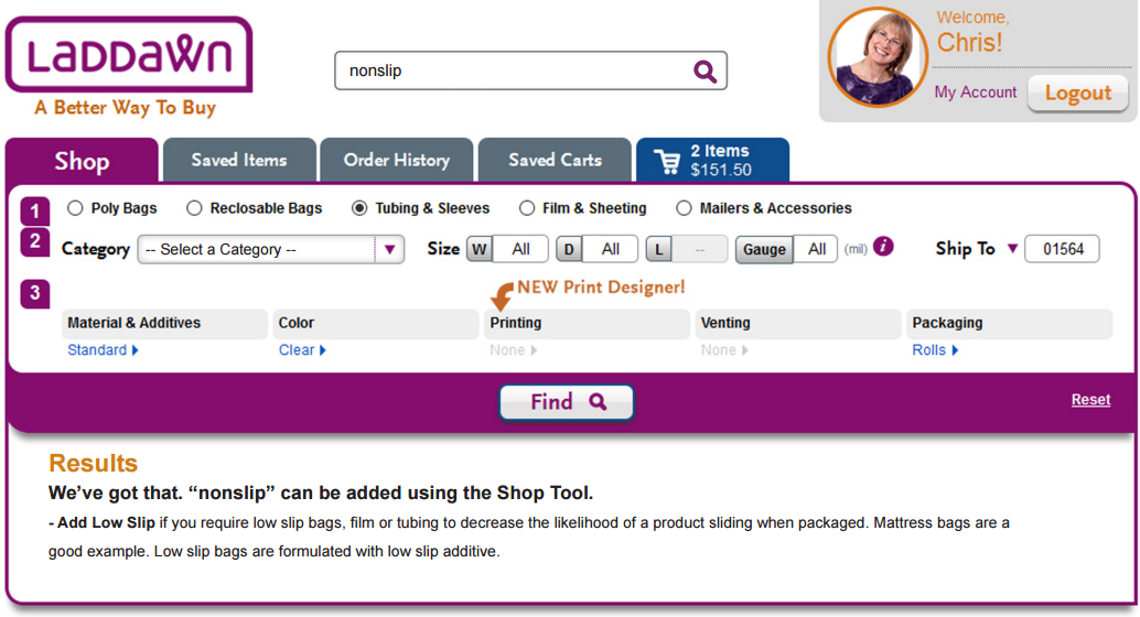
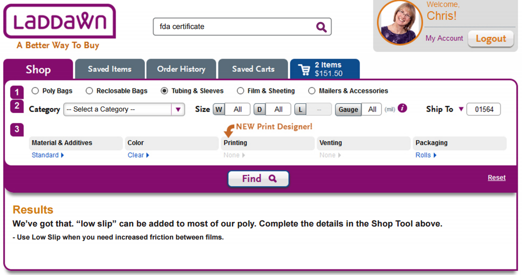
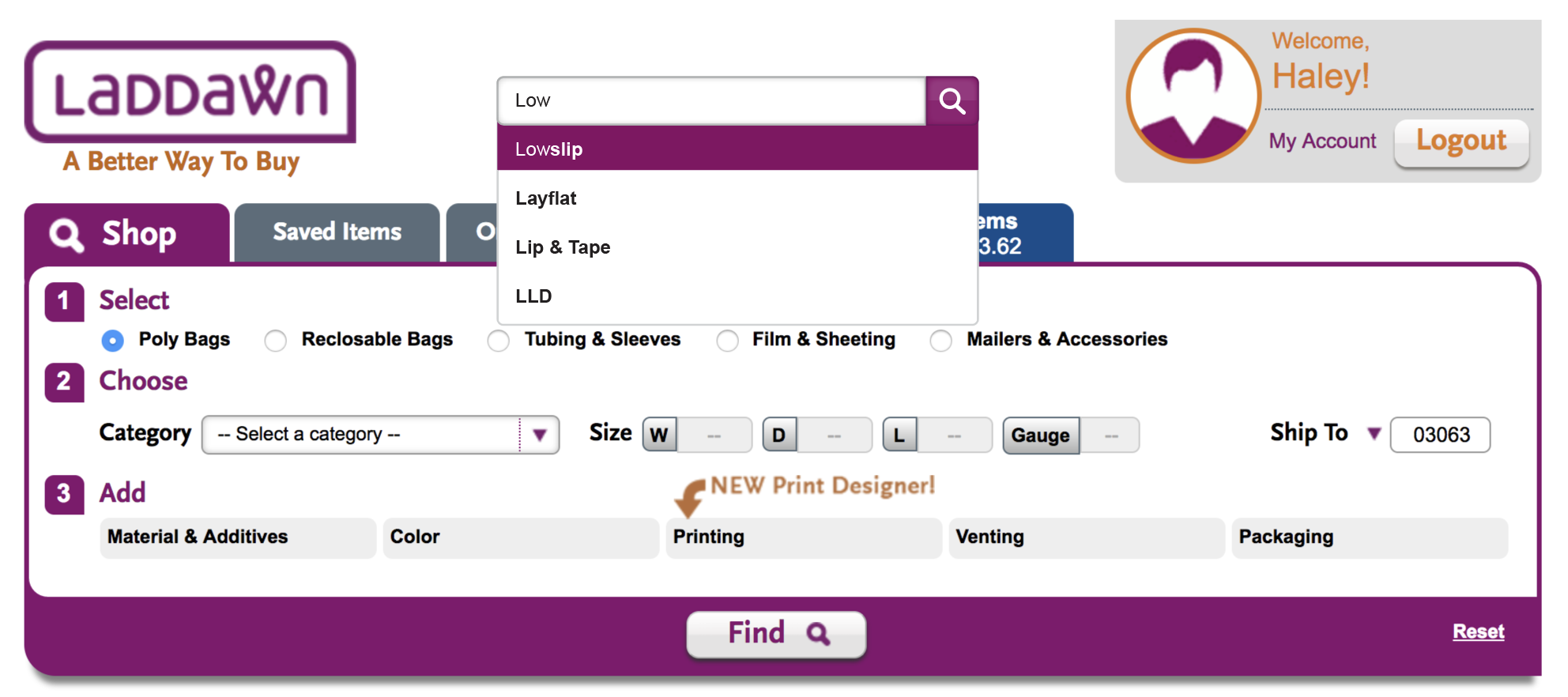
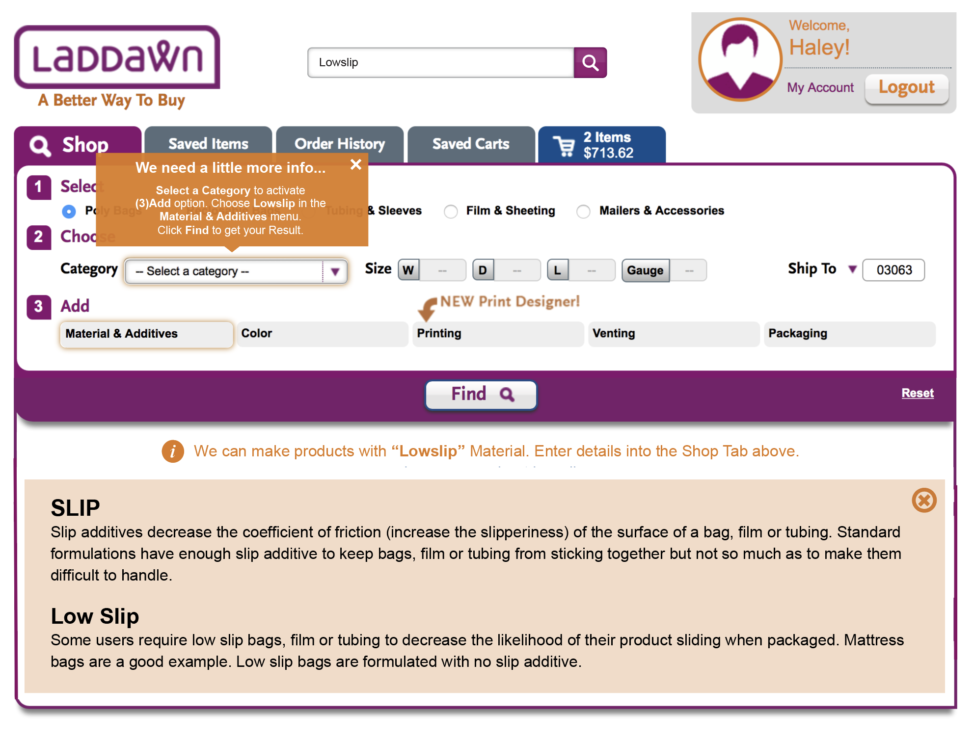
Scenario 4 - user chooses suggestion that matches a level 3 option (material, additive, color, printing, venting)
For example, "Low Slip" - we cannot provide results without a product category and full dimensions for that category.
| Current | Susan's last | Haley's last | Chris's last | New |
|---|---|---|---|---|
| (No true equivalent.) | Search box and auto-suggestion after typing
Result if you click search box
| Search box and auto-suggestion after typing (Note, slightly modified from original to better match specs for auto-suggestions. -SP)
The down arrow here is problematic; unlike scenario 3, product categories are likely to appear below the first suggestion - so it's ambiguous as to what's being pointed at. Result if you a) click the hyperlinked suggestion or b) click search box. Note - There shouldn't be any results below the messaging. We can't give any product results without knowing a product category. I don't think we want to assume that someone who leads with "non slip" or "low slip" is searching for mattress bags. So showing mattress bags as results if they don't explicitly pick that category from the suggestion list seems likely to cause confusion.
| Result if you click search box
| I would like to see a path similar to that for scenario 3. Suggestion text 1: Suggestion text 2: Clicking this or clicking search will put you into widget with halo around category drop down. Then you will get either: a) a popup - Please select a product category, and then choose Low Slip from the Material & Additives menu. OR b) messaging in the area below the widget: Need Low Slip Film? We've got that. But we need a little more info.
   |


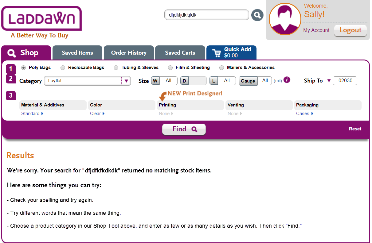
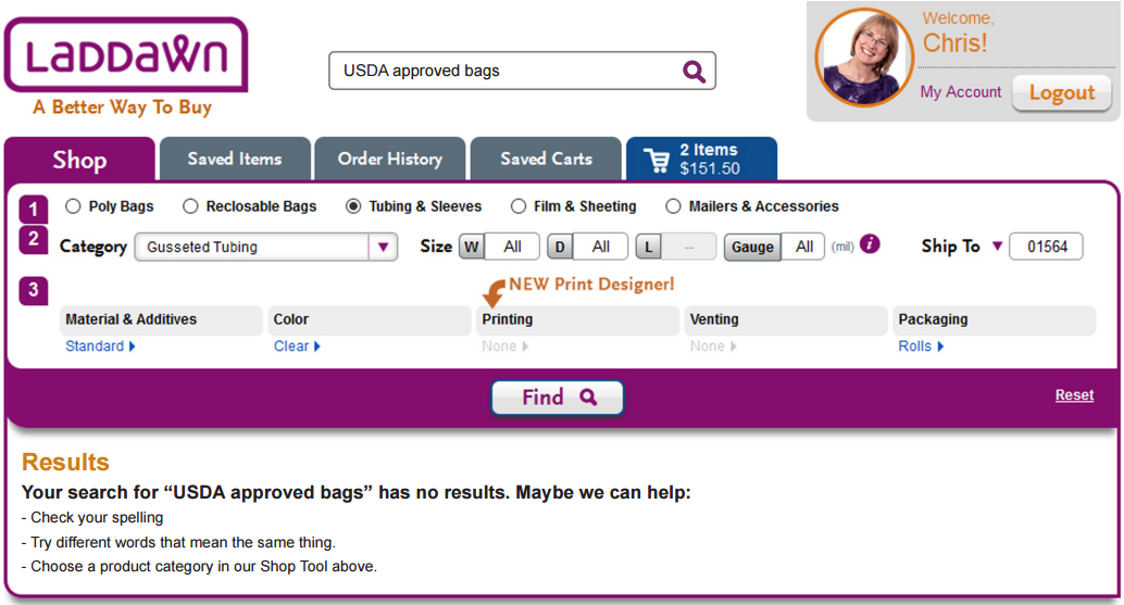
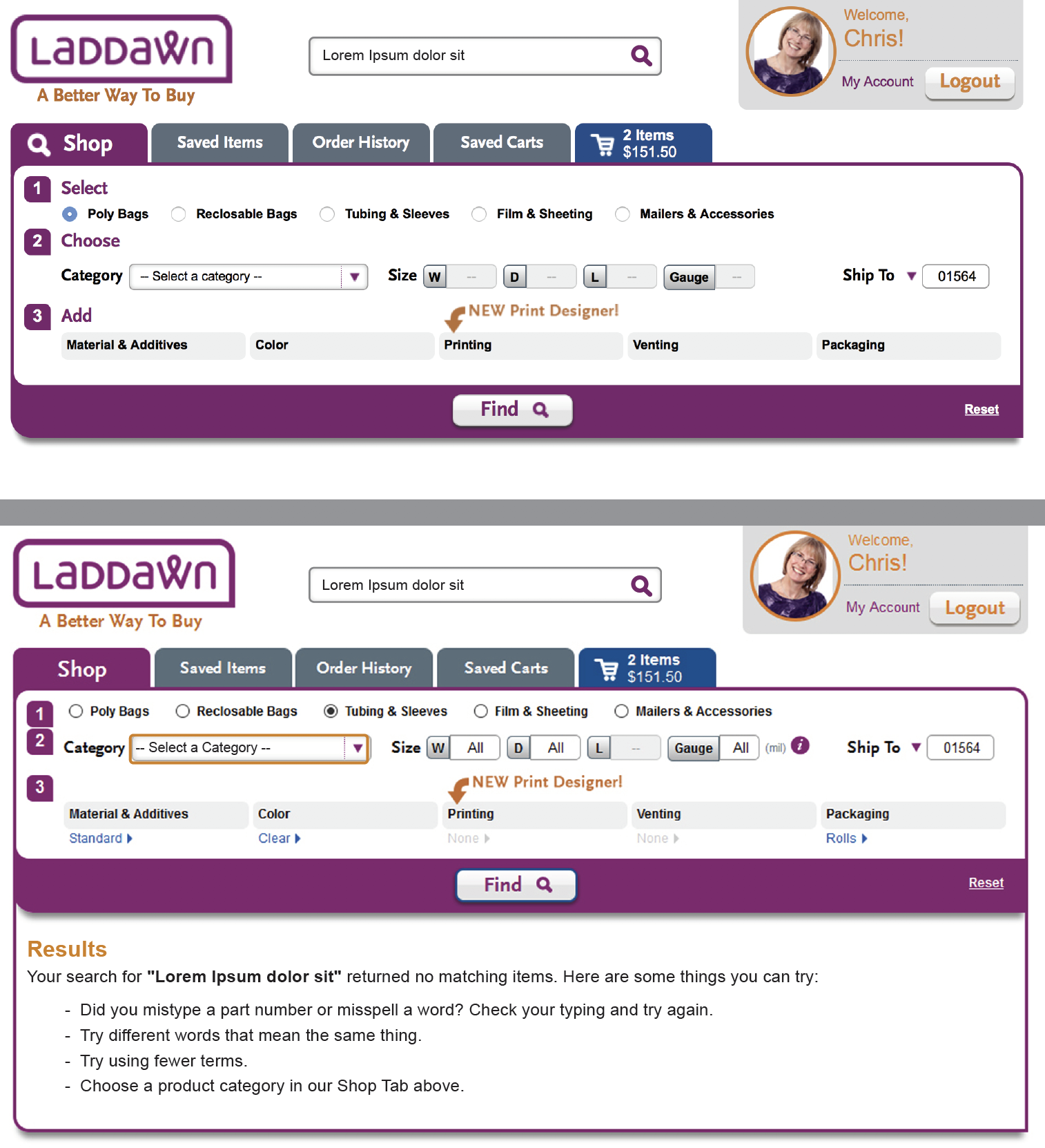
Scenario 5 - user searches on their typing, and there are no suggestions showing
For example, they type two incompatible terms "polypropylene" and "printing" or gibberish, like "SJDFJDKFJKD"
| Current | Susan's last | Chris's last | New |
|---|---|---|---|
Rendered obsolete with enabling of keyword searches:
FYI - we do have scenarios where we just say "sorry, no matches" without any messaging RE custom - but this is sort of apples/oranges - it only arises from widget searches w/certain products and complete dimensions...
... although we may want to improve the messaging here, the proposed design/bullets for keyword search/no results do not apply here. |
|
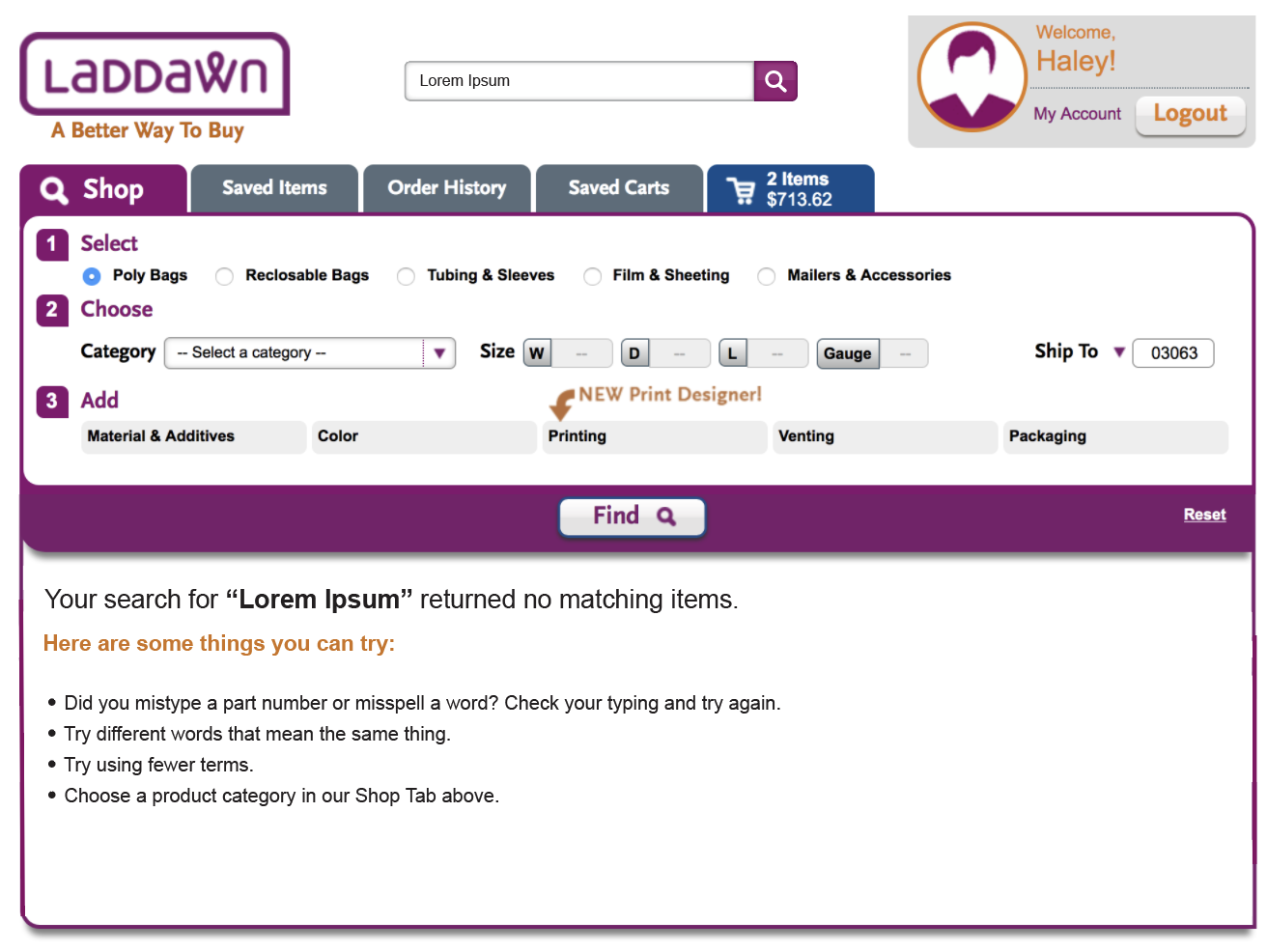
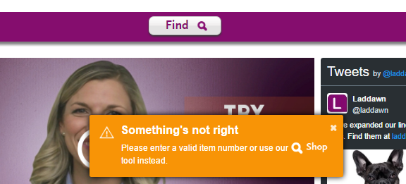
Note, FWIW, typing USDA approved bags will likely generate some suggestions. "...has no results" doesn't sound right to me; "we may be able to help" doesn't seem quite right either. | I'd like to see text with some changes. (Remove my reference to stock, and some added/modified bullets): Your search for "XXX" returned no matching items. Here are some things you can try:
|


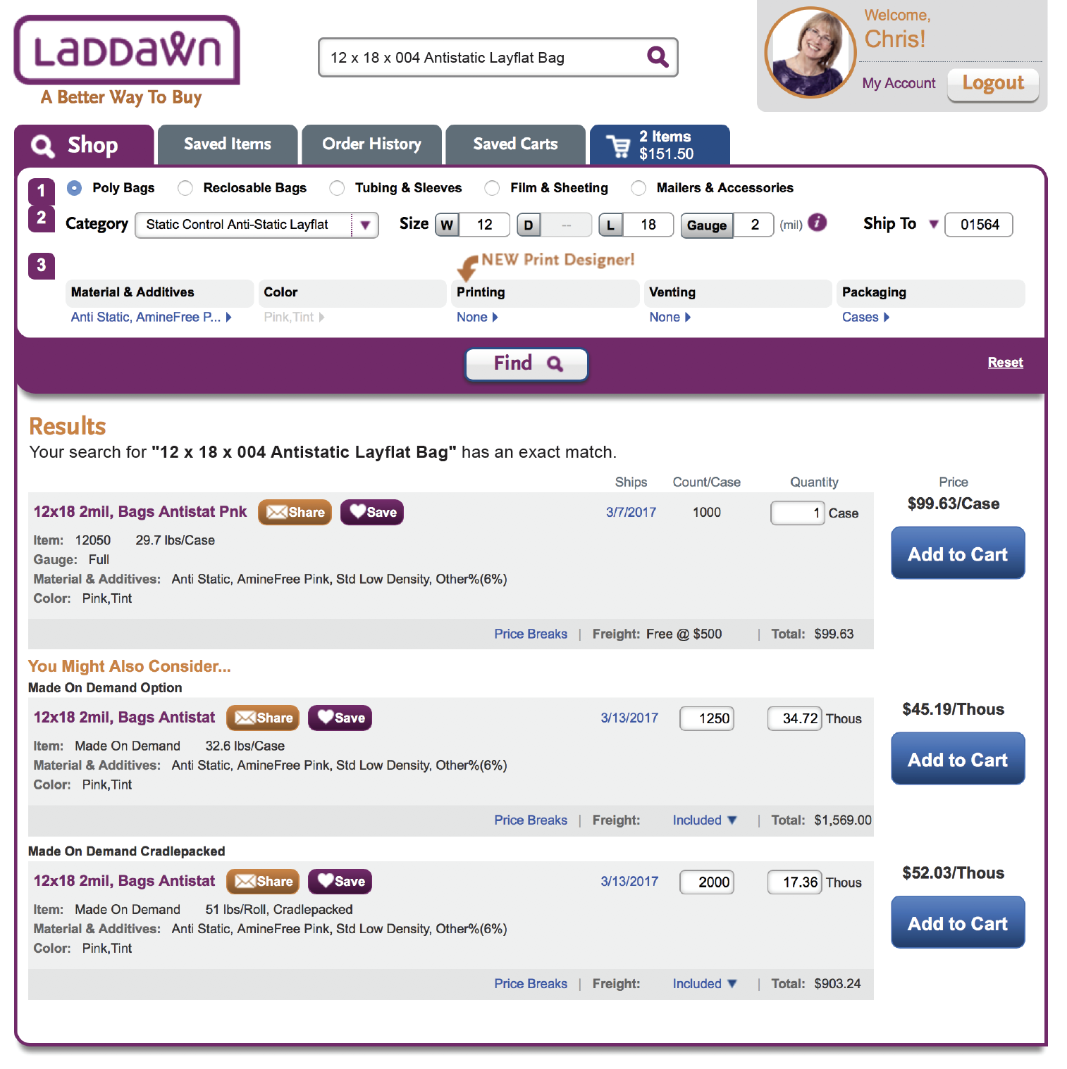
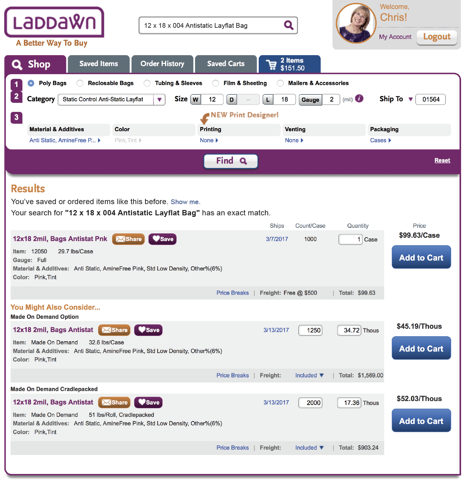
Scenario 6 - exact match as a result of a widget search (not search box)
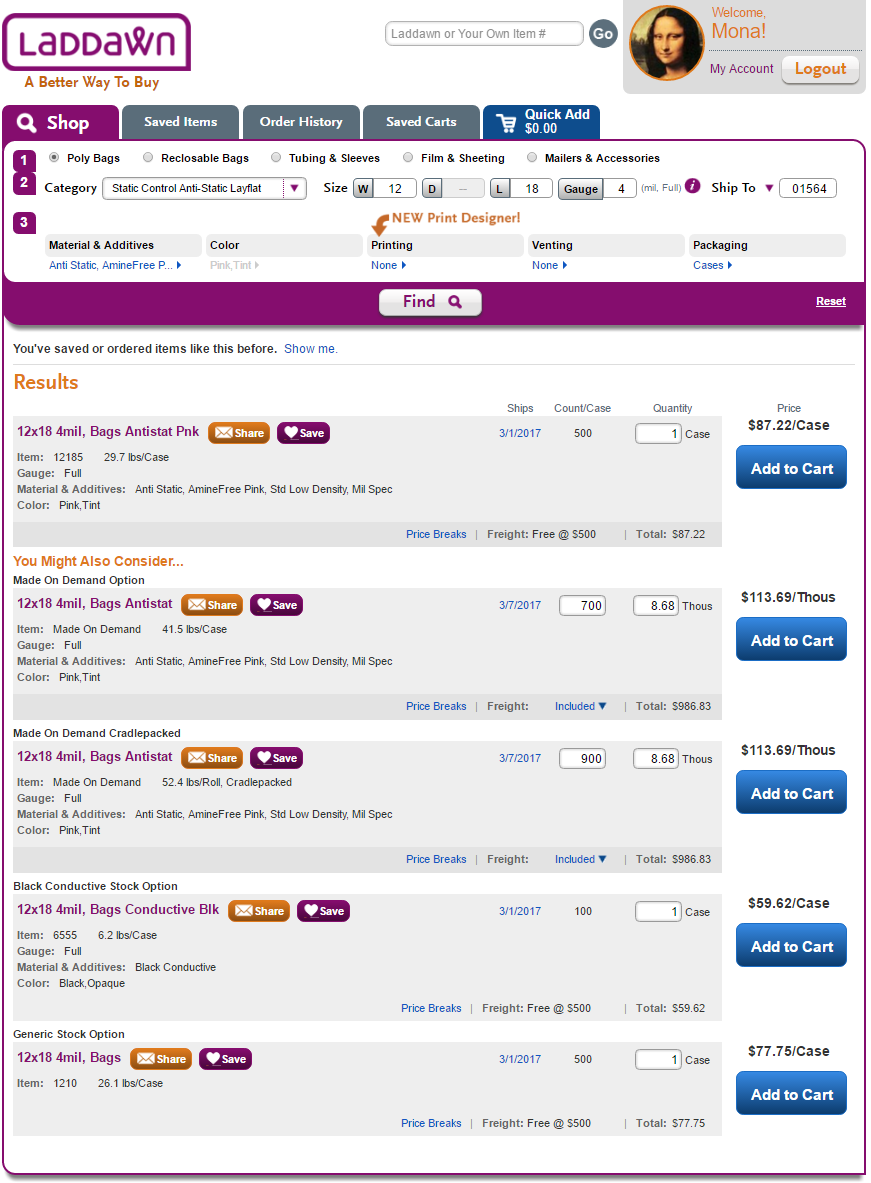
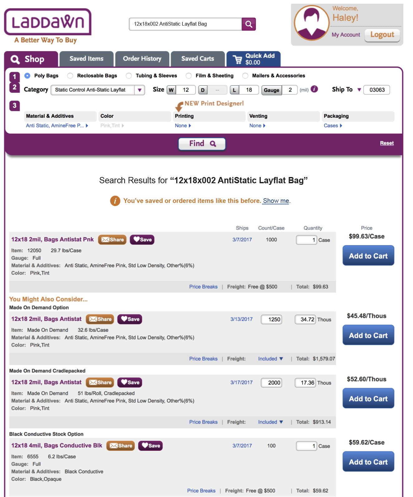
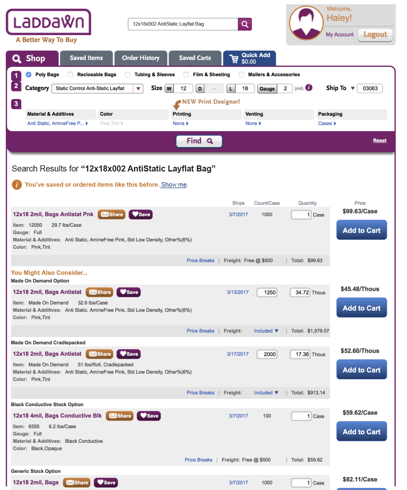
A category with full dimensions (including gauge), and optionally custom materials (and more - color, printing, venting), with one exact match (could be stock or MOD) and one or more YMAC matches. For example, a 12 x 18 x 004 antistatic layflat bag. Typically there will be an exact match, often though not always followed by a varying number of "you might also consider" alternatives. We will also need to have a line for "Godzilla" results - "You've saved or ordered items like this before. Show me." Note: This scenario is not to be confused with the user typing "12 x 18 antistatic bag" into search box. When the user does this, they will see the suggestion for "Antistatic Layflat Bags" and when they search, they will get the broad results set for the entire category (30 items) - this is scenario 1 above.
| Current | New |
|---|---|
| The only change may be to the "Results" heading itself?
|


Prior designs through 2/28
| Haley's PDF | Chris's PDF |
Search bar design 1 | |
Haley's Revised PDF 2/27: | Search bar design 2 |
Additional Results w/ design 1 |