| Issue - be specific | |||
|---|---|---|---|
| Page | Address ASAP? | Defer; handle in 'spare time' or ensure issue not repeated in new site | |
| General/multiple | Title tags for content pages pulling from old titles (e.g. about laddawn); missing from new pages (env, giving, etc..) | x | |
| Styles - tighten up styles used for major headings, subheads, sub-subheads; links; highlights - colors, font, size, consistent use. Make inline links underlined. | x (design task first) | ||
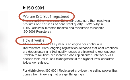
General web page stylizing: How we will stylize topic lines. I have found that we are stylizing our topic lines in 3 different methods: Plain text with indent, Bold without indent,
| x | ||
| Rewrite all link "click here" link labels. This is not best practice. | x | |
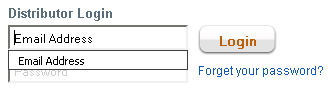
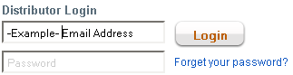
Login: As I click in the box to enter my login info the existing text "Email Address" moves to the right, remaining in the field, needing manual deletion.
I found the reason for this, but I can't recreate how it happened in the first place. The greyed out sample text "Email Address" had gotten entered as the user name itself and saved (thus the site or browser is automatically populating this info, since the greyed out text is an exact match, even if the last user name entered was jpiette@laddawn.com for example). Manually deleting the saved user name will solve this issue, but we need to find out what click caused this to happen in the first place.
This is something John P. would have to look into. Given the temporary nature of the site, and inability to reproduce the issue - until and unless this is causes a serious issue (like customer confusion or inability to login) I suggest we defer attempts to ID root cause and solution. -SP, 3/25/13 | X | ||
| A Better Way to Buy | Add image | x | |
| Outlet | Download buttons look blurry. (Maybe replace as part of review of styles for consistency?) | x | |
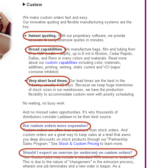
| Custom | ":: : Custom Manufacturing Capabilities" should be in Blue to signify a hyperlink. We may also want to reformat/remove the ": : " Agree up to a point; this link and bullet style is used on other pages; see general style consistency issue above; need longer term solution - hurried attempts to change black/bold links to blue have actually introduced more inconsistency, not less. -SP, 3/25/13 | x | |
| Request a Catalog | ": : Download catalog" & ": : Send me a catalog" should be in Blue to signify a hyperlink. We may also want to reformat/remove the ": : " Agree up to a point; this link and bullet style is used on other pages; see general style consistency issue above; need longer term solution - hurried attempts to change black/bold links to blue have actually introduced more inconsistency, not less. -SP, 3/25/13 | x | |
| Within the picture of Mark holding a stack of catalogs, the catalogs themselves have our old Laddawn logo, fairly visible to the viewer. We should alter the image or switch it out for something new. | X | ||
| Brandit | Coming to a brand decision on how to write out brandit in a normal sentence. Between this page and the linked word doc we show four different manners of this in a sentence. "Brandit" "brandit" "Brandit" "brandit" are all seen independent of capitalization queues. | X-Owen | |
| The "LaddawnBrandit.doc" needs updating. We still have the old logo and slogan on both pages. The 1-5 bullet points may need to be revised due to our new label compliance. | X-Owen | ||
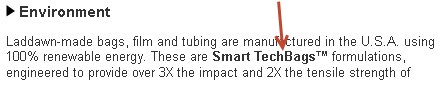
| Film and Materials | The description for Non-scratch needs to be rewritten. "Non-scratch bags and film contain little or no anti-block additive. Because anti-block also makes the inside of bags slippery, however, non-scratch bags and tubing be more difficult to open." The text is confusing and doesn't tell the reader what purpose this additive serves. | X?-Owen There is also a missing word - should read "...are/may be more difficult to open." | |
| Contact Us | Replace image of outdated items. | X | |

