Files in company share, \neptune, current version is dev3.
Round 3 - QA performed on 8/6 and 8/14
CHANGES!
In the time since Carl coded his latest version of the Cart, we've changed a few things (see Cart design page) - which, if any, do we want Carl to implement? Which issues has Ed already addressed? Note: Some of these changes are referenced in the QA notes below.
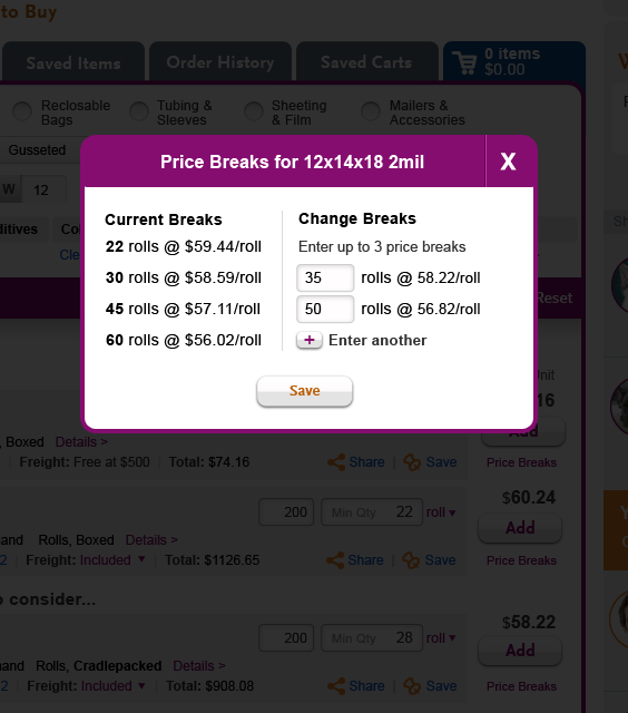
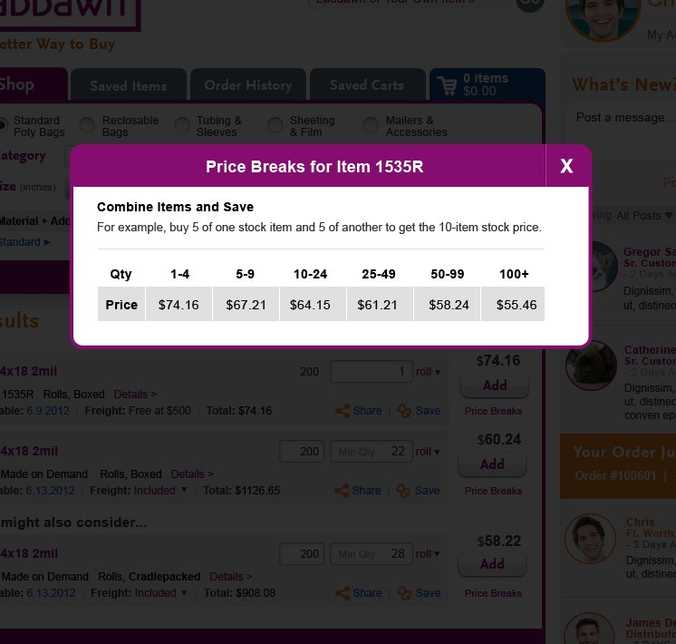
- Change Price Breaks from an expansion to a link that opens shadow box; remove "+" plus sign. Link pointing to purple Shop version; Cart version will be blue.
- Added Price Breaks link to all stock items; opens shadow box. Link pointing to purple Shop version; Cart version will be blue.
- Shift unit column to left (to right of quantity); change unit price column head to "Price/Unit."
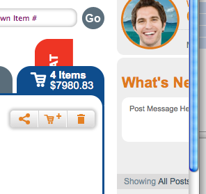
- Added message about stock quantity/stock $ value.
- Changed all instances of "Tag" to "Save" and changed icon to a pin. The "Tagged Items" tab is now Saved Items; we've removed the icons from the three inner tabs.
- Changed "More details > " to "Details >"; moved it up one line, to end of last line of description.
- Decided there should be an "Update" button for zip code; decided that both the "Save" button next to Cart name, and the new "Update" button for zip would not appear to the user until they type in those fields.
- Removed some of the verbiage from the descriptions -
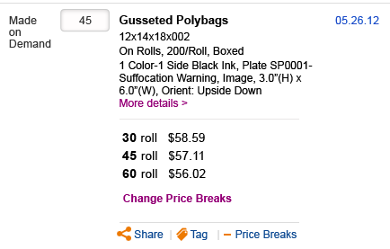
On Rolls,200/Roll, Boxed
QA notes - QA performed on 8/6 and 8/14
In the drop down under unit, I noticed that the gray background under the selected choice persists after I mouse to one of the other choices; more common behavior seems to be for the background shading to appear only behind the item being moused over.
All set - Removed gray background from the ‘selected’ item - CT (Carl Tortola)
The shading is now correct, however, I notice that when I select Option 1 or 2 after “Roll” the width of the column changes, and the position of the column headings changes. We should replace Option 1 and 2 with the real menu selections (for this scenario, Roll and Thousand, Thousand in the drop list, abbreviated as Thous or Thou after being selected), and see if Carl can make the col. widths and position of column headings static; they should not be shifting or expanding/contracting. (FIX REQUEST)
Removal of gray boxes from price breaks
All set -CT
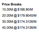
Done but the spacing is off (roll too far from 30, too close to dollar sign) relative to what Steve provided. However, as I thought more about this, I realized that our content isn’t correct. We've since changed it to “30 rolls @ $58.59/roll.” More importantly, price breaks are no longer handled as an expansion, we've since moved them into shadow boxes. We've also added price break shadow boxes for all stock items. (CHANGE REQUEST OR HAVE ED IMPLEMENT THIS CHANGE?)
Drop shadows are generally thicker than spec. Gradients seem darker. Is this simply the known issue with CSS3 or can these be fine tuned to match up better?
All set - I’ve tried to make these a little more consistent with the PSD. Let me know what you think. In the end, it’s up to each browser to render the shadow to the specifications we set in the CSS, so there may not be 100% consistency from browser to browser, but it should be very close. - CT
It’s not 100% but seems much improved. We can certainly live with it - all set.
Likewise, the shadows and borders around the share/new cart/delete buttons on the bottom dark blue strip appear larger and fuzzier sort of have an orange-on-blue glow, compared to the orig design with much subtler (black/gray, not orange) shadow.
I’ve tightened up/darkened the shadow. Let me know what you think - CT
Again not 100%, but enough of an improvement to live with - all set.
Corners of save cart button seem more squared than other buttons e.g. proceed to new cart; this creates breaks in shadow on corners. (MSIE only)
Border radius on all buttons is 7px; maybe it is the shadow causing some visual tricks? Please review again now that shadows have been tightened up - CT
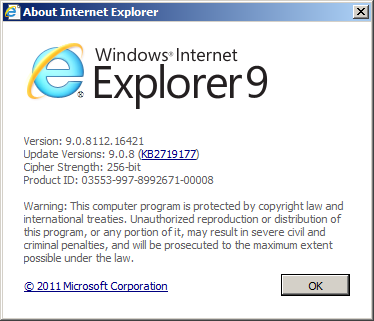
All set. For what it is worth, here is what I saw in prior version using MSIE9 (enlarged):
More importantly, as Ed has noted, in some versions of MSIE (8 and below?), all corners are squared (due to lack of support for this aspect of CSS3 ?).But why are the corners in dev 3 version square (MSIE 9), all rounded in the prior version of Carl's work (dev 2)?

Column headings should left align with content in columns; these headings seem to be centered (most obvious with "Description" col head).
Changed, though this does cause some visual misalignment now. What about centering all column headers text except for “Description”? - CT
Agreed. I think you’re right, in fact, I think that’s how it was in the spec. When I checked during the last QA round, the mis-alignment of description heading threw me. However, we have since shifted one of the columns (unit of measure toggle) over to the left (to the right of quantity). We've renamed the unit price column "Price/Unit." (CHANGE REQUEST OR ASK ED TO IMPLEMENT?)
What is the defined best practice for anchored tabs, such as our live chat tab? In the Neptune cart, (FF-PC) it stays on top of the narrative thread as you narrow the window leftward, but goes behind the shop widget as you narrow further. It behaves similarly in MSIE, but isn't consistently anchored to right of browser window. I noticed on LinkedIn, the "feedback" anchored tab goes behind the right column of page immediately ... that seems worse!) In Ed's coded version of the shop tab page, it stays on top and consistently anchored to right, on top of all content - this seems like the preferred method.
I think I am understanding you -- this is all set, with the button appearing ‘above’ all other layers on the page. The part I’m not 100% sure about is when you say it should be consistently anchored to the right. I’ve changed settings so that even when you scroll, the button will always be in the same place. Let me know if that’s incorrect. -CT
Agreed, all set.The anchor was misbehaving 3 ways before – appearing behind the widget; not staying anchored to the same place; and not staying connected to the scroll bar (there was a gap) – see screen shot below, mind the gap between the live chat button and the browser scrollbar. The behavior now seems correct on all counts.
Note, that in order to see the button placement correctly in IE8, the page needs to be served – we are using a conditional comment that is only read by IE8 but the page does not detect that from the browser unless the it’s being viewed at on a server and not from one’s desktop. -CT
OK
I noticed that the "Close" text in the close button for the You Should Know/save cart name shadow box is gray, and then orange on mouseover; it should simply be orange. As a general rule, the only time button text should be gray is if data must be entered in order for it to be actionable (like entering a name in the cart name field, or an item number and quantity for quick add).
All set - CT
Agreed, all set.
Similarly, I noticed that the Save Cart button is orange on mouseover, even if there's no text entered in the name field; I think it should simply be gray and dead (no gloved hand) on mouseover, until text is entered.
All set - CT
Agreed, all set. However, remember that I said that seeing the Cart coded allowed us to see some gaps in our own requirements? One such gap was our inconsistent treatment of edits to cart name v. zip code. We now believe that there should be a button for each ("Save Cart" for cart name, and "Update" for zip code). The buttons should not appear at all until the user types in either field. So, we do away with the grayed-out state. FYI, the cart will never open with a blank zip code. If the user opens up an empty cart, it will be pre-populated with a default zip. (CHANGE REQUEST OR HAVE ED IMPLEMENT?)
The "save cart" text in the button cuts off for me at "Save Ca" in Firefox-PC (not Firefox Mac or MSIE-PC).
All set – we cannot set “auto” width – we have to choose a static value, so if you find this is still too short, you can increase the width value in line 206 of the CSS. -CT
All set.
The quantity field for the expired made on demand item is still editable; it should not be.
All set - CT
Yes, this is all set, but I just realized something about the behavior of the qty field for unexpired items … what is best practice if you put your cursor in an editable quantity field? In your coded version, placing the cursor in the field deletes the whole quantity. I think standard behavior is:
- First click in field - number is highlighted (backspace or delete keys will delete entire number with one click)
- Second click in field - cursor blinks at end of number, user can back space one digit at a time
(FIX REQUEST?)
The 4 other tabs should be purple on mouseover, not blue. (Apologies, this might have been clearer had you also been given the task of coding one of the other four tabs as well.)
All set - CT
Not quite what we wanted. Sorry again – In hindsight, I never fully explained this in our documentation or my followup QA notes, so I consider this a change request. . Here's what we wanted:
- The shop tab when activated should be purple, along with the surround for the entire widget - not blue. (Note: The default view of the widget upon login is the activated shop tab.)
- The next three tabs (tagged items, saved carts, order history), when activated, should be purple, along with the surround for the entire widget.
- When inactive, the first four tabs (shop, tagged items, saved carts, order history) are gray, and purple upon mousever.
- The Active Cart tab is always blue. When the active cart tab is active, the widget surround becomes blue. When I mouseover the Active cart tab (whether it's the active tab or not) it turns gray.
(CHANGE REQUEST OR HAVE ED ADDRESS (IF HE HASN'T ALREADY)?).
More of an observation - There is a sort of "fly in" effect with the bubble noting price change to left of Cart Total price. I am not sure we really spec'd how that should come into view or disappear; what it does here seems a bit too subtle. I think Laddawn needs to give some more thought to this.
OK – let me know. The other option is a fade-in effect. -CT
Since you coded this we a) decided to eliminate all bubbles; b) we decided to add a message (when stock items are in the cart). The message is data driven, but static in behavior/appearance. (CHANGE REQUEST OR HAVE ED IMPLEMENT?)
Please remove the free freight bubble - that is a vestige of a prior design and my apologies for it being in the PSD; it was supposed to have been removed from all layers.
All set -CT
Agreed, all set.
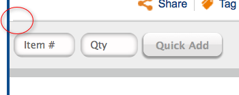
The hairline between products in the cart appears to be a dotted line, but in the spec it appears as a solid line; it should be closer to spec if possible. In the Quick Add strip, it appears that there is a dotted line and a solid line on the top horizontal border; it should just be the solid line.
All set - CT
Line between items in cart seems to have been addressed, however, see screenshot for line in quick add strip. There's either still an extra line there, or a border that doesn't span the full width of the bar as it should. (FIX)
Additional change requests
- When we changed the quantity, the change to total price didn't initially get our attention. Is there a means of making that change less subtle, such as a delay or unobtrusive animation, like the iPhone spinning wheel? Look for examples.
- The icons have been removed from the middle 3 tabs of the tab structure -please remove them in the code itself. I think Ed has already done this; perhaps we leave all the widget tab work to Ed anyway.
QA review 7/26 and 27
- Drop shadows are generally thicker than spec. Gradients seem darker. Is this simply the known issue with CSS3 or can these be fine tuned to match up better?
- Likewise, the shadows and borders around the share/new cart/delete buttons on the bottom dark blue strip appear larger and fuzzier sort of have an orange-on-blue glow, compared to the orig design with much subtler (black/gray, not orange) shadow.
- Corners of save cart button seem more squared than other buttons e.g. proceed to new cart; this creates breaks in shadow on corners
- Column headings should left align with content in columns; these headings seem to be centered (most obvious with "Description" col head).
- What is the defined best practice for anchored tabs, such as our live chat tab? In the Neptune cart, (FF-PC) it stays on top of the narrative thread as you narrow the window leftward , but goes behind the shop widget as you narrow further. It behaves similarly in MSIE, but isn't consistently anchored to right of browser window. I noticed on LinkedIn, the "feedback" anchored tab goes behind the right column of page immediately ... that seems worse!) In Ed's coded version of the shop tab page, it stays on top and consistently anchored to right, on top of all content - this seems like the preferred method.
- Mouseover effects for links and buttons, and variable button states: Just an observation - although we've spec'd a few hover messages/tool tips for special situations (for example, price expiration and the mini share/new cart/delete cart buttons), we haven't really decided on a site-wide basis whether and what type of mouseover effects to have for all other "run of the mill" links and buttons. On a related note..
- I noticed that the "Close" text in the close button for the You Should Know/save cart name shadow box is gray, and then orange on mouseover; it should simply be orange. As a general rule, the only time button text should be gray is if data must be entered in order for it to be actionable (like entering a name in the cart name field, or an item number and quantity for quick add).
- Similarly, I noticed that the Save Cart button is orange on mouseover, even if there's no text entered in the name field; I think it should simply be gray and dead (no gloved hand) on mouseover, until text is entered.
- These are my gut instincts - feel free to challenge me on the above 2 points if there are some generally accepted best practices that contradict what I am saying.
- The "save cart" text in the button cuts off for me in Firefox-PC (not Firefox Mac or MSIE-PC).
- The quantity field for the expired made on demand item is still editable; it should not be.
- The 4 other tabs should be purple on mouseover, not blue. Apologies, this might have been clearer had you also been given the task of coding one of the other four tabs as well.
- More of an observation - There is a sort of "fly in" effect with the bubble noting price change to left of Cart Total price. I am not sure we really spec'd how that should come into view or disappear; what it does here seems a bit too subtle. I think Laddawn needs to give some more thought to this.
- Please remove the free freight bubble - that is a vestige of a prior design and my apologies for it being in the PSD; it was supposed to have been removed from all layers.
- The hairline between products in the cart appears to be a dotted line, but in the spec it appears as a solid line. In the Quick Add strip, it appears that there is a dotted line and a solid line on the top horizontal border; it should just be the solid line.
Gaps in our requirements
- Handling of zip code; it should never be blank (unless the user deletes what's their and doesn't overwrite it, in which case there's an error?). Never been happy with decision to remove the save button; at the very least, one needs to magically appear when the user starts to type over zip. Don't like this b/c it is inconsistent w/line above it.
- Mouseover effect for run of the mill links and buttons (links and buttons with no other special hover effects or data entry dependencies for activation).