10/8 - Steve's latest round of work - Product Descriptions with Tabs
Notes delivered (SB), 10/11
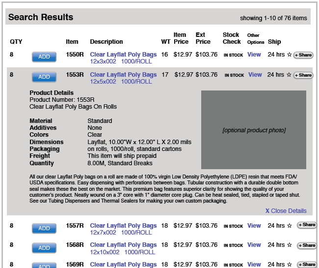
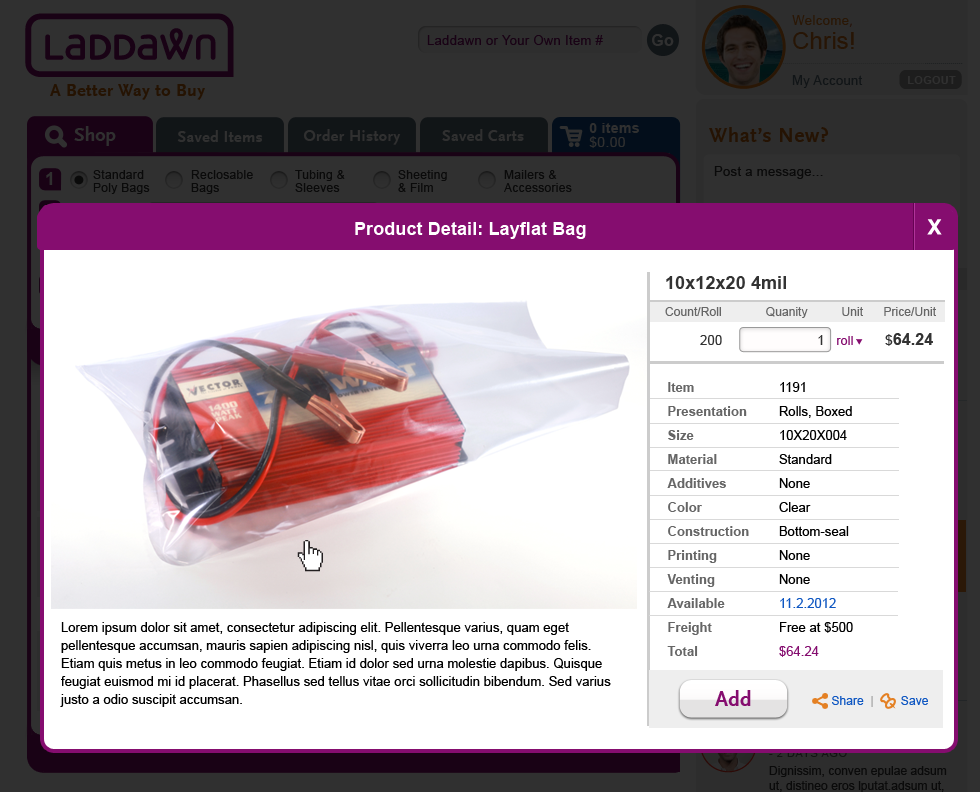
- Remove redundant content - don't need "Layflat Bags" heading, item number or size in the expanded description (since the results are still visible). SB - Done.
- Image - a small subset of products (not this example), may belong to more than one category and therefore have more than one photo. We would like you to give thought to how you might incorporate thumbnails or a slider or some other mechanism, to enable the user to access the alternative photos. Note: We don't think users will need to zoom in and out.
SB - I went the thumbnail route because it seems to fit space better. Is there any scenario where we might need more than 4 photos? - Open/close - expand/collapse. We have one approach in place for the level 3 menus (right arrow, down arrow). Should that carry through to open/close of details? Seems like it should for sake of consistent affordance. And yet - will it be confusing alongside the very similar looking downward arrows for the drop menus (freight, unit of measure)? Previously we had used +/- for the price breaks expansion (which is now a shadwo box not an expansion). Should the plus/minus convention be used for Details AND level 3s? Thoughts?
SB - I am on the fence with this. Originally I thought those right facing arrows would blow out into a shadowbox. That was my original intention. Now that we are moving down the path of drawers/expand and collapse functionality it probably does make to make use of the plus/minus icons for consistency.
SP: OK - so what does this mean for other treatments like right/down arrows for level 3 menus? Also - what about all the other links that open shadow boxes? - There are additional trademarks/logos (such as EPA green power partner andSmart-tech, for starters) that go with some products - how would you reference these within the description? For smart tech - go to this site (which is eventually going away) - http://www.smarttechbags.com/ Here's the EPA logo:
Maybe these would clutter up the descriptions? (They belong somewhere, but maybe not here.) Maybe it is enough to mention "Smart-Tech" in the description, as Owen has done below (5-a)?
SB - I guess my question is how important are these logos for gaining trust in Laddawn's products. Depending on that answer will depend on whether we should Hide or show these logos? The design shows a sample of how we could incorporate the logo(s).
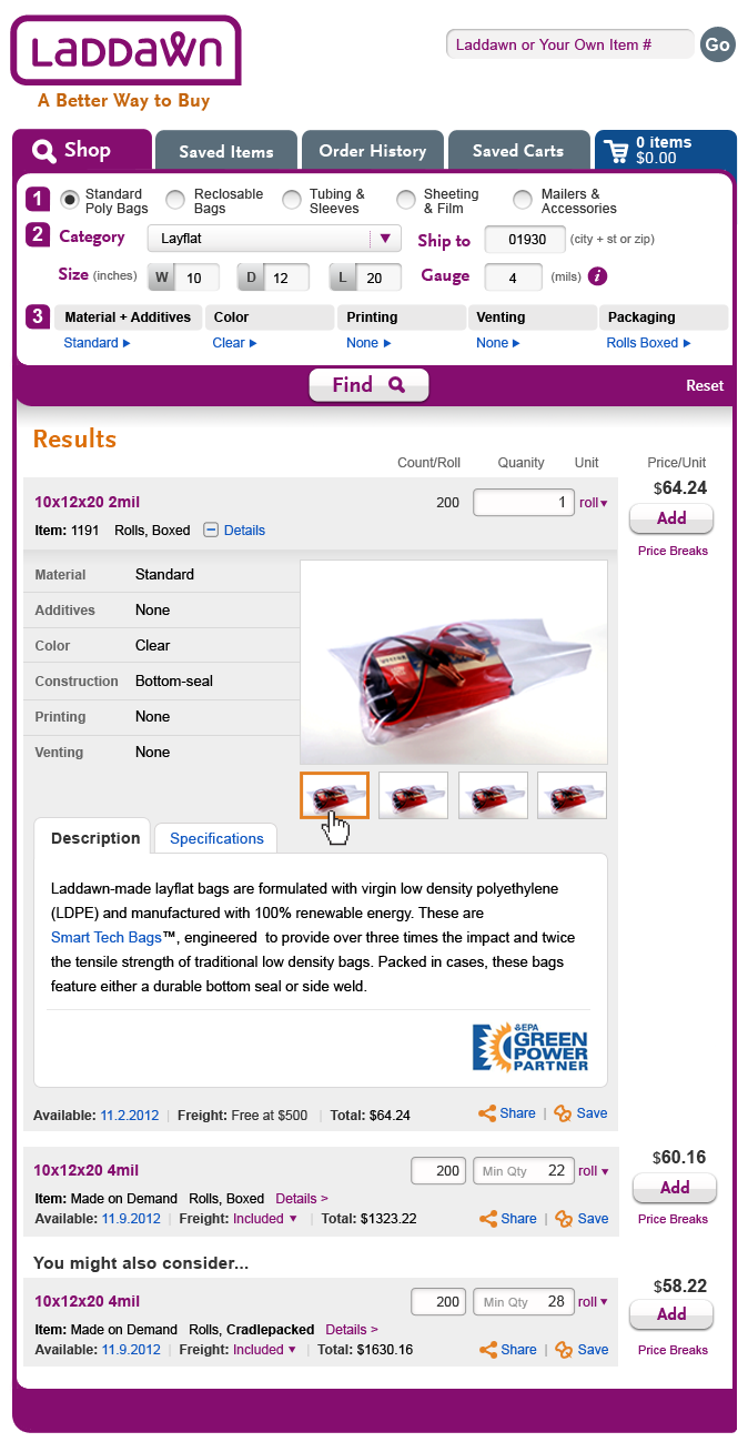
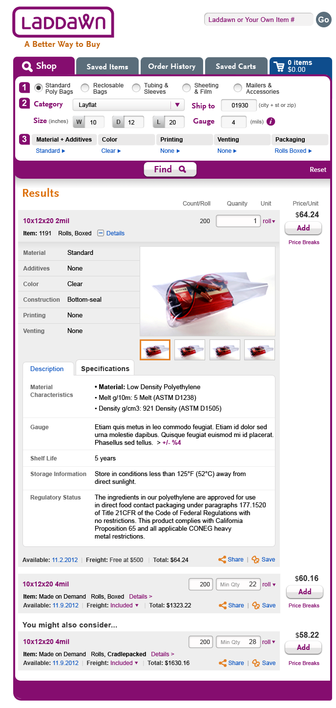
SP: Great question, I knew this wouldn't be easy - let's discuss with Owen. - Replace Lorem ipsum with these two chunks of content:
Laddawn-made layflat bags are formulated with virgin low density polyethylene (LDPE) and manufactured with 100% renewable energy. These are Smart Tech Bags™, engineered to provide over three times the impact and twice the tensile strength of traditional low density bags. Packed in cases, these bags feature either a durable bottom seal or side weld.
the attributes in the table below
Note: we were thinking that, similar to the Wal-Mart example, chunks (a) and (b) could presented under two tabs, like "Description" and "Specifications"
SB - Done. I like the use of in-page tabs here.
| Tabs - Description | Tabs - Specifications |
|---|---|
 |  |
10/9 feedback & direction
Thank you for the designs, the pro and con breakdown, and for your questions. Jim, Owen, John and I met and decided (for now) in favor of the drawer approach. We agree that whether it's a shadow box or drawer, the user should be able to add the product (and share and save it). Despite its drawbacks, the drawer seems to offer a smoother flow for all of these actions.
Here are some changes:
- Remove redundant content - don't need "Layflat Bags" heading, item number or size in the expanded description (since the results are still visible).
- Image - a small subset of products (not this example), may belong to more than one category and therefore have more than one photo. We would like you to give thought to how you might incorporate thumbnails or a slider or some other mechanism, to enable the user to access the alternative photos. Note: We don't think users will need to zoom in and out.
- Open/close - expand/collapse. We have one approach in place for the level 3 menus (right arrow, down arrow). Should that carry through to open/close of details? Seems like it should for sake of consistent affordance. And yet - will it be confusing alongside the very similar looking downward arrows for the drop menus (freight, unit of measure)? Previously we had used +/- for the price breaks expansion (which is now a shadwo box not an expansion). Should the plus/minus convention be used for Details AND level 3s? Thoughts?
- There are additional trademarks/logos (such as EPA green power partner andSmart-tech, for starters) that go with some products - how would you reference these within the description? For smart tech - go to this site (which is eventually going away) - http://www.smarttechbags.com/ Here's the EPA logo:
Maybe these would clutter up the descriptions? (They belong somewhere, but maybe not here.) Maybe it is enough to mention "Smart-Tech" in the description, as Owen has done below (5-a)? - Replace Lorem ipsum with these two chunks of content:
Laddawn-made layflat bags are formulated with virgin low density polyethylene (LDPE) and manufactured with 100% renewable energy. These are Smart Tech Bags™, engineered to provide over three times the impact and twice the tensile strength of traditional low density bags. Packed in cases, these bags feature either a durable bottom seal or side weld.
the attributes in the table below
Note: we were thinking that, similar to the Wal-Mart example, chunks (a) and (b) could presented under two tabs, like "Description" and "Specifications"Material Characteristics
Material: Low Density Polyethylene
Melt g/10m: 5 Melt (ASTM D1238)
Density g/cm3: 921 Density (ASTM D1505)
Gauge < An explanatory sentence to be provided by Owen - for now use lorem ipsum > +/- 4% Shelf Life
5 years
Storage Information
Store in conditions less than 125°F (52°C) away from direct sunlight.
Regulatory Status
The ingredients in our polyethylene are approved for use in direct food contact packaging under paragraphs 177.1520 of Title 21CFR of the Code of Federal Regulations with no restrictions. This product complies with California Proposition 65 and all applicable CONEG heavy metal restrictions.
10/8 - Steve's latest round of work - Product Descriptions (drawer vs. shadowbox)
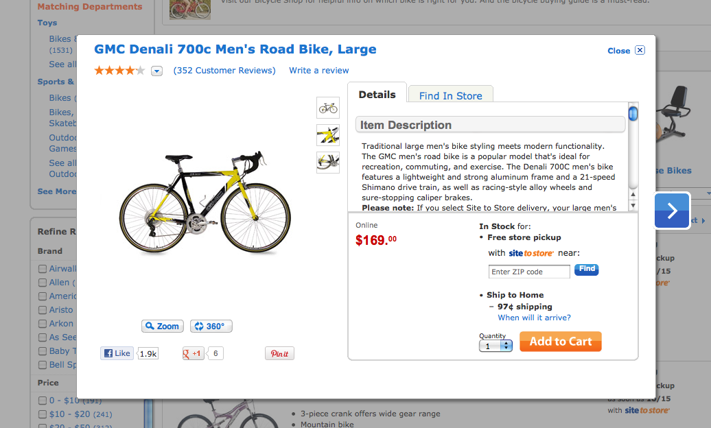
Note on Corey recommendation: I don't quite understand why you couldn't allow the user to add the product form the lightbox? That's is a fairly standard interaction. Here's a quick sample from the Walmart site which does this.
Good question - I was wondering the same thing and had been meaning to ask. I wasn't sure if there was a history to this, or if it was just an erroneous assumption on Corey's part that had never been challenged. (SP)
Overall, I think both drawer and lightbox have their pluses and minuses.
Expandable Drawer
Pluses
• design stays in context to where you are
• content still fits space nicely.
• another potential advantage is that it could link to more detailed content elsewhere, which I think is awkward to do from within a shadow box.
Minuses
• Image would need to expand to a larger size. Seems kind of small. I don't know about that. Unlike a consumer site, where you really want to scrutinize the object, I think these images are just meant to give an idea (SP)
• opportunity for repeating content. Not sure I understand this point (SP)
lightbox
Pluses
• More space for design to breathe. Information would be easier to scan.
• Image can be made much larger I actually think the image is too large; also, the content (see below) may be more extensive than the lorem ipsum you have here, and might even require its own table. (SP)
Minuses
• Lose context from search
• Because image is intentionally larger, shadowbox could be very large as well. Don't think image needs to be this big (SP)
| Expandable Drawer | Shadowbox | Walmart Sample |
|---|---|---|
 |  |  |
| If we go this route, I think the "Layflat Bag" heading is superfluous. It was really intended to be the heading for the shadow box. |
10/5 - We're ready to have you work on product descriptions.
See requirements page. Below is some raw material to work with. Q: Do you think Corey's approach below (a drawer or expansion) makes sense?
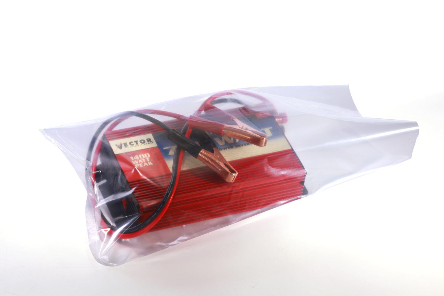
Product thumbnail (source attached & linked):
Product description
Search parameters & construction
| Layflat Bag | |
| Item: | 1191 |
| Size: | 10X20X004 |
| Material: | Standard |
| Additives: | None |
| Color: | Clear |
| Construction: | Bottom-seal |
| Printing: | None |
| Venting: | None |
| Gauge tolerance: | +/- 4% |
Generic info from spec sheet - still DRAFT, an subject to change:
Description | Laddawn Layflat poly bags are full gauge and offer exceptional clarity and quality. Smaller items are not Laddawn-made. These are imports, bottom sealed and packaged in 100 pack bundles. | ||
Applications | These bags are available in a variety of sizes and gauges to suit all of your packaging needs. | ||
Material Characteristics | Material Melt g/10min Density g/cm3 | Low Density Polyethylene 5 Melt 921 Density |
ASTM D1238 ASTM D1505 |
Shelf Life | Our Layflat poly bags have a shelf life of 5 -10 years. | ||
General Storage Information | Do not use or store near heat, sparks, or open flames. Store in conditions less than | ||
Regulatory Status | The ingredients in our polyolefin based polyethylene are approved for use in direct food contact packaging under paragraphs 177.1520 of Title 21CFR of the Code of Federal Regulations, with no restrictions. This product complies with California Proposition 65 and all applicable CONEG heavy metal restrictions. | ||
Note & image from Corey Oct wireframe document
"We recommend using an expandable outline (drawer) technique here rather than a light box or popup because the product listing will remain actionable while the user is reviewing the the details. With a lightbox treatment, the user would need to close the lightbox before adding the item to their Cart/Quote."