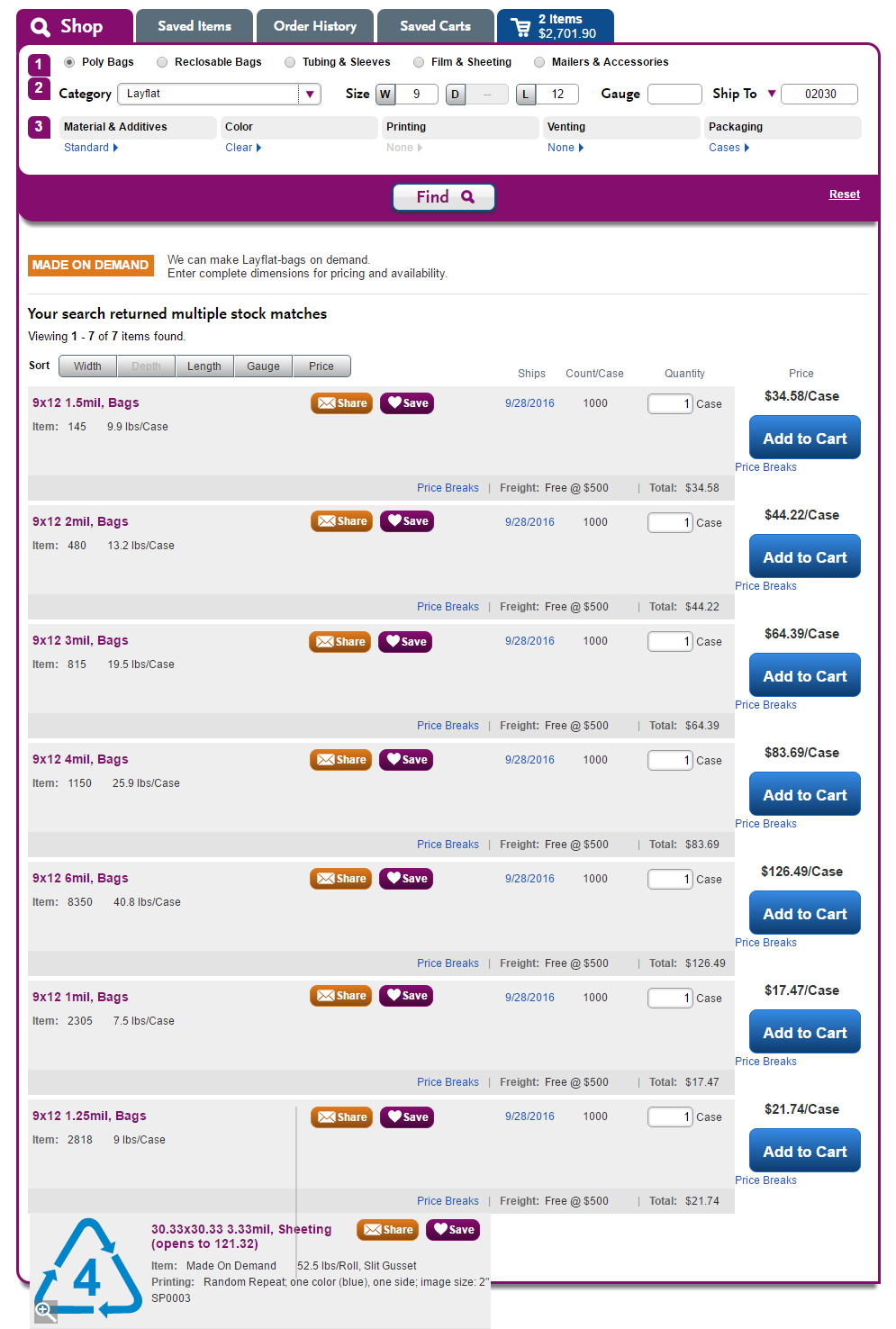
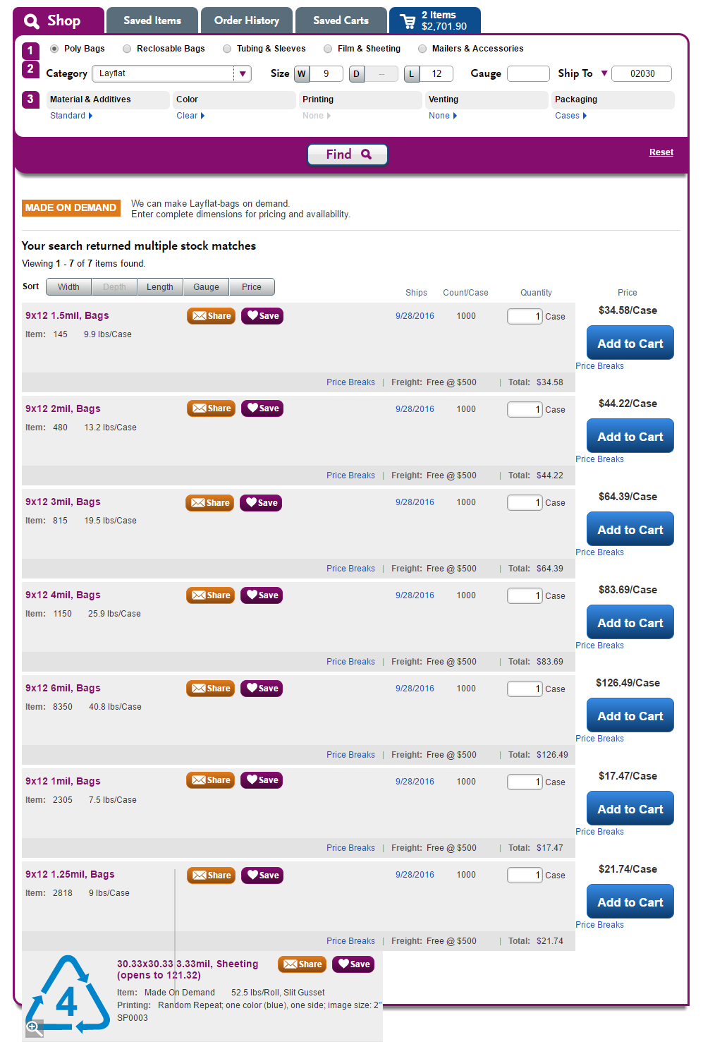
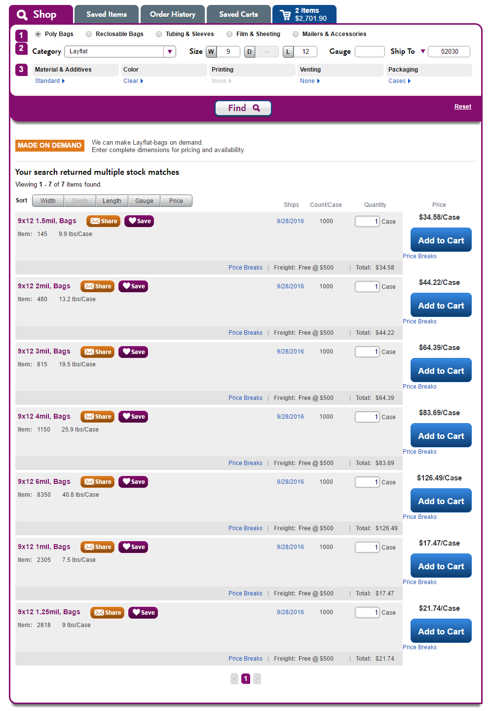
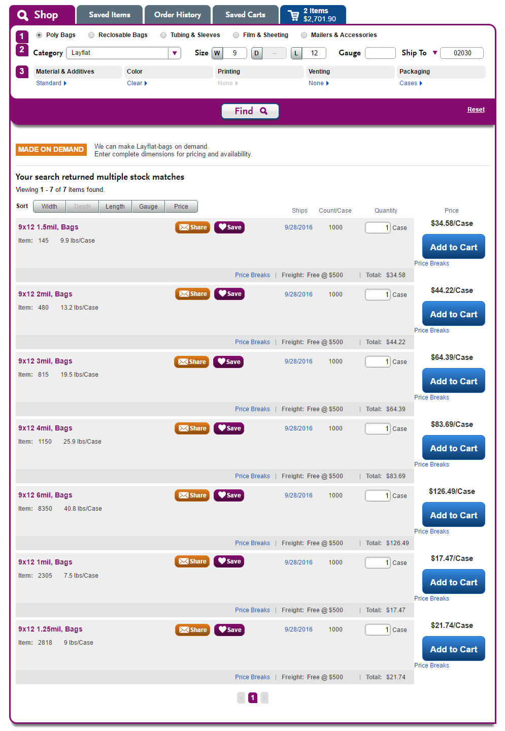
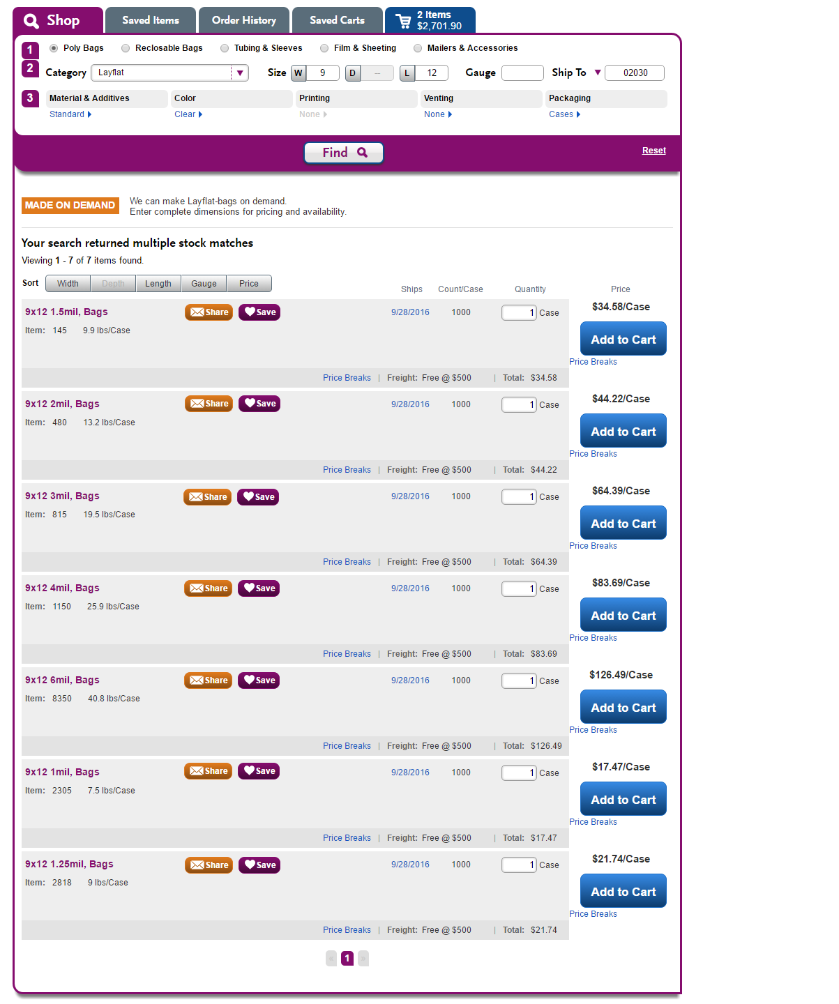
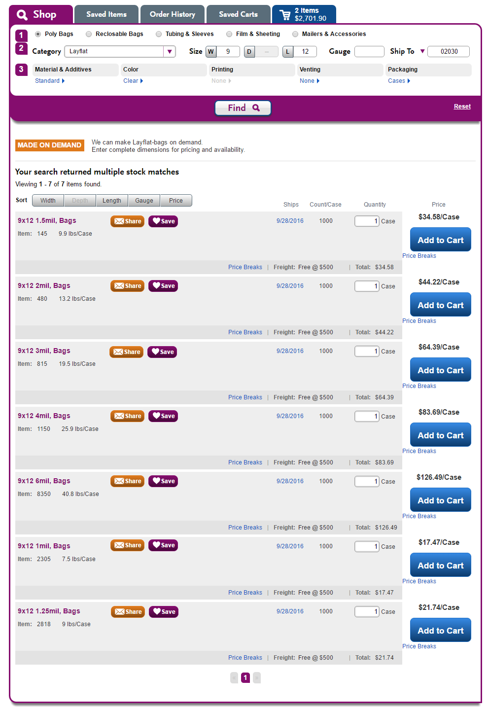
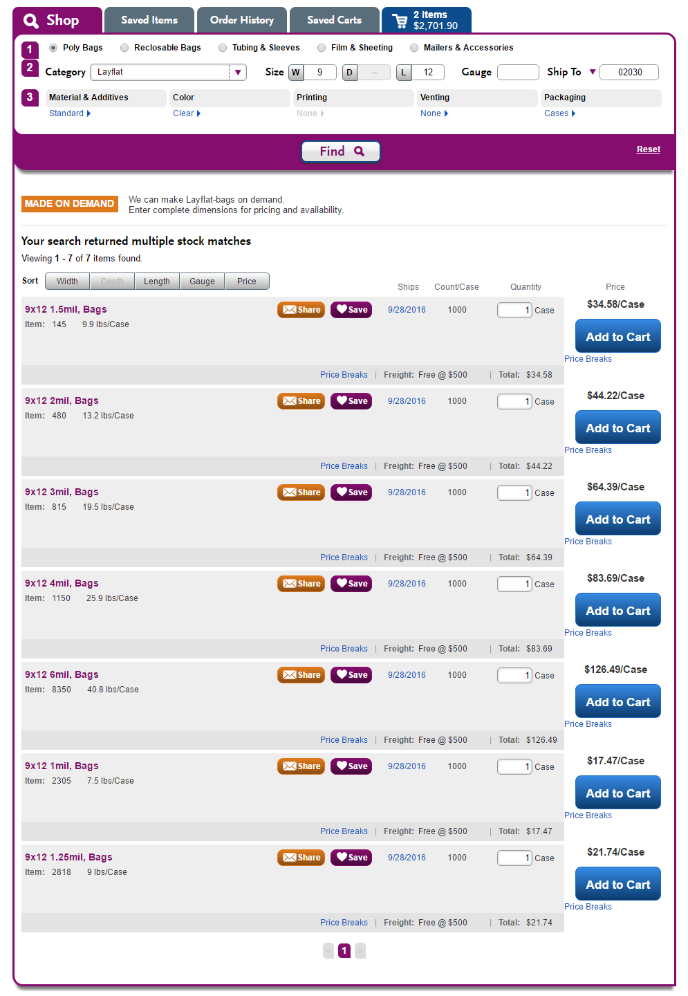
In results
| How it is right now | (1) Equal distance to right of variable-length product descriptions - the winner? | (2) Consistent position, headline wraps at 35 chars - slight improvement | (3) Consistent position, headline wraps at 30 chars - better | (4) Consistent position, headline wraps at 25 chars - best | |
|
|
|
|
| |
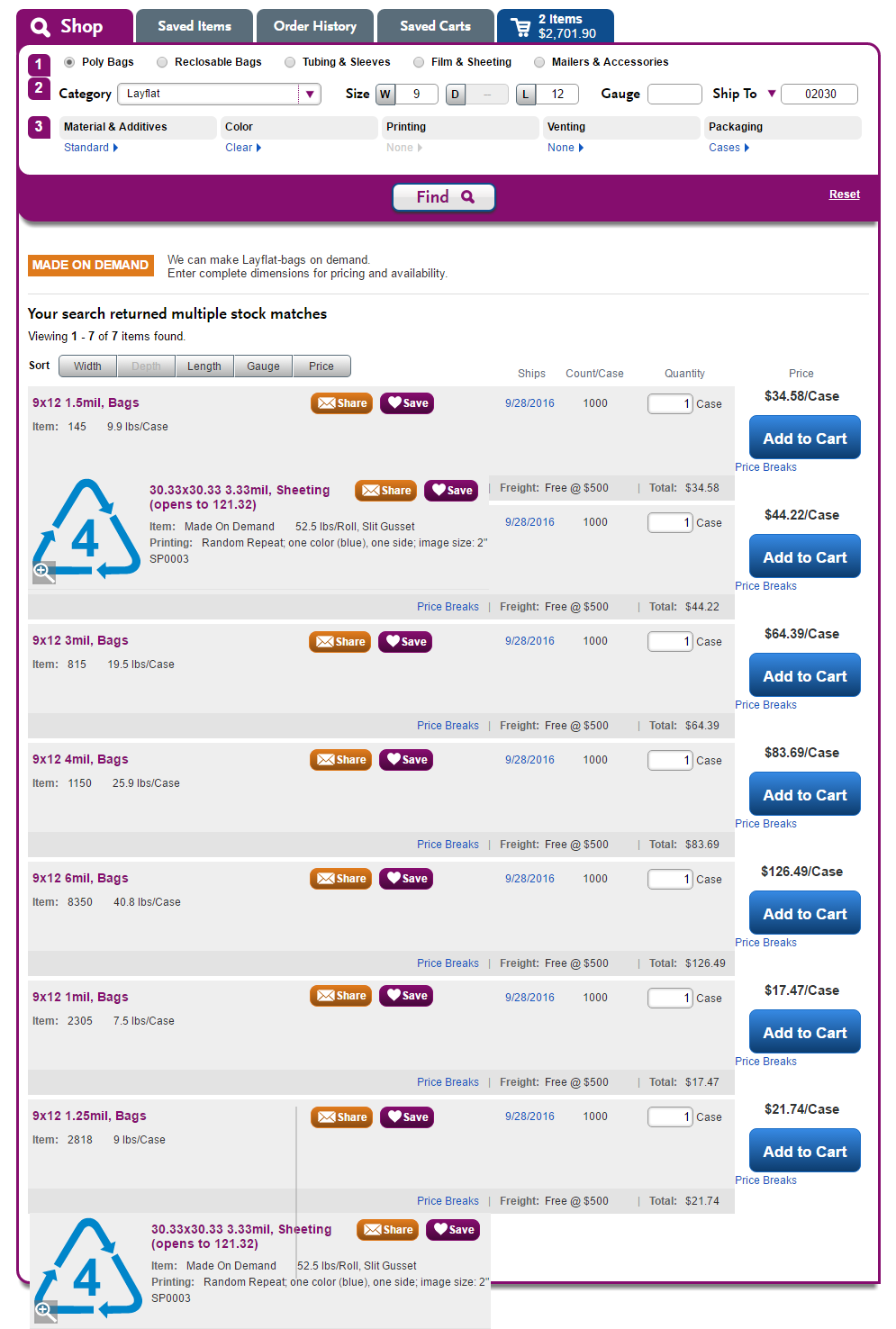
| Consistent placement but divorced from product and overshadows ship date. | Pros: More consistent with Fitt's law, if we think of the product as the starting point, and the save/share buttons as targets flowing from that starting point - https://www.interaction-design.org/literature/article/fitts-s-law-the-importance-of-size-and-distance-in-ui-design Wrapped product headlines are harder to read; this option requires the least wrapping - at about 45 characters: 22.25x22.25 3.33mil, Lip & Tape Perm Postal
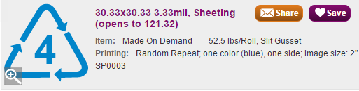
| Good, better and best when there are no thumbnails but they won't work well, or at all, when there are thumbnails., unless we can have different button positions for printed/non-printed. Turns out we can. So, if we go with this option, we have to figure out what tradeoff we want to live with as far as headlines wrapping more to enable closer button placement. 25 chars - with "clean" line breaks (we don't hyphenate words, etc).:A really long headline, not printed 30.33x30.33 3.33mil, 12.32x20.32 3.25mil, Lip Or a gusseted bag with 2 decimals in each dimension has to wrap at character 18 - 30.25x15.25x36.25 Even a layflat... 97.25x222.25 3.33mil, 30 chars30.33x30.33 3.33mil, Sheeting 12.32x20.32 3.25mil, Lip & 30.25x15.25x36.25 3.25mil, 30.25x30.25 3.33mil, Bags | |||


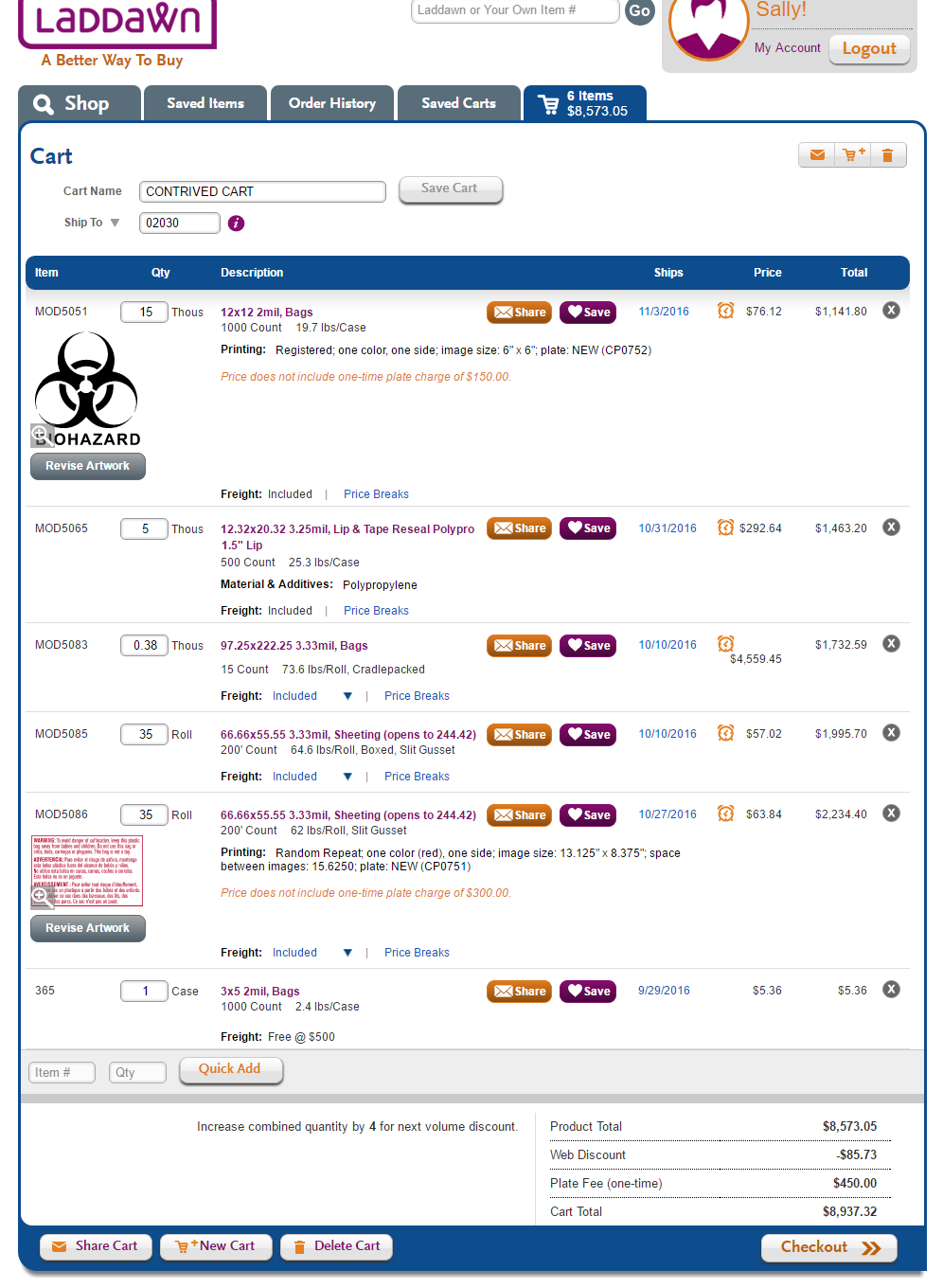
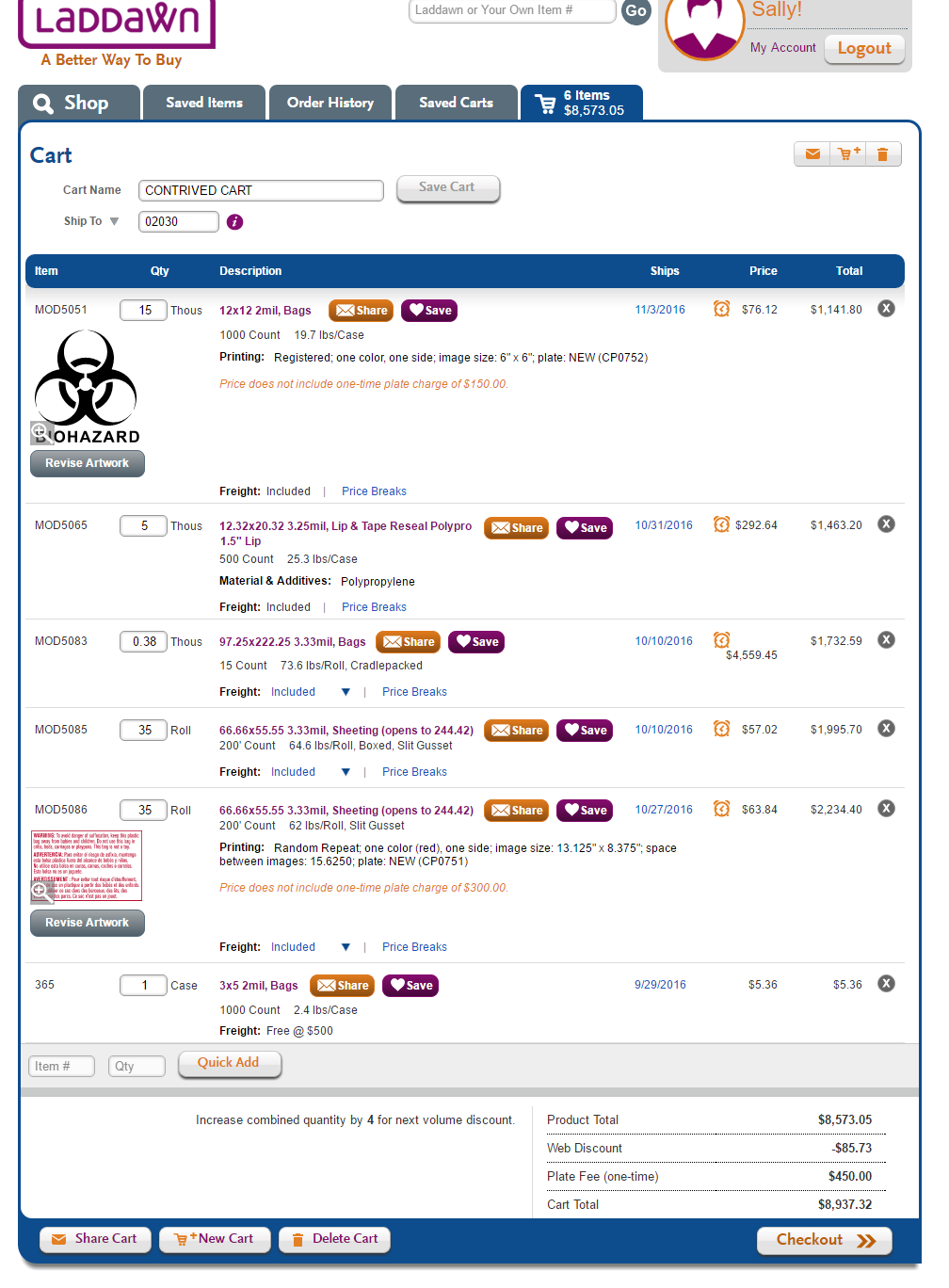
In the cart
| Aligned vertically | Anchored to product headline |
|
|
