

Tweaked.
Eliminated

Some side-by-side thumbnail alternatives


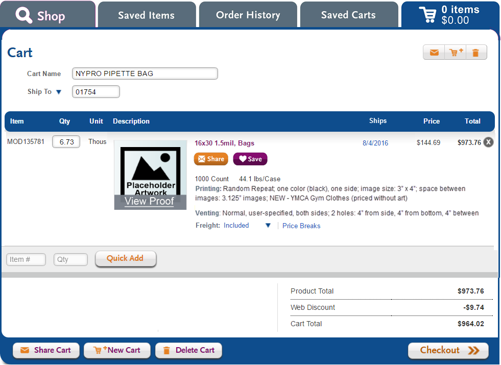
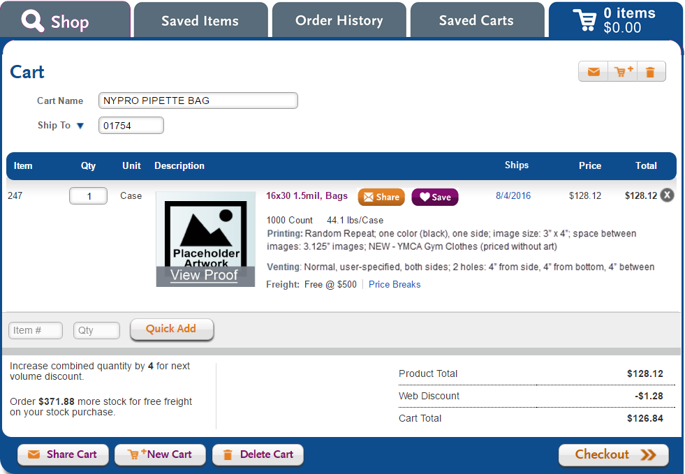
And now for something completely different. The cart. Now in previews.
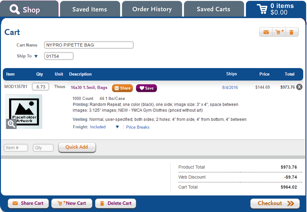
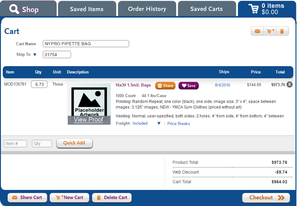
Current cart

Not shown
- Verbiage concerning lead time pending Laddawn art approval.
- Checkbox for customer signoff on proof.


Action items from Ladd's and Dawn's feedback (7/28) | ... and the resulting design options |
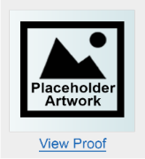
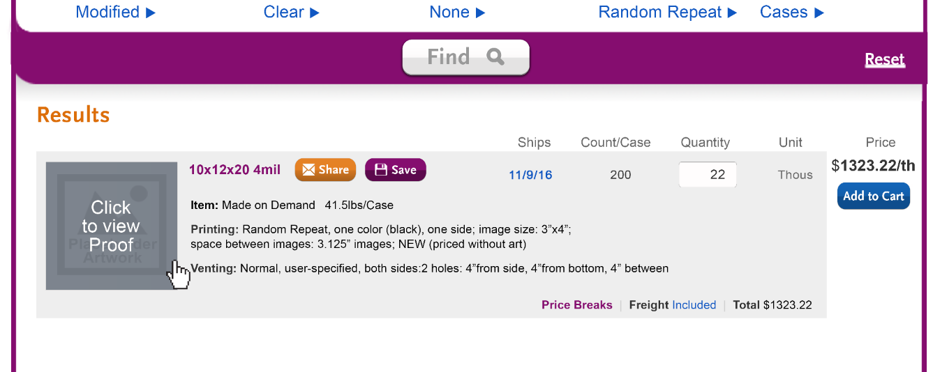
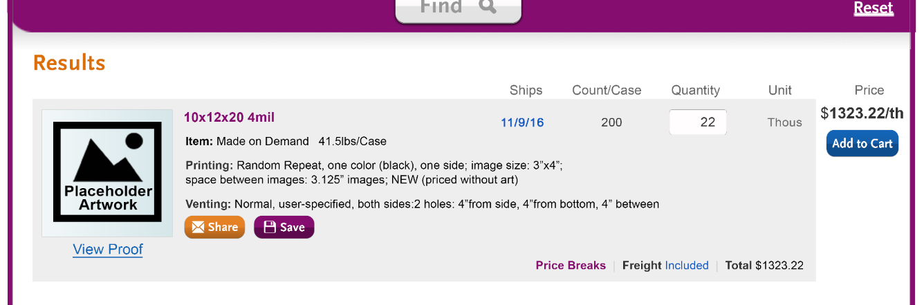
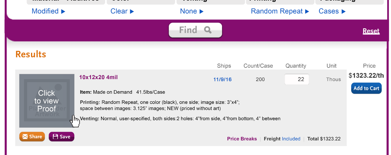
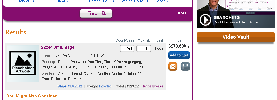
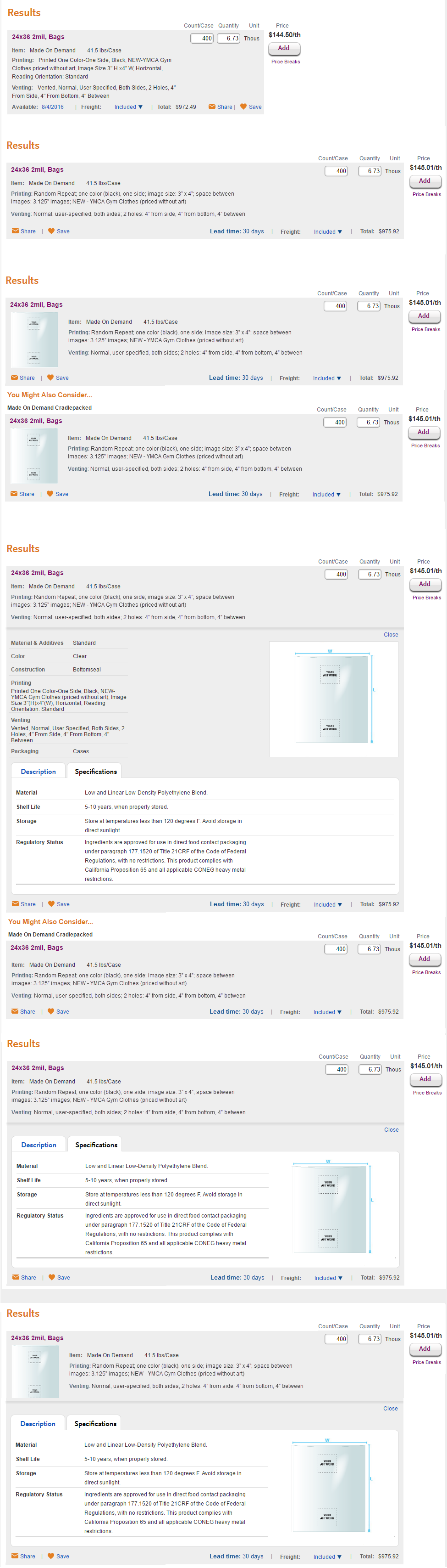
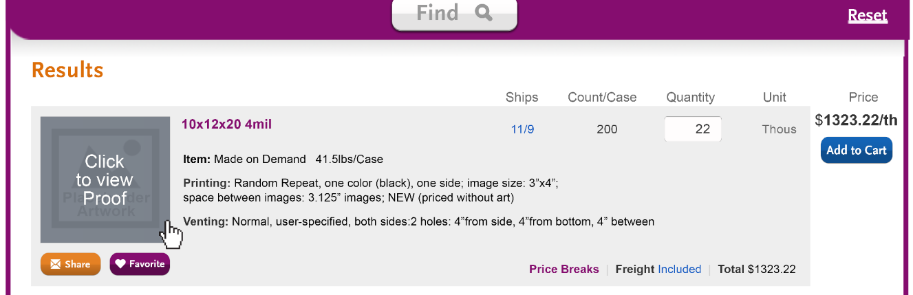
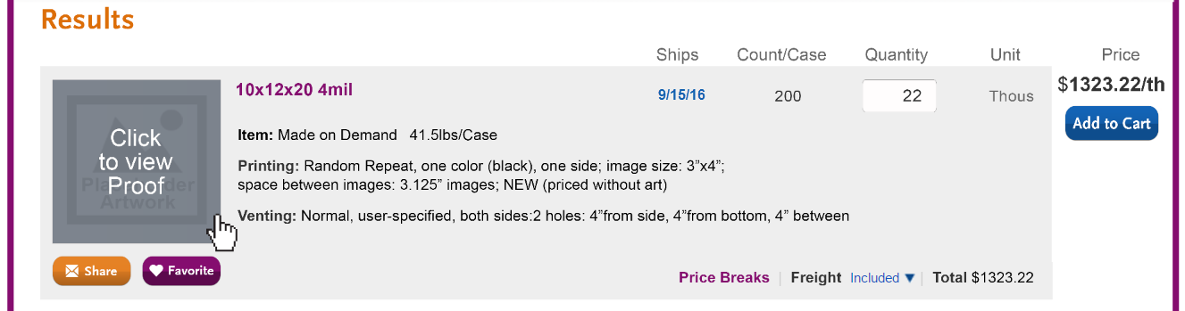
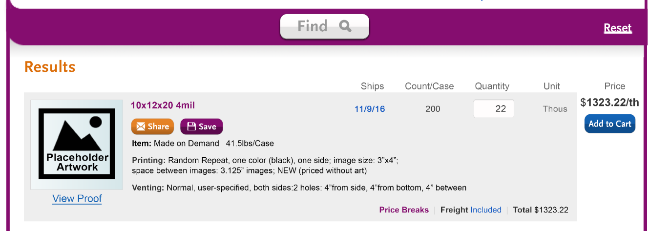
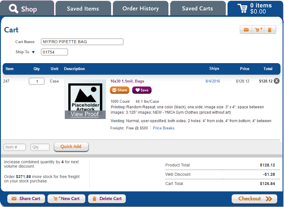
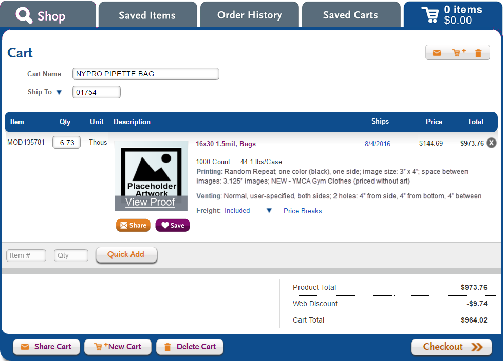
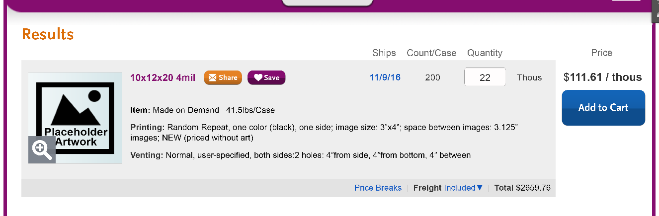
Change favorite back to save. (A change to favorites requires a fairly serious discussion and has all sorts of ripple effects we probably do not want to take on just yet; for now, we need to see it as save.) Share and Save to the right of description. Caption (or something other than just a hover) that shows that the thumbnail will open into a full schematic. "Click to see full product drawing"? | Share and save to right of description + two thumbnail captioning options
|
Share and save alternative 1 - below product heading/description, but above product deals; caption below thumbnail
| |
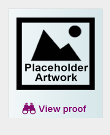
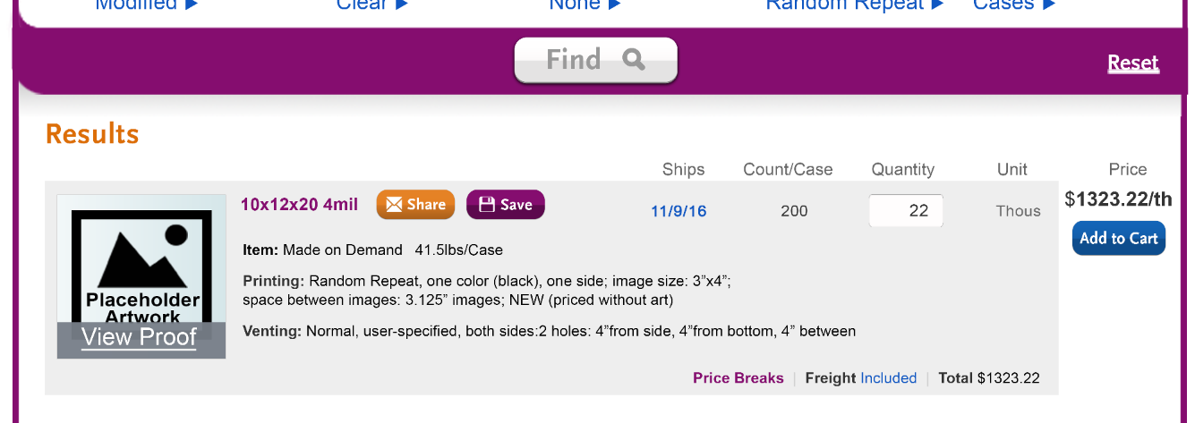
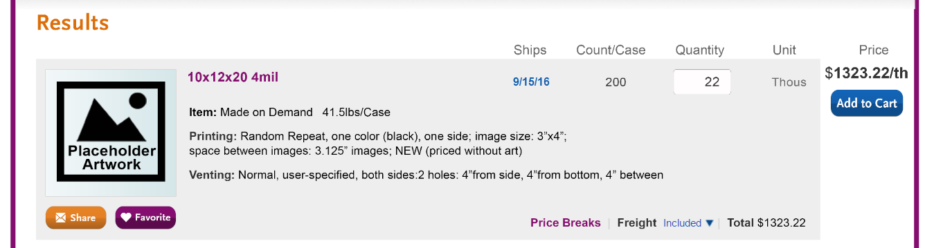
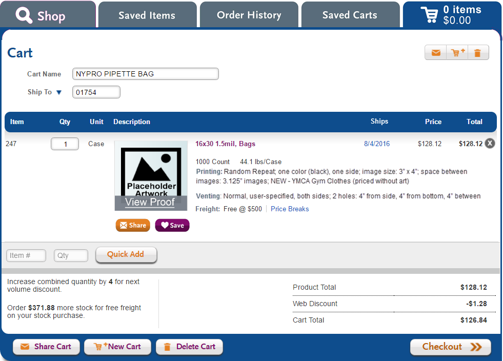
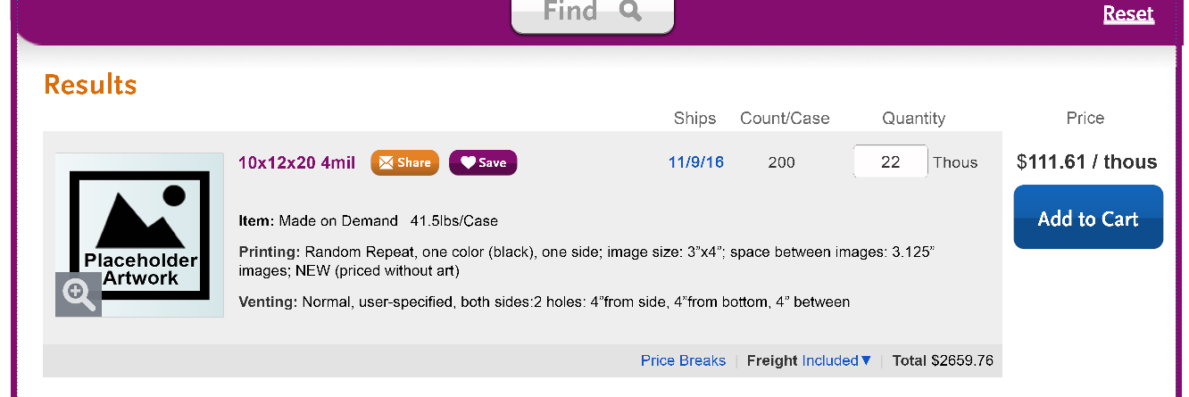
Share and save alternative 2 - below last row of product details (venting); caption below thumbnail
| |
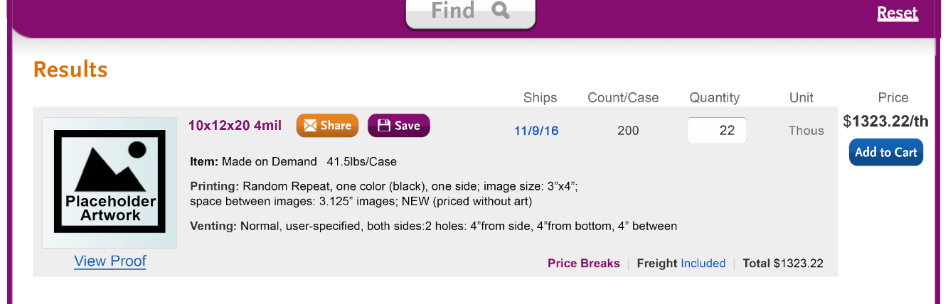
Share and save alternative 3 - the prior design iteration, for comparison
| |
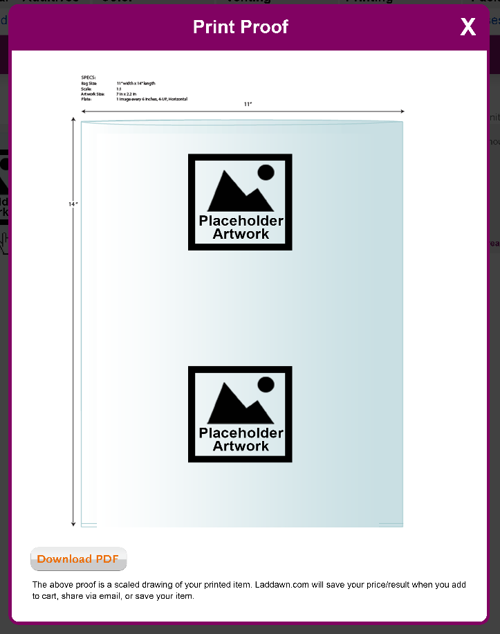
| Print proof | (No change)
|
| New design applied to result without printing (no thumbnails for Release 1) | To be done after we settle on wide design. Here is the last iteration:
|
| Plan B - narrow results designs - 2-3 different placements of thumbnails and possibly rearrangement of other elements from the final wide design | To be done after we settle on wide design. Please note - having the share/save buttons to right of the thumbnail may not work in the narrow design, at least for some of the longer product descriptions. |
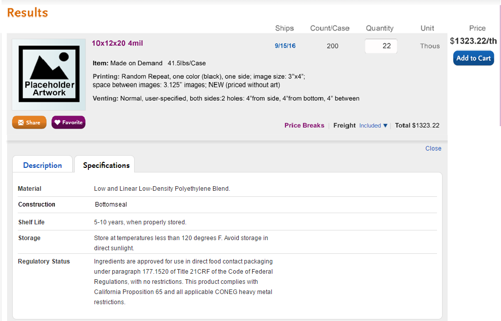
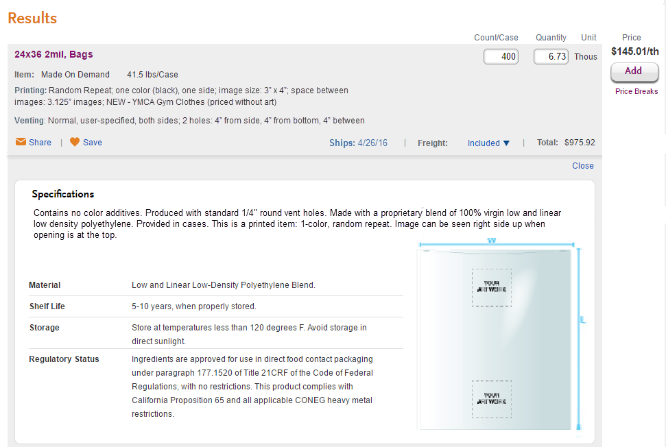
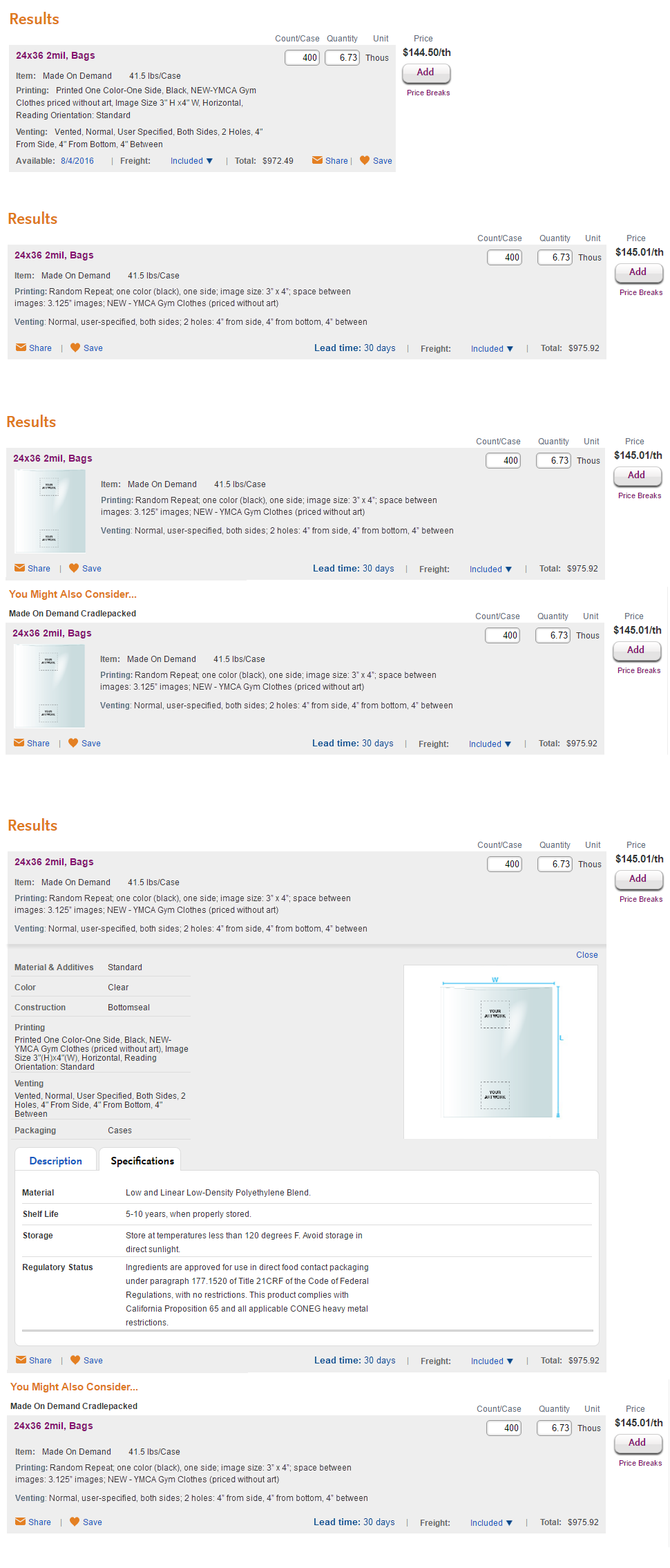
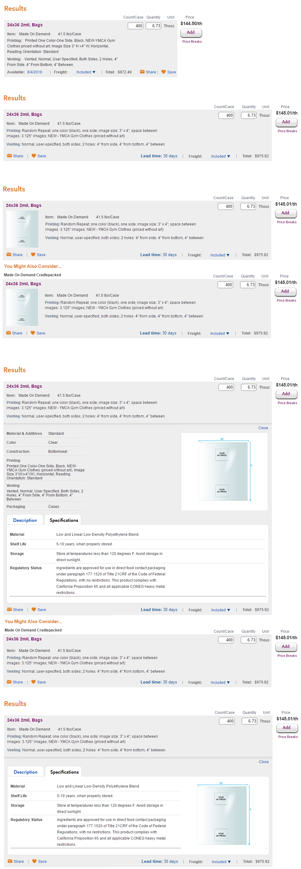
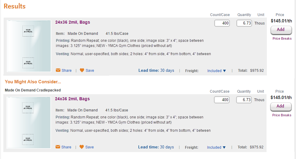
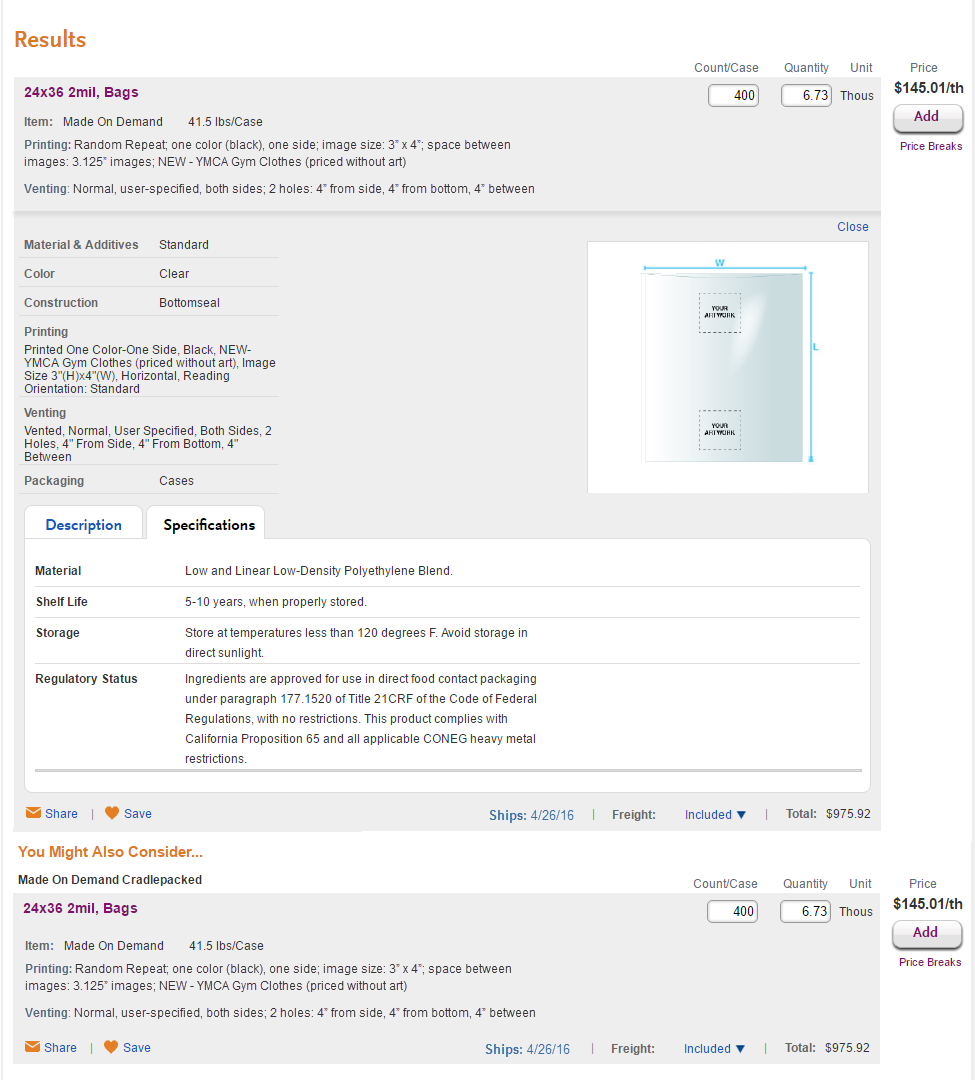
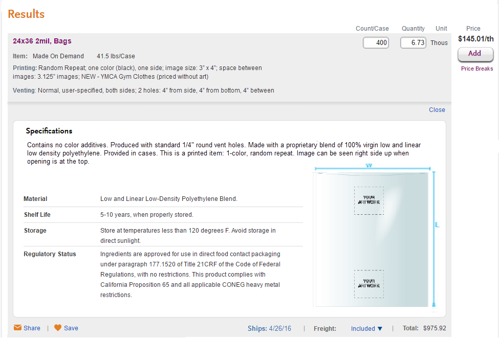
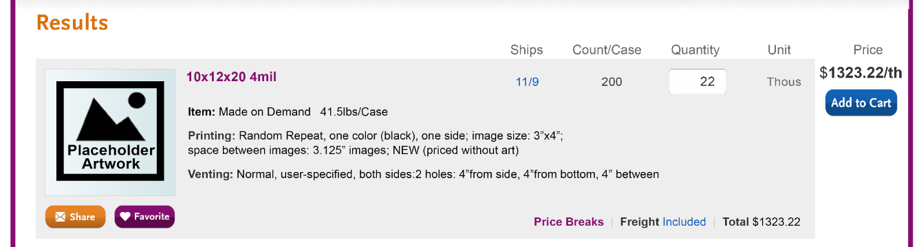
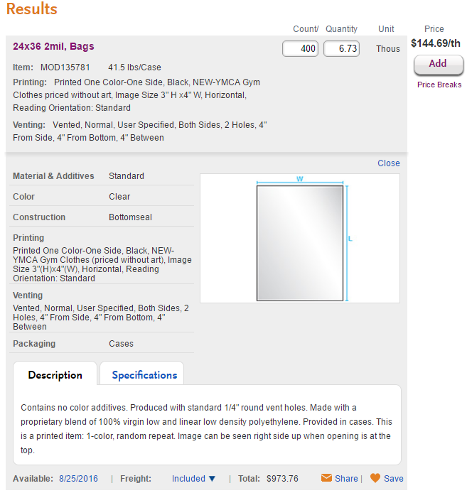
| Expanded results - wide design | To be done after we settle on wide design. Here is the last iteration: Eliminated redundant product details section that appears above the desc/spec tabs; incorporated construction into specifications tab.
Why didn't I have specifications text extend to the full width? Thumbnails for products with with no printing (often a photo and a drawing) could be fit into space to the right of the text or be included on the Description tab. This is still half baked - we need to think about how this plays into what we eventually do when we have thumbnails in the main results for all products. |
| Expanded results - narrow design | To be done after we settle on wide design. |


Designs from 7/26-ish
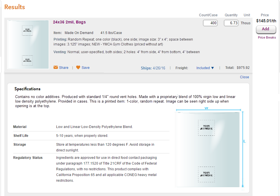
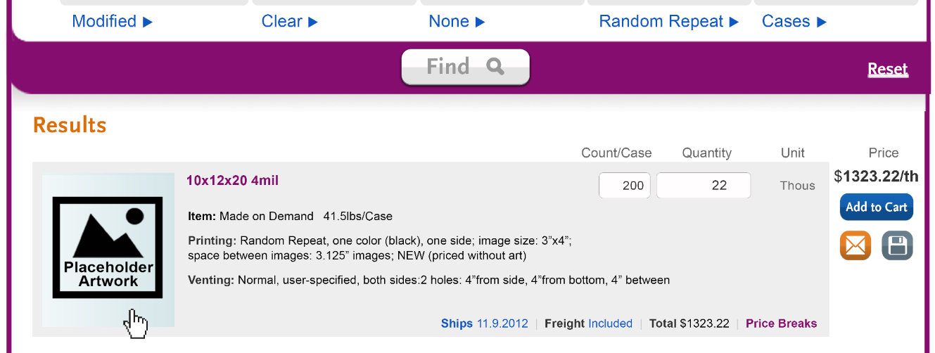
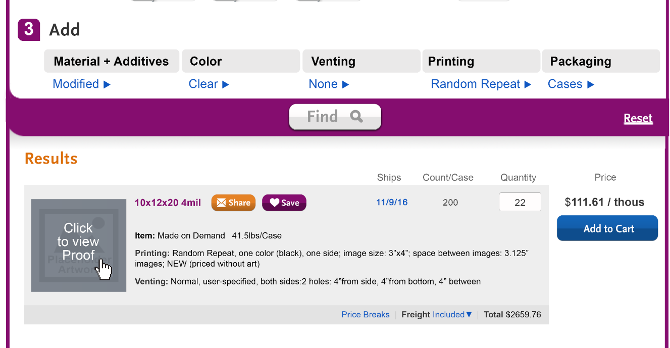
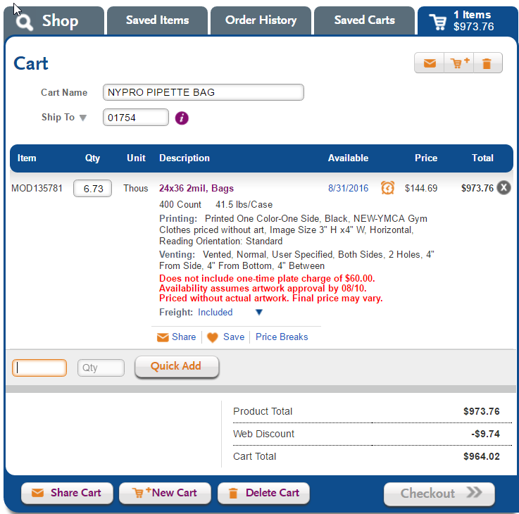
Result with thumbnail that is closeup of art (instead of full schematic of bag). Ship date now in column. This replaces "availability." Please note, IT would like us to hold off on all other availability functionality changes until after Print Designer launch, including replacing dates with "today" and "tomorrow." Increased prominence of share and save through iconography, scale and placement. New treatment for the Add button and price breaks - give Add more primacy.
RE: Replacing "Save" with "Favorite" - easier to discuss in person. Even if we want to do this, I think we may need to stick with "Save" for release one.
|
|
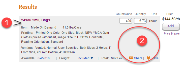
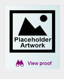
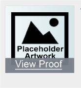
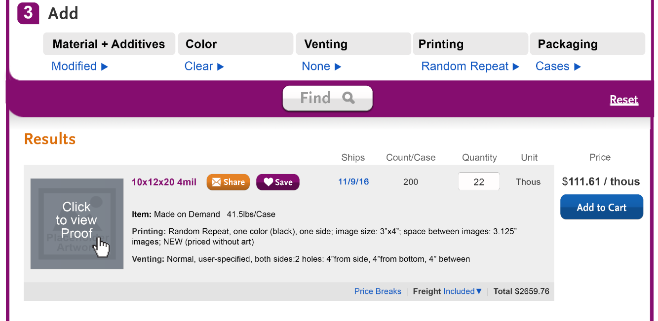
Show that swatch will open a full schematic - we did not do this with a caption. Haley felt the mouseover was sufficient. Do you agree?
|
|
| New design applied to a result that does not have printing. |
|
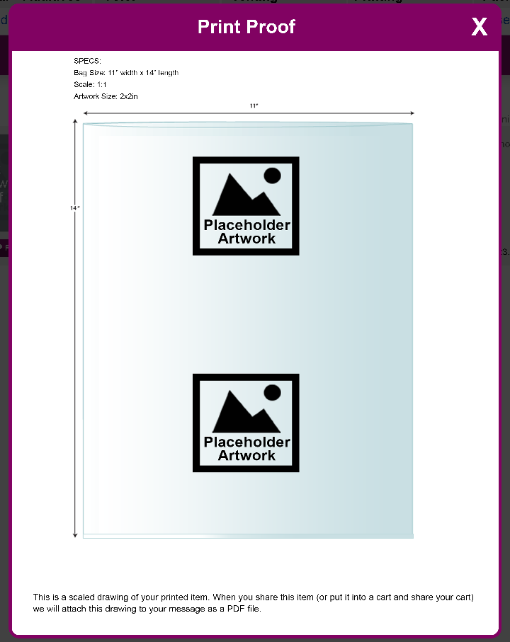
| Proof - as discussed. We need to discuss whether we call this a proof or not. We need to work through the process flow first. |
|
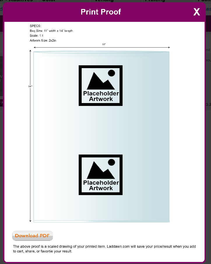
| Proof - with PDF download button. (Haley wants to fight for this.) |
|
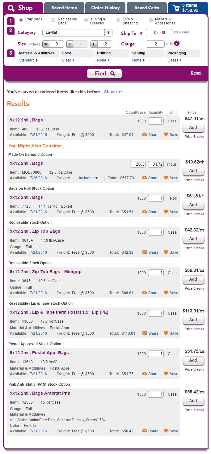
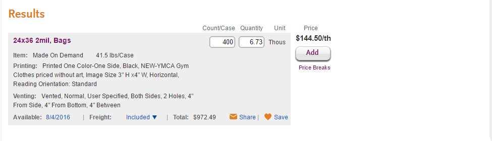
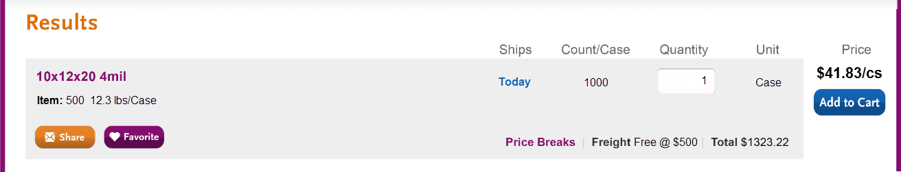
Expanded results - Current
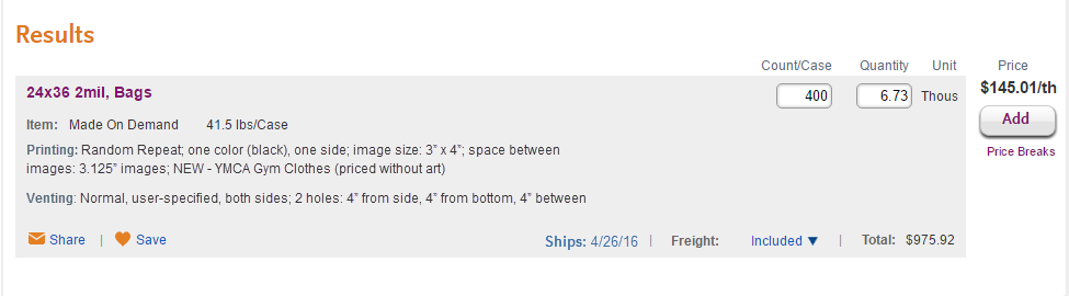
| Revised - eliminated redundant product details; incorporated construction into specifications tab.
Why didn't I have specifications text extend to the full width? Thumbnails for products with with no printing (often a photo and a drawing) could be fit into space to the right of the text or be included on the Description tab. This is still half baked - we need to think about how this plays into what we eventually do when we have thumbnails in the main results for all products. |
| "Plan B" results - design using current width | Haley to revise an earlier design (below). On hold pending next iteration of wide results. |


Next steps - notes from 7/20/16
Please do this: | With this design as a starting point: |
Haley
Susan:
|
A.
B.
C.
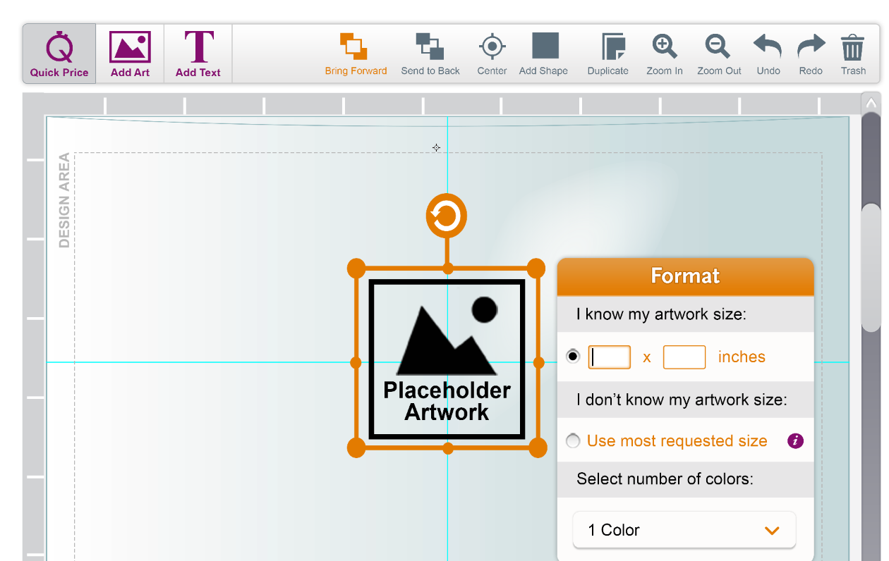
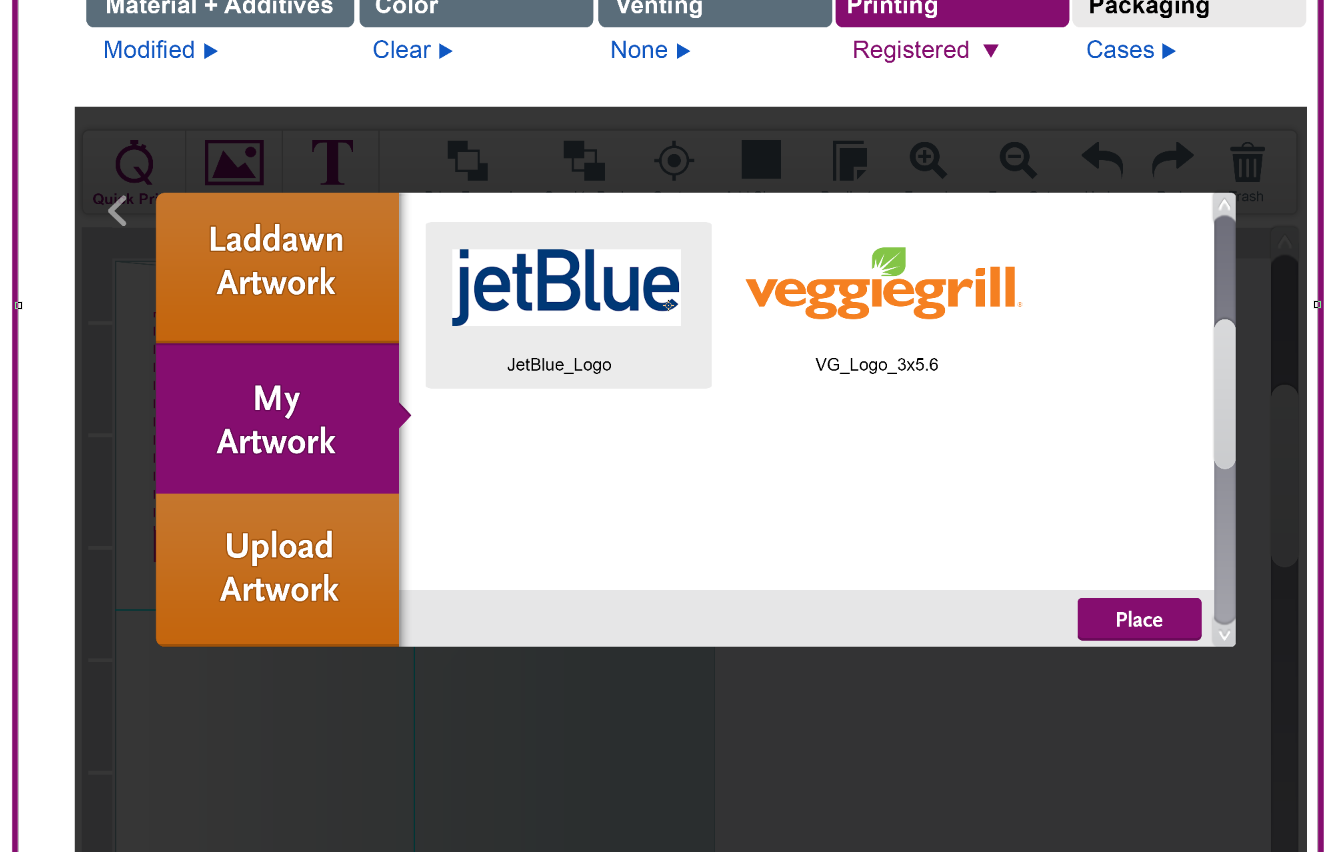
Thumbnail Pop-Up:
|
Haley: Just in case... We need to have a backup plan if we cannot widen the widget. So...
Susan:
|
|
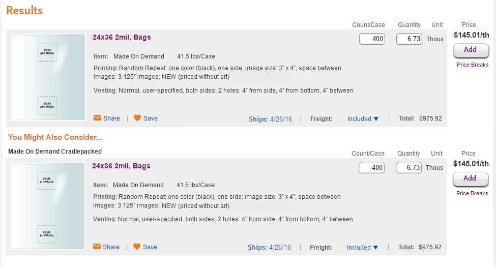
| Haley - Not urgent, maybe for later: Show how this set of results (9 x 12 2 mil layflat) would look with thumbnail images on the left using the first (wide) layout above. Are the images we're already using suitable for this purpose? When we're showing more than one image with the expanded result, which image would we use for the thumbnail here, and would they be clickable and open to something larger? |
|
| Owen/Susan - work on inventory/leadtimes fluctuation verbiage for availability popups. |


Other Updates:
No Save Button:
Selected vs. Non-selected Image:
Discussed 7/20/16
Just some thoughts. Intentionally trying NOT to think outside the box very much to avoid scope creep for release 1.
(1) Current format - from live; does not reflect recently proposed changes to availability and new print details. |
|
(2) Wider format, with some re-arranging of elements, and slightly different printing/venting detail presentation. Also, new handling of "availability." Do we want to mention anything about this assuming art approval within X days, or only mention that in the cart? Now that we have extra width... What would you think of putting weight in a column, just to left of Count/Case? It seems like it has more of an affinity with count and quantity, and out of place where it is. |
|
| (3) With left column thumbnails (also showing YMAC) |
|
(4) No thumbnail on left; default to full expansion (with a YMAC below). Is it overwhelming? (Obviously several more adjustments could be made to content/layout to take advantage of additional width.) Other than the construction line, and perhaps having more real estate to spell out materials & additives- the repetition of configuration details seems unnecessary. Can we eliminate? (See below.) |
|
(5) Big mashup - Eliminated redundant product details, mashed "description" and "specifications" tabs and schematic into single non-tabbed block. Again, imagine results defaulting to this view (at least for printed items). Also - moved the whole share/save/freight etc line up above the expansion. |
|
| (6) Question: With thumbnails on the left, would we still see a bigger thumbnail in the description? Feels redundant. |
|


