Results - Line Item Link
When viewing the “Results” section, it wasn’t obvious to me that each line item returned was ‘clickable’. For example, if you click on “76x45 1mils Furniture Bags” – it then expands to show details about that item. My reason for thinking this, lies with the font color chosen. The Laddawn purple, is the same color that is used up above “Category”, “Size”, “Ship To”, “Gauge” etc. That header text is not clickable, and it left me feeling the same was true for all the line items returned. While this was my experience, other users might not have the same trouble.
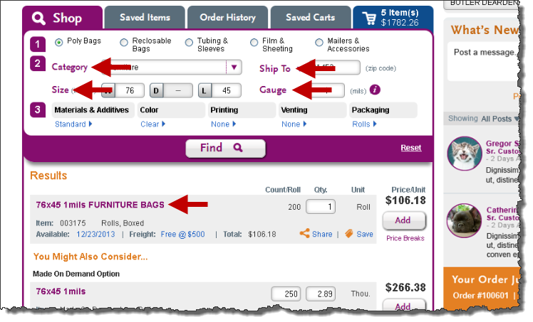
Suggestion: A possible solution would be to change the default color of that line item. Though, I would suggest keeping the color as-is, and maybe including a visual element indicating it’s a clickable field. (IE: Underscore or upside down triangle)
Your point about the similar treatments is well taken. However, there are a couple of subtle differences (perhaps too subtle?); the font for the headings within the widget is a special font (Scala) whereas the font for the product links is Arial; also, the product links do show underlines upon hover. I'd like to observe some more users before we draw any conclusions, but this is something to watch for and thanks for noting it. sp, 1/13
Results - Save Item Pop Up
The saving of items will quickly present itself as a problem to many users who use our website. I can see many users referencing the price being offered, and not saving the item. It actually reminds me of how a travel website works, where you search for vacation packages – see the pricing being offered, yet you’re not locked into anything until you ‘book it’ or ‘save the offer’. But this is a huge step away from how we handle this on our website currently.
Suggestion: It might be a good idea to train the user into saving their items. This could be accomplished by showing the user a popup that displays immediately after results are displayed. I would also recommend the popup to be shown a couple of times – not just once. For example,... The user searches for their first item, and when the results are displayed – it shows the popup, with only an “Ok” button to acknowledge the message. Then maybe when the user performs the second search, the popup is displayed once again, but the user now has the ability to silence the message if they choose to. This would ensure the user doesn’t just mindlessly silence the message, and gives them another chance to read it.
This is a valid, widely recognized concern. We have previously noted it as a Change management issue. I encourage you to log your pop-up suggestion on the change management page - each separate issue is logged as a comment on the page - use the comment reply feature to post your suggestion. -sp, 1/13
Validation - Updating Our Custom Capabilities
After viewing the ‘Validation Error’ message, it got me thinking. I assume, with all searches – if the user enters in a size that we are unable to manufacture, they will be presented with a similar message. Sometimes, the user has flexibility in the size and will enter a new measurement – but often times, if we can’t manufacture it, the customer moves onto another vendor that can.
Which gets me thinking?... How often is someone leaving us to go with another vendor because we cannot manufacture the size they are looking for? That information could be very valuable to us…
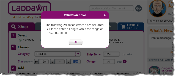
Suggestion: When the user is presented with a ‘Validation Error’, it might be a good idea to capture that information behind the scenes. In time, we could potentially see a size that is trending – which we could then research further and decide if it makes sense to purchase equipment down the road to accommodate that size. To take it even a step further, we could also keep track of what users entered that size – and send out an email blast informing the user we can now manufacture the size they were searching for previously.
I think this is Tom's area of expertise; we've had discussions and made plans regarding this, and I'm not sure if the widget code reflects this yet. I will ask him to weigh in. -sp, 1/13
Validation - Reset Not Working Correctly
When the user enters a dimension we are unable to manufacture, they are presented with a ‘Validation Error’ message. Once the user sees we are unable to manufacture that specific size bag, they will either (1) enter a new size within our capabilities or (2) click on 'reset' and search for something else. Currently, the 'Validation Error' message will appear every time the 'Reset' link is pressed, putting the user in a never ending loop. The only way to stop this, is if the user enters a size within our capabilities.
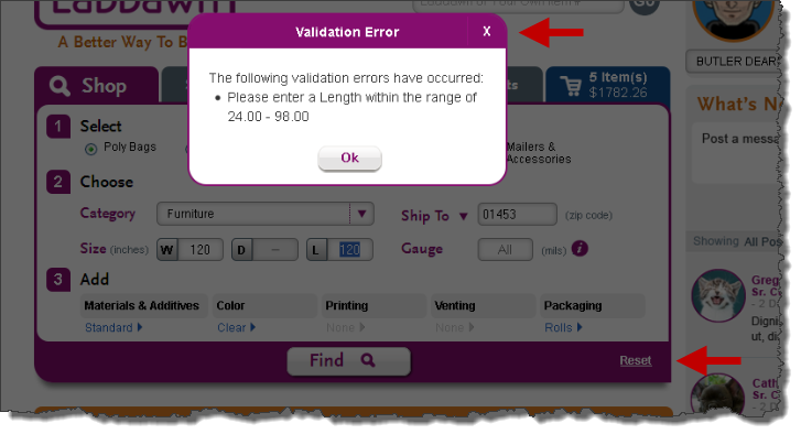
Suggestion: Silence the ‘Validation Error’ message when the user clicks on “Reset”.
I have logged this as a bug (#66) on the Open-closed issue archive (as of 5-14) page (and added some additional details of my own based on additional testing). -SP, 3/24/14
Moving Pop Up Message
I'm not sure if this is true for all 'Pop Up Messages' - but when the user receives a 'Pop Up Message', they could scroll the website (IE: Mouse Wheel) - therefor resulting in the 'Pop Up Message' being hidden out of view.
Suggestion: I would assume a 'Pop Up Message' - should remain in focus at all times, until the user acknowledges the message. It should remain front & center, even if the user scrolls around the webpage.
This could be a bug or it could be the way it's supposed to function. I can see pros and cons to both for our application. (I tested the popups in Confluence and they remain front and center at all times, they way you describe.) I will ask Steve to comment on best practices for "modals" (we sometimes, rightly or wrongly, also refer to these as "shadow boxes"). -sp, 1/13
This is a bug that needs to be fixed. Shadowboxes should remian front/center until user action. That's the core idea of a window going modal, to reduce user distraction and enforce an action. - Steve B 1/15/14
Furniture Bag - Construction
The construction of a Furniture Bag is actually a large over-sized "Side weld" seal.
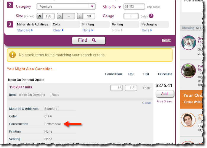
Suggestion: In the 'Construction' field, change from "Bottom seal" to "Side weld".
Captured on QA reporting & tracking as issue #80. -sp, 3/25/14
Gusseted Sheeting - On Hover / Spelling
When searching for gusseted sheeting, there is a spelling error on the 'On Hover' popup alert.

Suggestion: Correct spelling.
Spelling error included with a few other errors with this tool tip logged under issue #69 on QA page. -sp, 3/25/14
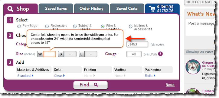
Centerfold Sheeting - Perforated / Missing "On Hover" Popup
When the user selects "Centerfold" from the category drop-down, they are presented with an "On Hover" popup in the 'width' field - informing the user to enter the folded dimension. But if the user selects "Sheets Perforated - Centerfold", they no longer see the same popup message.
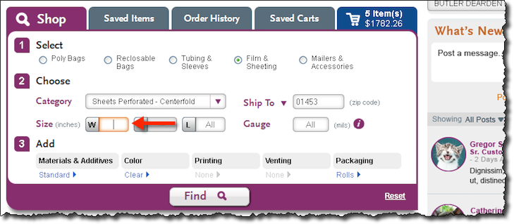
Suggestion: Add the same "On Hover" popup message, that shows when the user selects "Centerfold".
I have captured this as issue #82 in QA reporting page. - sp, 3/25/14
Custom Saved Plates Display Order
Custom plates are currently being displayed in the order they were created. (IE: CP0001-V; CP0002-H; CP0004-V) This doesn’t become a problem, until the customer has converted several print jobs. Assuming this is a category that could potentially become popular with some customers, we should consider displaying the custom plates differently.
Suggestion: The ‘short list’ should consist of the top 5 recently added custom plates, sorted in ascending order. And the “More Saved Plates” (‘long list’) should display all custom plates, sorted in ascending order.
Good observations here and below on print plate menu; your feedback spurred some redesign work - Print Plates - New Design Execution (Phase 2 change) - however, we've deferred revisions to this menu till after launch of release 1. -sp, 3/25/14
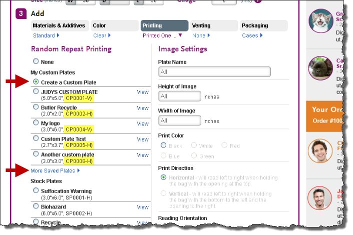
Create a Custom Plate
The “Create a Custom Plate” option appears to ‘disappear’ in the collection of custom plates.
Suggestion: Consider moving the “Create a Custom Plate” above “My Custom Plates” and right below “None”. Doing so may showcase the “Create a Custom Plate” more prominently.
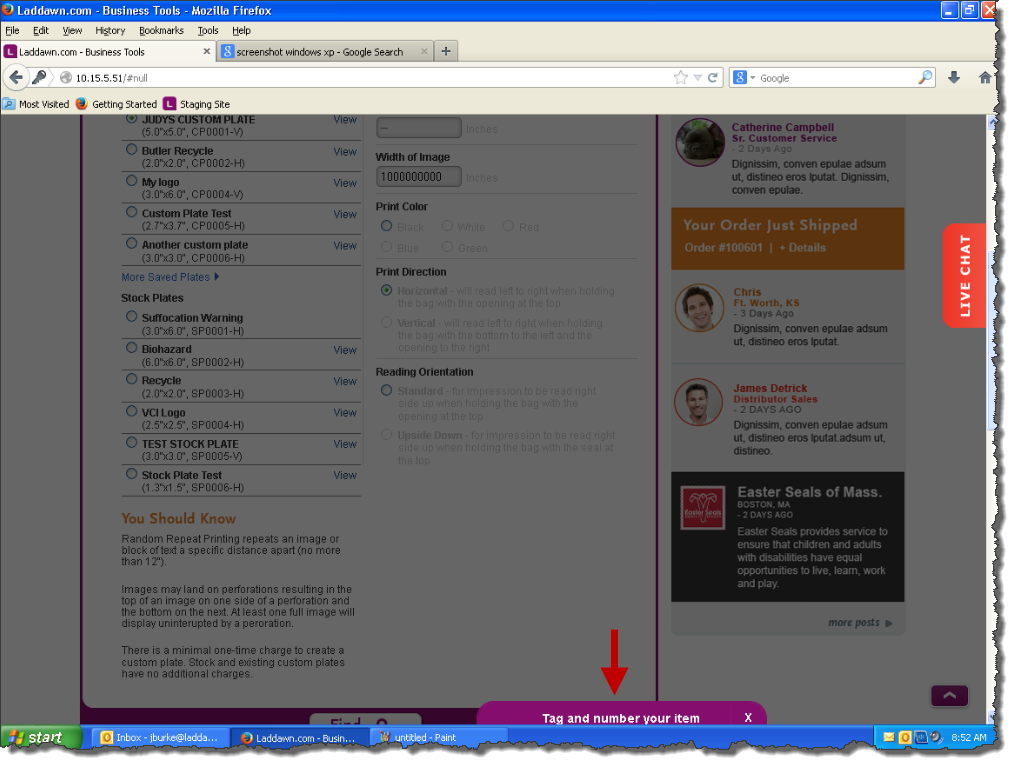
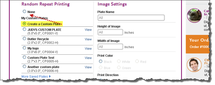
Default Input Field Values
“Plate Name”, “Height of Image” & “Width of Image” contain the word “All” as default.
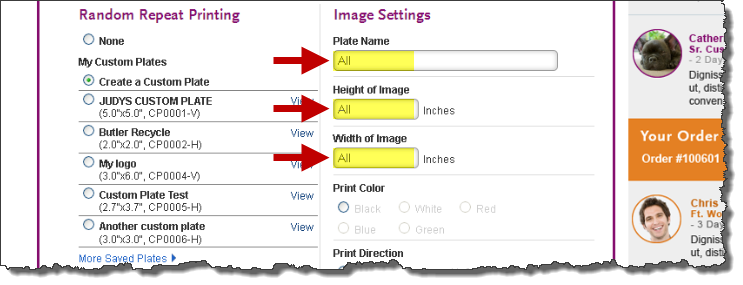
Suggestion: I assume this text was “copied” from other input fields where it did make sense to include the word “All”. But it should not be included in these fields specifically.
Rename Custom Plates
There will inevitably come a time, when a user wishes to rename their custom plate. I am not sure if this feature is possibly hidden within the “View” section, but I was unable to test that link out at the time of this writing.
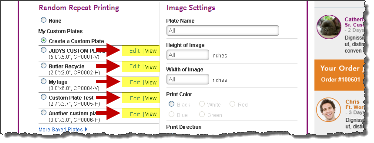
Suggestion: Give the user the ability to rename their custom plates. It could possibly be done by adding a text link, to the left of “View”. So it would then read, “Edit | View”.
Print Layout
If there’s one thing about printing that frustrates most users, both customers & employees – it would be ‘Print Direction’ & ‘Print Orientation’. As you’re reading the description, the whole time you’re trying to draw a picture in your mind. We often find ourselves having to read descriptions like the one below several times, until we feel confident in how the print will be displayed.
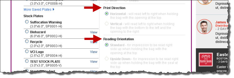
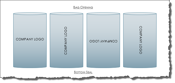
Suggestion: Instead of only providing a textual description of how the print will be displayed on the item, we may want to consider including a visual illustration too. Based on what the user selects above, we could display something similar to one of the images shown below. Making this change alone, would clear up a lot of confusion.
Inches Between Print Impressions
If there is one question that comes up the most when talking about printing, it’s “How many inches are in-between each print impression?”
Suggestion: It would be great if the user was told how many inches will be between each print impression. Whether that is conveyed to the user in a blurb of text, or maybe it’s text that is an over lay on the preview images I suggested above.
VCI Stock Plate
When creating a printed item, and selecting the “VCI Logo” stock plate – a user could accidentally select this configuration when they are actually not using VCI as the material.
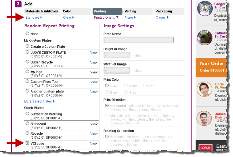
Suggestion: Consider disabling “VCI Logo” stock plate, if user has not selected “VCI” in the materials section. Or, if the user selects the "VCI Logo" stock plate - we could present them with a popup informing the user that "VCI" was added to the materials section.
I will log this as a post-launch enhancement. - sp, 3/25/14
Stock Plate Suggestion
Often times it can be an easy sell to convince a customer to move their business over to Laddawn because of all the value added services we have to offer. But it’s often a lot harder to convince a customer to move their printed business over to us. One reason customers often over-look us for printing is because we don’t stock a specific plate. They are aware they can create a custom plate with us, but swallowing that custom plate charge is hard when they’re already getting that plate for free with another vendor.
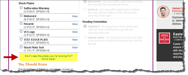
Suggestion: It might be a good idea to include an area where the customer could suggest a stock plate. For example, below the stock plate section it could say – “Don’t see the stock plate you’re looking for? Click here!” And then the user is brought to a popup, asking for detail of the stock plate they’re looking for. That information would then be captured, and after the user submits that – we could then try to offer them the custom plate.
Resize Custom Plate
When selecting a custom plate, “Image Setting” fields on the right side are enabled.
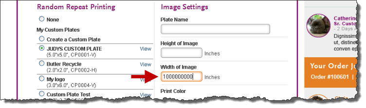
Suggestion: “Height of Image” & “Width of Image” should be disabled because those are two things you can’t change after the plate has already been created.
Breadcrumb - "Color" Inconsistant
If the user selects a "Pink" "Tint" film, the 'Color' breadcrumb reads - "Pink, Tint". But if the user selects "Zip Top" and changes the material to "Anti Static", the breadcrumb only reads - "Pink".
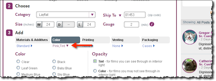
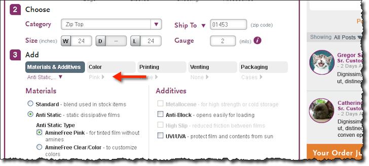
Suggestion: Consider revising the 'Color' breadcrumb to read "Pink, Tint" with Anti Static selections.
It appears as though this specific issue got resolved. -sp, 3/25/14
Single Wound Sheeting - "On Hover" Popup
When selecting "Single Wound Sheeting" from the category drop-down - the user is presented with a "On Hover" popup talking about centerfold sheeting.
Suggestion: Remove "On Hover" popup.
Centerfold Description - "Open's To..."
When the user selects "Centerfold" or "Gusseted" sheeting, they are presented with a "On Hover" popup, alerting them of the folded dimension. But I can see many users second guessing themselves, when they read the description of the item in the results section, and especially if they come back at the later time to review their saved items. Not every customer will read "24x0" as "centerfold sheeting".
Suggestion: Consider changing the description of returned results & saved items. For example, 24x0 4mils (Opens to 48).
Logged in QA page as issue #83 - sp, 3/25/14
Results - Unit Price
When viewing an item in the results section of the Shop Tab - you see the price per unit. But if you update the quantity, only the total price changes and not the unit price.
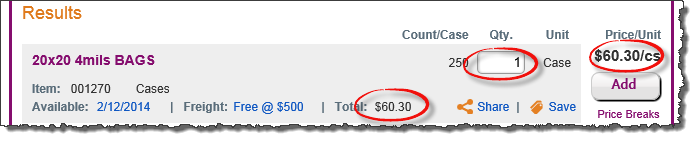
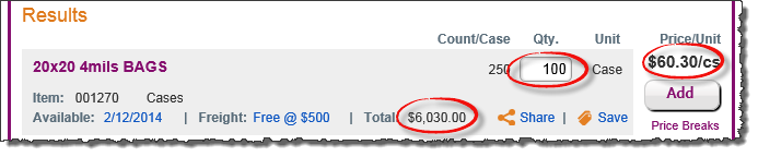
Suggestion: I think this might be a bug, as you would want this price to update once the quantity is changed and it puts you into a different pricing bracket.
Still happening, though I wonder if they have this piece up and running yet. Logged as issue 84. -sp, 3/25/14