| Observations from testing | The last word (for now)(5/26/16 - SP) | (5/23-25 - Susan, and where noted, Jeff) | Jay's Comments, 5/25 | |
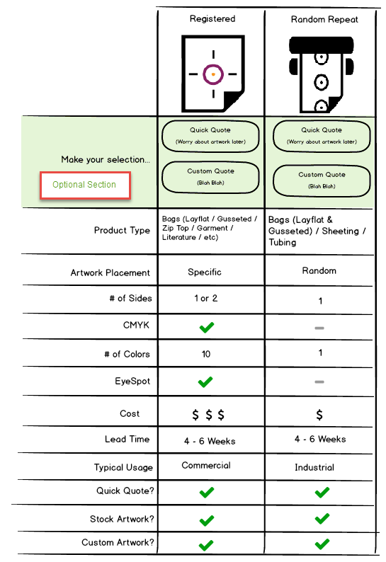
Regardless of the first scenario tested, none of the CR/hybrids had a difficult time choosing Reg. v. RRP (except for quick quote scenario which can be done either way, and offers no clues). | I am not as concerned as Jay about "new users" - a new employee is going to ask (or they'll read). I'm getting the feeling more and more that distributors (or their customers) know what they want. I am not a fan of f hitting every user with this grid. However, for "enquiring minds" I agree that a grid is a good way to showcase the differences and similarities/pros/cons. (Chris had proposed something similar.) Let's consider this approach for the "flip side" - what you see when you click the question mark button. (Note - we've decided not to say anything about RRP costing less.) | When we do the more "integrated" visual design, maybe these do not need to be so big? | Correct. Most users did not have any trouble selecting Random Repeat vs Registered. But I think that's partly due to the fact that most of us, already know what we should be selecting. I noticed most users did not read each description. Which makes me wonder,... will it be as easy for new users to decided between the two types of printing? I doubt it. This is the perfect opportunity for us to teach our customers about our printing capabilities. I am more likely to look at the pro's and con's of a grid like this, rather than reading lines/paragraphs of text. To help a new user decide, I wondered if it would be best to display them like this? I think it would be helpful, if we also included "See example". And the user could see 'actual photographs' of printed jobs. (See image to the right) |
|
About 50-50 used "click here to get started" v. going right to the purple buttons. One person seemed to feel obligated to use that. Some puzzled a little over the two. In the YMCA scenario, most seemed to have no problem using "get started" and then knowing to use "choose artwork" purple button to add a 2d piece of artwork; one person however thought she might lose the work she'd already done if she clicked the purple choose artwork button. A couple of people puzzled over what "Browse" meant within the context of the choose artwork tile in the get started popup. | If someone clicks the Quick Quote button (to be renamed "Price without artwork") after adding text or placing artwork, we will warn them - "Are you sure? You will lose your artwork." (Exact wording may need work.) As to Jeff C's suggestion - I suggest a pop-up after the first art/text placement that says "Did you know you can add other images or text to combine with the art you just added? Just click Choose Art or Add Text." And include a "Got it" button to close (and a checkbox for "don't show me this again.") After that we run for luck as they say. I think people will figure it out. Testing showed that "Choose artwork" was not problematic, but I'm game for trying "Add Artwork." | Jeff C says: we should talk about how we can somehow call out in the designer that you don't lose a currently placed image if you add a second or third image (or text) | I feel "Quick Quote" should be removed from the header bar AND on the popup after selecting "Click here to get started". It seems misleading, especially after I've already committed to a custom design. The second I alter my design, (Add text, add images, etc) I should not be able to quick quote. I disagree. I do not think the data suggest Quick Quote should be removed from the header or popup. Where would it live, if not there? I'm not sure. In my mockup above, I have it living at the beginning where it sort of makes sense to include it. But I'll admit, I'm not a fan of the 4 buttons. I think it's a little overwhelming. I think the testing actually validated our current approach for the most part. "Choose Artwork" I think should be changed to "Add Artwork", similar to our "Add Text" button. Whether I'm choosing a stock plate or uploading artwork, I am ' adding' artwork to my custom design. "Choose" might lead me to believe I can only 'choose' between whatever is already there. | |
Quoting without art – everyone is confused about this defaulting to a size, especially given the scenario stating "You don't know the size." All ask questions about what the size was – the max? random? | This is not just a design challenge, this is also a matter of coaching our staff regarding size. Changes already made: Placeholder now says: (Artwork Placeholder). Bubble heading is now just "Format"; dimensions no longer defaulted. Ink colors now defaulted to "select." Let's try Jeff's suggestion - replace "(Artwork Placeholder)" with a dummy image (the same mountain/sun icon we use in "Choose art" button). Let's work in some informational data - based on bag size, the min and max image size, showing within the formatting bubble. We may also want a question mark/info button or tooltip regarding how size of image (and coverage) play into cost. | Lots of issues here including training and policy questions. Requires discussion. | I think we should (by default) quote the largest size possible, but give the user the ability to change the size of the placeholder artwork. Most customers (if they don't have the artwork) will not know the size of the artwork. Let's assume the worst and give THEM the ability to change it, if they know it. Nope. Owen wants CR/CE to handle this conversation differently. He does not want them doing what they do today and quoting max. This is going to be a coaching exercise. | |
Some people are thrown off by the bubble heading saying "Format artwork" because this is "quoting without artwork" | See changes above. |
| Sounds great! But I'm confused by "dimensions no longer defaulted". Are the input boxes going to be empty? If yes, is there anyway of indicating the maximum size? Yes and yes. | |
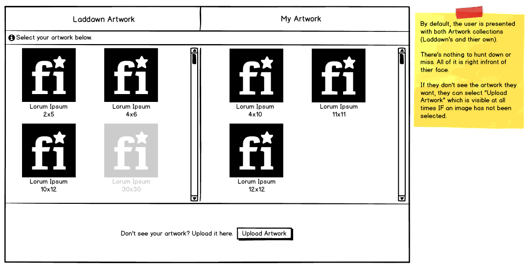
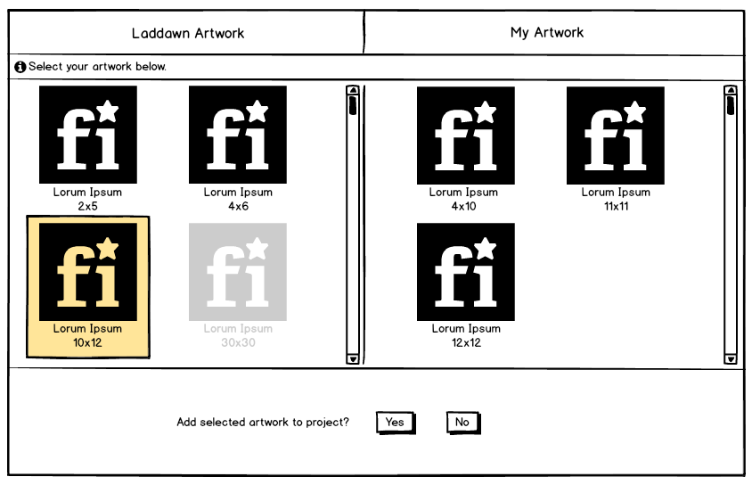
When quoting with art, no one seemed to have difficulty landing on "choose art" from either the "get started" pop-up or the purple buttons. However, most ? seemed to struggle with the artwork chooser itself: | Haley, what are your thoughts on Jay's suggestion? I think it is interesting, potentially helpful, but I also wonder what we lose. | Jeff C says: we should discuss the radio buttons for sizes/custom in our meeting. We discussed and agreed to eliminate radio buttons on stock art/plates. I do think informational captions are still necessary. | I think the artwork chooser, should display each collection at the same time. That way, there is nothing for the user to miss. On the other hand, it could be overwhelming but maybe we want to consider it? The first mockup, shows that both collections are visible at all times, including the ability to upload. It's only after you select an image, does the "upload" disappear and it then asks you if you want to add the select art into your project. |
|
A few not seeing the tabs to the left, so not realizing they were seeing just a subset of options (Laddawn art). This is where we had to guide some testers. | Haley is working on vis. design, possibly moving tabs to top. Maybe she'll like Jay's approach. We'll see. | I think this can be remedied with visual design. | ||
Confusion over the white box – at least 3-4 thought it was a means of uploading art. | Bill, Haley and Chris have come through with a way to have this be part of the toolbar. Having it within Laddawn art was never an ideal solution. | I think this will be helped w/visual design of the 3 side tabs making it clearer this is just Laddawn art; but we also need to call it something other than white block or white box – maybe "white background"??? | I think the "White Block" should not be considered 'art', but more so an 'option' you enable within the designer. Agreed but out of scope for this release. Hence the art solution. | |
Confusion about the "Place" button. | Let's disable "Place" until artwork is selected. It lights up as soon as user clicks on specific artwork. Eliminating file field (see below) will also lessen confusion, I think. | I think this may be an artifact of testing with a static prototype; some important visual cues are missing, which would not be missing with a fully functioning UI. | ||
| Confusion over the File: [ ] field - people in upload art scenarios wanted to use this for that. | Eliminate the "File" field. The artwork selected will be highlighted with shaded background rectangle. | Do we need this? Why not have the artwork selected be highlighted and just have them click the place button. | There's no need for it. | |
Once the tabs were discovered/understood, no one had a problem with the "my computer" tab and uploading, previewing and placing their art. (One person puzzled a little over the what the difference is between "my computer" and "my artwork" | No change to the file upload flow. |
| I think we should remove the tabs completely. I don't know that the evidence supports a change this drastic - there are some good arguments for keeping the choices separate, but your idea (above) is not without merit. | |
In the scenarios with Laddawn biohazard and recycle plates, a couple of people struggled with the radio buttons to choose specific sizes v. custom option; even those who figured it out within a few seconds did pause over it, and weren't totally confident about their choices (even when correct). | We're ditching these radio buttons. We'll warn when user rotates or changes size of a stock images. | Why are we doing this again? I'm tempted to just have them pick the art, and give a warning upon resizing. We have to do it anyway for rotating. | I don't think we should include the ability to choose the artwork size within the artwork chooser window. (That should be left in the designer, if I have that image selected) | |
| A couple of people got off track on the scenarios with Laddawn art - 2 went for quick quote and then needed to be guided back to Laddawn art. Neither tester had yet seen the 3-tabbed artwork chooser. This might have had something to do with the scenario stating that the size doesn't matter (so they'd pick the stock size); this may have gotten translated in their heads into "they don't need a proof, so I will quick quote without art" One of these two went for quick quote again on a Laddawn artwork scenario, but this time said it was because "quote" was in the scenario being tested. | IT also pointed out that we've gone to great pains to eradicate the term "quote" from the website, and found this branding extremely ironic and surprising. Should we rename this? Should we be more utilitarian and call this "Price without artwork" ? | |||
In the designer- general |
| |||
Most people seemed to understand the general purpose of the orange resize box, though some did gravitate more toward the data input boxes for resizing. Most didn't really get the rotate feature. | Re rotate: I think if the resolution of the circular arrow on this is improved in the visual design, users who actually have a need to rotate will, hopefully, figure it out through trial and error. We might incorporate a tooltip/hover. It is what it is. I don't want to clutter the toolbar or the designer with some other button or feature to accomplish this - yet. |
| ||
Mixed reactions to the spacer tool for RRP – some got it, some didn't. Even when pointed out some didn't realize the +/- were buttons that could be used to change the distance. | Add text and work on buttons. | Jeff C - I think this can be remedied with some simple text telling people what it does. | We could include "inches between print impressions", displayed vertically. | |
In scenarios where we uploaded multi-color registered art, most seemed to understand that we were detecting the colors. |
| |||
| Purpose of checkbox/circle buttons in format bubbles generally not consistently understood (I include myself in that group). The circle/arrow (undo???) also looks too similar to rotate. Some people thought the checkbox performed same function as "Find." | Bottom line - let's remove these two buttons. Here are some notes on interaction which explain why they're not needed: For artwork and quick quote: As you tab or mouse from field to field, the designer is going to update on the fly with your size/ink selections. No checkbox needed. If you want to undo your last choice, use the upper toolbar's undo button. No circle button needed. To make the bubble go away, click outside of it. To make it reappear, click anywhere on or within the orange artwork container. For text: Will work similar to editors like Word. You type and see what you're typing within text box as you type. If you want to change font, underline, etc. of text that's already been typed, you need to select the text (all or a portion). (Alternatively, you can change font, color, underline etc. before you begin typing; then no need to select.) | |||
In the YMCA scenario, I think some people are thrown off a little by the color pallet being different for the Text bubble (only one color shows), than the artwork bubbles (all colors show). Several testers were stumped about how to change text color, but tended to have no problem changing image color. | See Color choosers for registered print for changes. | Text format bubble needs to expose color choices in manner that is closer to what we do for images. | ||
Some knew what it was, some didn't. One person thought it was a font color indicator (both happened to be black). | Per Tom it is problematic to show this in the designer. But the importance of "full disclosure" about the potential for this to appear on the product was validated through our testing. We're going to handle this a different way TBD (via a disclaimer?), | We can train CE/CR but I suspect higher percentage of customers will not know. Add an info button? | Most customers have no idea what this is. | |
| Results | ||||
| When done with designing, a few people had difficulty knowing to click Find to get the quote. One person, a couple of times, wanted to click "quick quote" to finish the bag and get pricing. | Let's see how this looks when we show it using our purple widget container. As stated above, let's rename this "Price without artwork" | Agreed, Find is a bit of an awkward term in this case, but I think seeing this in the finished design, integrated into the widget will likely overcome this | ||
Download Proof (PDF) & Sharing. To share the quote, most seem to assume they'd download the PDF and attach it to an email. At least one person thought the PDF would contain all the details of the quote (price, etc.) | We discussed and decided to remove the download button so they HAVE to share/save/add to cart. Let's replace with caption that says "Save, share or add to cart to create a PDF file containing your design." (Wording subject to fine tuning.) | We definitely need a downloadable proof, but we need to take steps to encourage customers to use the share feature v. downloading the file and emailing it themselves. | ||
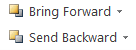
| At least two people though the font/back buttons reference front and back of bag. We did not consistently ask every tester about the purpose of these buttons. | Let's try "Bring forward" and "Send backward" (à la Word):
|
Additional observations:
- Everyone seemed to learn as they went along. (We varied the order of tests for this reason.)
- The "caution: hot contents" registered print scenario suggests we need some sort of color pallet for text in registered printing. Although black, white and "detected" colors are probably sufficient for 99.99% of colored art for registered, when the artwork is ONLY text that they type/create in the designer, they need to have a choice. We could offer our standard RRP ink colors, but that seems kind of arbitrary. So back to offering a full color pallet? And if we're offering it on text, then maybe we offer it on images too – for sake of consistency. But we need to preserve the color strip of B&W+detected colors; I think people really "get" that. See Color choosers for registered print for changes.
Attachments:
 img.png (image/png)
 art1.png (image/png)
 art2.png (image/png)
 image2016-5-26 10:56:11.png (image/png)