Notes from 5/18 meeting with Ladd & Dawn
One prototype.
- Color: Anything that's clickable/usable should not be gray.
- Flow:
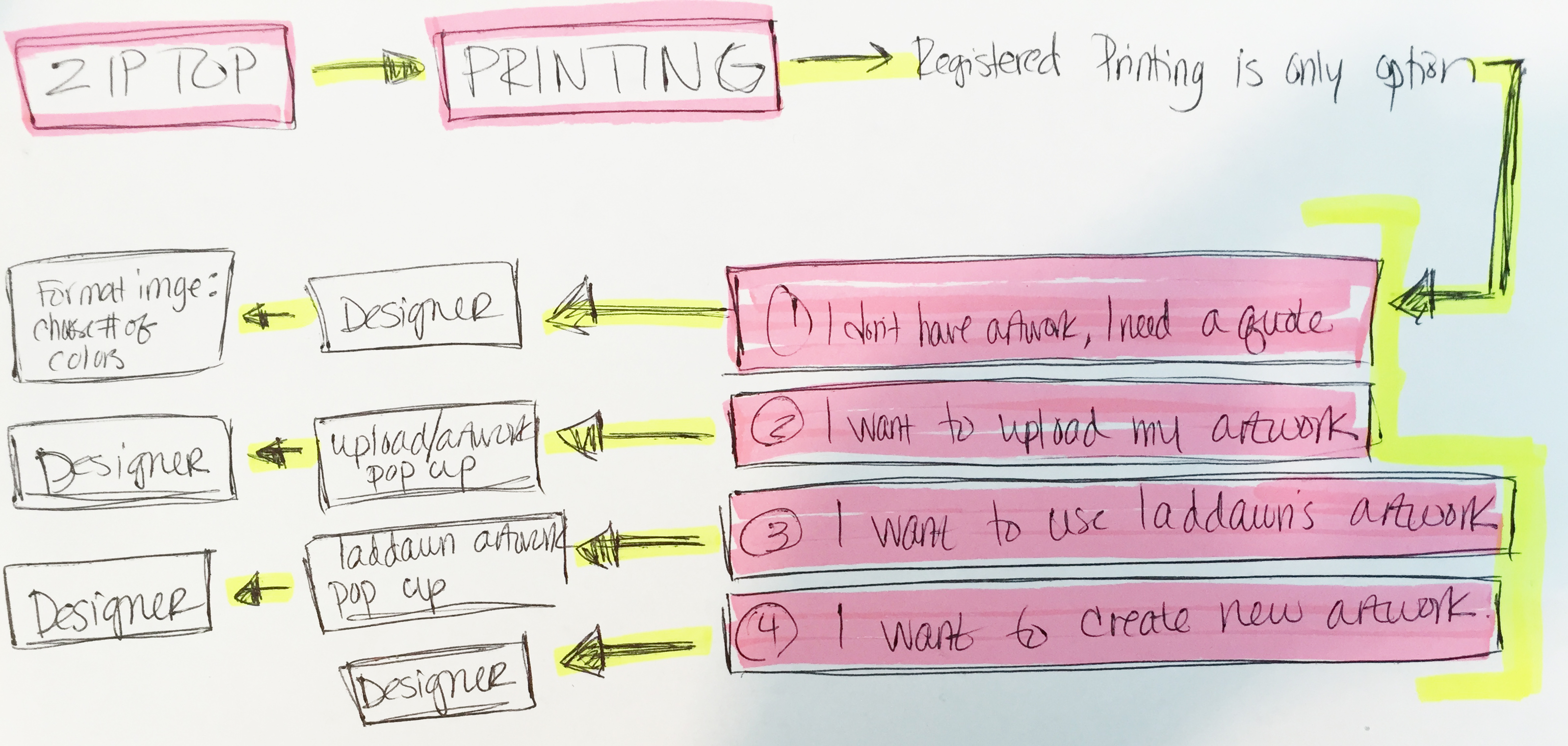
- Open printing.
- Address how other level 3 menus open w/defaults (materials - standard, color - clear, venting-none) v. how this menu opens - bring some unifying consistency?
- Present choices (in shadow box or other means identified identified in step 1a above): none, Reg and RRP. (Should Reg come first, since its new and we want people to be aware of it?) Print designer not in background.
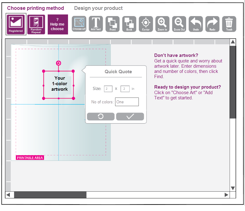
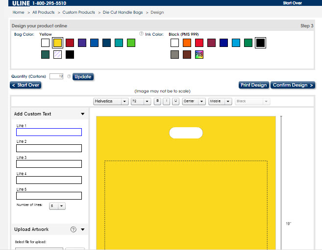
- Once Reg/RRP chosen, you're in designer, with a neutral, static art placeholder (cannot be stretched or moved - maybe gray, not pink? ) and the approriate REg/RRP schematic. The placeholder says something like "Get started" - if clicked it opens a pop-up based on the current one (with darkened print designer in background):
- Open printing.
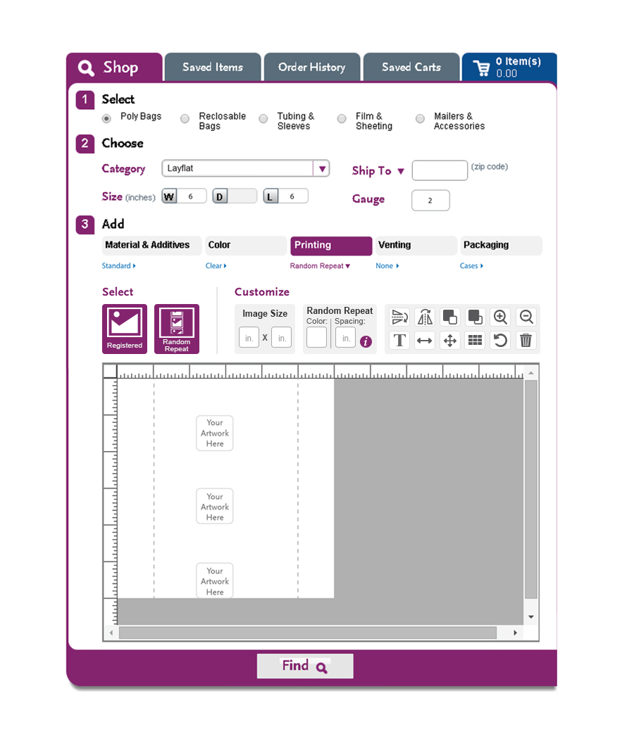
- The designer:
- Remove the Reg/RRP buttons and the RRP spacer button. Replace spacer with representation embedded in the bag, between RRP images. A riff on this:

- Add a button for "Don't have art?" (quick quote). Modify text on "Browse" button to be "Choose art." Visually separate the "determine my art" buttons (quick quote, choose art, add text)- from the other design tools.
- Remove the Reg/RRP buttons and the RRP spacer button. Replace spacer with representation embedded in the bag, between RRP images. A riff on this:
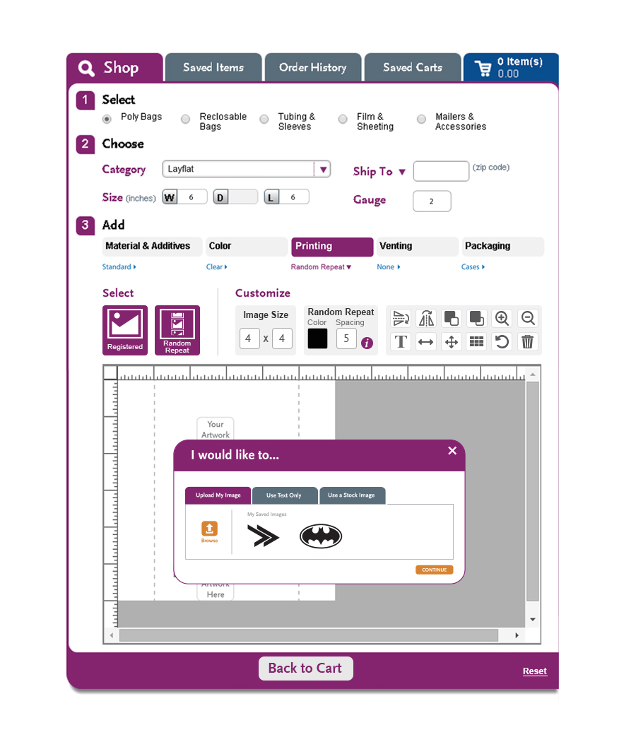
- The artwork/plate chooser pop-up:
- Saving uploaded art - "My artwork" will include artwork that has been uploaded for other bag designs, but not yet converted, in addition to artwork that has been converted to plates. (Confirmed with Bill.)
- Keep the same three tabs, and the artwork language on tabs? Yes.
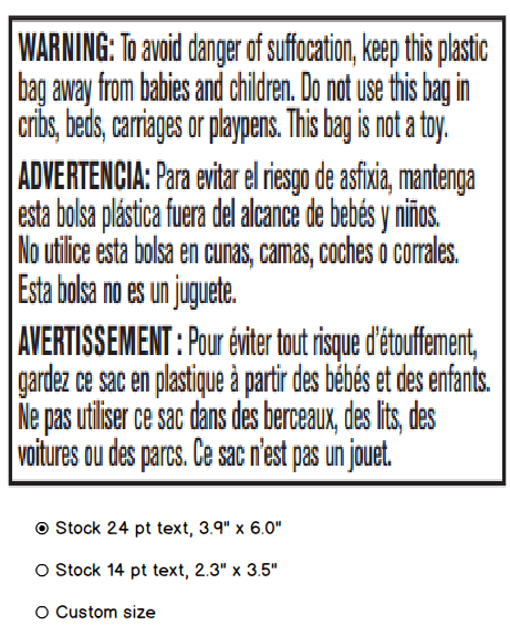
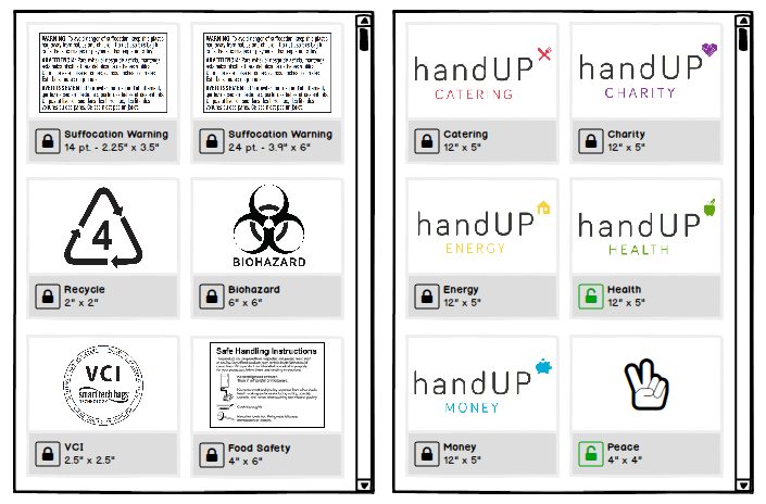
- For RRP, to aid users in deliberately choosing a stock plate v. artwork they want to resize, we will present Laddawn stock plates with our size choices underneath (so no need for repeated images), and an option for custom, something like this:
"Laddawn artwork" for REG is basically just clip art; we will quote assuming new plate is needed (unless they are requoting/reordering as had). - In spite of adding the custom size option, the customer can still choose a stock size, and resize it or rotate it in the designer - and we will warn them it is a new plate. However, we will quote all "My artwork" reg art with new plates, unless an as had, so no need to warn them; explain in results.
- Do we still need to tell give them, in the results, an explanation of why we're quoting with a new plate? Yes.
- Do we need to warn them at the artwork-chooser stage that they've used a plate X times and it is too old to be reused? Maybe for registered, but not for Random, we will eat it. Owen will research what to do with both Reg and RRP.
- Remove warning in laddawn artwork/myartwork.
Updated Prototypes:
V1:
V2:
Two prototypes for 5/17
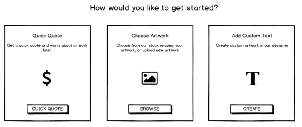
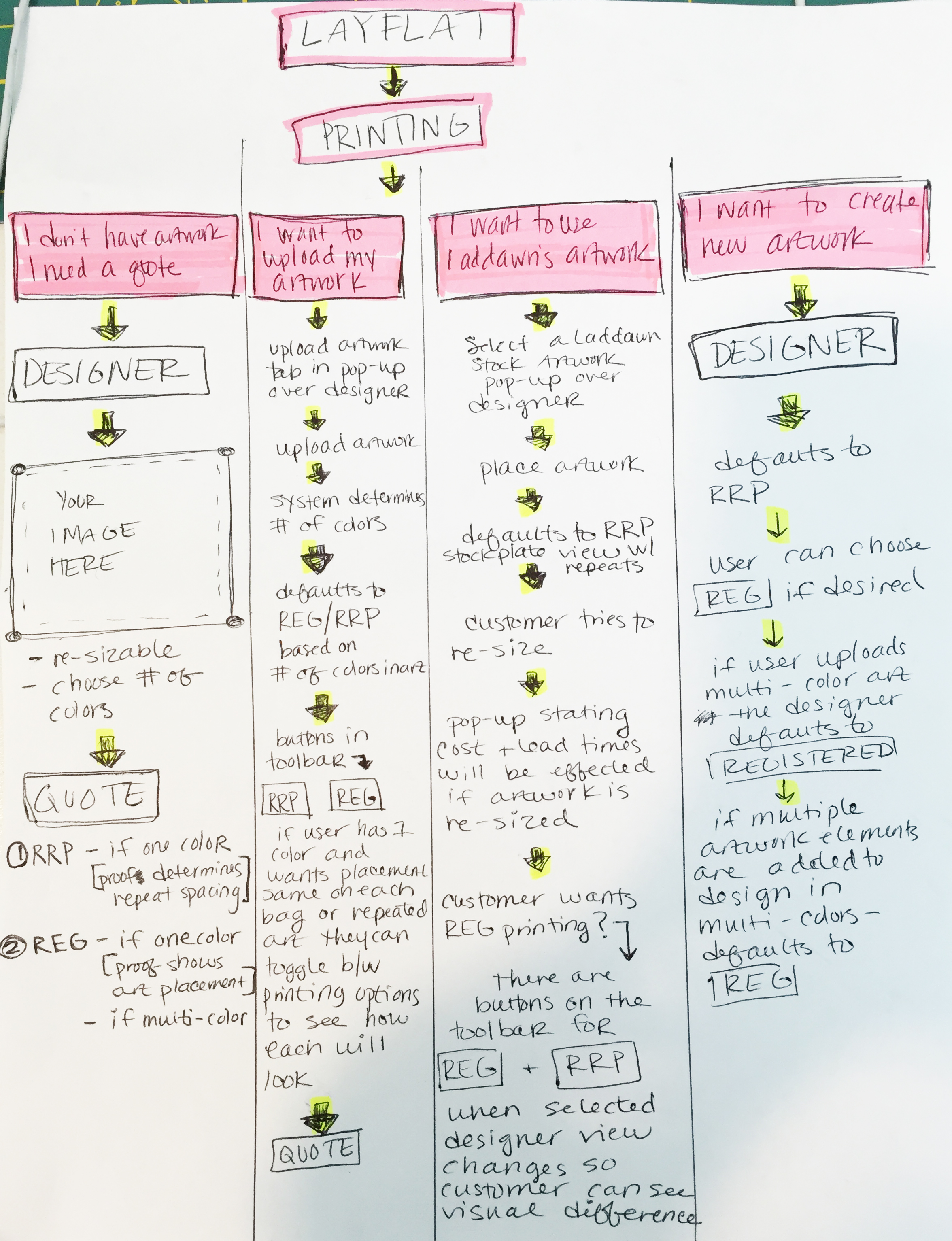
1. Stepped pop-ups to ease you into your choices and the flow. First pop-up requires user to choose Reg v. RRP. Added subhead/call to action. Bulletized the description in hopes of improving recognition of key features/differences. Once you choose one or the other, you go to second pop-up which presents three choices:
1) quick quote (brings you directly to designer, ready for your placeholder size/color inputs - much like prototype 2 below)
2) "Choose artwork" (brings you to interface for choosing plates as artwork and uploading file for new artwork); and
3) "Create text-based artwork" (brings you to designer with text box overlaying bag), in focus, with formatting "bubble."
The following wireframe is just a start. It needs to be fleshed out further to support the test scenarios. This one only goes down paths for registered. It also illustrates my attempt to address issues discussed on 5/11 trial run (see my notes below). The first screen shows Reg/RRP still on a blank background. The remaining wireframes all have the print designer in the background (with revised toolbar) - this is very important for Ladd and Dawn to see.

(Note - the display version here just steps through each screen sequentially. If you download the PDF, many buttons are clickable to demonstrate the paths for specific scenarios.)
2. No pop-ups at the start. We bring you directly to designer. As with prototype 1, we have 3 largish buttons (or blocks with a radio button below): 1) RRP; 2) REG; 3) "Help me decide" The buttons are all clickable while everything else in the designer is disabled/grayed back (need to show this in prototype). As shown below, when RRP or Reg are chosen, Designer activates, and is defaulted to a Quick Quote view - an empty "your artwork is here" rectangle, with corners for stretching, representing what you'd need for a "quick quote," with a bubble to the right of it for entering dimensions and color choices appropriate to Reg. v RRP. We provide some text that could dissolve after you either format your placeholder or click choose artwork or add text; at this point, the buttons and their iconography should (in theory) be sufficient to convey your other options.
Here is a static mockup - just a start. The Designer is the same as in prototype 1 above, except the headings above the toolbars are more "directive." Not sure where "help me choose" brings you - to the same Reg/RRP pop-up used in prototype 1? To something a bit more stepped and involved?
| To set the stage…
|
In both prototypes ...
Note: I eliminated two buttons - duplicate and shape tool. For release 1 the "shape" will be handled as stock art (and plate). Duplicate tool seems nice to have but non-essential - am I wrong? I changed the Upload to “Choose art” as I felt we needed a better umbrella to guide you to both uploading new art, and choosing existing art.
I wonder if the Choose Art and Text t buttons should have a different visual treatment (color?) to set them apart from the printing method buttons AND the other buttons, which are really tools/utilities.
What are your thoughts on all the gray in the tool bars and the formatting "bubbles"? It is aesthetically pleasing but we use it a lot elsewhere to indicate features that are disabled.
Here is a nice resource Haley dug up for Help content: http://www.clearviewbag.com/faq/
Jeff''s feedback:
It looks like both scenarios we still have the RR and RP buttons on the designer. Is that correct?
I like your idea of having the Choose Art and Add Text buttons be a different color.
I’m starting to feel like going straight to the designer under this scenario may be the better way. I didn’t feel that way originally because I was overwhelmed by the amount of buttons and options in the designer itself. Now I feel it’s been greatly simplified, so now having RR and RP buttons right there seems ok.
The testing we’ll do with real people (haha) will really dictate a lot of the direction, at least I think.
Notes from 5/11 check in (Susan)
We reviewed this prototype...
.... Using these print designer test scenarios (since revised a little, plus one added to test re-use of an existing customer plate).
- If my task involves text-based art or a Laddawn stock plate, not apparent how to get there at the start.
- Neither the "Design my product" nor the the upload symbol/button in the designer convey that Laddawn has stock art (plates) to choose from (which technically do not need to be "uploaded"). For the designer button, maybe different symbol and terminology - choose artwork? Browse artwork? (These are neutral enough to describe choosing from artwork online v. choosing artwork on my computer.) For "Design my product" see revised prototypes above.
- Is there benefit to customers knowing that RRP tends to cost less than registered?
- The proof may need to have a second page showing just the artwork.
Thoughts from 5/11 check in (Haley):
Thinking about what Chris had brought up and how the functionality would work if the designer could default or prompt the user in a certain direction based on options/images selected.
What IF we didn't have them chose random or registered at the start, since that is where a lot of confusion lies. What if the user is asked to chose an option for the task they would like to complete and then after their selection has been made or artwork has been uploaded - the designer then defaults to RRP/REG based on their selections.
Similar to our initial design BUT the user has some choices before being thrown into the designer. I am envisioning with these paths that the designer toolbar will have a button for RRP and a button for REG - that way if there is any confusion as to what the printing options look like (if there are more than one) - the user has the freedom to toggle between both printing options so that they can see the visual difference between the 2 options easily and without much extra explanation.
See attached very rough flow paths for this idea. Let me know what you think - very quick and rough but wanted to get this functionality flushed out quickly. Let me know if you have any questions.
RE Thoughts from 5//11 check in. Thanks so much for thinking outside of our little box and sketching this all out (and posting in the Wiki (smile)). I wonder what we lose by not making a choice about Reg v. RRP up front in terms of usability; I think it will cut both ways. I'd like to see how real customers and CE/CR reps fare with having to make this choice up front, within a new and improved version of the prototype, before we go further in this direction. They may not struggle with it quite so much as we do - after all, CE/CR is quoting both types of printing today. I also think we can overcome some of the confusion we saw yesterday with design tweaks. I spoke with folks in IT and the programming they've done to date is based on the assumption that this decision gets made up front. It's definitely not impossible to change that, but we lose a lot of time if we change that.. And as far as design goes, we're running out of time to have really well-functioning prototypes next week. Let's pursue this option if our testing shows that the RRP/Reg choice is a serious usability problem. PS: I'm struggling with "Upload artwork" and "Create new artwork" being in the same series of choices. I see that the flows are slightly different, but I think it's a little confusing. What do others think? -Susan
Design to do list from review of last iteration (4/2-4/4/2016)
To do list
Remove features that are out of scope for release 1:
- Printer ready specification drawing.
- Ability to modify colors of REG artwork? Let’s discuss. As we discussed and per email I forwarded, we probably need this to enable customers to change an all-black graphic to a color. You (Haley and Chris) will gather some more info from VRPs on the demand for this type of thing). Also – the way the color selection works is not totally clear from the mockup; you may figure out a way to show this more clearly.
- We can have a bag color, or a bag image, but not both. If we have to choose one, I think it’s film color. So bag image needs to go (for now).
- No front and back; release 1 will only support printing on one side.
- Anything involving a file upload needs to spawn a standard file browsing window. (Probably out of scope for all releases.)
Changes
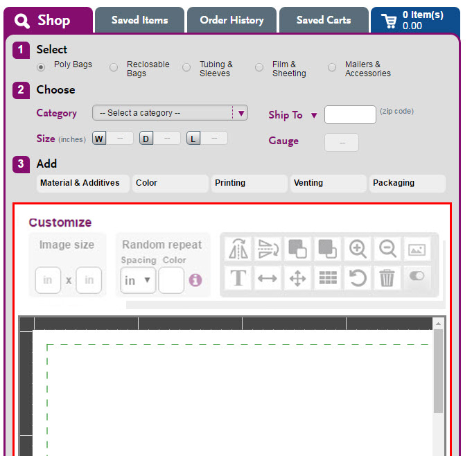
- We’d like the print designer to be visible from the beginning, even if only in the background.
- Initial choices after picking REG/RRP - “Create my product” doesn’t convey enough about what the options are.
We also feel that some of the language choices to avoid use of the term “plate” feel a little tortured, and that both Laddawn staff and customers are, or should become familiar with, the concept of plates, because, as they progress beyond quoting to purchasing, we’re going to have to reference the physical plates in our communications (as early as cart/checkout stage) – we have to charge $ for them, we have to add to lead time, etc.
We propose:- Get a quick quote and worry about artwork later > Prompts for dimensions (and ink color if REG) > See the empty outline back in designer anyway (?) (current mockup skips this; seems going to designer would enable you to play around, change dimensions entered on prior step, and also show off the designer) > then click Find
- Design with artwork from an existing plate > Then choose from Laddawn stock plates/Your custom plates > Print Designer
- Upload art for a new plate (will incur one time plate fee(s) + x days additional lead time) > Standard file upload window > Print Designer
- Create text-based art for a new plate (will incur one time plate fee(s) + x days additional lead time) > Brings you right to Print Designer with text box in focus, cursor blinking and format text bubble open
- Quick quote:
- Illustrate the choices for “How many colors does your artwork have?” with examples (to see how it looks)
- Remove “I do not know the artwork size and would like to quote based on max size…” (Owen, true? Might still help to display some info like “Max image size for this bag is X x X?)
- Results:
- This layout does not reflect our existing design for expanded result – granted it may be ripe for redesign, but we’d prefer to handle that later. We’d like to see the product details on the left, and the thumbnail/image to the right. Q: How do we integrate proof thumbnail with existing product images? Are the existing images superfluous? A: Yes. Since these are all custom, the current images are just drawings; the print designer thumbnails will be enhanced versions of these drawings.
- Change “Download PDF” to “Download Proof (PDF)”Remove verbiage
- “We recommend showing…” (Owen?); if we do include this, it should reference sharing, right?
- “I have reviewed, proofread…” – if we do include something like this, it belongs in the Cart or Checkout, not in the results.
- Naming the composition/plate - Users need to be able to name their “compositions” – not the artwork they upload, but the complete grouping of artwork, text, etc. that put together in the designer to make up a plate (or plates in the case of many registered print jobs). Where does this happen in the flow?
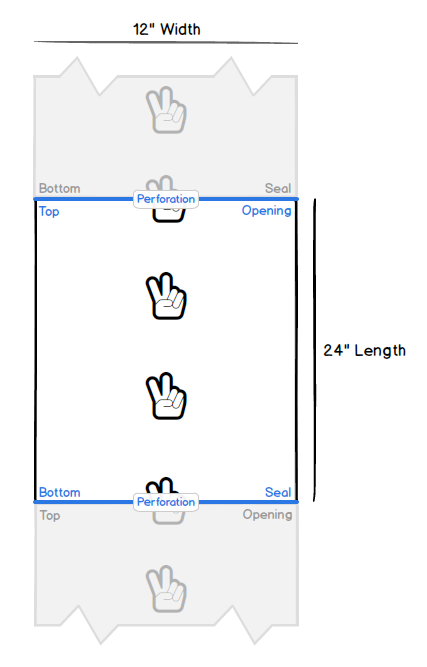
- Random repeat – let’s keep the pink border/tab, but lose the repeat border/tab.
Balsamiq mockups illustrating some of the changes

User stats to keep in mind
Last 12 months:
459 RRP orders – 204 stock plates'
186 Registered – 112 1C / 29 2C / 30 3 C / 13 4C / 1 5C / 1 6C
Meeting notes
Design questions
- How do we convey the two main choices - random repeat v. registered? Do our distributors understand what they each mean?
- How do we make the visual display of random repeat, and the concept of the green boundary, more intuitive?
- Will Chris and Haley still review plate PDFs? Is this step invisible to customers?
- Where and when in the UI/flow will we present the user the opportunity to name the prospective plate? Will they be able to change the name later (up until the quote is converted)?
- Will we enable distributors to associate plates with specific customers (other than via the plate name, and saving the MOD and tagging it to a location)?
- How much do we validate "up front" about image quality? For example, if the image uploaded is less than the min thresshold (300 dpi?), do we reject it and/or throw up a message of some sort?
- In the image/plate chooser popup (if we still need a pop-up for these choices), should we change the order, to put the "placeholder" option first? Suggested language: "No image (quick quote)." (Because we anticipate it being the most frequently used.)
- To what extent do things like #up need to be understood by distributors (and Laddawn staff quoting on their behalf)?
- How should image rotation be handled - in 15 degree increments? (it may be problematic to allow free form rotation that results in odd rotations like 179 degrees...)
- WHAT AM I MISSING?
We agreed to meet on a weekly basis. Chris and Haley will work on designs to show the group next week. Everyone's homework is to continue to contribute thoughts about the current design, as well as poke around other websites with similar functionality and report back on likes and dislikes. Let's record that here using the comments section for this page.
User mindset
- User Personas & Scenarios
- Customer Experience Persona
- Distributor Visits & Calls - these are not personas, but notes from recent customer visits and calls - discussions have not been focused on printing (but rather on the website in general and marketing topics), they may give you some general ideas about our users.
Live prototypes
- The in-house version is at: http://10.15.5.40:81/laddawnprinttest.htm (The caveat with this one is that it is constantly in flux as we add and modify features.)
Mockups
Haley's mockups - done prior to live prototypes?

| Redesign of image/plate chooser pop-up (done last week) Should this functionality even be in a pop-up? Could it be integrated into the Designer layout?
|

Additional considerations - what is our canvas?
Long run we are contemplating changes to the widget, some are cosmetic (such as expanding to full width of page), some involve substantive functionality (the way validations are done, they way first and second level categories are chosen; add other dimensions like "lip height"; suppressing appearance of dimensions that aren't applicable (eg depth on gussetted bags) v. graying them back.
Should we "bite the bullet" on the widening and do it along with the Print Designer? (I.e., what new flexibility will a wider widget give us?) We want to avoid any substantive widget changes that will compete for IT (and design) resources with Print Designer, but at the same time, we don't want to be redesigning the designer after redesigning the widget (right?)
Homework
Websites with designers (yes, not apples to apples)
Visit the websites below or come up with your own examples.
How do they handle guiding a novice through the process? (What sort of helper text or tips do they provide? Is it helpful or intrusive?)
What do you like/not like - about the flow, language and iconography? Why?
How do they handle the concept of reusing a design that the customer has used before?
Do any have a quoting-with-a-placeholder concept that we can learn from?
How do they handle combining images and images and text?
Business cards, t-shirts and more
(Note, I suspect some of these could be using the same underlying designer "engine" - provided by a third party and minimally customized.)
- http://www.zazzle.com/
- https://www.moo.com/us/products/business-cards.html
- http://www.cafepress.com/make/design-your-own
- http://www.vistaprint.com/
- http://www.overnightprints.com/businesscards
- http://www.whooptee.com/designer
- https://teespring.com/
- https://undergroundshirts.com/